Wp-calypso: Themes: Header sections persist on mobile, overlapping the sidebar after exiting Themes section
Steps to reproduce
- Starting at URL on a mobile device: https://wordpress.com/
- Open the My Sites section.
- Open a site's Themes section.
- After the Themes section loads, tap the back arrow to navigate back to the site's sidebar.
What I expected
I expected to fully exit the Themes section and view my site's sidebar.
What happened instead
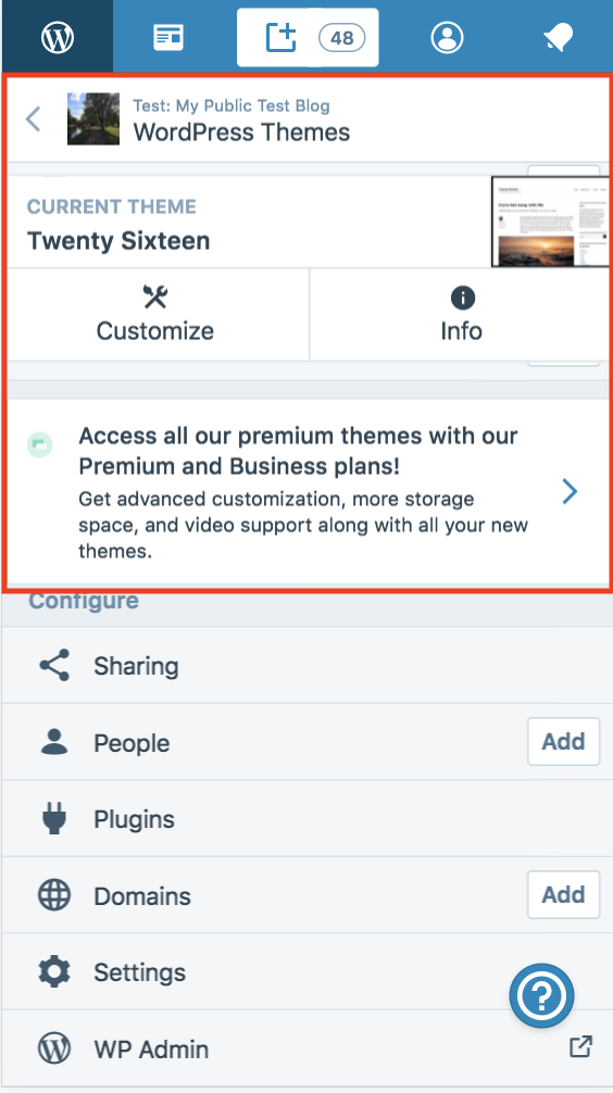
The top section of the Themes page (the back nav bar, the "current theme" section, and the upgrade nudge on sites that have it) persisted.
In the "All Sites" view, the back nav bar persists when going back.
Browser / OS version
Tested on iPhone 6 (iOS 11.2.6) Safari, and on macOS/Chrome using responsive dev tools.
Screenshot / Video
Site sidebar showing the themes header sections overlapping:
Context / Source
manual-testing
 rachelmcr
All 11 comments
@Automattic/theam I didn't see any recent theme showcase changes to account for this issue, but wanted to give you a heads up since this makes for a pretty broken experience for mobile users visiting the showcase.
rachelmcr
on 29 Mar 2018
The two persistent sections (the current theme block and the upgrade banner) are missing CSS layout transforms and transitions to hide them because they're located outside .layout__primary .main.
I'm not sure if their placement in the DOM is intentional, but adding CSS to target those areas and hide them works for me in testing:
// Set transitons for current theme and upgrade card
.layout__primary .current-theme,
.layout__primary .card.is-upgrade-premium {
    transition: transform 0.15s ease-in-out,
                opacity 0.15s ease-out;
}

// Adjust the current theme and upgrade card as needed
// when focused on the site selector or sidebar, but never in the editor.
.layout.focus-sites:not(.is-section-post-editor),
.layout.focus-sidebar:not(.is-section-post-editor) {
    .layout__primary .current-theme,
    .layout__primary .card.is-upgrade-premium {
        @include breakpoint( "<660px" ) {
            pointer-events: none;
            overflow: hidden;
            max-height: calc( 100vh - 47px );

            // Removing this transform could have unintended side-affects
            // related to z-index and elements showing through on mobile.
            transform: translateX( 100% );
        }
    }
}
I'm not sure where this CSS would fit best, however. Maybe @mapk or @mendezcode could point me in the right direction?
 sixhours
on 2 Apr 2018
sixhours
on 2 Apr 2018
Noting that if we move forward with #23694 we could ignore that section and just fix the upgrade notification card.
sixhours
on 2 Apr 2018
@sixhours That's right, we'll only need to hide the upgrade notification card. I'm working on the removal of the current themes section and will notify here to move forward with this fix ;-)
cc @rachelmcr
 mendezcode
on 2 Apr 2018
mendezcode
on 2 Apr 2018
@mendezcode I think the problem resides in the way the HTML is structured right now.
All other sections in Calypso wrap the <div> inside a <main> element like this:
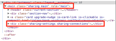
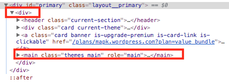
But the Theme Showcase wraps the <main> inside the <div> like this: (which seems backwards)
 mapk
on 4 Apr 2018
mapk
on 4 Apr 2018
It also turns out that those three child elements under the <div> are the ones staying on screen:
<header class="current-section">...</header>
<div class="card current-theme">...</div>
<a class="card banner is-upgrade-premium is-card-link is-clickable href="">...</a>
The above branch nests the header, div, and banner elements within the Main component by moving the Main component into several different outer files.
It needs more thorough testing. I worry adjusting the markup will have unintended consequences.
sixhours
on 5 Apr 2018
Seems like this problem was caused (or surfaced) by #22884. @ryelle any thoughts on how this could be addressed? Some exploration going on in #24037.
 seear
on 11 Apr 2018
seear
on 11 Apr 2018
Yeah, looks like re-ordering the #primary & #secondary containers surfaced an issue with the show/hide styles – the layout css expects the top-level primary component to be .main. I think the approach in #24037 is the right way forward.
 ryelle
on 11 Apr 2018
ryelle
on 11 Apr 2018
I think the approach in #24037 is the right way forward.
Yeah, sounds good, thanks for taking a look @ryelle
seear
on 12 Apr 2018
This issue has been marked as stale and will be closed in seven days. This happened because:
- It has been inactive in the past 9 months.
- It isn't a project or a milestone, and hasn’t been labeled `[Pri] Blocker`, `[Pri] High`, `[Status] Keep Open`, or `OSS Citizen`.
You can keep the issue open by adding a comment. If you do, please provide additional context and explain why you’d like it to remain open. You can also close the issue yourself — if you do, please add a brief explanation.
![stale[bot] picture](https://avatars3.githubusercontent.com/in/1724?v=4&s=40) stale[bot]
on 7 Jan 2019
stale[bot]
on 7 Jan 2019
Related issues
 jeherve
·
3Comments
jeherve
·
3Comments
 samouri
·
3Comments
samouri
·
3Comments
 hoverduck
·
3Comments
hoverduck
·
3Comments
 spen
·
3Comments
spen
·
3Comments
 ehg
·
3Comments
ehg
·
3Comments
Most helpful comment
@sixhours That's right, we'll only need to hide the upgrade notification card. I'm working on the removal of the current themes section and will notify here to move forward with this fix ;-)
cc @rachelmcr