Wp-calypso: Signup: Plans page needs extra hint to scroll horizontally on small screens
Steps to reproduce:
- Using a mobile device or small screen, go to https://wordpress.com/ and click "Sign Up."
- Complete the steps until you get to the plans screen.
Result: the plans page is not responsive on mobile.
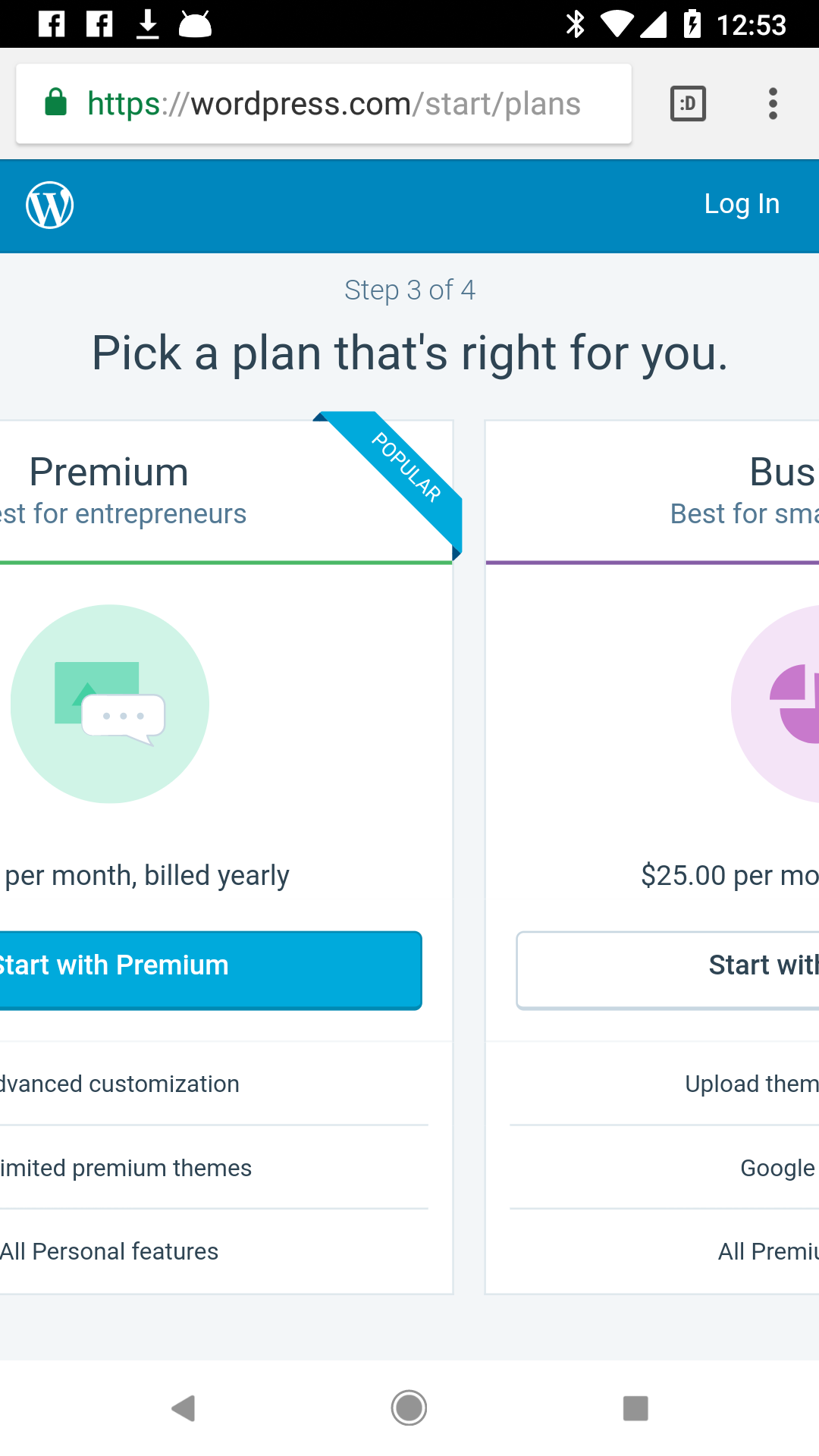
Seen at https://wordpress.com/start/plans using Pixel, Android 8.1.0.
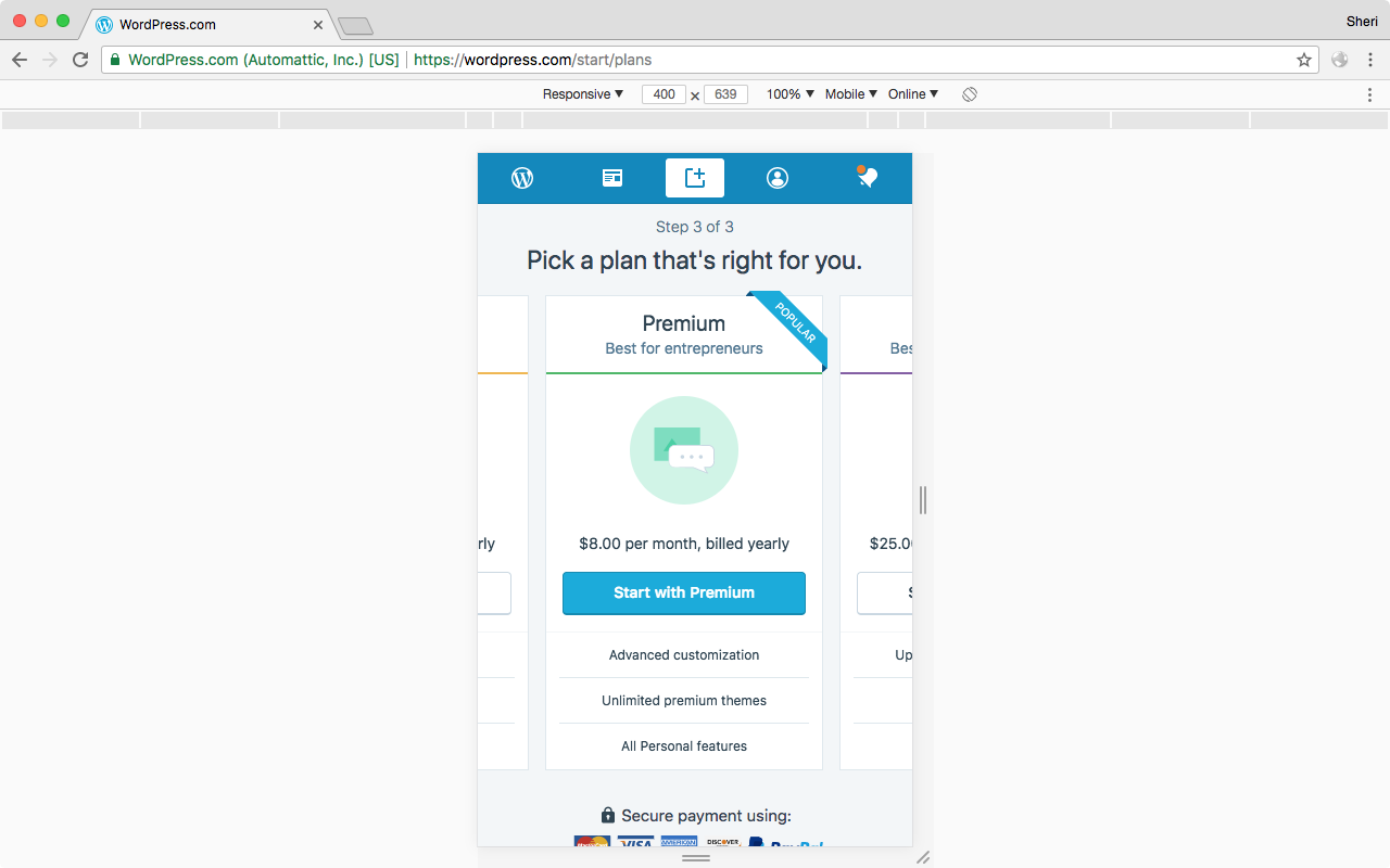
Seen at https://wordpress.com/start/plans using the "Toggle device toolbar" in the browser tools on Chrome 64.0.3282.167 on macOS 10.13.3.
/hat tip 🤠 @apeatling for the report at p7jreA-1wc-p2.
 designsimply
All 5 comments
This is a bad one. :( Thanks for creating the issue, Sheri.
 lancewillett
on 23 Feb 2018
lancewillett
on 23 Feb 2018
@shaunandrews mentioned this could be intentional — one card at a time on a small screen. Which works OK (not very smooth when I use my finger to scroll sideways.)
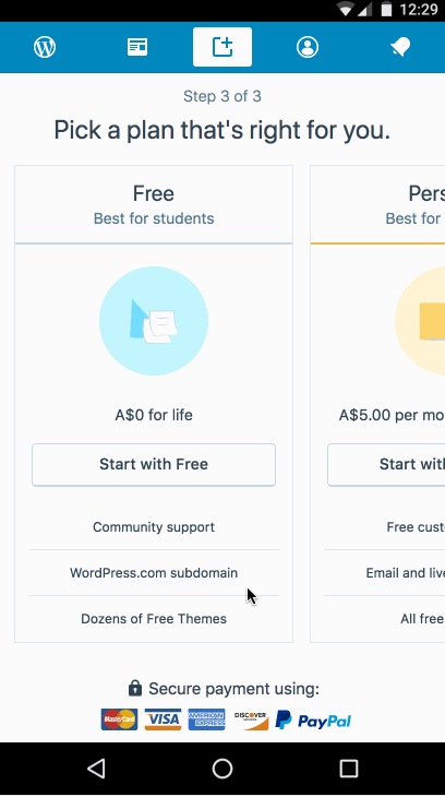
Note: testing on iPhone 8, Safari I don't see a free option to bypass a paid plan.
lancewillett
on 23 Feb 2018
Leaving this open for Filippo to chime in — but my feeling is this is the intended behavior, and the "desktop browser, small screen" isn't a likely scenario to address.
@shaunandrews suggested adding dots to the view

lancewillett
on 23 Feb 2018
Thanks for posting @designsimply.
The horizontal scrolling plans is the intended behaviour. I wanted to reduce the amount of scrolling on the screen. The mobile design tested well both in the a/b test this was introduced and with a handful of people before I rolled it out — people didn't have any problems figuring out that the options were scrollable.
That being said, the placement does look off in that screenshot you posted, the popular plan should be centred. I'll take a look at what's happening there.
@lancewillett also commented on the scrolling being really clunky. I recently found out on another project that this is an issue with IOS: https://stackoverflow.com/questions/33601165/scrolling-slow-on-mobile-ios-when-using-overflowscroll. I can get a fix in for that as well.
Note: testing on iPhone 8, Safari I don't see a free option to bypass a paid plan.
@lancewillett an a/b test was just launched last week that removed the free plan and added a button to start for free under the payment options. We'll see how the test performs before making updates. One suggestion could be to reduce the height of illustrations in the cards so that the button is visible on more screens.
 fditrapani
on 26 Feb 2018
fditrapani
on 26 Feb 2018
I retested this both on an iPhone and in responsive mode on Google Chrome. On the most narrow devices I could see a centered card with space either side, and the scrolling seemed smooth.
I'd say this has been fixed since raising it (eg. #22820) and the horizontal scrolling is intentional, so I'll close this for now. @designsimply can you reopen if you still consider this an issue please.
 alisterscott
on 6 Mar 2018
alisterscott
on 6 Mar 2018
Related issues
 kellychoffman
·
3Comments
kellychoffman
·
3Comments
 lamosty
·
3Comments
lamosty
·
3Comments
 ghost
·
3Comments
ghost
·
3Comments
 jeherve
·
3Comments
kellychoffman
·
3Comments
jeherve
·
3Comments
kellychoffman
·
3Comments
Most helpful comment
Thanks for posting @designsimply.
The horizontal scrolling plans is the intended behaviour. I wanted to reduce the amount of scrolling on the screen. The mobile design tested well both in the a/b test this was introduced and with a handful of people before I rolled it out — people didn't have any problems figuring out that the options were scrollable.
That being said, the placement does look off in that screenshot you posted, the popular plan should be centred. I'll take a look at what's happening there.
@lancewillett also commented on the scrolling being really clunky. I recently found out on another project that this is an issue with IOS: https://stackoverflow.com/questions/33601165/scrolling-slow-on-mobile-ios-when-using-overflowscroll. I can get a fix in for that as well.
@lancewillett an a/b test was just launched last week that removed the free plan and added a button to start for free under the payment options. We'll see how the test performs before making updates. One suggestion could be to reduce the height of illustrations in the cards so that the button is visible on more screens.