Wp-calypso: My Plan: Various Inconsistencies
Steps to reproduce
- Starting at URL: https://wordpress.com/plans/my-plan/{site-url}
- Make sure site has a professional plan
- Scroll through my plan page
What I expected
Beauty.
What happened instead
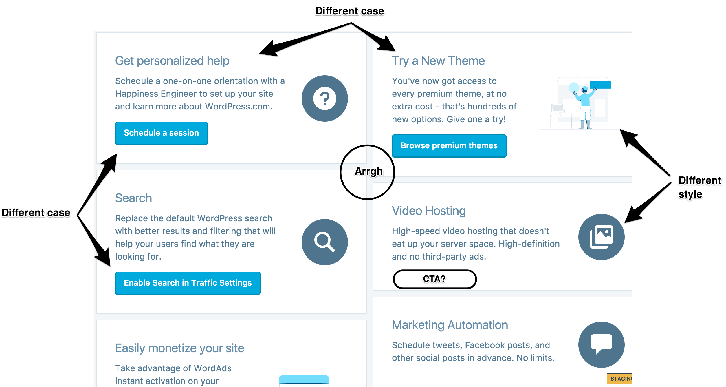
- Card titles sometimes have sentence case, sometimes title case. Should be all sentence case.
- Card CTAs sometimes have sentence case, sometimes title case. Should be all title case.
- "Marketing Automation" has no call to action
- "Video Hosting" has no call to action
- "Spam Filtering" has no call to action
- "PayPal Payments" is missing
- Some cards have large pictures, some have small ones, some have icons
- Variable height layout makes it very hard to scan
- Title and description lengths are sometimes super short, sometimes super long
Screenshot / Video
 richardmuscat
All 17 comments
We're replacing this whole view relatively soon, but there's no reason not to make these small fixes in the meantime.
 beaulebens
on 23 Feb 2018
beaulebens
on 23 Feb 2018
@richardmuscat could you say more about what you'd like a copy review to entail here? It looks like you did much of it yourself already... :)
Item #9 looks like it might be something we could help with, perhaps?
 benhuberman
on 23 Feb 2018
benhuberman
on 23 Feb 2018
@richardmuscat @johnHackworth here are mockups of two variations of this updated My Plan page with the following items addressed:
x Card titles sometimes have sentence case, sometimes title case. Should be all sentence case.
x Card CTAs sometimes have sentence case, sometimes title case. Should be all title case.
x "Marketing Automation" has no call to action
x "Video Hosting" has no call to action
x "Spam Filtering" has no call to action
x "PayPal Payments" is missing
x Some cards have large pictures, some have small ones, some have icons
x Variable height layout makes it very hard to scan
x Title and description lengths are sometimes super short, sometimes super long
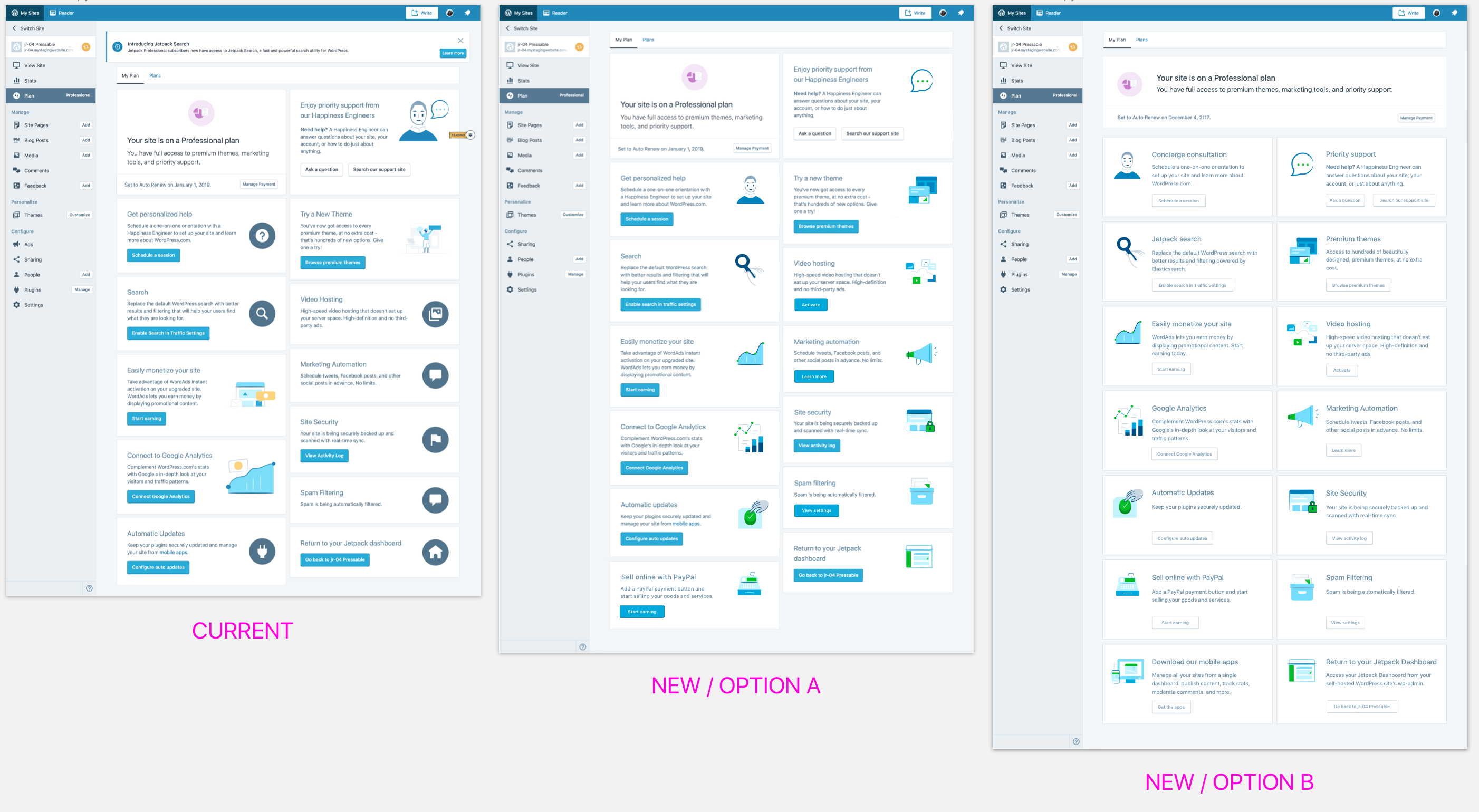
(view higher res versions of the above)
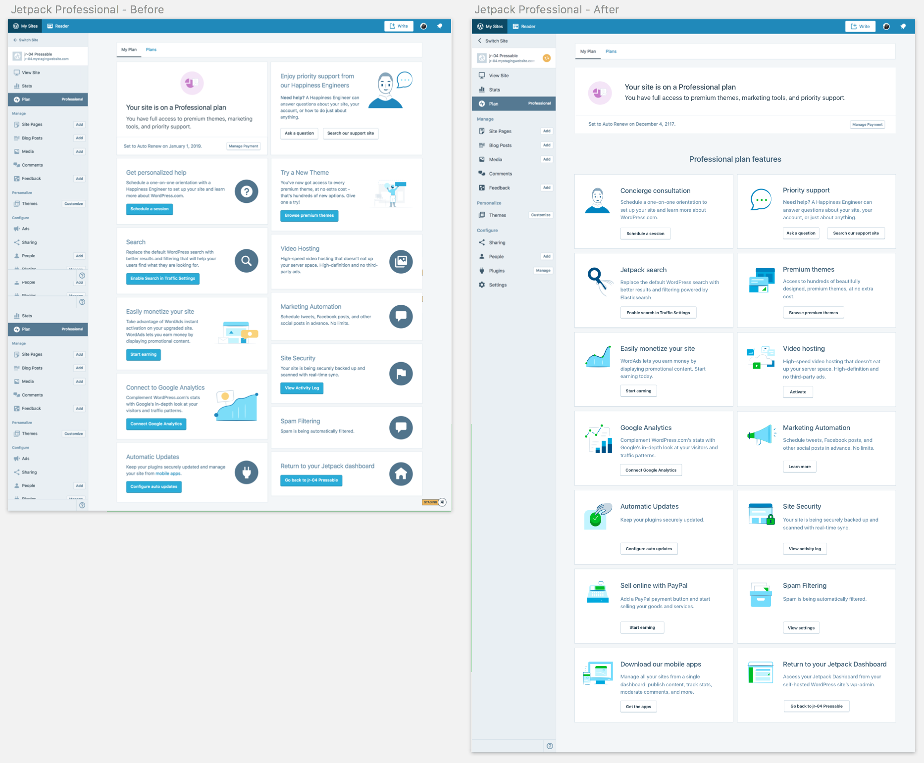
The first screenshot is of the current view (Pro plan).
The middle mockup (NEW / OPTION A) addresses all of the above minus the fixed height.
The far right mockup (NEW / OPTION B) introduces our updated My Plan page (see p6TEKc-1Qp) and includes fixed height cards and an updated My Plan card that's full width. I recommend moving forward with this version, if timing and dev resources permit.
cc @rickybanister
 joanrho
on 1 Mar 2018
joanrho
on 1 Mar 2018
Love them. Option B looks better but depends on dev effort required of
course
On Mar 1, 2018 7:55 PM, "Joan Rho" notifications@github.com wrote:
@richardmuscat https://github.com/richardmuscat @johnHackworth
https://github.com/johnhackworth here are mockups of two variations of
this updated My Plan page with the following items addressed:x Card titles sometimes have sentence case, sometimes title case. Should
be all sentence case.
x Card CTAs sometimes have sentence case, sometimes title case. Should be
all title case.
x "Marketing Automation" has no call to action
x "Video Hosting" has no call to action
x "Spam Filtering" has no call to action
x "PayPal Payments" is missing
x Some cards have large pictures, some have small ones, some have icons
x Variable height layout makes it very hard to scan
x Title and description lengths are sometimes super short, sometimes super
long[image: screen shot 2018-03-01 at 12 51 02 pm]
https://user-images.githubusercontent.com/204742/36866368-5618b92c-1d4f-11e8-9562-bb26524c52b4.png(view higher res versions https://cloudup.com/cUsd0V3zwCq of the above)
The first screenshot is of the current view (Pro plan).
The middle mockup (NEW / OPTION A) addresses all of the above minus the
fixed height.The far right mockup (NEW / OPTION B) introduces our updated My Plan page
(see p6TEKc-1Qp) and includes fixed height cards and an updated My Plan
card that's full width. I recommend moving forward with this version, if
timing and dev resources permit.cc @rickybanister https://github.com/rickybanister
—
You are receiving this because you were mentioned.
Reply to this email directly, view it on GitHub
https://github.com/Automattic/wp-calypso/issues/22691#issuecomment-369711151,
or mute the thread
https://github.com/notifications/unsubscribe-auth/ACLofOstcNpnbrO6MQM06cp6fMOc7D5iks5taFIegaJpZM4SPJGI
.
richardmuscat
on 2 Mar 2018
Please see p6TEKc-1SF#comment-4340 for the discussion around these mockups. I'll post the final ones here once we've gotten all approvals.
joanrho
on 7 Mar 2018
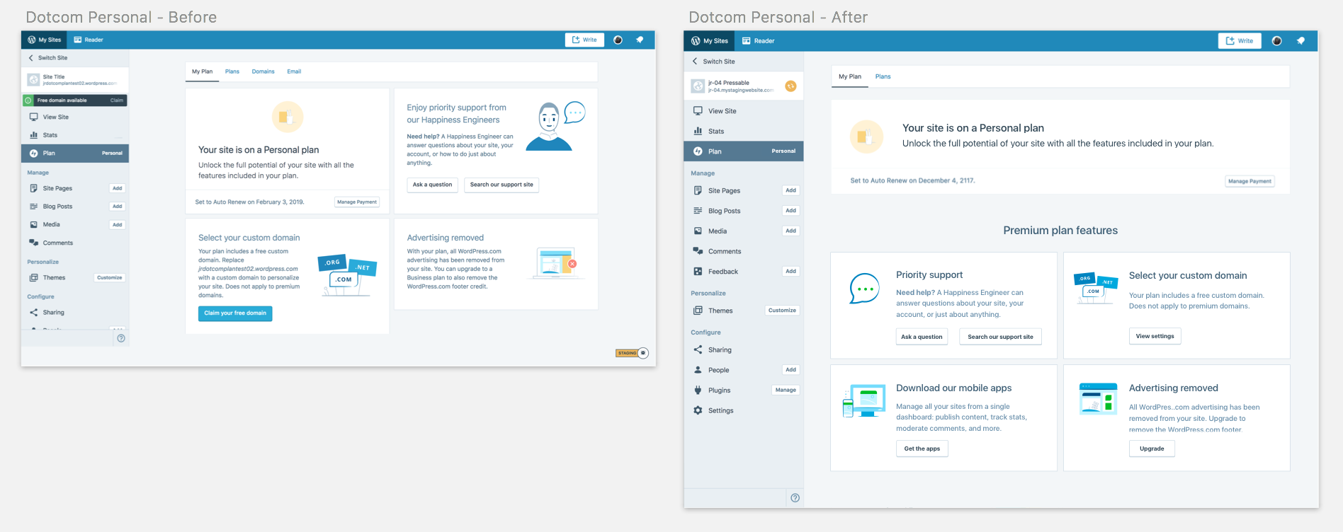
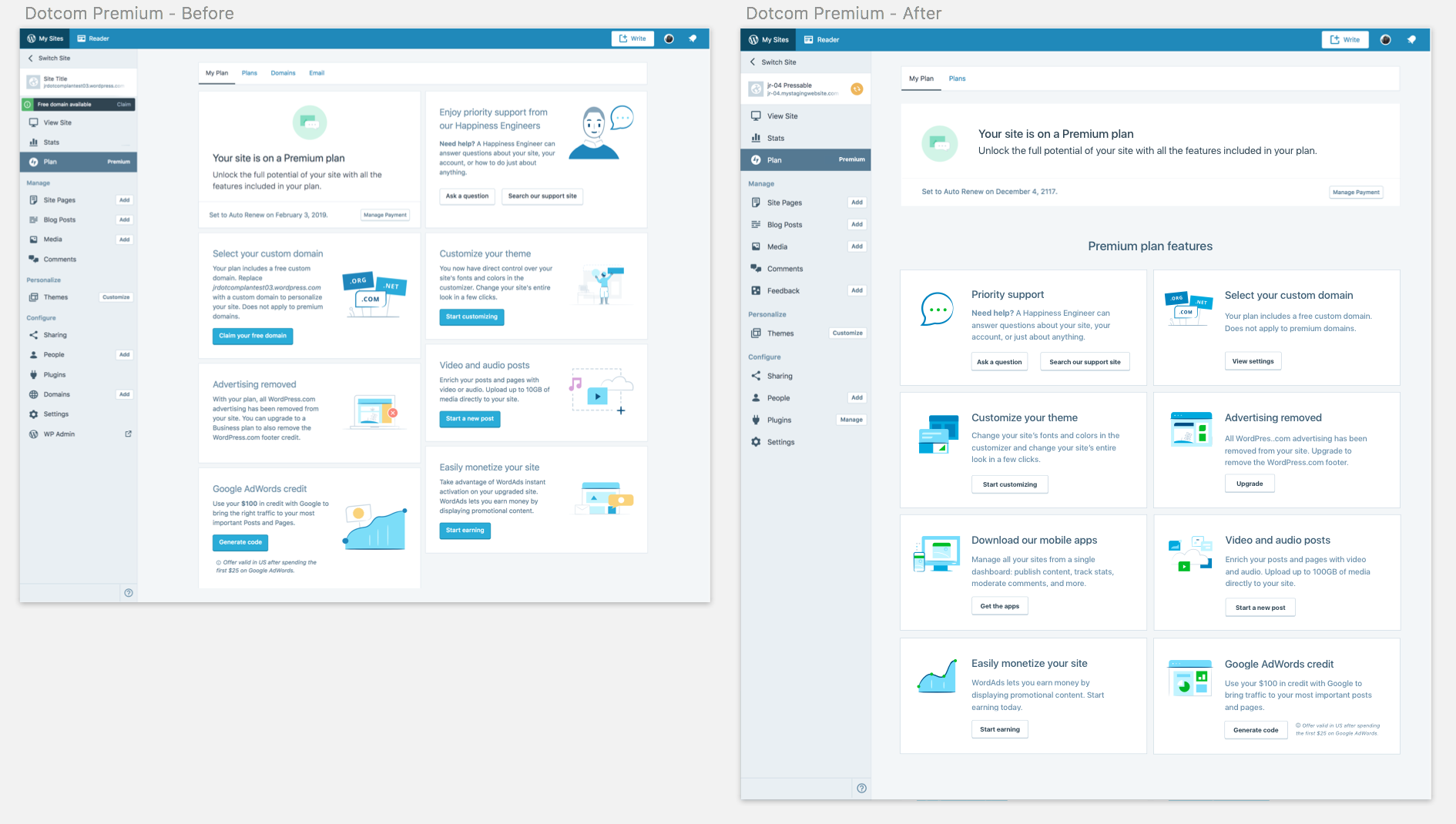
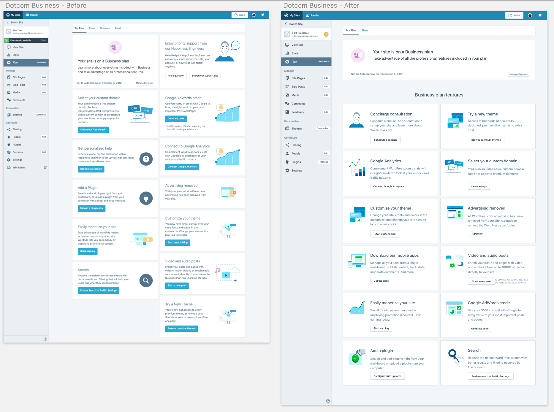
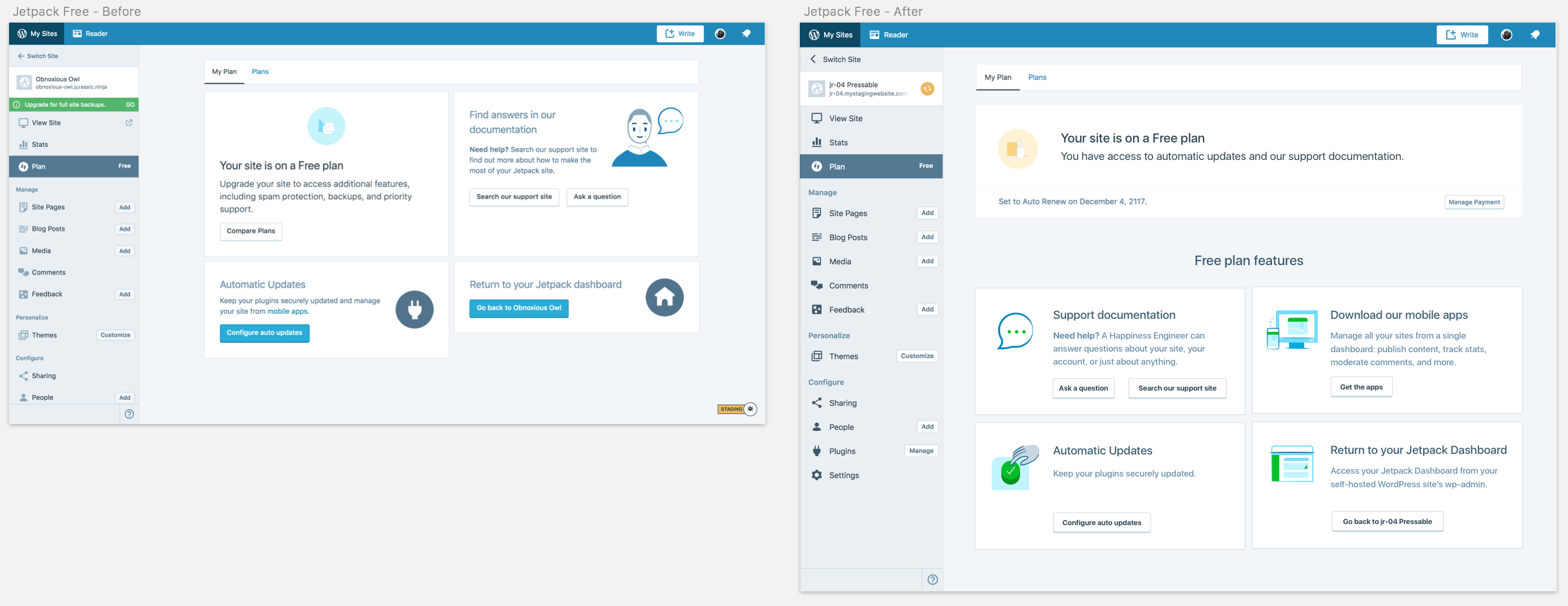
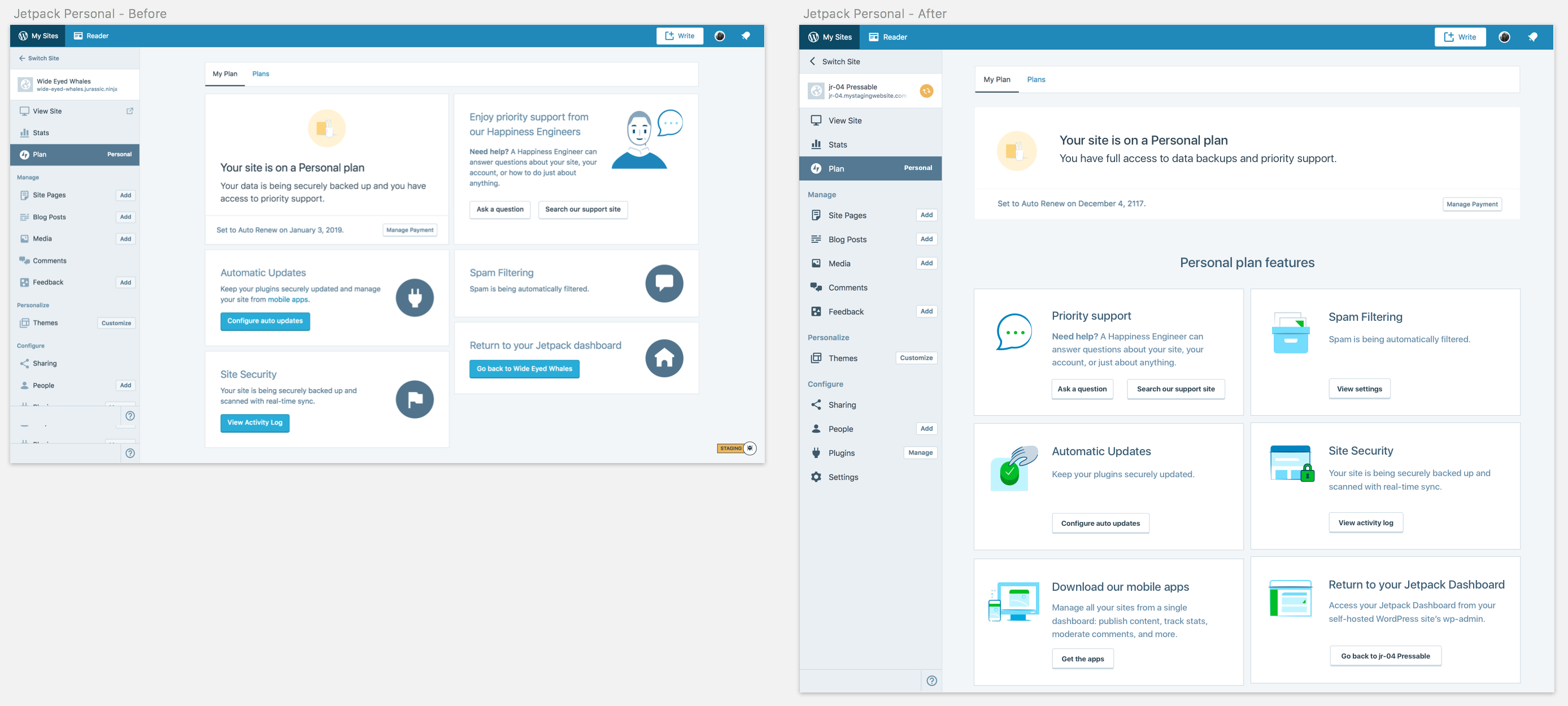
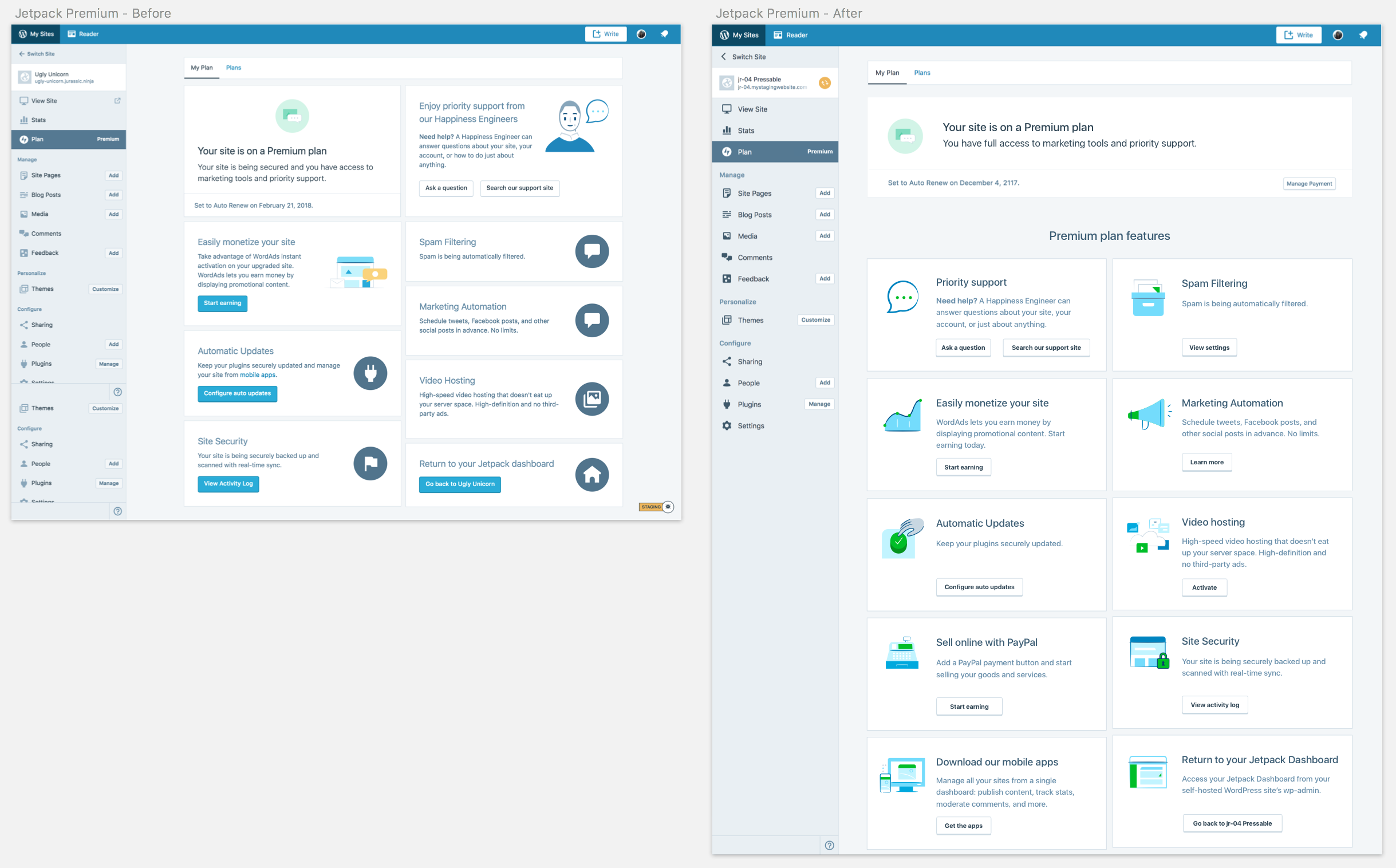
@AnnaMag Here are the updated before/after mockups of all plan levels across Jetpack and WordPress.com:
WordPress.com
higher res images of new mockups here: https://cloudup.com/c6bG74nlGaJ
Free will remain unchanged, since there is no My Plan page there.
Personal
Premium
Business
Jetpack
higher res images of new mockups here: https://cloudup.com/cy25IZpNxy7
Free
Personal
Premium
Professional
I've updated the illustrations for the dotcom "Advertising Removed" and "Google AdWords Credit", so I'll be updating those and one of other the illustrations I already added in #23006 shortly. Will ping you on that PR for review. 😄
Also updated p6TEKc-1SF to include these updates.
joanrho
on 8 Mar 2018
FYI — added illustration assets for these cards in #23006 and #23106.
joanrho
on 8 Mar 2018
:wave:
I'm here to be the Grinch and stole the Christmas out of this conversation, as usual...
I love how the squared-out layout looks for the plans page, BUT ... what happens when those texts get translated into other languages? Spanish is something like 30% more verbose than English on average (I may be remembering that figure wrong, but it's something like that). And German is like ... well, you know, German. :)
What I mean is that once those texts get translated into other languages, either they are going to get cut by the fixed layout, or all the alignment of every box will jump through the window
 johnHackworth
on 8 Mar 2018
johnHackworth
on 8 Mar 2018
(that being said, the result wouldn't be different to what we have right now, so it may be a case of "optimize for English and let the other languages handle themselves" )
johnHackworth
on 8 Mar 2018
I think we can mostly handle that by using flexbox to keep the boxes the same height in each row.
 ebinnion
on 8 Mar 2018
ebinnion
on 8 Mar 2018
@ebinnion @johnHackworth If we could keep all the boxes the same height, not just in each row, that'd be great. Is it possible to get all the translations to see what the max char length will be?
joanrho
on 8 Mar 2018
I imagine it's possible. Although, if we were going to use character length, and perhaps pad the short strings with extra spaces, we'd also want to use a monospace font to ensure each character was the same width.
ebinnion
on 8 Mar 2018
I imagine it's possible
Well, not really. Our translations are community-driven, so we don't really know what's going to end there. And even if we provide some languages translations from the beginning (expecting that no user changes them), we couldn't do that with all the languages our users can select :/
I think we can mostly handle that by using flexbox to keep the boxes the same height in each row.
hmm, I guess that's possible (but I would like to ping someone with good knowledge of flexbox to confirm... @MichaelArestad ? ). But that would mean that we will need to use a CSS selector affecting different react modules but defined in an upper layer. Are we ok with doing that? I vaguely remember that we stopped doing that some time ago
johnHackworth
on 9 Mar 2018
hmm, I guess that's possible (but I would like to ping someone with good knowledge of flexbox to confirm... @MichaelArestad ? ). But that would mean that we will need to use a CSS selector affecting different react modules but defined in an upper layer. Are we ok with doing that? I vaguely remember that we stopped doing that some time ago
It would mean using the parent component (or upper layer) to define the styles of child components. However, flexbox should make that fairly straightforward. I would be happy to help or point you to flexbox docs if you want to take a stab at it. Flexbox is pretty handy when you get the hang of it.
 MichaelArestad
on 9 Mar 2018
MichaelArestad
on 9 Mar 2018
And yes, flexbox allows for things in rows to be the same height pretty nicely.
MichaelArestad
on 9 Mar 2018
I started by updating the header styling and content (https://github.com/Automattic/wp-calypso/pull/23181) using flexbox and was planning on using it for the grid. From what I read above, I think we are on the same page here 👍
I was wondering the same about grid aligned layout. I'll take a stab at it and ping for help if that is ok 😄
 AnnaMag
on 13 Mar 2018
AnnaMag
on 13 Mar 2018
Addressed.
AnnaMag
on 15 May 2018
Related issues
 roccotripaldi
·
3Comments
roccotripaldi
·
3Comments
 apeatling
·
3Comments
apeatling
·
3Comments
 gedex
·
3Comments
gedex
·
3Comments
 ghost
·
3Comments
ghost
·
3Comments
 ehg
·
3Comments
ehg
·
3Comments
Most helpful comment
FYI — added illustration assets for these cards in #23006 and #23106.