Wp-calypso: Editor: reduce confusion by hiding Write button in navigation when you're in the editor
Props @johnmaeda for this idea.
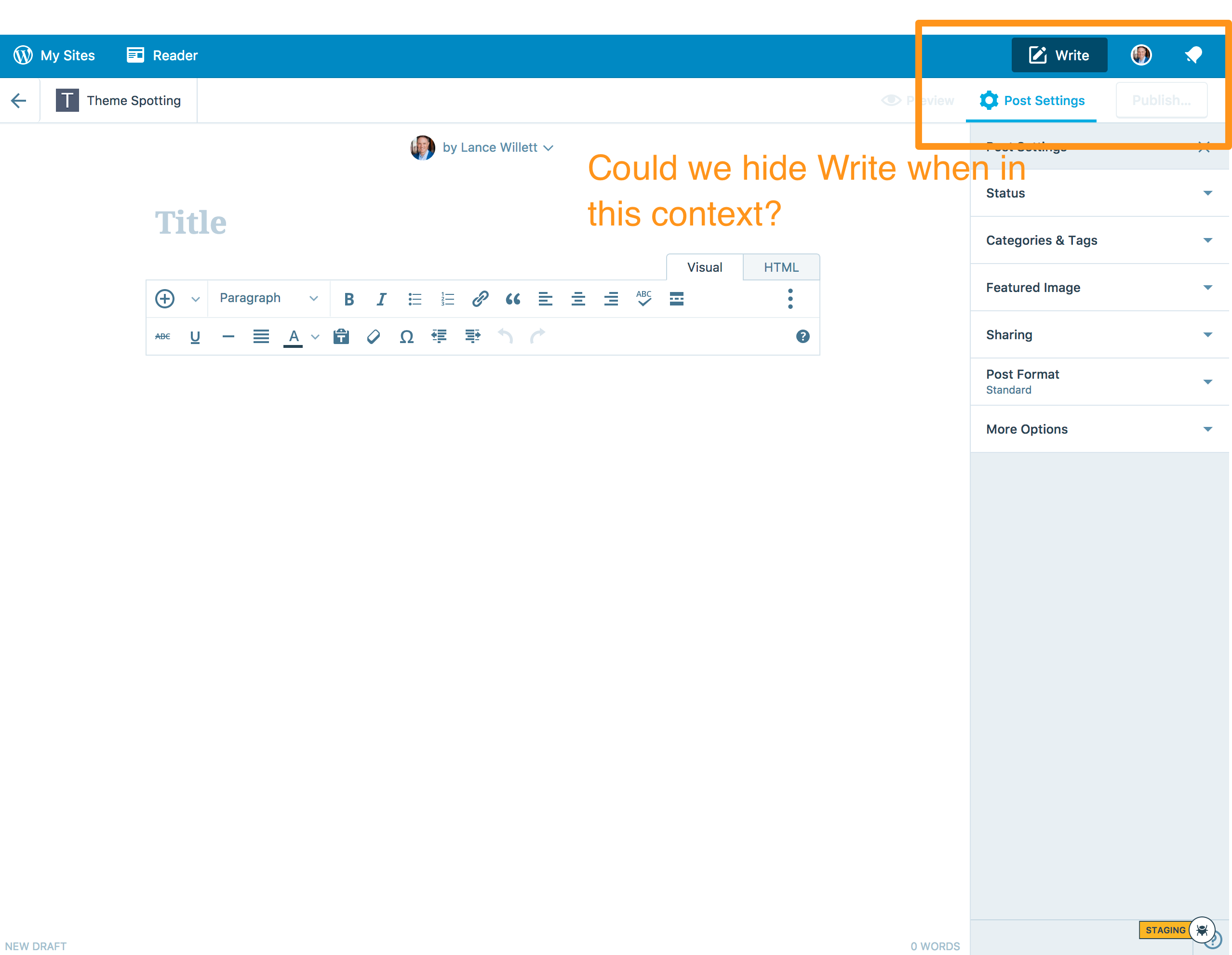
Steps to reproduce
- Go to wordpress.com
- Click "Write" at the top right of the navigation bar.
- You'll end up on a URL such as https://wordpress.com/post/example.wordpress.com
Description
I'd expected to not see the competing Write action when I'm already writing!
It's also very close to the Update/Publish button, which can be confusing. Do I click Write when I'm done?
Screenshot / Video
Context / Source
context #empathy #perspective
Found via #user-report and #reallife "wine tasting."
 lancewillett
All 7 comments
I like this idea.
But then again, UIs that adjust themselves magically to the current context can also come across as confusing or inconsistent.
To take it to the extreme: when someone is currently writing — that is, actually typing — we could hide everything except the text area.
Maybe an alternative is to fade the button — and maybe other things as well? — into the background a bit. Make things lighter or darker or ... something else?
In any case, I think hiding a button that is otherwise always there could be more confusing than helpful.
 lsinger
on 7 Sep 2017
lsinger
on 7 Sep 2017
I like the idea of changing the button state to "Active" like when you click it, it goes grayscale or opaque a bit so it doesn't look clickable. When making the help videos recently JM commented he made a big red X through the button because people were confusing it with the publish button.
lancewillett
on 7 Sep 2017
+1 to the idea of trying to do _a thing_ to the button rather than hiding it for the same reasons Leif is suggesting.
 ianstewart
on 8 Sep 2017
ianstewart
on 8 Sep 2017
I like the idea of changing the button state to "Active" like when you click it, it goes grayscale or opaque a bit so it doesn't look clickable.
This is actually the intention behind the current design — the dark blue is the calypso masterbar's active state.
people were confusing it with the publish button
That seems like the root problem. And the Masterbar's dark-blue active state isn't helping.
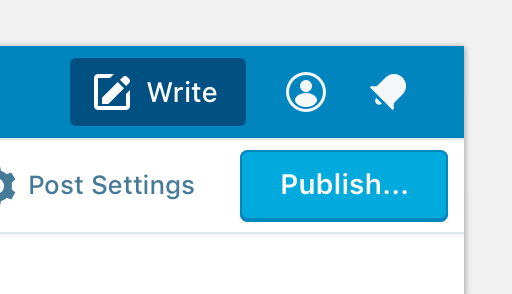
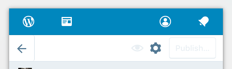
We could try fading the button, but its not great:
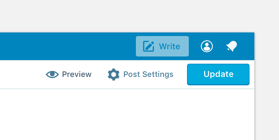
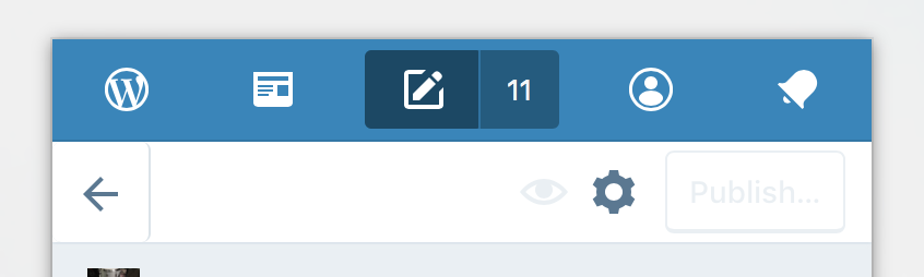
Hiding the button is weird, but it does help keep the emphasis on the Publish/Update button:
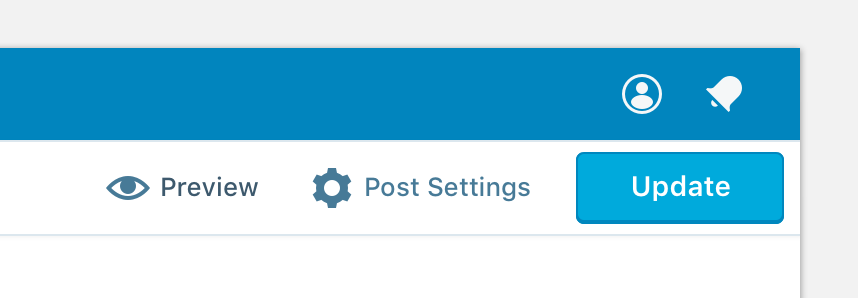
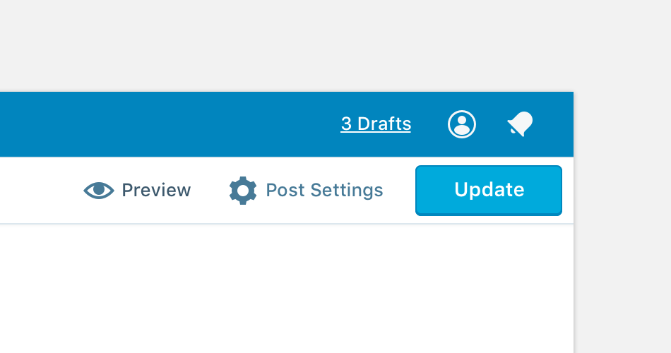
We could replace the button with some other useful link or information, like drafts or saved status:
Its also worth considering how this affects things on mobile. Removing the write button is going to look strange:
 shaunandrews
on 8 Sep 2017
shaunandrews
on 8 Sep 2017
We could also ditch the masterbar when writing.
shaunandrews
on 19 Oct 2017
We could also ditch the masterbar when writing.
I love that.
lsinger
on 19 Oct 2017
This was fixed in https://github.com/Automattic/wp-calypso/pull/20326.
 nylen
on 19 Dec 2017
nylen
on 19 Dec 2017
Related issues
 spen
·
3Comments
spen
·
3Comments
 samouri
·
3Comments
samouri
·
3Comments
 hoverduck
·
3Comments
hoverduck
·
3Comments
 gedex
·
3Comments
gedex
·
3Comments
 ghost
·
3Comments
ghost
·
3Comments
Most helpful comment
I like the idea of changing the button state to "Active" like when you click it, it goes grayscale or opaque a bit so it doesn't look clickable. When making the help videos recently JM commented he made a big red X through the button because people were confusing it with the publish button.