Wp-calypso: Comments: design for reblog and link type comments
Comments that are either reblog, pingback, or trackback should have some sort of indication in the comments expanded view.
Edit: We went ahead with @megsfulton's option D choice:
 davewhitley
All 10 comments
Took a stab at this and would be great to get some other designer 👀 on it @iamtakashi @folletto @rickybanister
What I'm looking for feedback on:
- Is a visual indication of reblog / pingback / trackback necessary for users?
- And if so should it always be visible? Or only visible when the comment is expanded?
- Which of the options best handles a visual indication of a reblog / pingback / trackback? Is there a better way to handle this?
- Is the link icon the right icon for pingbacks / trackbacks? I'm using what I think is the pingback / trackback icon from the reader (see this for example)
Option A
- Puts a small 18px icon to the left of the reblog / pingback / trackback text
- Displays the icon in both the expanded and collapsed views
- Mocked up what this would look like on larger screens - the other options scale up a bit better than this one
Option B
- Moves the icon adjacent to the profile photo, similar to how it is in the notifications panel
- Probably argument to be made for treating regular comments the same way
- (This option is probably overkill)
Option C
- Only shows the reblog / pingback icons in the expanded view
You can see all the options in inVision: https://automattic.invisionapp.com/share/42D992S5Q#/250955023_Reblog_Mobile_-_Option_A
 megsfulton
on 30 Aug 2017
megsfulton
on 30 Aug 2017
Nice work! I think these are all viable alternatives, reposting bits here for ease of use (and just in case the Invision account changes in the future):
Option A:

Option B:

Option C:

I've a slight preference for (B), ideally however with an icon that has higher contrast. This because I expect people to anchor visually on the image/avatar, and as such it's probably worth to have the icon coordinated there. :)
 folletto
on 30 Aug 2017
folletto
on 30 Aug 2017
Thanks for the feedback!
Tried out two different things outlined below.
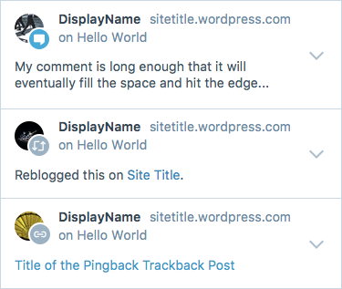
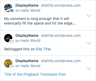
Option D
Reversed the icons out to white to help with the contrast and better match the style that's in the notifications panel. I think if we go with this approach, we might consider adding an icon for comments too. I added that in here and used the medium blue to draw a little more attention than the reblog/pingback icons.

One thing @gwwar pointed out is that comment replies have a similar icon / circle lock up - so wanted to make sure that this approach would work for that case. It starts get a little busy.

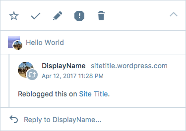
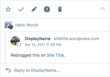
Option E
The one thing I don't love about Opt D is how close in size the profile icon is in relation to the comment/reblog/pingback icon. This option is an attempt to see if there was a way to balance them better by removing the circle and adding a stroke to the icon. I haven't seen anything like this in calypso so might not be the right approach but wanted to give it a shot.
And here's how that looks like nested:
megsfulton
on 31 Aug 2017
@megsfulton - These look great! I'm a big fan of Option E. It's got the cool icons, it's also nice to see a bit more of the avatar as it's not blocked by the circles around the icons.
Is a visual indication of reblog / pingback / trackback necessary for users?
I'm not sure if it's necessary but it's certainly helpful. I love that the icons make it easier to digest what's going on.
And if so should it always be visible? Or only visible when the comment is expanded?
I think it should always be visible.
Which of the options best handles a visual indication of a reblog / pingback / trackback? Is there a better way to handle this?
Uh... Option E (it's my fav). I'm not sure if there is a better way, this way makes it really easy right up front to tell what's going on.
Is the link icon the right icon for pingbacks / trackbacks?
This looks right to me.
 jeremysawesome
on 1 Sep 2017
jeremysawesome
on 1 Sep 2017
I agree on option E. Solid. :)
Just two things:
- How do we do that border programmatically? It's just a CSS border on the Gridicon?
- I'd not add an icon for comments. The reason is that's somehow the "default", resonates better with the design in other parts on the interface, and it would also create better differentiation.
folletto
on 1 Sep 2017
You're right @folletto I think for option E, we'd need to build that into the SVG or provide more options on the component. Thanks for that catch! As a first iteration, how about we go with the circle background first in D.
cc @megsfulton
 gwwar
on 1 Sep 2017
gwwar
on 1 Sep 2017
How do we do that border programmatically? It's just a CSS border on the Gridicon?
We could potentially add a ton of text-shadow to the dashicons. It does look like it glows a little bit...
quick example
http://jeremysawesome.com/examples/dashicon-test.html?1=9
But it's probably best to go with D now and E later 👍
jeremysawesome
on 2 Sep 2017
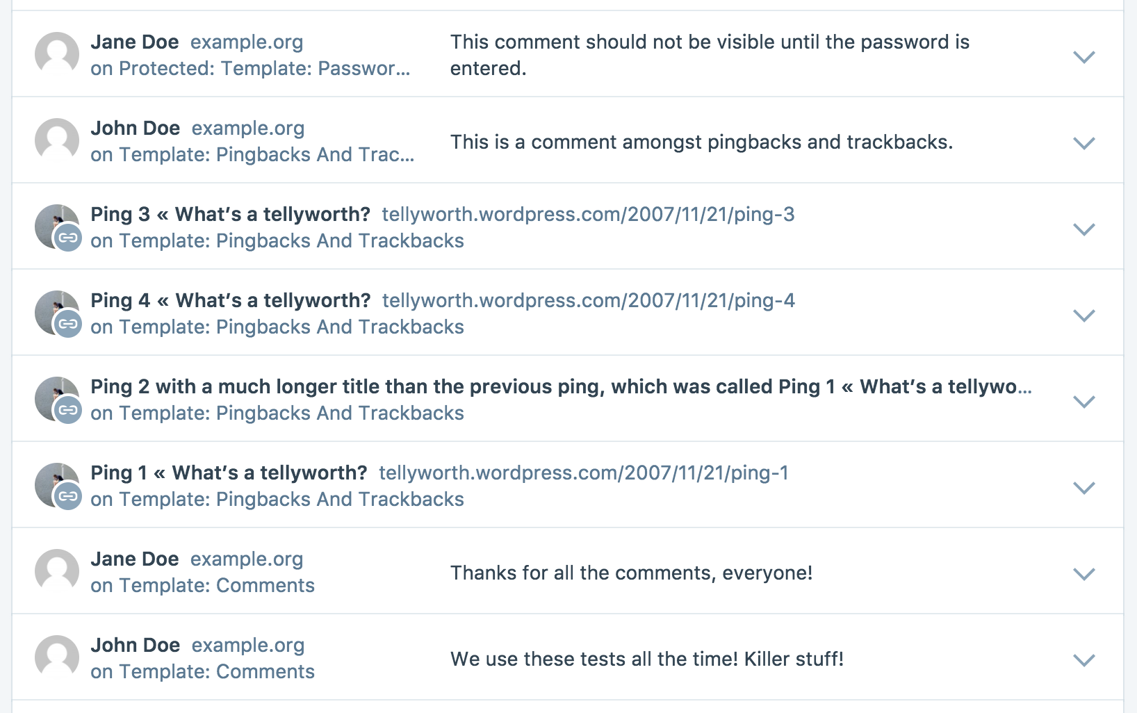
So, let's talk about pings!
This is what they look like if I just throw them in the list as-is, without touching their data (please ignore the HTML entities and the link icon style):

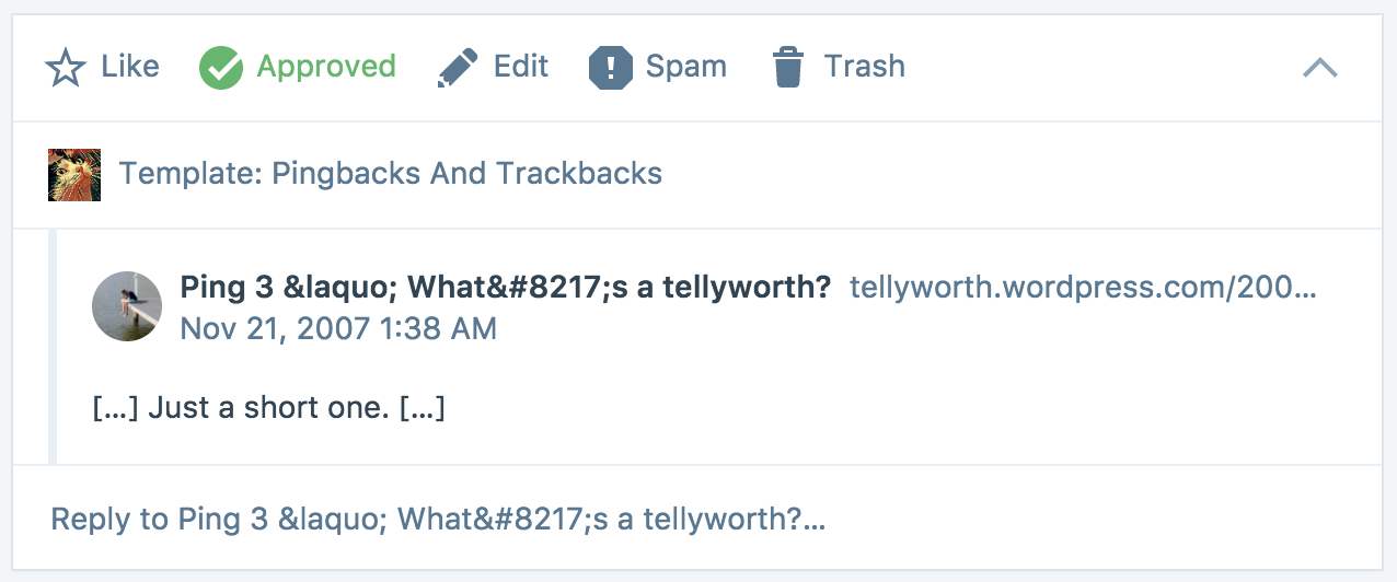
This is what changes with comments:
| Comments | Pings |
| --- | --- |
| Author Name | Pinging Post Title |
| Author URL | Pinging Post Permalink |
| Author Avatar | Pinging Site Icon |
| Content | Pinging Post Excerpt |
In the mocks we assume that pings have an author name and URL, but we don't.
So unfortunately we need to move things around, especially in the collapsed view, for this to make sense.
What do you think if we remove the content from the collapsed view?

Or even the permalink too?

cc @folletto
 Copons
on 7 Sep 2017
Copons
on 7 Sep 2017
Thanks for writing this up! Didn't realize that pings had a different information structure.
What do you think if we remove the content from the collapsed view?
I think that's a good call. 👍
Or even the permalink too?
This looks a lot cleaner, but I think it's nice to keep in there since it might trip up users who are used to clicking on the permalink in comments to not find it in the same expected place for pings.
megsfulton
on 21 Sep 2017
And here we go!
I'll put the PR in review, so that we can move the conversation there. 🙂
Copons
on 22 Sep 2017
Related issues
 spen
·
3Comments
spen
·
3Comments
 rickybanister
·
3Comments
rickybanister
·
3Comments
 ghost
·
3Comments
ghost
·
3Comments
 samouri
·
3Comments
samouri
·
3Comments
 lamosty
·
3Comments
lamosty
·
3Comments
Most helpful comment
Thanks for writing this up! Didn't realize that pings had a different information structure.
I think that's a good call. 👍
This looks a lot cleaner, but I think it's nice to keep in there since it might trip up users who are used to clicking on the permalink in comments to not find it in the same expected place for pings.