Worldcubeassociation.org: Redesign the navigation bar
The current navigation bar is a bit ugly with regard to the intended new homepage design (see #5340), and could benefit from a makeover.
Laura actually did suggest a design on which we could base our work.
As very limited user interaction is expected (ie: only links to click and basic dropdown), this is a pure html issue (with the exception of the - already existing - rails-generated links to pages).
This is kind of related to #5456, as we need the omnisearch component in the navigation.
 viroulep
All 39 comments
Hello,
I'm interested in giving this issue a shot as my first issue in this repository, but I have some questions. Is there some sort of concrete guideline to follow for the redesign? Is this (the following screenshot) the navbar to redesign?

Thanks!
 shzcuber
on 21 Nov 2020
shzcuber
on 21 Nov 2020
Hey Shawn, here's a mockup created by Laura Ohrndorf, but the navbar doesn't include all the elements (especially dropdown lists), so feel free to treat it as an inspiration, but the final looks is definitely not concretely specified. If you want to give it a shoot the relevant files are _navigation.html.erb and navbar-static-top.scss.
 jonatanklosko
on 22 Nov 2020
jonatanklosko
on 22 Nov 2020
5904
Created a pull request. I'm a newbie at HTML and CSS, so please let me know if I need to change or add anything, and I'll be happy to fix it. Thanks!
shzcuber
on 24 Nov 2020
Could you post a screenshot to let more people comment on it without having to apply your changes?
 moralsh
on 24 Nov 2020
moralsh
on 24 Nov 2020
Sure!
Front page (desktop)

Mobile version:


shzcuber
on 24 Nov 2020
I like this direction! I would be happy to hear what vision others have. As for my suggestions:
- I strongly believe it actually looks better without the grey color (just look up and remove the
#cccand#dddcolors in the scss file). - I think the social media icons outside of navbar look weird. We could place them above te navbar (as in the mockup), but that takes a bit of space. One alternative I can think of is just adding a new expandable navigation option with all the links.
I quickly modified your code to show how it would look like:


If someone has a better idea how to handle the social media links, I'd be happy to hear it!
Here's the code for the navigation section if you want to try it out (just after the existing regulations dropdown):
<li class="dropdown">
  <a href="#" class="dropdown-toggle top-nav" data-toggle="dropdown" data-hover="dropdown">
    <%= ui_icon('paper plane') %> <span class="hidden-sm">Find us</span> <span class="caret"></span>
  </a>
  <ul class="dropdown-menu" role="menu">
    <li>
      <%= link_to("https://www.instagram.com/thewcaofficial/", target: "_blank", class: "hide-new-window-icon") do %>
        <%= ui_icon("instagram") %> Instagram
      <% end %>
    </li>
    <li>
      <%= link_to("https://www.facebook.com/WorldCubeAssociation/", target: "_blank", class: "hide-new-window-icon") do %>
        <%= ui_icon("facebook square") %> Facebook
      <% end %>
    </li>
    <li>
      <%= link_to("https://www.twitter.com/theWCAofficial/", target: "_blank", class: "hide-new-window-icon") do %>
        <%= ui_icon("twitter") %> Twitter
      <% end %>
    </li>
    <li>
      <%= link_to("https://www.reddit.com/r/TheWCAOfficial/", target: "_blank", class: "hide-new-window-icon") do %>
        <%= ui_icon("reddit") %> Reddit
      <% end %>
    </li>
    <li>
      <%= link_to("https://www.twitch.tv/worldcubeassociation/", target: "_blank", class: "hide-new-window-icon") do %>
        <%= ui_icon("twitch") %> Twitch
      <%end%>
    </li>
    <li>
      <%= link_to("https://www.weibo.com/theWCA/", target: "_blank", class: "hide-new-window-icon") do %>
        <%= ui_icon("weibo") %> Weibo
      <% end %>
    </li>
    <li>
      <%= link_to("https://www.youtube.com/channel/UC5OUMUnS8PvY1RvtB1pQZ0g", target: "_blank", class: "hide-new-window-icon") do %>
        <%= ui_icon("youtube") %> YouTube
      <% end %>
    </li>
  </ul>
</li>
Thanks @shzcuber for starting working on this!
It's not explicit in the issue description, but one of the goal of the issue was to migrate the navigation bar from using bootstrap's component to fomantic ui's (which can actually be a bit tricky).
I can definitely see how the "look changes" and "framework changes" can be handled separately, so if just one of them is done we should just remember to either not close this or to create another specific issue for the remaining part.
viroulep
on 25 Nov 2020
Thanks Jonatan and Phillippe for the feedback! I will be implementing your dropdown for the social media links, and changing the background color. As for the Formantic UI migration, I'll try to learn the framework (just like I did with bootstrap) and give it shot!
shzcuber
on 25 Nov 2020
Sounds great!
I'd expect you'll face two challenges (apart from actually learning the FUI components):
- we have both bootstrap and fui's css included in the website, which may lead to different looking layouts from FUI's documentation. We do load FUI last, so if there are css classes conflicts, FUI will override (hopefully it's just a matter of avoiding bootstrap-specific classes).
- the omnisearch engine is not ported to FUI yet (and it's honestly not the most beginner-friendly task, even if I started a PoC here when redesigning the homepage). But it may be possible to restyle the search field while keeping the current javascript behavior (if it is not, it should be fine to let it as-is, hoping that the visual contrast wouldn't be too annoying).
viroulep
on 25 Nov 2020
Thanks, will keep those in mind.
shzcuber
on 25 Nov 2020
Sounds great!
I'd expect you'll face two challenges (apart from actually learning the FUI components):
- we have both bootstrap and fui's css included in the website, which may lead to different looking layouts from FUI's documentation. We do load FUI last, so if there are css classes conflicts, FUI will override (hopefully it's just a matter of avoiding bootstrap-specific classes).
- the omnisearch engine is not ported to FUI yet (and it's honestly not the most beginner-friendly task, even if I started a PoC here when redesigning the homepage). But it may be possible to restyle the search field while keeping the current javascript behavior (if it is not, it should be fine to let it as-is, hoping that the visual contrast wouldn't be too annoying).
Is the bootstrap's css fully loaded? Because I remember trying to use some classe that showed no effect. I'm not sure if it were some overridden thing.
Also, good to note that the docker implementation is showing results. As far as I can tell, Shawn codes in Windows.
 campos20
on 25 Nov 2020
campos20
on 25 Nov 2020
Hello,
Sorry for the bother, but I'm having trouble with FUI. To practice and learn the framework, I tried to run sample code from the FUI website. It works perfectly here in fiddle: https://jsfiddle.net/0fwm32ge/1/ However, on the WCA website, the dropdowns are not hidden. Does anyone know the problem? I will include the code and images of my problem below.
<div class="ui menu">
  <a class="item">
    Home
  </a>
  <div class="ui pointing dropdown link item">
    <span class="text">Shopping</span>
    <i class="dropdown icon"></i>
    <div class="menu">
      <div class="header">Categories</div>
      <div class="item">
        <i class="dropdown icon"></i>
        <span class="text">Clothing</span>
        <div class="menu">
          <div class="header">Mens</div>
          <div class="item">Shirts</div>
          <div class="item">Pants</div>
          <div class="item">Jeans</div>
          <div class="item">Shoes</div>
          <div class="divider"></div>
          <div class="header">Womens</div>
          <div class="item">Dresses</div>
          <div class="item">Shoes</div>
          <div class="item">Bags</div>
        </div>
      </div>
      <div class="item">Home Goods</div>
      <div class="item">Bedroom</div>
      <div class="divider"></div>
      <div class="header">Order</div>
      <div class="item">Status</div>
      <div class="item">Cancellations</div>
    </div>
  </div>
  <a class="item">
    Forums
  </a>
  <a class="item">
    Contact Us
  </a>
</div>

<script src="https://code.jquery.com/jquery-3.5.1.min.js"></script>
<script>
$('.ui.dropdown')
  .dropdown({
    on: 'hover'
  })
;
</script>

Here is the code if anyone wants to reproduce the issue: https://github.com/shzcuber/worldcubeassociation.org/tree/switch-to-fomantic
Thanks in advance.
shzcuber
on 26 Nov 2020
Ah, I think the javascript part is missing and it's because we don't load all "plain javascript" files from fomantic ui: the goal is to have all the new javascript-related development in react (jquery-free, as much as possible), using the "webpack" part of rails (a lot of our current javascript still contains a lot of jquery and is managed through sprockets).
There is a wiki article describing the rationale and guide for writing/integrating React components in the website here.
I totally overlooked we would need js for the navigation; ideally we would port the navigation to react, but that definitely relies heavily on #5456.
I don't have a great suggestion for solving everything right now.
I think that regardless of the framework we can redesign the navigation bar, and however it looks it should be possible to closely match its look in a different framework (which basically means you could focus on giving the navigation a new look in the current framework, without having to worry about unveiling a whole lot of issues coming from the port to react).
On a related note: I've seen that you added fomantic-sass in your changes: this is actually not necessary, as we load FUI's css in this pack, which is included in all the website page.
You just need to add import 'semantic-css/dropdown'; in the pack I mentionned.
Actually: reading the pack and taking another look at our FUI's files made me realize that you could achieve what you want.
Additionally to the css, you could also import the dropdown-related js by adding import '../stylesheets/semantic/components/dropdown.min'; to the global_styles pack!
This kind of breaks the "new component" => "react" rule, but:
- we're far from dropping jquery
- the necessary component for the search bar doesn't exist
- it would be extremely straightforward to port the navigation to react when it does exist
The changes are simple enough to give it a go I think!
(I haven't actually tested them, so if it doesn't work let me know :))
viroulep
on 26 Nov 2020
Thanks for the reply! Really gives me insight on the structure of the project, as a new contributor. However, I have a couple questions.
1) As you told me to "focus on giving the navigation a new look in the current framework, without having to worry about unveiling a whole lot of issues coming from the port to react", does this mean I should continue using bootstrap to redesign the navigation bar?
2) I imported both semantic-css/dropdown and '../stylesheets/semantic/components/dropdown.min'; to global_styles (https://github.com/shzcuber/worldcubeassociation.org/commits/switch-to-fomantic), and it did hide the dropdowns, but did not reveal the dropdowns on click. Would I need to write jQuery for that? If so, where should I insert the jQuery? I copied the jQuery from the website and inserted in the same file in a
Got it, thanks for clearing everything up! Here is the current navigation bar redesigned with Jonatan's suggestions #5904 :
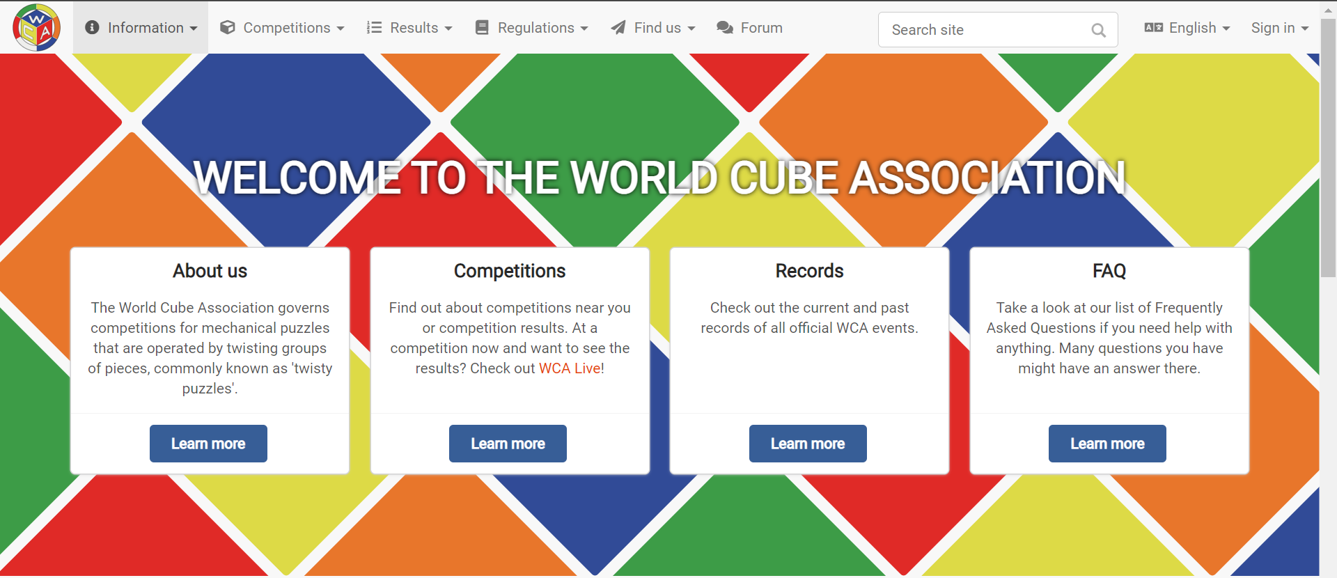
Anything I should fix/add?
shzcuber
on 28 Nov 2020
It seems like my pull request #5904 failed all the checks. How would I correct that?
shzcuber
on 29 Nov 2020
It seems like my pull request #5904 failed all the checks. How would I correct that?
Commented on that on the PR.
Before looking into the code, does it look ok on mobile having the title ale icons removed?
jonatanklosko
on 29 Nov 2020
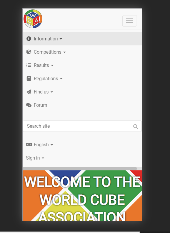
It seems to look alright - always open to suggestions, of course :)
shzcuber
on 29 Nov 2020
Look alright to me! The search bar could be a little bit smaller (ideally 100% width with some padding), as it looks like it causes the horizontal scroll. Also the hamburger icon is not centered vertically, so it could also be slightly adjusted.
jonatanklosko
on 29 Nov 2020
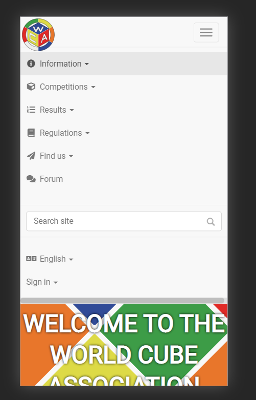
Does this work?
shzcuber
on 29 Nov 2020
Now the logo kinda gets out of the navbar, I'd rather keep it inside ^^
jonatanklosko
on 29 Nov 2020
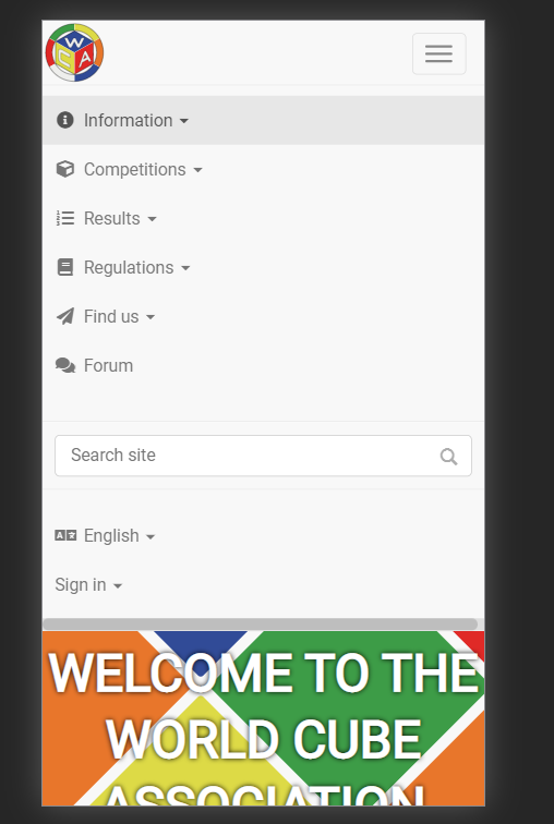
Right, somehow missed that haha. Hopefully this works now
shzcuber
on 29 Nov 2020
Great, I like that! Would be happy to see what others think, I'll send a quick email to the Communication Team to check with them.
Also: I've just deployed the changed to the staging so that everyone can have a closer look.
jonatanklosko
on 29 Nov 2020
Look alright to me! The search bar could be a little bit smaller (ideally 100% width with some padding), as it looks like it causes the horizontal scroll. Also the hamburger icon is not centered vertically, so it could also be slightly adjusted.
I think this is also causing this issue at different zooms if settings are trying to avoid displaying horizontal scrolling
90% zoom - search is inline

100% zoom - search gets "bumped" lower
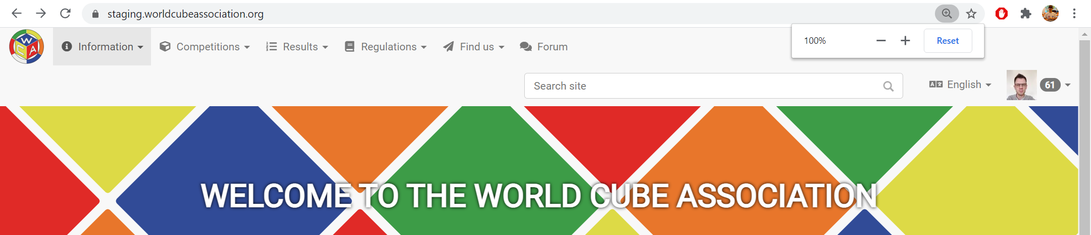
110% zoom - back to normal :-D

 c-goodyear
on 29 Nov 2020
c-goodyear
on 29 Nov 2020
Thanks for catching that - I ended up resizing the search bar to fix that issue.
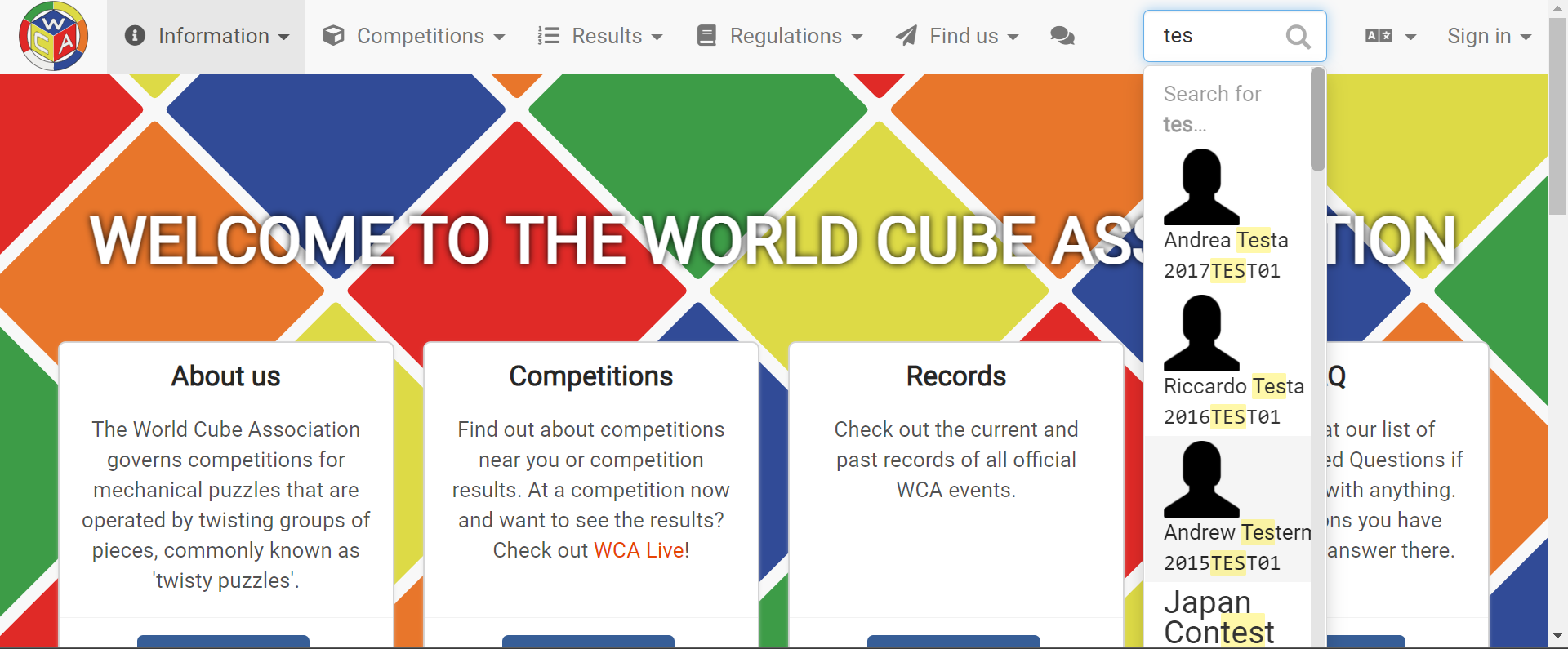
I don't know if this is too small though - is there a better way to fix this?
shzcuber
on 29 Nov 2020
What about if the search bar is small when the cursor is not placed in it. Then when the cursor is inside it, the dropdowns to the left could collapse to only show their icons, thus making the search bar wider in their place.
Something like this? (But the search bar would become longer, I just forced this icon collapse with zoom)

c-goodyear
on 29 Nov 2020
That's a good solution - not too sure how I would go about that though (I didn't create the icon collapse). I'll give it a shot and see what I can do.
shzcuber
on 29 Nov 2020
woo this is fabulous. Getting a unified navbar at all back in the day was a feat, but I'm glad to see it go.
I have a fairly large accessbility concern, which is that the dropdowns do not have a focus ring:
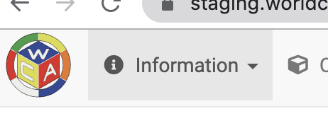
Compare that to the logo and the non-dropdown menu item:
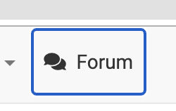
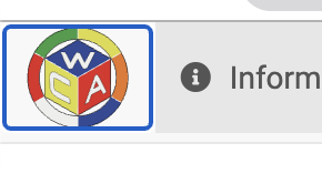
(The hover background is also inconsistent between dropdown and non-dropdown and is fairly subtle.)
Also, as a minor nit, it feels odd to me that the navbar has 4px padding at the bottom, but not on the other sides. This means the logo is not centered, and dropdown highlights are also not centered. Would it be possible to add 4px padding on top as well?
 lgarron
on 29 Nov 2020
lgarron
on 29 Nov 2020
Also, the logo gets a little bit less legible at this resolution. You might be interested in updating it with a cleaned-up SVG I made where the lines are more visible at smaller resolution:

https://www.dropbox.com/s/01qhwutfyb9a0oq/WCA%20Logo%202020.svg?dl=0
lgarron
on 29 Nov 2020
Thanks so much for the feedback!
I added the logo, and here's what the navbar looks like now when you hover over either the logo or the forum element:


As for the padding, Jonatan gave me a good fix for that, but I don't think it's deployed on the staging website yet. Hopefully it's clear in the screenshots.
shzcuber
on 29 Nov 2020
Hopefully it's clear in the screenshots.
It is!
Given that the new menu is already a lot slimmer, I'm actually a fan of the padding — especially to avoid bumping the icon into the edge. Just wanted to ask for it to be symmetric. :-P
(As an alternative, the icon can be put into a border-box padded wrapper.)
lgarron
on 30 Nov 2020
Oh, I see what you mean. Here's a 5px vertical padding:

You like?
shzcuber
on 30 Nov 2020
Hi @shzcuber, thanks for working on that, it looks very promising!
I have a couple of remarks:
- The "Information" button is darker by default (without hovering), is this intended? I actually just noticed that it's also the case on the normal website so this might be a question for a broader audience :)
- I feel like the logo should be either bigger or not touching to the borders but making the logo even smaller doesn't make too much sense. I don't have a good suggestion at the moment, unless we rethink the logo placement and replace it with a "Home" button on the navbar instead. The WCT is also working on trying to unify the logo design across different pages (i.e. website, forum and WCA Live so it could be a good time to think about that.
 EvilAngel00
on 30 Nov 2020
EvilAngel00
on 30 Nov 2020
Thanks for the suggestions!
The "Information" button is darker by default (without hovering), is this intended? I actually just noticed that it's also the case on the normal website so this might be a question for a broader audience :)
Yeah, I was wondering about that too. I removed the default dark shade for now - please let me know if you want me to re-add it again.
I feel like the logo should be either bigger or not touching to the borders but making the logo even smaller doesn't make too much sense. I don't have a good suggestion at the moment, unless we rethink the logo placement and replace it with a "Home" button on the navbar instead. The WCT is also working on trying to unify the logo design across different pages (i.e. website, forum and WCA Live so it could be a good time to think about that.
I see. I actually added 5px vertical padding to the navbar through Lucas Garron's suggestions, so the logo is no longer touching the borders (see image below).

shzcuber
on 30 Nov 2020
Hello,
Just wondering if there's anything else I need to do with the nav bar :)
shzcuber
on 5 Dec 2020
Fixed by #5904.
jonatanklosko
on 7 Dec 2020
Glad to see this in action!
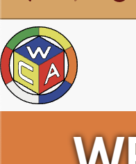
It seems that left padding for the icon is missing for the narrow version; is that worth a separate bugissue
lgarron
on 11 Dec 2020

Added the same amount of padding as the normal sized version, hopefully this works. #5932
shzcuber
on 12 Dec 2020
Related issues
 jfly
·
4Comments
viroulep
·
9Comments
jfly
·
4Comments
viroulep
·
9Comments
 Baiqiang
·
3Comments
viroulep
·
6Comments
Baiqiang
·
3Comments
viroulep
·
6Comments
 Nanush7
·
3Comments
Nanush7
·
3Comments
Most helpful comment
Ah, I think the javascript part is missing and it's because we don't load all "plain javascript" files from fomantic ui: the goal is to have all the new javascript-related development in react (jquery-free, as much as possible), using the "webpack" part of rails (a lot of our current javascript still contains a lot of jquery and is managed through sprockets).
There is a wiki article describing the rationale and guide for writing/integrating React components in the website here.
I totally overlooked we would need js for the navigation; ideally we would port the navigation to react, but that definitely relies heavily on #5456.
I don't have a great suggestion for solving everything right now.
I think that regardless of the framework we can redesign the navigation bar, and however it looks it should be possible to closely match its look in a different framework (which basically means you could focus on giving the navigation a new look in the current framework, without having to worry about unveiling a whole lot of issues coming from the port to react).
On a related note: I've seen that you added
fomantic-sassin your changes: this is actually not necessary, as we load FUI's css in this pack, which is included in all the website page.You just need to add
import 'semantic-css/dropdown';in the pack I mentionned.Actually: reading the pack and taking another look at our FUI's files made me realize that you could achieve what you want.
Additionally to the css, you could also import the dropdown-related js by adding
import '../stylesheets/semantic/components/dropdown.min';to theglobal_stylespack!This kind of breaks the "new component" => "react" rule, but:
The changes are simple enough to give it a go I think!
(I haven't actually tested them, so if it doesn't work let me know :))