Wordpress-android: Stat Graph Anomalies with low stats
Expected behavior
The user expected to see more accurate representation of the numbers in the values shown in the graph.
Actual behavior
The difference between the value shown and the numbers received doesn't always equal the difference between the numbers trying to be reflected.
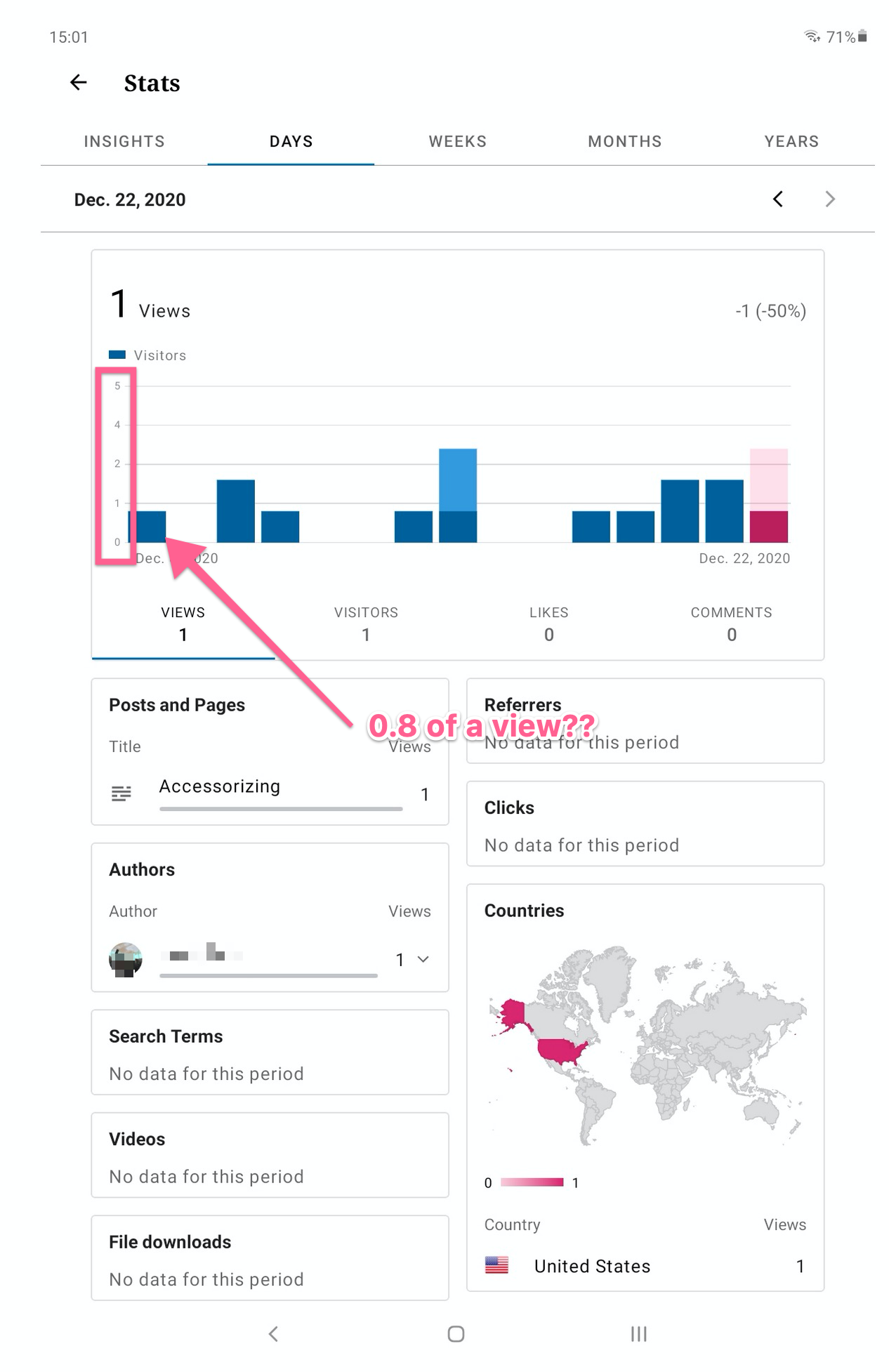
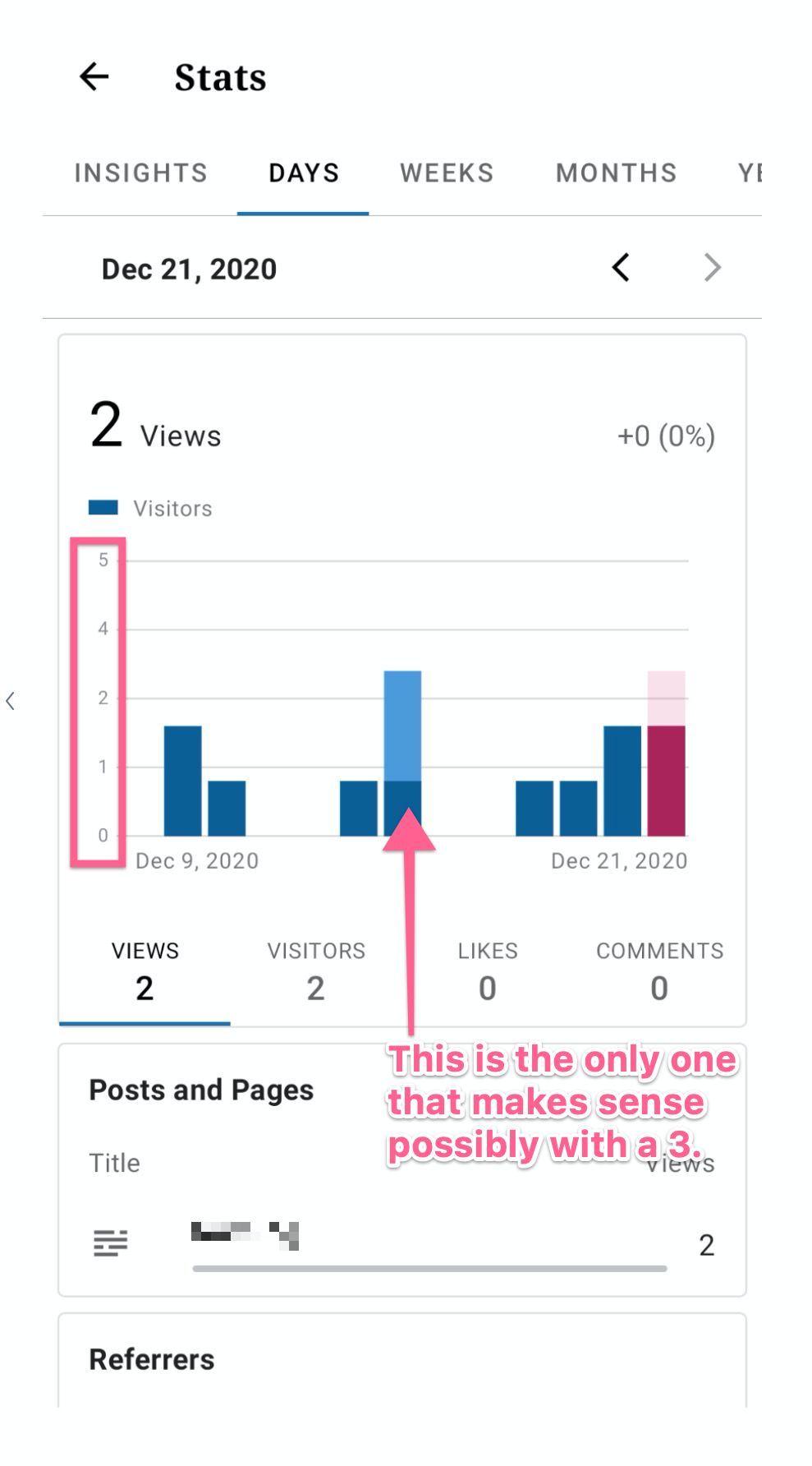
They mention the following and share two screenshots:
note two things:
- the vertical scale is labelled 0-1-2-4-5. i don't know the reason
for this but it's extremely odd. i have never seen a graph or chart
where the scale changes then changes _back_.- the graph purports to show views. note that _every_ day with views
is a non-integer value -- it looks to me as if the ones that 'should'
be 1 hit are a little less -- to my eye around .8. what is .8 of a
view? or 1.6 (three of them look like that)? the last one i can't
guess because i don't want to guess what's going on in the 2-4 part of
the graph.
Steps to reproduce the behavior
To reproduce this, view stats for a site that doesn't have a lot of stats and check where the graph end bar lands compared to the actual 1 on the graph. Note the scale.
Tested on Samsung S9+, Android 10, WPAndroid 16.3-rc-2
User reported on Pixel 4a in 3594277-zen
 rezzap
All 7 comments
👋 @rezzap !
I was able to replicate that myself as well.
the vertical scale is labelled 0-1-2-4-5. i don't know the reason for this but it's extremely odd. i have never seen a graph or chart where the scale changes then changes back.
I believe this is normal, the scale here is 0 to 5 because this is the minimum number of days that can be presented in the stats screen. As such if the user has less than 5 views per day then this is what they will get. On the other hand if the user exceed those 5 days then the scale will adjust accordingly. This is a pretty standard way of scaling a graph and I personally wouldn't consider it as odd.
the graph purports to show views. note that every day with views is a non-integer value -- it looks to me as if the ones that 'should' be 1 hit are a little less -- to my eye around .8. what is .8 of a view? or 1.6 (three of them look like that)? the last one i can't guess because i don't want to guess what's going on in the 2-4 part of the graph.
Now, as far as this goes, this is indeed something worth looking into. The non-integer stat bars appear for low stats, but not otherwise. The app is utilising the MPAndroidChart library to draw the chart and there are two possibilities here:
- Either the library itself has a bug with displaying such low stat bars (less probable), or
- The way the app in using this library to draw the low stat bars needs tuning (most probable).
@planarvoid @malinajirka your thoughts?
 ParaskP7
on 5 Jan 2021
ParaskP7
on 5 Jan 2021
I believe this is normal, the scale here is 0 to 5 because this is the minimum number of days that can be presented in the stats screen. As such if the user has less than 5 views per day then this is what they will get. On the other hand if the user exceed those 5 days then the scale will adjust accordingly. This is a pretty standard way of scaling a graph and I personally wouldn't consider it as odd.
I think what they meant is that 3 is missing from the vertical labels -> so for instance scale between 1-2 is different then between 2-3. Wdyt @ParaskP7 ?
Regarding the second issue -> I agree that it looks like a bug. I'm not sure if it's a bug in the library or in our code, but we should look into it. I'd assign it to groundskeeping and time-box it to a couple of hours since it seems like a low priority issue. First thing we might want to try is to check if there is a newer version of the library.
 malinajirka
on 6 Jan 2021
malinajirka
on 6 Jan 2021
I think what they meant is that 3 is missing from the vertical labels -> so for instance scale between 1-2 is different then between 2-3. Wdyt @ParaskP7 ?
Oh yeap, maybe, I haven't noticed that 3 is missing. But, no matter, I believe that the user is not used to this kind of scaling graphs in general, thus they find it odd. The library chose to dismiss 3 because it only shown 5 values (horizontal lines) in total, which are scaled in numbers according to the available distributed daily stats, so for me not having the 3 there is perfectly fine.
Regarding the second issue -> I agree that it looks like a bug. I'm not sure if it's a bug in the library or in our code, but we should look into it. I'd assign it to groundskeeping and time-box it to a couple of hours since it seems like a low priority issue. First thing we might want to try is to check if there is a newer version of the library.
Brilliant, thanks for your input there Jirka, I totally agree! 🌟
ParaskP7
on 7 Jan 2021
I think I know what the issue is. In the BarChartViewHolder we always show exactly 5 labels on the left axis. For a site with very small numbers we define the top value of the X axis to 5 like this:
private const val MIN_VALUE = 5f
...
axisMaximum = if (maxYValue < MIN_VALUE) {
                MIN_VALUE
            } else {
                roundUp(maxYValue.toFloat())
            }
            setLabelCount(5, true)
Now, as you see, if the maximum value is 5 and you want 5 labels, it's going to get tricky because between 0 and 5 there are actually 6 values. That's why nm 3 gets dropped. The decision what to drop is done by the library. We just remove the decimal points from the Y axis. As a solution I'd suggest maybe setting the min value to 4. This would stop us from dropping nm 3 for sites with almost no views and visits. WDYT @ParaskP7 @malinajirka ?
 planarvoid
on 12 Jan 2021
planarvoid
on 12 Jan 2021
👋 @planarvoid !
Definitely, I think this can solve the issue.
I am not sure how 5 was picked as a min in the first place, so I might be missing something. Having 4 as the min, which will result in not having the horizontal line number 3 dropped, and as such removing the decimal point inconsistency, seems only logical and a quick fix.
ParaskP7
on 12 Jan 2021
I'm pretty sure I've picked it trying to make it look as good as possible. There is no sophisticated answer. Having 5 labels and lines in the graph was a design decision so I wouldn't change that. Changing the top value should be enough.
planarvoid
on 12 Jan 2021
Changing the top value should be enough.
💯 🙏
ParaskP7
on 12 Jan 2021
Related issues
 jkmassel
·
3Comments
jkmassel
·
3Comments
 maxme
·
3Comments
maxme
·
3Comments
 khaykov
·
3Comments
khaykov
·
3Comments
 guarani
·
3Comments
malinajirka
·
3Comments
guarani
·
3Comments
malinajirka
·
3Comments