Wordpress-android: Downgrade the Gravatar change popup tooltip
Back when the ability to change your Gravatar directly from the "Me" screen was introduced, we added a "New! Tap your Gravatar to change it" popup tooltip to help bring the feature into user's attention.
The feature is no longer new and we should probably remove the popup and replace it with a more subtle way to denote support for Gravatar changing.
 hypest
All 7 comments
+1000000
 maxme
on 22 Aug 2017
maxme
on 22 Aug 2017
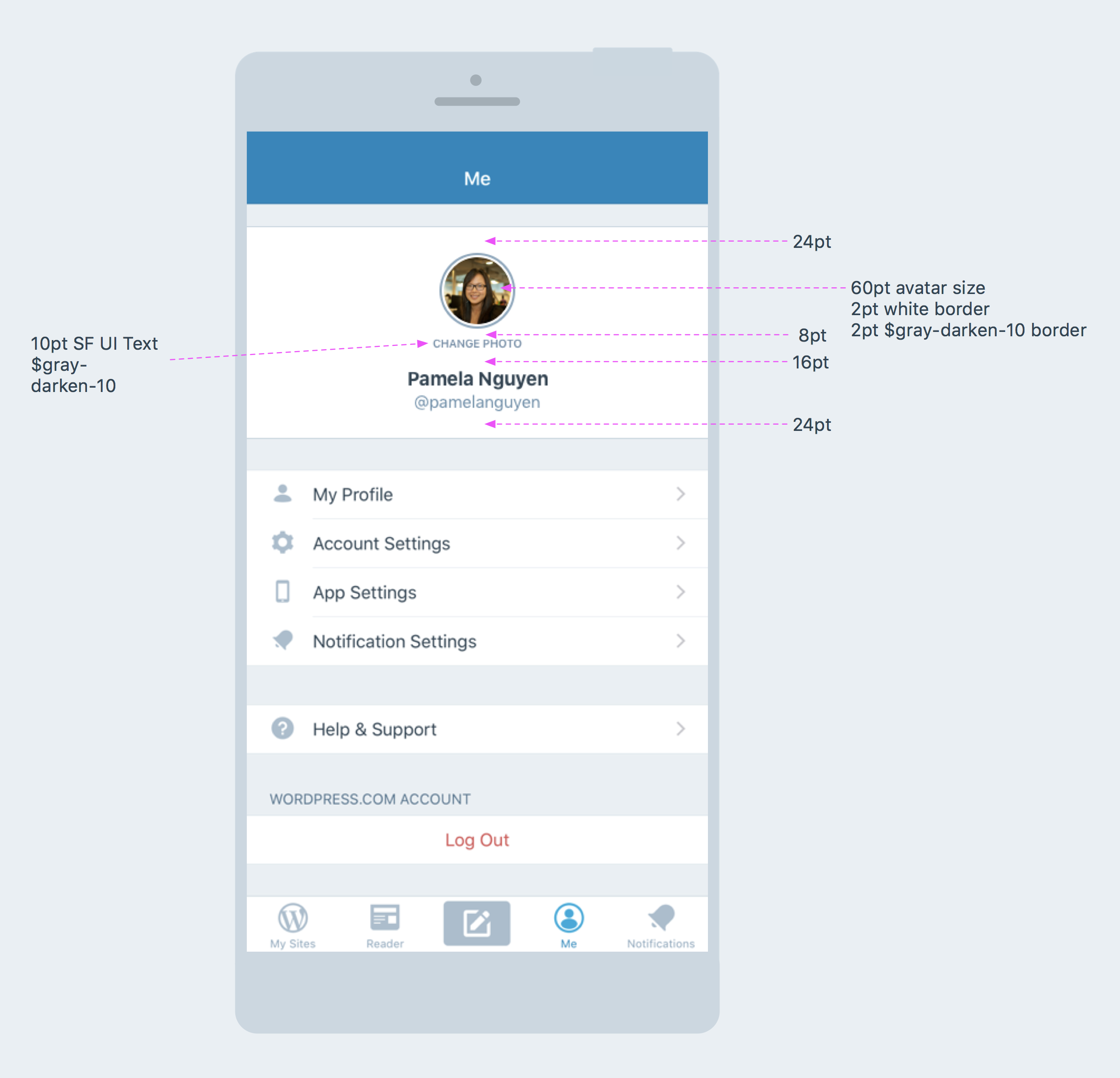
Mockup with notes based on condo in the original mobilerequests ticket:
 iamthomasbishop
on 5 Sep 2017
iamthomasbishop
on 5 Sep 2017
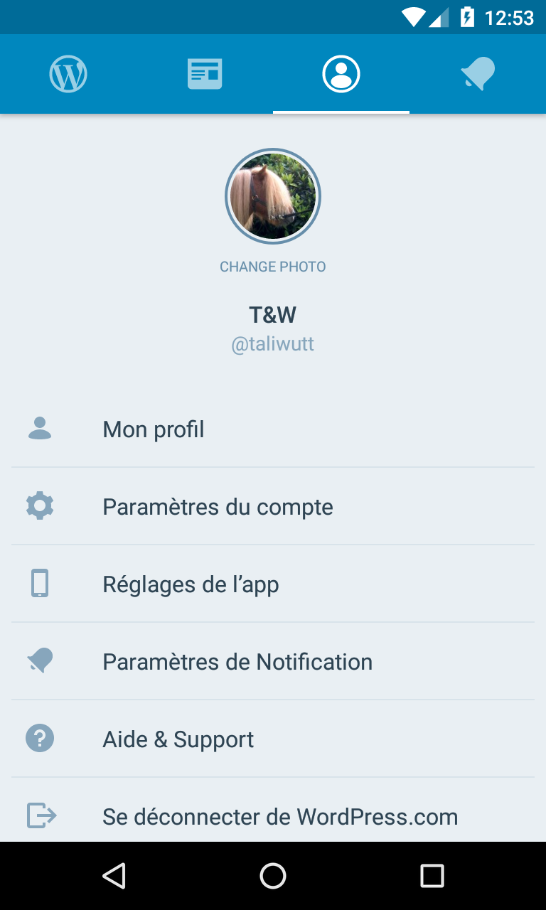
@iamthomasbishop I did a quick and dirty fix to change this screen in the android app. Something looks wrong with the "change photo" label (I used the sizes you provided in the iOS screenshot), maybe too much vertical space used on this screen. Perhaps, we could move the name/username to the right of the avatar?
With the Change photo label:
Without:
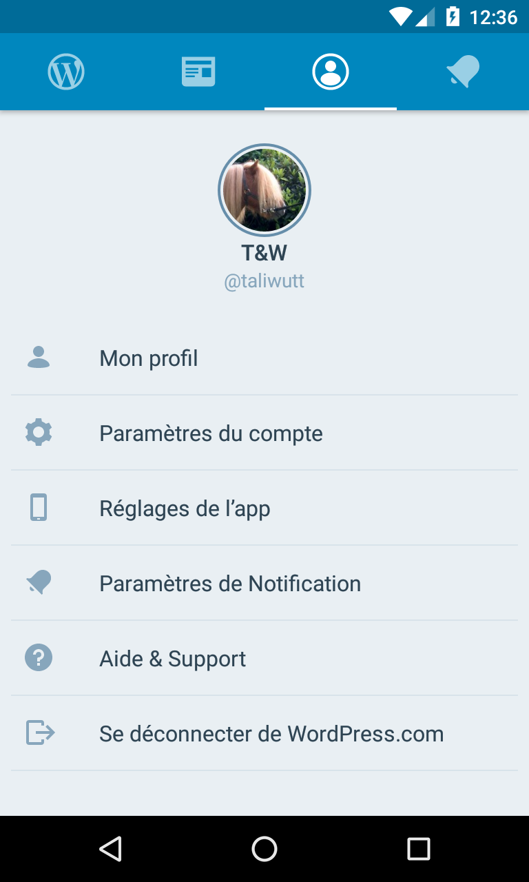
It's maybe just a visual effect of this test account name T&W.
maxme
on 14 Dec 2017
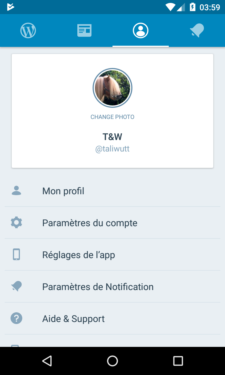
I think the spacing is okay, but I'm wondering if we should use a card background behind the header area, which is the pattern that we've been following on login/signup, etc. Here's what it looks like on login:
iamthomasbishop
on 14 Dec 2017
It looks better but it makes the view scrollable on some devices, which is not ideal IMO:
maxme
on 15 Dec 2017
Ping @mattmiklic bc I believe you worked on the cards for login - do you think the cards should also apply on this page (profile) for consistency with the login cards (screenshot above)? The downside is that the last item could get pushed out of the viewport in some cases (which I think isn't the end of the world) because of the height using a card adds, but I wanted to check with you before making a call.
Fwiw, profiles on both iOS and Android are currently card-less, so maybe we could push @maxme 's proposal now and address the cards separately.
iamthomasbishop
on 18 Dec 2017
Ping @mattmiklic bc I believe you worked on the cards for login - do you think the cards should also apply on this page (profile) for consistency with the login cards (screenshot above)?
I like the look of the cards visually, and don't mind much that they make the page scroll. But I don't have a strong opinion either way; it'd also be fine to address the card styling separately from this.
 mattmiklic
on 19 Dec 2017
mattmiklic
on 19 Dec 2017
Related issues
 roundhill
·
3Comments
roundhill
·
3Comments
 mzorz
·
3Comments
mzorz
·
3Comments
 JavonDavis
·
3Comments
JavonDavis
·
3Comments
 designsimply
·
3Comments
designsimply
·
3Comments
 malinajirka
·
3Comments
malinajirka
·
3Comments
Most helpful comment
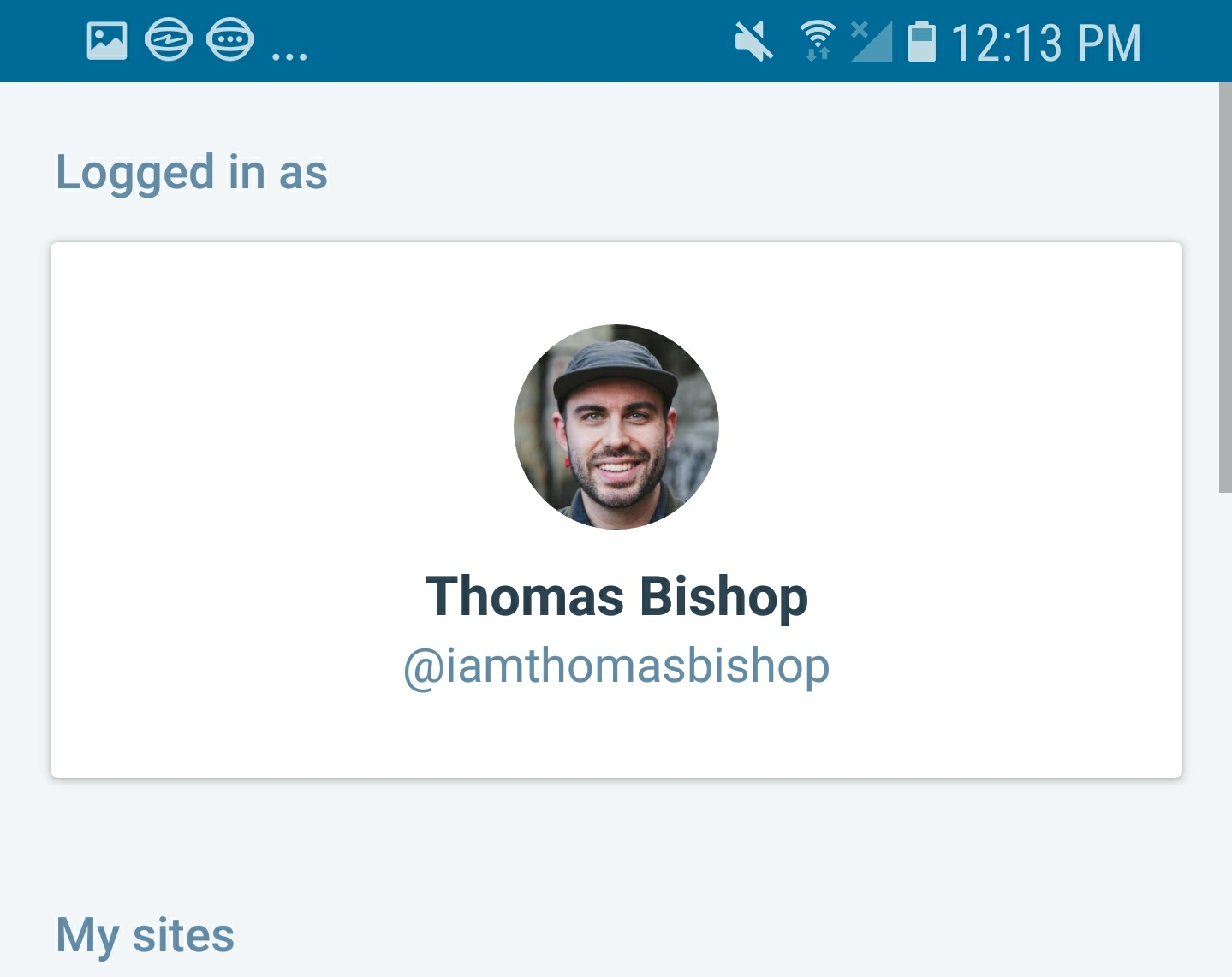
Mockup with notes based on condo in the original mobilerequests ticket: