Woocommerce-services: Better differentiation of service options
We have several closely related issues that I'm closing to be addressed altogether on this issue instead:
https://github.com/Automattic/woocommerce-services/issues/1819
https://github.com/Automattic/woocommerce-services/issues/1903
https://github.com/Automattic/woocommerce-services/issues/1885
https://github.com/Automattic/woocommerce-services/issues/1818
https://github.com/Automattic/woocommerce-services/issues/1865
@elizaan36 is working at looking at the overall design here
This Spike was done to determine how we should store/transmit the needed data to address all the above issues.
https://github.com/Automattic/woocommerce-connect-server/issues/1347 is for the Connect Server implementation of this work. If this issue is worked on at the same time, we'll need to coordinate on what the API interface will be.
 c-shultz
All 5 comments
@c-shultz @aleftick
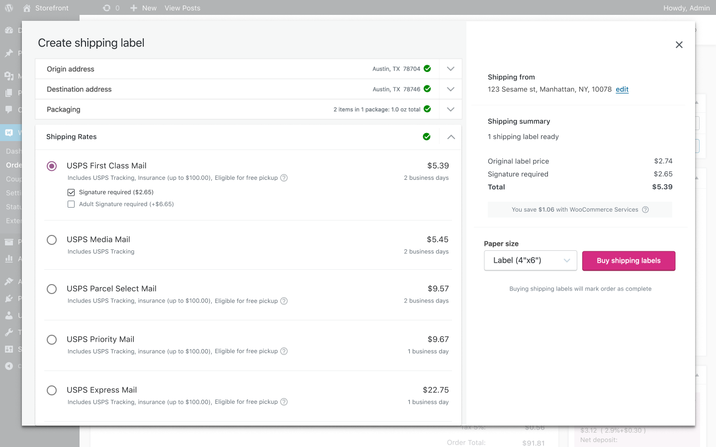
Here's a solution for better displaying the service options, shown for desktop and mobile. Probably not final but I'll post them here so we can discuss.
Quick walkthroughs:
Desktop
https://share.getcloudapp.com/kpuY98GE
- Top services to compare are shown in the abbreviated list of services. Thinking about the flow for a merchant, the top items to compare are probably whether tracking is included, and how much insurance is covered. We'd like to advertise the free pickup option, so that's listed next to those items if available, with a help icon for further information.
- Upon selection, the signature options are shown and the service area expands down
- When a signature option is selected, the pricing for all services in the list are updated to reflect that. When a merchant needs the signature requirement, they'll want to compare all pricing with that option selected. They will likely not de-select it (unless all of the options are too expensive) because that would most likely be an important requirement for them.
- Just in case they want to de-select the signature option, it's shown as a checkbox. When no signature options are selected, that means "No signature required" for the package.
- Selecting a new service when a signature option is selected will keep it selected with pricing staying the same.
Mobile
https://share.getcloudapp.com/eDuxWXmG
- Mobile view lists out the services in a bulleted list rather than wrapping the line (maybe <400px?)
Also included a solution for better displaying the WCS savings. This would appear as a notice below the totals.
 elizaan36
on 10 Feb 2020
elizaan36
on 10 Feb 2020
Here's the Figma file for these designs: https://www.figma.com/file/fcebyhNqZ9RhkFUzPHAtUG/WCS?node-id=1%3A1832
@c-shultz the only change I made based on the feedback yesterday was to add in "signature required" as a differentiator to choosing USPS Express mail. (edited from _Requirement > required_ cc @aleftick)
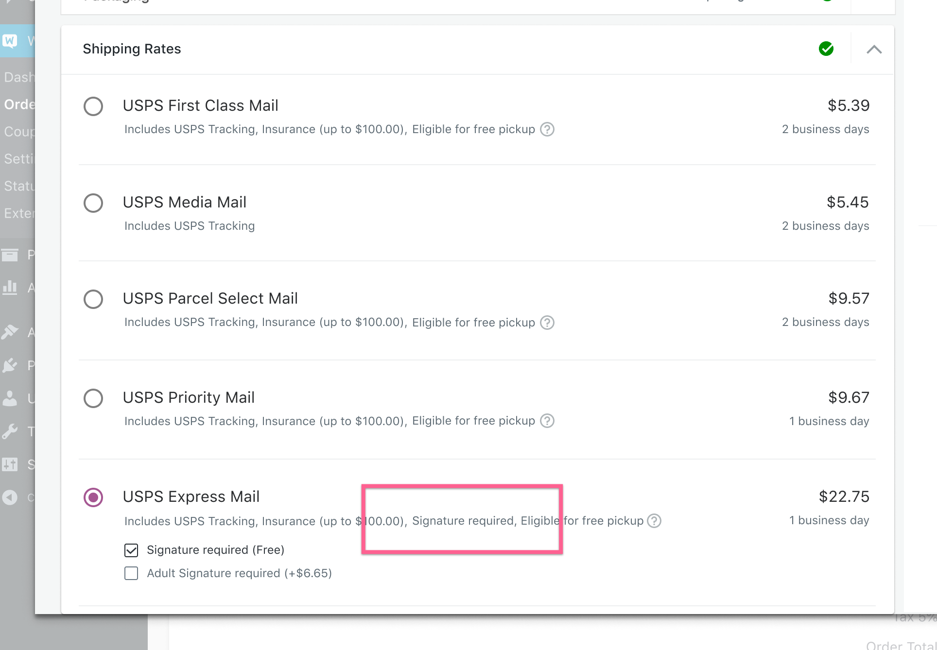
- So any services that offer the free signature required would have it listed as an additional benefit, and _also_ then have it listed as checkbox selections.
elizaan36
on 12 Feb 2020
Hey @elizaan36 :wave: I have a question about the signature options. Since they're checkboxes, what would happen if the user clicks the two options in the last screenshot?
- [x] Signature required (Free)
- [x] Adult Signature required (+$6.65)
 Ferdev
on 17 Feb 2020
Ferdev
on 17 Feb 2020
hey! They can only select one or the other. They appear as checkboxes but they behave as radio buttons. I know it's not ideal, but we need to allow users to De-select the checkbox as well, which doesn't make sense with radio buttons.
Let me know if you want to jump on a slack call anytime to walk through the prototype.
elizaan36
on 17 Feb 2020
Thanks @elizaan36! Ok, I'll do that. The rest of the prototype is crystal clear, I just had doubts with that part. But I'll ping you if I need any clarifications. Thanks again!
Ferdev
on 17 Feb 2020
Related issues
 FreshPhil
·
3Comments
FreshPhil
·
3Comments
 allendav
·
4Comments
c-shultz
·
5Comments
allendav
·
4Comments
c-shultz
·
5Comments
 v18
·
6Comments
v18
·
6Comments
 tijosh
·
5Comments
tijosh
·
5Comments
Most helpful comment
@c-shultz @aleftick
Here's a solution for better displaying the service options, shown for desktop and mobile. Probably not final but I'll post them here so we can discuss.
Quick walkthroughs:
Desktop
https://share.getcloudapp.com/kpuY98GE
Mobile
https://share.getcloudapp.com/eDuxWXmG
Also included a solution for better displaying the WCS savings. This would appear as a notice below the totals.