Windowscommunitytoolkit: Overlays and animations to focus on keys areas
An App Tour Guide , Like what android has , is extremely needed. We need to have some kind of tutorial for or users on how to use our application,... . android shows an spectacular animation on it!
I wanted to implement this myself but It's too hard for me!
 HesamKashefi
All 54 comments
 hermitdave
on 5 Jan 2017
hermitdave
on 5 Jan 2017
@hermitdave
as you can see here : https://github.com/amlcurran/ShowcaseView
your Suggestion is irrelevant !
I knew how to create a simple FlipView or a help page for my app as I've done it already!
I want something like this : https://github.com/amlcurran/ShowcaseView
if I'm the only one who wants this on UWP then I'll try to create it on my own!
HesamKashefi
on 5 Jan 2017
You meant custom overlays! I have nothing for or against it. You could create something like this and raise a PR
hermitdave
on 5 Jan 2017
@hermitdave Yes , But as I said currently I may not be able to make such a thing! and this is something useful for everyone , that's why I want it to be inside the communityToolkit! It's obvious it can improve windows store!
HesamKashefi
on 6 Jan 2017
I will reopen this for now. if there is any traction towards this we will see it added
hermitdave
on 6 Jan 2017
@hermitdave If I understand correctly, it's simply a translucent container (ex: Grid) that is on top of the current view ?
 Odonno
on 6 Jan 2017
Odonno
on 6 Jan 2017
If I needed something like this, it would be a combination of Grid with background plus opacity, some elements - ellipses / rectangles, Text and a button.
hermitdave
on 6 Jan 2017
@hermitdave I think that the elements are just part of the Content, I mean a DataTemplate. Am I wrong ?
Odonno
on 6 Jan 2017
new ShowcaseView.Builder(this)
    .setTarget(new ActionViewTarget(this, ActionViewTarget.Type.HOME))
    .setContentTitle("ShowcaseView")
    .setContentText("This is highlighting the Home button")
    .hideOnTouchOutside()
    .build();
I think above is specifying a UIElement that is the point of focus, there is a text associated with the overlay and possibly call to render it.
hermitdave
on 6 Jan 2017
@hermitdave In the android when they pass "this" they can simply Inflate (add) a layout (view) into it!
I think this takes all of the view and adds those Views and animations to it.
I thought I may be able to implement a custom content control that holds all of the page and then using the Attached Properties some how mimic the same behavior but it seems to be a wrong approach.
HesamKashefi
on 6 Jan 2017
@HesamKashefi I like the idea of attached properties however this would have to be the last item on visual tree. how you'd consume it from XAML easily is something to think about
hermitdave
on 6 Jan 2017
It's still unclear to me what this attached property will do. Are we just talking about a transparent grid? What are the services provided by this property?
 deltakosh
on 6 Jan 2017
hermitdave
on 6 Jan 2017
deltakosh
on 6 Jan 2017
hermitdave
on 6 Jan 2017
the discussion is about a control that has a grid with opacity and background and that has optional text and button to hide it away
hermitdave
on 6 Jan 2017
isn't it too simple to be promoted as a control?
deltakosh
on 6 Jan 2017
errr yes that why I said if it gets traction
hermitdave
on 6 Jan 2017
Ok we are on the same page :D
deltakosh
on 6 Jan 2017
@deltakosh Actually I want it to be similar as what is provided here:https://github.com/amlcurran/ShowcaseView
if you have an android phone you may have seen that most of the apps are using this.
it's like a signature! every user is familiar with it! and it is created by just a few lines of code!
I don't want it to be created from zero in every project! and for every single usage in each page
HesamKashefi
on 6 Jan 2017
Well, let's say I need to be convinced ;)
deltakosh
on 6 Jan 2017
That reminds me now of some notification / alert design that appeared on Windows 10.
Well, an image would be better but I assume you have seen them at least one time. They are some notifications like "how to use Cortana" or "how to draw on Edge". A little black notification that appear anywhere on the screen.
Odonno
on 6 Jan 2017
hello what about creating a uservoice entry now that we have this opportunity?
deltakosh
on 2 Mar 2017
The ShowcaseView looks really cool. I like that it works in the actual app and is not based on a screenshot (where layout might be different than on the current device).
 lukasf
on 9 Mar 2017
lukasf
on 9 Mar 2017
Seems like there is no uservoice entry created.
 windowstoolkitbot
on 25 Oct 2017
windowstoolkitbot
on 25 Oct 2017
Seems like there is no uservoice entry created.
windowstoolkitbot
on 1 Nov 2017
@HesamKashefi, could you open a uservoice entry for this in order to gauge the community interest in building this?
 nmetulev
on 1 Nov 2017
nmetulev
on 1 Nov 2017
Seems like there is no uservoice entry created.
windowstoolkitbot
on 9 Nov 2017
Seems like there is no uservoice entry created.
windowstoolkitbot
on 16 Nov 2017
This issue seems inactive. It will automatically be closed in 14 days if there is no activity.
windowstoolkitbot
on 23 Nov 2017
@nmetulev I like this idea. I will create a UserVoice for this.
 Vijay-Nirmal
on 27 Nov 2017
Vijay-Nirmal
on 27 Nov 2017
UserVoice created - Control to create an App Tour Guide
Vijay-Nirmal
on 27 Nov 2017
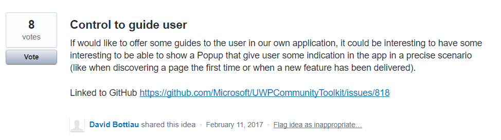
I feel this control and #818 control have the same end goal (control to help the user understand the use of a UIElement). @Odonno What do you think?
Vijay-Nirmal
on 27 Nov 2017
I would propose to close #818 in favor of this one here. The basic intention is the same, but this one here already has a very good proposal for how this could look like. Also the UserVoice entry for #818 has been deleted, so it is essentially dead already.
lukasf
on 27 Nov 2017
@lukasf I think @Odonno has deleted it now. I had the UserVoice opened before deleting. I just want to point out it has 8 upvotes. So add that upvote with this one 😄
Vijay-Nirmal
on 27 Nov 2017
@deltakosh @hermitdave I think you are making this too easy. Check the website. It is not just a control with some opacity. It has a transparent opening which is centered on an existing UI element. You cannot do this with a static control since you don't know the exact app layout on the user display. Also, you don't want to mess up your UI definition by putting lots and lots instances of the control into your page, if you want to highlight a few different things on different occasions.
Although I don't know if this will be possible in UWP, I like the android implementation where you can do this easily in code-behind. This is not something that will be shown every time, probably only once per feature, and maybe also depending on conditions. So it will most probably always be triggered from code-behind. If possible, XAML definitions should not be polluted with stuff for these rare one-time messages.
lukasf
on 27 Nov 2017
@Vijay-Nirmal I don't know what you mean. I have no admin access on the uservoice.
Anyway, I don't know where we can go with this issue. Mine proposed to copy a not-so reused component on Windows 10 and it did not get a lot of traction. Moreover, it looks a little like an InAppNotification with a custom style. We may be able to do something with that.
That one seems interesting but I think we should clearly apply Fluent design into this concept to make a good user experience using Light / Shadow / Blur effects to emphasize on either the Content, the Guide or both.
Odonno
on 27 Nov 2017
I also think that an (optional) blur effect would be great, which blurs the non-focus area behind the notification. But I am not sure if this is possible in Composition, to have a blur area with a non-blurred circle in it.
lukasf
on 28 Nov 2017
@lukasf If we want to make it right, we need to use elements offered by Light, Depth, Motion, Material and Scale of the Fluent Design system.
What I envision is to be able to focus on one part of the app to get user attention. So it requires one or more of this features :
- Light with a notion of Light & Dark emphasis / shadow
- Depth with a notion of "back-and-forth"
- Material with a notion of Blur
In my opinon, the Toolkit already had these features. What do you think is missing?
Odonno
on 29 Nov 2017
When I look at the "ShowCase" link from OP, I can well imagine a blur effect behind the semi transparent notification area. But of course the content behind/inside the circle (the focus area) must not be blurred. I worked a bit with blur effects, but I do not know if it is possible to selectively blur only parts of an image/control. Maybe a Composition expert could find a way. Everything else you say should be relatively easy to accomplish using Composition APIs.
lukasf
on 29 Nov 2017
An overlay with Acrylic over apps background over everything except desired control would do the trick. The see through area woa have to programmatically determine the location of desired control. Calculating bounds shouldn't be difficult.
hermitdave
on 29 Nov 2017
Finding the location/bounds of the focus area is easy. But how to "cut out" the circle from the blur area? Maybe an opacity mask could be used on the overlay, but I never worked with that...
lukasf
on 29 Nov 2017
@lukasf circle would be difficult.. rectangle is easy since you would apply backdrop brush on all but one child areas controlled by row / column position. Messy but can be done.
hermitdave
on 29 Nov 2017
@lukasf you always apply apply BackdropBrush twice.. once on a popup for full overlay with blur and tint and then again on a circle with no blur / tint making it look transparent
hermitdave
on 29 Nov 2017
@hermitdave We can't use "circle with no blur/tint" because if we use a circle (or any other shapes) the control behind will lose its functionality. Eg: A button can't be pressed when it is behind a circle. So we should create the circle (or any other shapes) like the image shown below
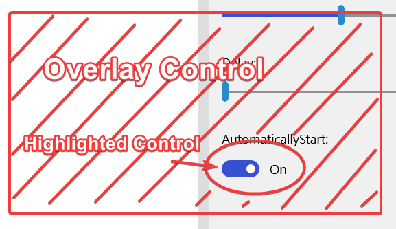
With the help of Composition APIs, we can move the circle from the highlighted control to another (next step in the tour) in a continuous faction. It will look like connected animation.
Vijay-Nirmal
on 29 Nov 2017
Err any overlay will mean control will lose its functionality until overlay is hidden
hermitdave
on 29 Nov 2017
That's the point, the overlay control must no overlap the highlighted control as shown in the image (Shaded parts are the Overlay control)
Vijay-Nirmal
on 30 Nov 2017
You can set "IsHitTestVisible=False" on any control, then all interactions will go through to controls below it. But you probably want the opaque/semi-transparent parts of the overlay to be hit-testable. That could turn out more difficult. We could start segmenting the overlay, but that would probably create visual artifacts on segment borderts...
lukasf
on 30 Nov 2017
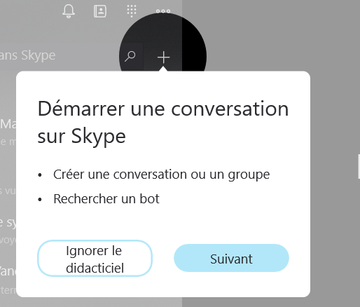
Well, it seems Skype made a tutorial like you want. The control in the circle are clickable and the circle has a swift animation when it appears.
Odonno
on 2 Dec 2017
This is exactly what I was looking for, I was gonna open an issue for it, but its good we already have one tracking this. But it seems this issue has not been active for a while.
@HesamKashefi did you find a way to do it? or still struggling with the concept?
 touseefbsb
on 13 Mar 2018
touseefbsb
on 13 Mar 2018
@touseefbsb No , Unfortunately I could not find a way and I didn't have time to work more on it, there are some limitations in UWP's XAML compared to WPF's XAML that I could not find a substitute for them (namely combined geometries) which was my best guessed way of implementing this.
I think it's not impossible yet but it needs an experienced developer to overcome it.
Maybe there be some useful APIs in Composition API which I have not worked with yet!
HesamKashefi
on 14 Mar 2018
yeah we need a composition api expert who is expert also with the visual layer of the xaml. maybe they can figure out a generic way to do it.
touseefbsb
on 14 Mar 2018
Whats the current status?
 gbarcho
on 27 Jun 2018
gbarcho
on 27 Jun 2018
Will the Teaching Tip proposal in the WinUI controls satisfy this need?
 michael-hawker
on 15 Feb 2019
michael-hawker
on 15 Feb 2019
@michael-hawker , I don't think so.
The problem is that the Teaching Tip does not force the user to focus and it can't present a tour of application (a step by step focused learning).
We need something to disable all of screen, put a circle on the area in question and then show a message and possibly a button for the 'next step' or 'done'.
HesamKashefi
on 16 Feb 2019
@JustinXinLiu I feel your Insider Dev Tour Sample had a great UX for guiding a user through a UI with the teaching tip.
@HesamKashefi if that's not sufficient for your needs, can you open an issue on WinUI to request additional features to the TeachingTip.
@SavoySchuler FYI
Thanks!
michael-hawker
on 17 Oct 2019
Related issues
 nolanblew
·
3Comments
nolanblew
·
3Comments
 IanStorm
·
4Comments
deltakosh
·
3Comments
IanStorm
·
4Comments
deltakosh
·
3Comments
 shweaver-MSFT
·
3Comments
shweaver-MSFT
·
3Comments
 HardySoftware
·
3Comments
HardySoftware
·
3Comments
Most helpful comment
yeah we need a composition api expert who is expert also with the visual layer of the xaml. maybe they can figure out a generic way to do it.