Webiny-js: Headless CMS - content view
Created this issue just for better observability.
 doitadrian
All 23 comments
Let's discuss the UI a bit and pick the right approach. I'm leaning towards version 2.1, but let's come to a decision together.
Version 1
A simple copy of the page builder's UI:
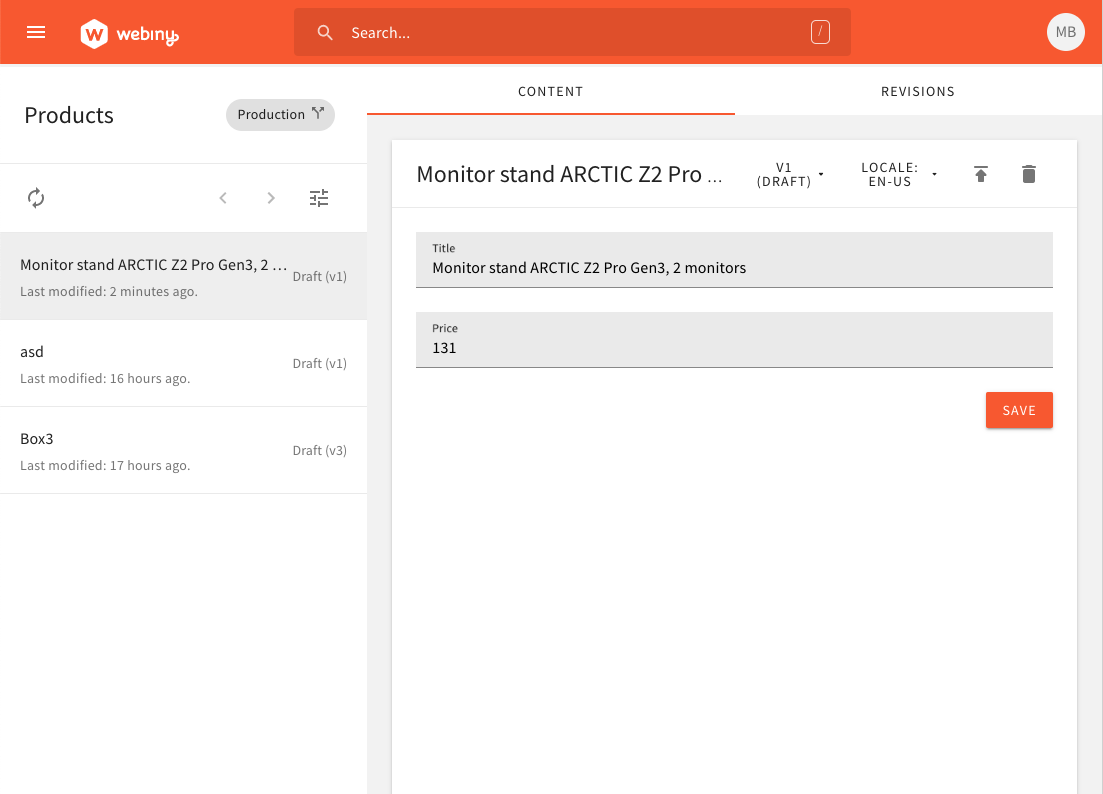
I just wanted to see how it'll look like. But yeah, definitely too crowded. Let's scratch this one.
Version 2
So, let's have two rows.
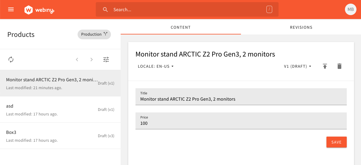
Looks much better, although I don't like this gap:
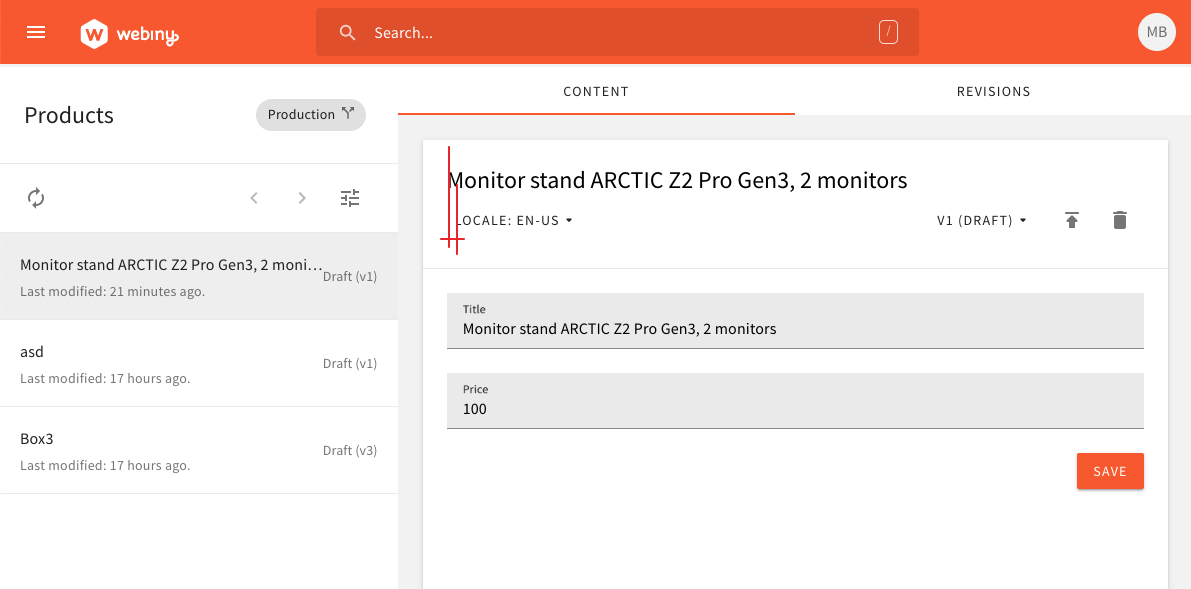
This is because the button itself has itts own padding, which is visible when you hover over it:
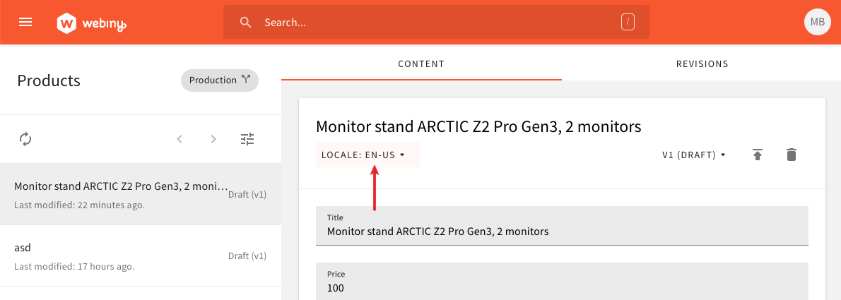
Version 2.1
The only idea I had was just to use the ButtonSecondary instead of ButtonDefault:
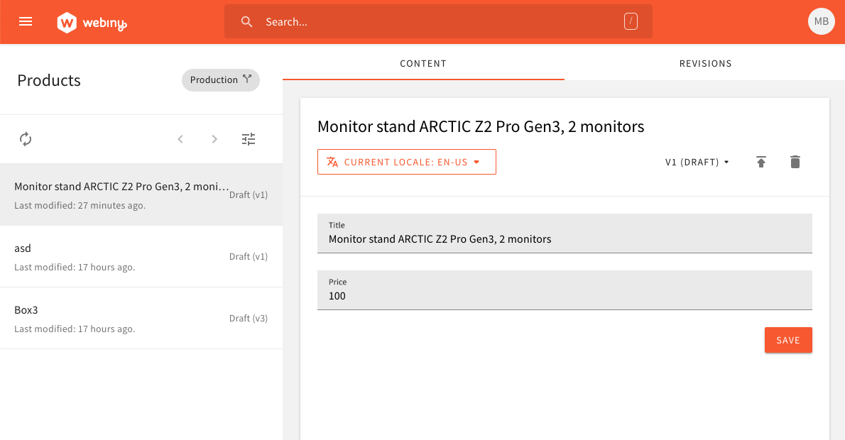
Now these are in line, but yeah, maybe somebody will have a reason why this is not such a good idea. :)
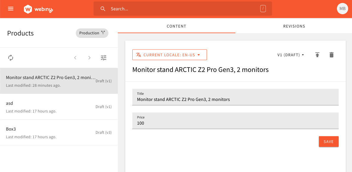
Version 3
Same as version 2, although the title is not below the toolbar, and the toolbar is on top of the form.
doitadrian
on 9 May 2020
Of course, if anybody has anything else to add, feel free to do so.
doitadrian
on 9 May 2020
I like version 3 the most. That was also sven’s suggestion all along so let’s do that for v1.
 Pavel910
on 9 May 2020
Pavel910
on 9 May 2020
I'm aware this was @SvenAlHamad's idea, just wanted to have all variants in front of us.
I'll let this one stand here until Monday, just in case anyone has anything to add, and in the meantime work on other pending issues.
doitadrian
on 9 May 2020
Just wondering, what if we remove the title completely and just have the toolbar and inputs? Could you attach such a screenshot please?
That title seems redundant because there is an input with that same string right below it.
Pavel910
on 9 May 2020
Sure:
Version 4
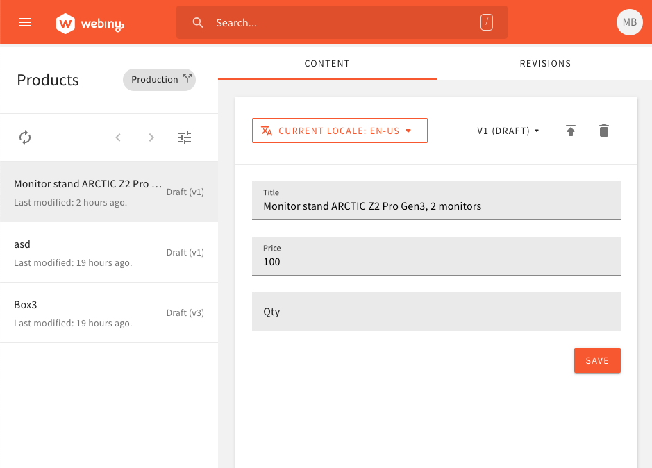
Note that this content model has the Title field, but others might not have it. For example, if we were to create a Customer content model, that one might have First name and Last name fields instead of a single field that could be considered as title.
Off topic: The above first name/last name example is interesting, since having just one of these two fields as entry's title might not have a lot of sense. In the future, we might enable users to pick two fields as the content entry's title.
doitadrian
on 9 May 2020
This actually looks good. Let’s hear other opinions @SvenAlHamad @EmilK15 @Ashu96
Pavel910
on 9 May 2020
Cool, I'd be interested what they think too.
We can create a poll later and take a vote.
I'll name this last version v4. :)
doitadrian
on 9 May 2020
V4 has a good baseline, but I think we need to work on the toolbar.
- From the UX perspective, version and language dropdown have the same interaction preference. There is no reason to have a different visual design between those two components.
- Also, why have "current locale", and then not have "current version". So we either have the wording on both, or on none.
- From the more practical perspective. I would maybe make the top toolbar fixed, add a bottom toolbar for the save button (and maybe also add "publish" button), and only scroll the middle body. Like we have it on the page builder pages. (not sure if this complicates things with the form)
 SvenAlHamad
on 9 May 2020
SvenAlHamad
on 9 May 2020
@doitadrian Version 4 looks good.
I agree with @SvenAlHamad feedback.
In regards to point 2: Personally I think the top toolbar should not have labels like current locale and current version
 Ashu96
on 9 May 2020
Ashu96
on 9 May 2020
Did 1 and 2, still have to do 3.
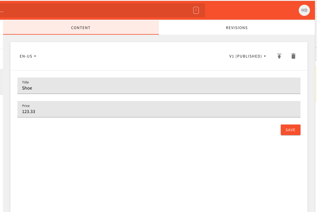
But I have another question now, it's regarding revision.
With content entries, you basically don't publish previous revisions, like you can do with Pages in the Page Builder app. This is because GQL schema always shows the latest content-model schema, so (1) publishing an old revision (with older content model) and (2) serving it via GQL simply wouldn't work.
That being said, I think we don't need the Revisions tab in the content form. Just to double check, I went to see which actions we had in the Page Builder app.
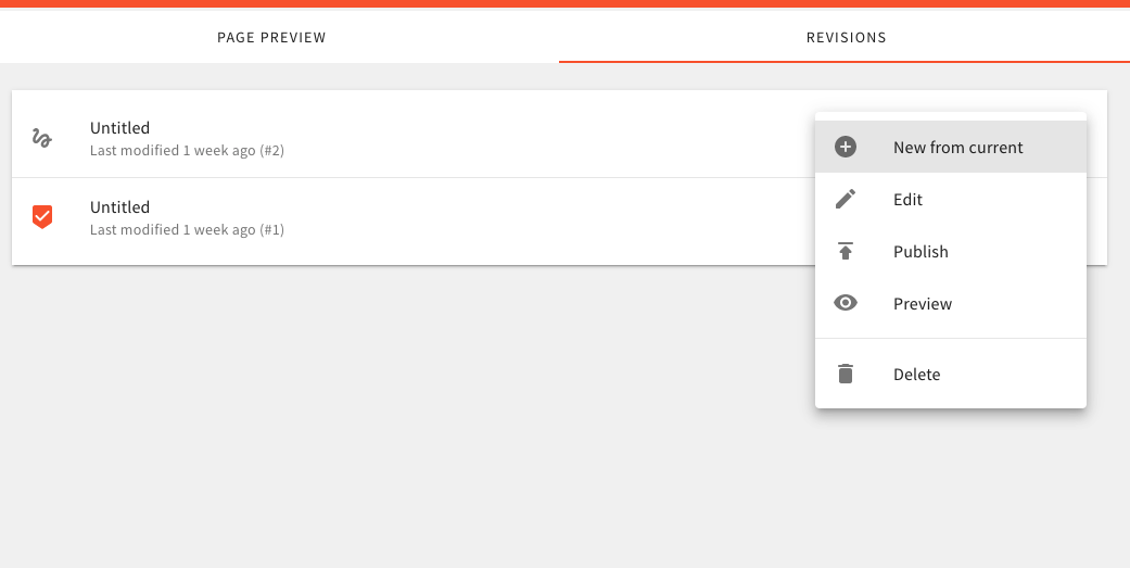
It seems, there aren't any super-needed actions here (that we could also c/p and use for content entries), so at this point, I would just remove this tab. We also have the revisions selector in the Content tab, which will enable users to just view previous revisions.
@webiny/webinydevteam @SvenAlHamad
doitadrian
on 11 May 2020
In terms of the updated image ... there is no reason for the language to be separated from the rest of the actions in the toolbar, again, it has the same "preference" level as other actions in there so there shouldn't be any differentiation.
As for revisions - we should still allow the user to publish an older revision in case it's for the same content model version. Otherwise, what would be the point of having content revisions?
As for the actions, I still feel they provide some value. New from current, is useful if you want to start creating a new revision from some older content version, same goes for all others, with the exception of "preview" action which I don't think applies here.
What does everyone else think? @webiny/webinydevteam
SvenAlHamad
on 11 May 2020
I agree that we should be able to publish older revisions, and New from current is also handy.
Not sure about the language selector; to me it looks ok on the left side, it's immediately visible and is something that will be used more often than other actions on the screen.
Pavel910
on 11 May 2020
Okay we can try.
Just have in mind that, after publishing an older revision, you might publish a revision that had a certain field not-required at the point of its publish, and that the latest content model requires the value for it. This means that, even though you have the field set as required, you might still get empty values while accessing data via GQL.
The same goes for other validators. For example, if you've attached a min/max validator at some point in time, by publishing an older revision, the content might have invalid items.
Not super problematic I'd say, but let's just have that on mind.
P.S. This might be prevented by removing the publish-old-revision functionality, and just leave the 'create-from' functionality.
Regarding actions:
- New from current - OK
- Edit - I guess it's OK, for cases where you end up with multiple draft entries. For example, you start a new draft, and later on, you press "Create from". Then you will have multiple drafts.
- Publish - OK
- Preview - Remove
- Delete - OK
doitadrian
on 11 May 2020
Validators are not an issue. If there is no content - there is no content. It's up to the content editor to worry about that.
I'm not sure about having multiple drafts, as the preview API only loads latest revision, so if you have 2 drafts, only the latest will be retrievable by the API.
Pavel910
on 11 May 2020
Agreed with Pavel regarding the missing content. The same goes for cases where other validators are not satisfied (the min/max example mentioned above).
doitadrian
on 11 May 2020
On the missing content - I believe this is also the expected behaviour from the user's/dev's side, so that shouldn't pose a problem.
As for multiple drafts - the improve the UX, on the revisions tab it would be great to add a "status" tag for "latest draft". So it's clear that this is the version which is visible in the preview API.
SvenAlHamad
on 11 May 2020
Sounds good guys. 👍
doitadrian
on 11 May 2020
Wanted to post this earlier, but got stuck fixing some bugs and decided to do some minor improvements too.
Anyways, this is the current state of the content entry form:
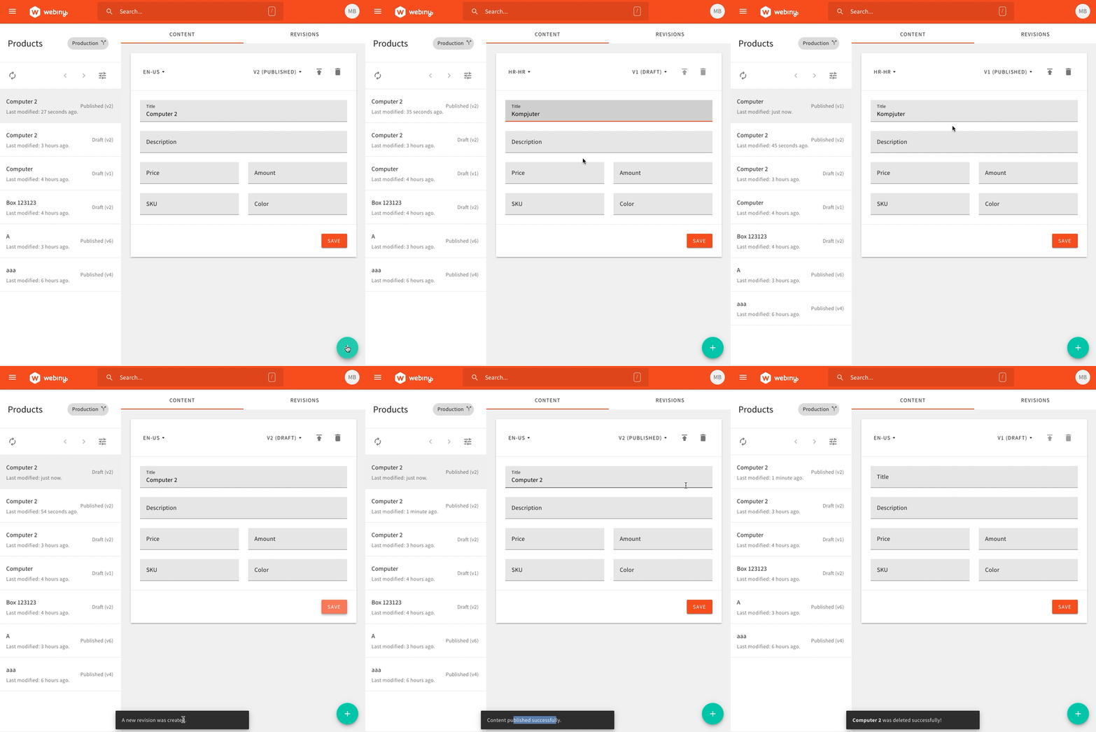
1 - No title, only actions in the header
1.1 - Regarding actions, it felt good having the locale selector on the left. But if you think it should still be on the right, let me know and I'll move it. It's just a matter of changing the plugin name.
2 - The body (middle) area contains the form. Note that currently, it doesn't work the way @SvenAlHamad mentioned - the footer is not fixed to the bottom of the screen. The height of the whole header/body/footer area depends on the content in the body section. I can create a separate issue for this, so we can tackle this post-beta if needed.
3 - the footer contains the save button. What I'm currently wondering, should we change the label of it, depending on the actual action that will be performed.
A) So, when you click on the new button, and want to create a new content entry, the button will just create a first revision. The label "Save" in that scenario works for me.
B) After that, the "Save" button just updates the revisions, which is also OK in my opinion.
C) Once you publish the revision, you can continue editing the data, but note that clicking on the "Save" button will actually create a new revisions. From there, we're back to B.
So in short, should we change the label to e.g. Create a new revisions and save or something like that? Note that the snackbars tells the user that a new entry revision was created in this case.
4 - one thing I'm also going to do, is that when you click on the publish button, the data is saved and then published. In other words, you don't have to strictly press save first, and then publish. You can just hit publish, the effect would be the same.
@webiny/webinydevteam @SvenAlHamad
doitadrian
on 18 May 2020
Looks great!
I personally like the language selector on the left. It's very prominent, and it's an action you will use very often. I also like that there is no extra title in the form, looks nice and clean.
Regarding Create a new revision and save - sounds fine with me, very explicit.
4) sounds like the right way to go.
Overall - this is great and I don't have anything to add.
Pavel910
on 18 May 2020
I believe this is now in a good shape for the launch. Things can be improved, for example like, the user might not understand that “Save” saves all languages, and not just the current one. As well as we can add some indicators that the content was edited but not yet saved and similar ... but let’s leave those as upgrades for later. This version will suffice for now.
SvenAlHamad
on 18 May 2020
Please reopen this issue once you add more information and updates here. If this is not the case and you need some help, feel free to seek help from our Slack Community or ping one of the reviewers. Thank you for your contributions!
doitadrian
on 13 Oct 2020
This issue is stale because it has been open 60 days with no activity. Remove stale label or comment or this will be closed in 7 days.
 webiny-bot
on 12 Dec 2020
webiny-bot
on 12 Dec 2020
Related issues
Pavel910
·
5Comments
 jcode-hub
·
4Comments
doitadrian
·
4Comments
doitadrian
·
4Comments
doitadrian
·
4Comments
jcode-hub
·
4Comments
doitadrian
·
4Comments
doitadrian
·
4Comments
doitadrian
·
4Comments
Most helpful comment
Wanted to post this earlier, but got stuck fixing some bugs and decided to do some minor improvements too.
Anyways, this is the current state of the content entry form:
1 - No title, only actions in the header
1.1 - Regarding actions, it felt good having the locale selector on the left. But if you think it should still be on the right, let me know and I'll move it. It's just a matter of changing the plugin name.
2 - The body (middle) area contains the form. Note that currently, it doesn't work the way @SvenAlHamad mentioned - the footer is not fixed to the bottom of the screen. The height of the whole header/body/footer area depends on the content in the body section. I can create a separate issue for this, so we can tackle this post-beta if needed.
3 - the footer contains the save button. What I'm currently wondering, should we change the label of it, depending on the actual action that will be performed.
A) So, when you click on the new button, and want to create a new content entry, the button will just create a first revision. The label "Save" in that scenario works for me.
B) After that, the "Save" button just updates the revisions, which is also OK in my opinion.
C) Once you publish the revision, you can continue editing the data, but note that clicking on the "Save" button will actually create a new revisions. From there, we're back to B.
So in short, should we change the label to e.g.
Create a new revisions and saveor something like that? Note that the snackbars tells the user that a new entry revision was created in this case.4 - one thing I'm also going to do, is that when you click on the publish button, the data is saved and then published. In other words, you don't have to strictly press save first, and then publish. You can just hit publish, the effect would be the same.
@webiny/webinydevteam @SvenAlHamad