User story
As a user I want to hide/show hidden files (, dot files) in the UI ala OC10
Acceptance criteria
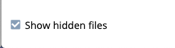
- have a dropdown above the files list (first scribble from [~tbaader]) with a
Show hidden filescheckbox - store the information in localStorage, so that it survives a browser session
- same interpretation of "hidden files" as in oc10
Show hidden filesapplies to files and folders- unit tests
- default: unchecked (hide hidden files)
- (don't modify the page number, only make sure that you move to the last page, if the page from before doesn't exist anymore after hiding hidden files)
 labkode
All 13 comments
cc @elizavetaRa
labkode
on 9 Apr 2021
@labkode @diocas two questions before we can get started working on this
- should this be done on an instance-wide basis (via the
config.json, perhaps) or configurable per user (which may take longer to implement)? - who defines what a hidden file is, do you want to provide your own list, should we follow some standard, same approach as OC10 etc?
 pascalwengerter
on 17 May 2021
pascalwengerter
on 17 May 2021
@pascalwengerter user-based. Hidden files are files starting with .. This is the OC10 model and is good enough. If more features will need to be added can be added in steps.
labkode
on 19 May 2021
Pascal Wengerter commented: OC10 hidden files toggle for reference: https://doc.owncloud.com/server/10.7/user_manual/files/webgui/navigating.html
![exalate-issue-sync[bot] picture](https://avatars.githubusercontent.com/in/18431?v=4&s=40) exalate-issue-sync[bot]
on 19 May 2021
exalate-issue-sync[bot]
on 19 May 2021
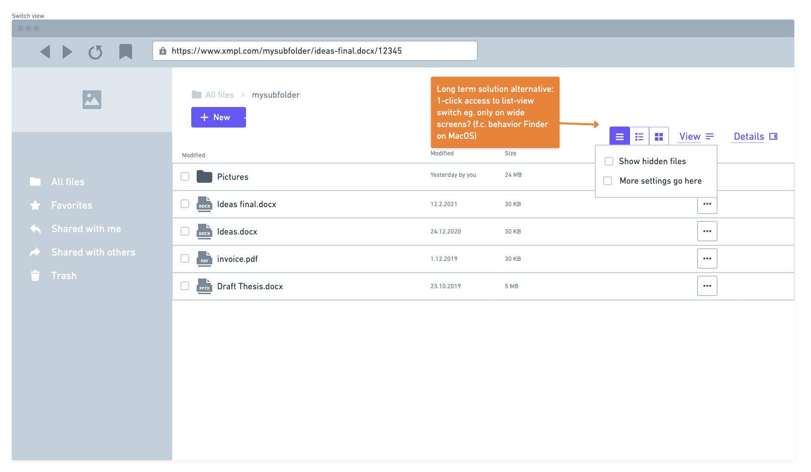
discussed a good idea by @elizavetaRa showing the switch in direct context the files list - and maybe in the future next to view-options like grid/condensed view. @elizavetaRa could you add a screenshot?
 tbsbdr
on 10 Jun 2021
tbsbdr
on 10 Jun 2021
UX-wise I fully agree. Related to https://github.com/owncloud/web/issues/5239
If we want to use the settings service (including the settings UI) from oCIS we need a concept of how changing the filter option in the files app also changes the setting in the settings service. We could start without the settings service, only storing the choice in the local storage of the browser (i.e. not persisted forever, user might be annoyed that this setting is not in sync across devices).
 kulmann
on 10 Jun 2021
kulmann
on 10 Jun 2021
@kulmann We have some urgency on this. Persistent settings are ofc great, but starting with the browser storage is the quickest way and I would say more than enough for now.
 diocas
on 10 Jun 2021
diocas
on 10 Jun 2021
@kulmann We have some urgency on this. Persistent settings are ofc great, but starting with the browser storage is the quickest way and I would say more than enough for now.
Fine by me 👍 Waiting for a screenshot from the UX discussion.
kulmann
on 11 Jun 2021
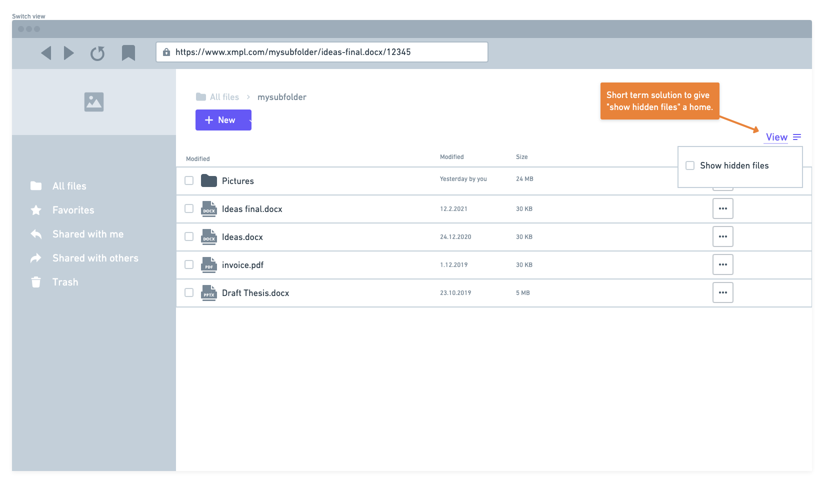
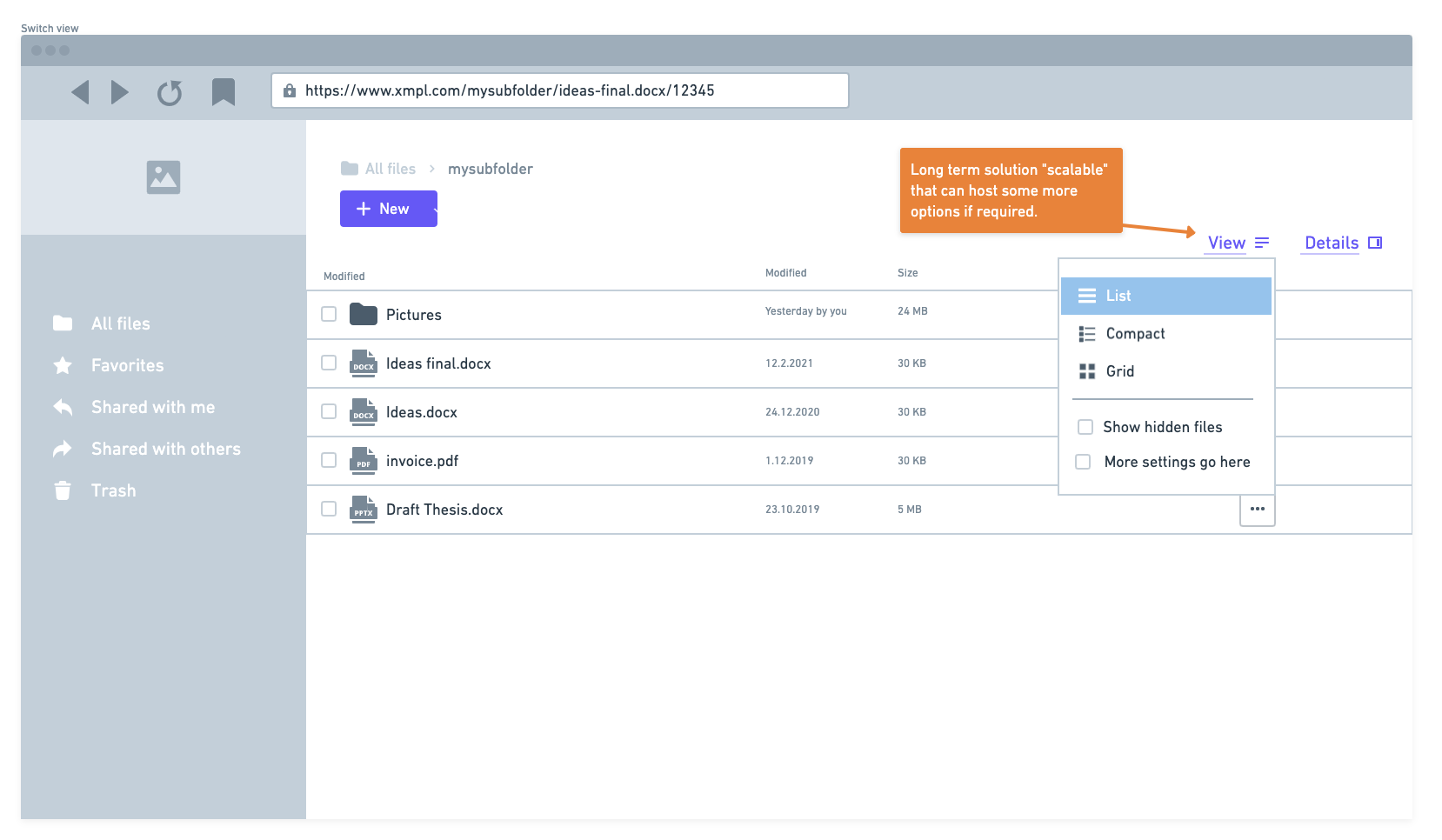
adopting elizas idea to place the switch next to the filelist and make it possible to add more options in the future like "show deleted files" and "show quick access files".
first screen is, whats planned next for short term:
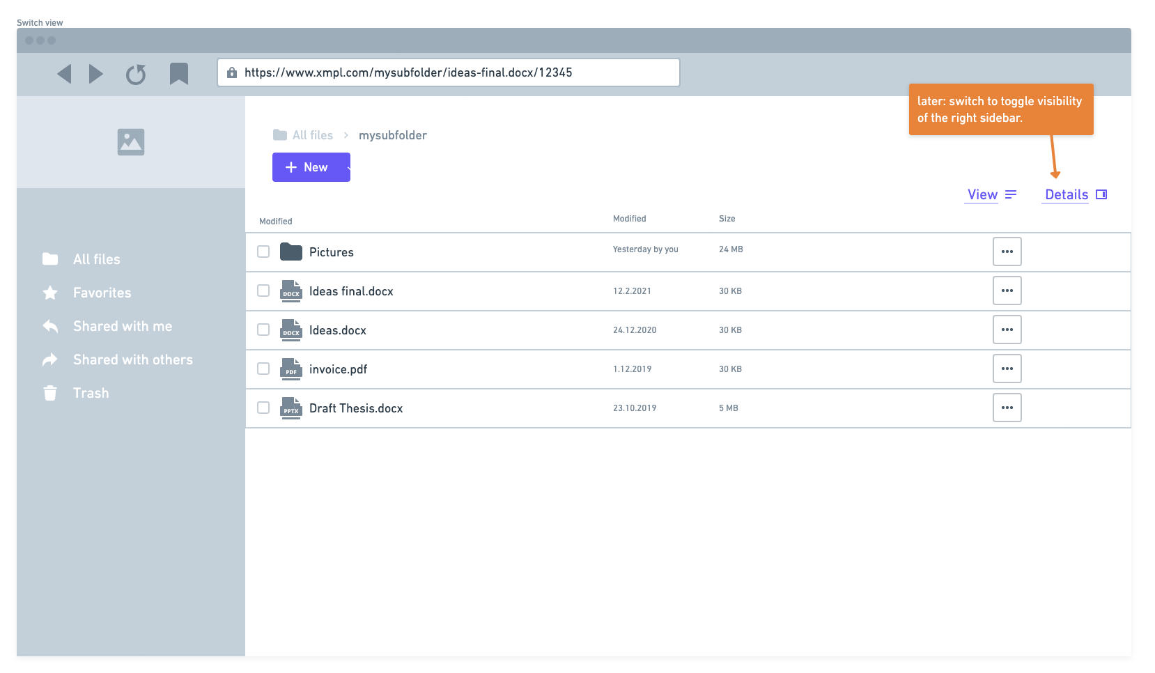
the other screens depict possible next levels, taking the sidebar-switch and more options into account:
tbsbdr
on 17 Jun 2021
(closed accidentally)
kulmann
on 17 Jun 2021
(closed accidentally)
you know me...
tbsbdr
on 17 Jun 2021
Mockups look really good. Suggestion: I would try to put the right buttons vertically aligned with the left buttons ("+ New") to avoid having even less vertical real-estate.
diocas
on 17 Jun 2021
FYI: I removed the Early-Adopters:CERN label because we planned this issue in our new sprint. Early-Adopters:CERN tickets live in our fastlane, which makes them unusable in sprints.
kulmann
on 21 Jun 2021
Related issues
 DeepDiver1975
·
6Comments
DeepDiver1975
·
6Comments
 LukasHirt
·
4Comments
LukasHirt
·
4Comments
 ChrisEdS
·
6Comments
DeepDiver1975
·
6Comments
ChrisEdS
·
6Comments
DeepDiver1975
·
6Comments
 individual-it
·
5Comments
individual-it
·
5Comments
Most helpful comment
Mockups look really good. Suggestion: I would try to put the right buttons vertically aligned with the left buttons ("+ New") to avoid having even less vertical real-estate.