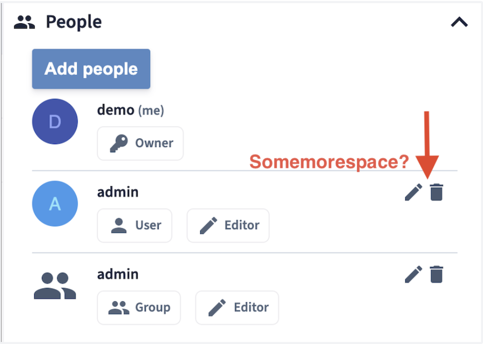
Web: More space between icons in People view
As a user, I need a little more space between the icons. Sometimes I click next to it.
 ChrisEdS
All 6 comments
Needs to fixed in the web repo, transfering this issue
class="files-collaborators-collaborator-edit oc-m-xs" in Collaborators.vue could be a way to go
 pascalwengerter
on 10 Jun 2021
pascalwengerter
on 10 Jun 2021
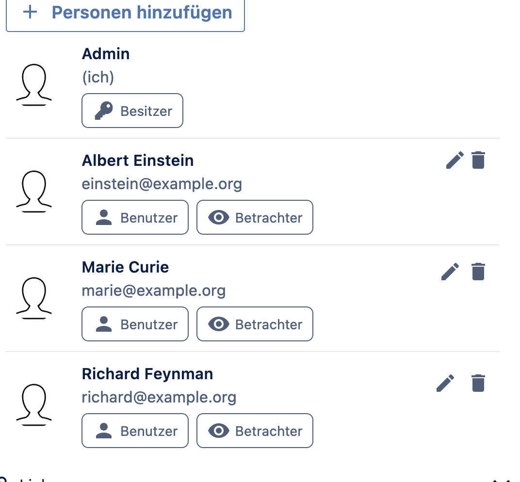
@ChrisEdS which one do you prefer? Top is current version, second is using the oc-m-xs and third is oc-m-s
pascalwengerter
on 10 Jun 2021
It depends on how many icons are in that view in the end. I'd vote for oc-m-s if it stays like this.
Also the click/hover behaviour is nice then.
If it is imaginable to have 5 icons in a row later, then oc-m-xs might be the better option.
ChrisEdS
on 10 Jun 2021
I guess this occurance of the icons will stay with two icons for a while. I'd vote for the oc-m-xs myself in any case to not create to much space between the icons
Adding @tbsbdr into the mix for a final decision on that issue plus to give him feedback for the re-structuring of the sidebar!
pascalwengerter
on 10 Jun 2021
We'll implement a new sharing widget in the right side bar within the next two sprints. So it will change soon anyway. 😅 but still, a bit more margin is a quick win. I like the smaller of the two proposals more.
 kulmann
on 10 Jun 2021
kulmann
on 10 Jun 2021
i would opt for oc-m-xs - the second one - as well. thanks for the proposals!
 tbsbdr
on 11 Jun 2021
tbsbdr
on 11 Jun 2021
Related issues
 jnweiger
·
6Comments
jnweiger
·
6Comments
 labkode
·
8Comments
labkode
·
8Comments
 DeepDiver1975
·
6Comments
DeepDiver1975
·
6Comments
 ishank011
·
8Comments
ishank011
·
8Comments
 individual-it
·
5Comments
individual-it
·
5Comments