TODO: link to @wuenschedesign mock up
We need a place to display various indivators:
- star icon indicator
- share indicators
- tag indicator (when tags exist)
- comments bubble
- extension point for apps to inject their own
 PVince81
All 9 comments
@wuenschedesign please experiment with the current Phoenix design to add a place for indicators.
One idea as discussed is about adding a second row below the file name with the indicators, without necessarily removing the columns.
PVince81
on 6 Nov 2019
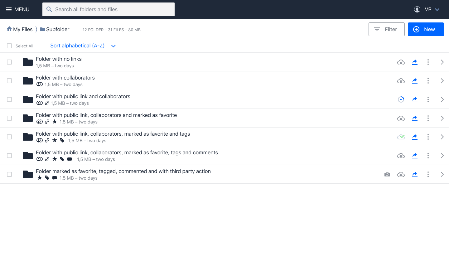
Draft for file list and indicators inline with subtitle:
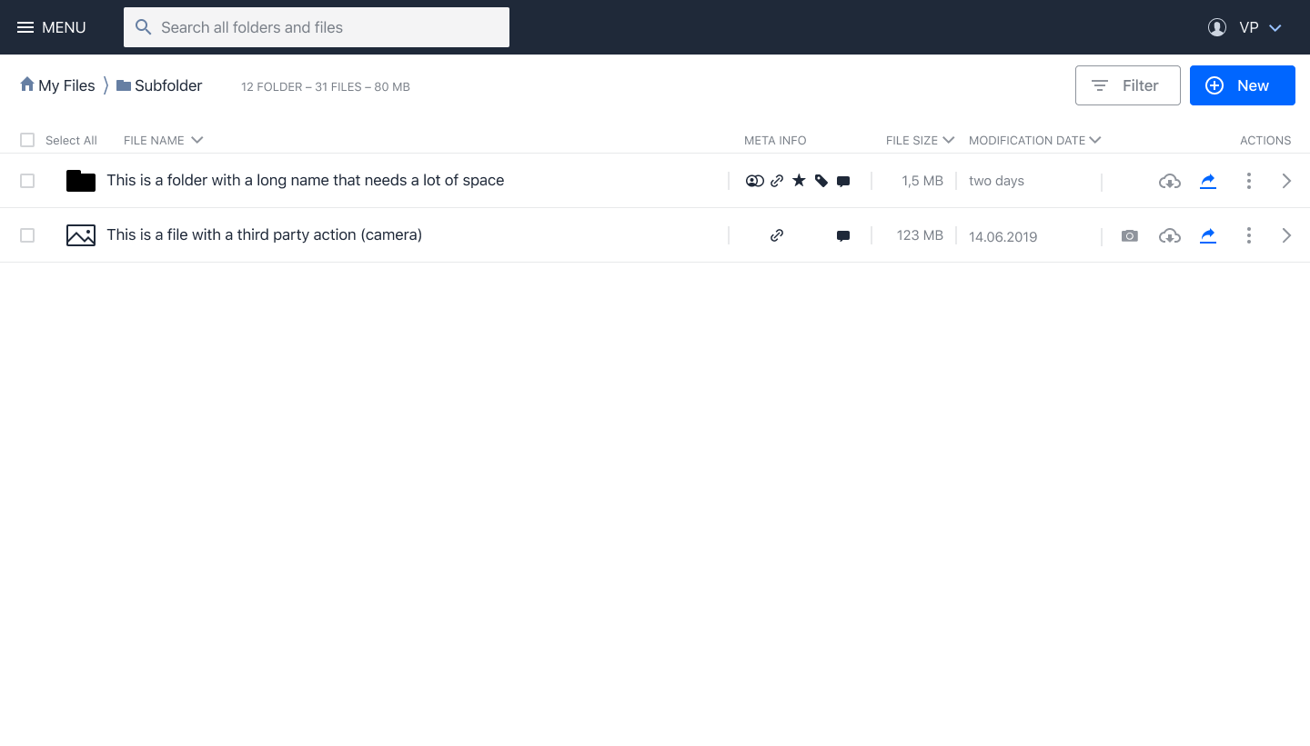
Draft for file list and indicators organized in columns:
 wuenschedesign
on 7 Nov 2019
wuenschedesign
on 7 Nov 2019
Some POC in design system for the second file row: https://github.com/owncloud/owncloud-design-system/pull/527
PVince81
on 7 Nov 2019
This is a great start.
For sharing in particular we need to think about how to represent "a parent folder is shared with others" vs "current folder is shared with others" and vs "this is a folder I received". Not sure if adding colors to the indicators would help to distinguish (and keeping in mind color blindness).
Ref https://github.com/owncloud/enterprise/issues/3556#issuecomment-544887860
PVince81
on 13 Nov 2019
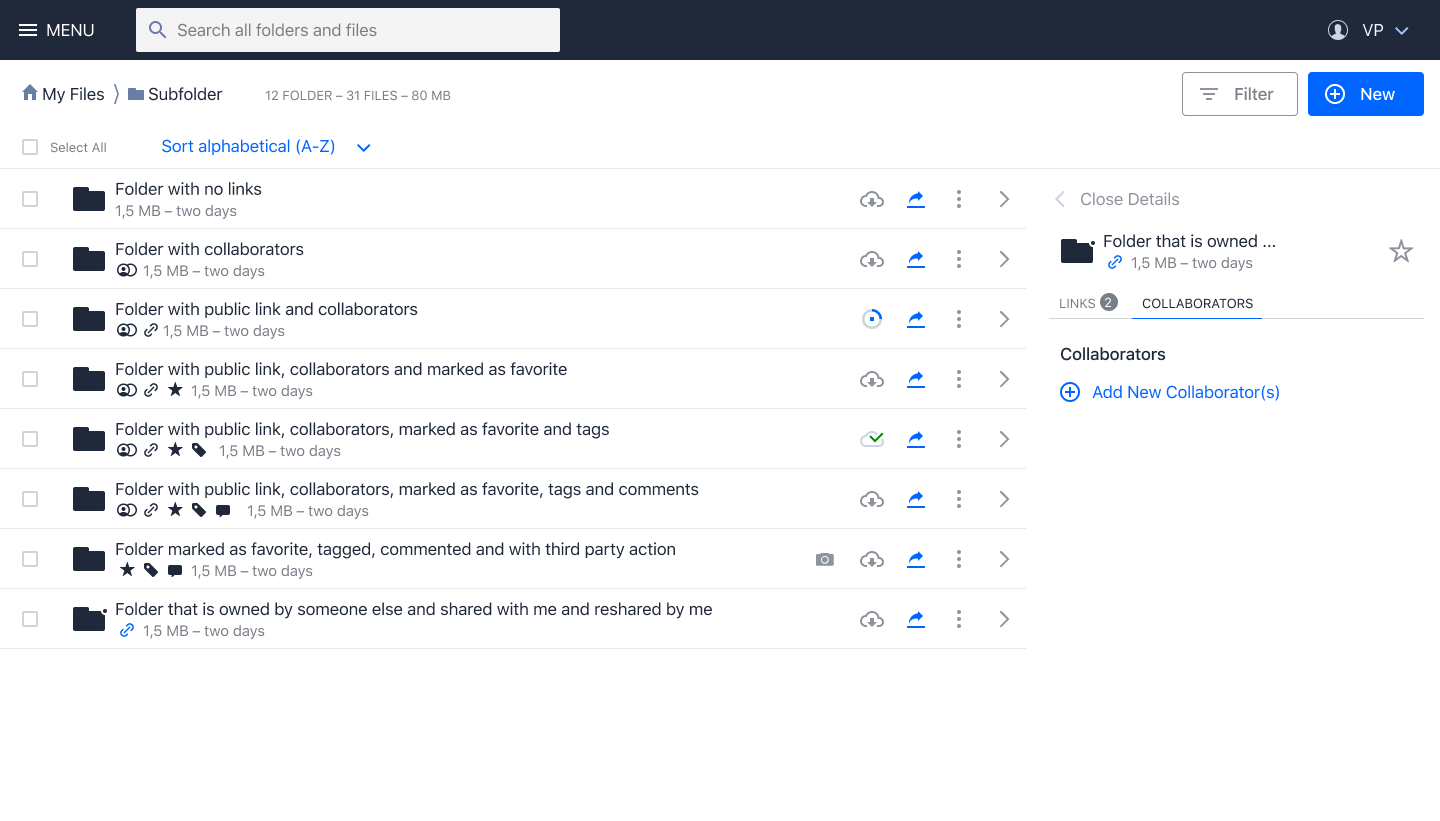
Following a screen that shows a list view including a folder that is owned by someone else and shared with me (last row). The idea is to mark any folder or file with a little dot. It’s subtle, but still recognizable.
wuenschedesign
on 13 Nov 2019
hmm, but some people might have trouble noticing such subtle details.
if we anyway go into the "touch the icon zone" territory, we could then simply use a bigger bubble with an icon in it, overlayed on top of the icon, positioned at the bottom right, like in the linked PR
PVince81
on 13 Nov 2019
More recent mock ups: https://github.com/owncloud/owncloud-design-system/pull/527#issuecomment-555022613
We should schedule time to implement a prototype of this inside the design system.
PVince81
on 25 Nov 2019
In Phoenix 0.3.0 we went for indicators in a separate column
PVince81
on 31 Jan 2020
Indicators are now being displayed in a second row under the resource name.
 LukasHirt
on 5 Jan 2021
LukasHirt
on 5 Jan 2021
Related issues
LukasHirt
·
4Comments
 dschmidt
·
6Comments
dschmidt
·
6Comments
 tomneedham
·
3Comments
tomneedham
·
3Comments
 ChrisEdS
·
6Comments
LukasHirt
·
4Comments
ChrisEdS
·
6Comments
LukasHirt
·
4Comments