Web: folder names in breadcrumbs overlayed by search bar on low resolution
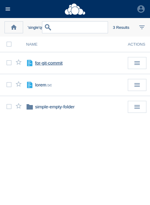
 individual-it
All 22 comments
will be fixed with #1221
 DeepDiver1975
on 7 Jun 2019
DeepDiver1975
on 7 Jun 2019
will be fixed with #1221
Well, not really as this can be tackled in different ways.
Space is really tight in the app-bar there. So I suggest the following:
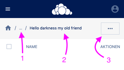
- Navigate to the immediate parent folder
- Current folder (ellipses if name it tooo long)
- All extra functions will hide in this "more" button
@individual-it @DeepDiver1975 @LukasHirt thoughts?
If it's feasable … I would take a look on how the "more" could work.
 felixheidecke
on 21 Jun 2019
felixheidecke
on 21 Jun 2019
I'm moving this to next week already - we need to chat about this then ....
DeepDiver1975
on 21 Jun 2019
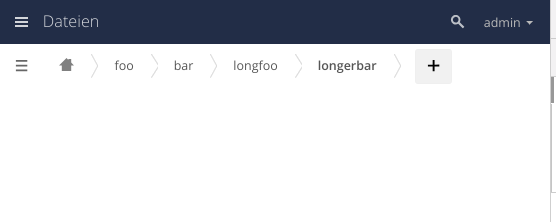
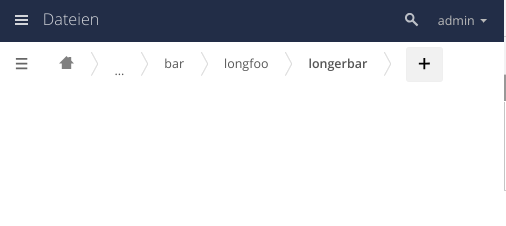


DeepDiver1975
on 25 Jun 2019
exactly :-)
felixheidecke
on 25 Jun 2019
go for it :+1:
DeepDiver1975
on 25 Jun 2019
@felixheidecke @DeepDiver1975 @michaelstingl I wouldn't hide the search. We could try to copy a little bit the new iOS app here.

Exchange back with home icon, in the middle the same behaviour - current folder with a dropdown in which you find all the previous folders - and instead of select filter and I think we are good to go. This should work nicely IMHO. Any thoughts about this?
 LukasHirt
on 25 Jun 2019
LukasHirt
on 25 Jun 2019
Nice alternative - yes. THX for the input
DeepDiver1975
on 25 Jun 2019
I guess in the app, all that disappears on the scroll. Apps have no authority over the Phoenix top bar, so the height and layout will remain as is. All of that together would amount to block roughly 1/4 or 1/5 other the overall vertical space. We can also have the app bar disappear on scroll and reappear on scroll upwards. Not in general but in the filesAppBar case.
Is the search as important so that it needs to be in view @ all times?
felixheidecke
on 25 Jun 2019
We must not forget, that the browser also brings its own address bar and app-info bar (or whatever term is)

We should keep it a thin as possible. using <oc-button size="small" … /> even
felixheidecke
on 25 Jun 2019
which actions are hided under the »more« options?
 wuenschedesign
on 26 Jun 2019
wuenschedesign
on 26 Jun 2019
Here we would have search, adding (Files and Folders) as well as the Filter option. All that is available in the wide-view so far.
felixheidecke
on 26 Jun 2019
I would not hide these options!
wuenschedesign
on 26 Jun 2019
the »add new« can be positioned under the breadcrumb.
wuenschedesign
on 26 Jun 2019
»add new« needs a primary colour. Currently it’s a nearly disabled colour.
wuenschedesign
on 26 Jun 2019
In the current screen, there are two »hamburger menues«. That’s one too much.
wuenschedesign
on 26 Jun 2019
As mentioned above … there is not much vertical room to show all of that @ the same time. There is the address bar as well as all the other stuff. If you'd like … I can go ahead and create a visual clue on how this may look.
felixheidecke
on 26 Jun 2019
In the current screen, there are two »hamburger menues«. That’s one too much.
@wuenschedesign this is the current oc11 way. The second burger is not part of the breadcrumb and not part of the session ;-)
felixheidecke
on 26 Jun 2019
A rough compilation of having the two rows of content here:
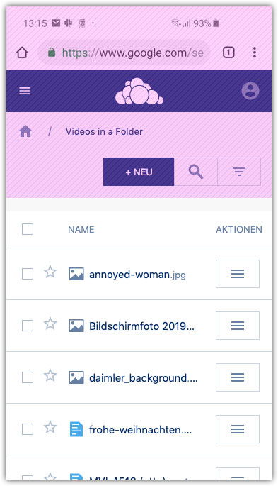
On scrolling down, the adressbar disappears, on scrolling up it reapears roughly blocking 1/3 of the screen height.
felixheidecke
on 26 Jun 2019
I propose the following, based on what @LukasHirt had in mind.
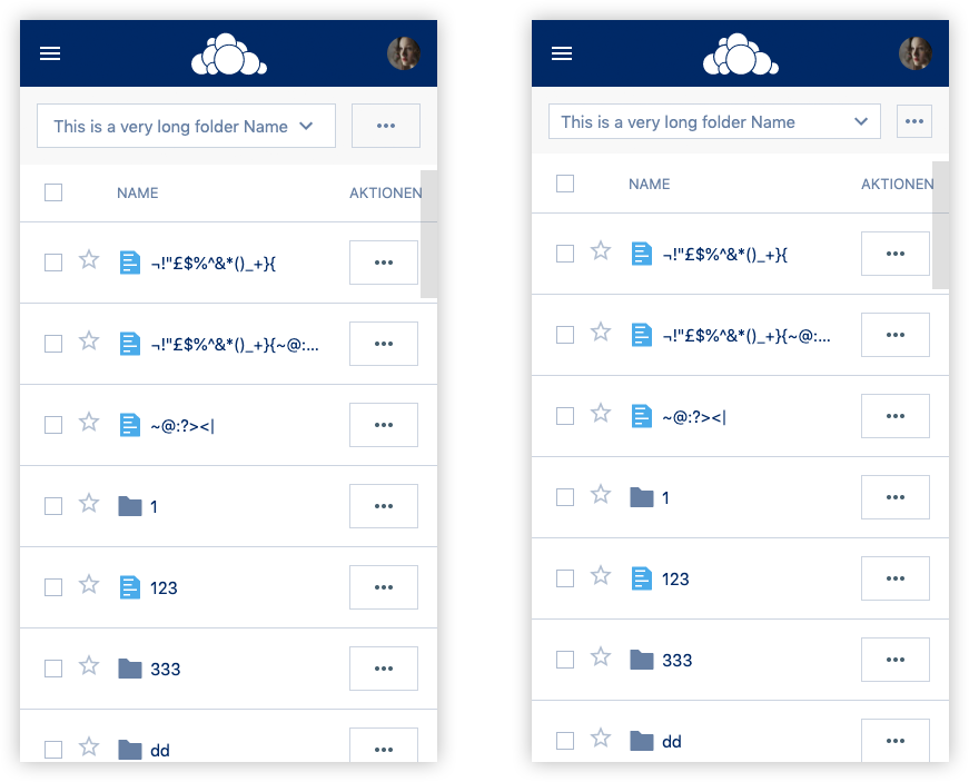
@wuenschedesign Using the small(er) approach on the right, we may be able to show more buttons. Such as search and add. The "rest" will be available inside of the more-button.
felixheidecke
on 26 Jun 2019
Why is the name of the folder in a pulldown menu?
wuenschedesign
on 26 Jun 2019
That stems from the current header implementation that @LukasHirt mentioned here: https://github.com/owncloud/phoenix/issues/1269#issuecomment-505371089
felixheidecke
on 26 Jun 2019
Related issues
 tomneedham
·
3Comments
DeepDiver1975
·
6Comments
LukasHirt
·
4Comments
individual-it
·
5Comments
tomneedham
·
3Comments
DeepDiver1975
·
6Comments
LukasHirt
·
4Comments
individual-it
·
5Comments
 PVince81
·
7Comments
PVince81
·
7Comments