Web: Split file list metadata horizontally instead of stacking
Steps to reproduce
- Open files app in phoenix
- Observe list of files and folders.
Expected behaviour
- Aasy to spot file based on name (this is why you are here, to locate a file)
- Can spot lasted activity, or particular sized file
Actual behaviour
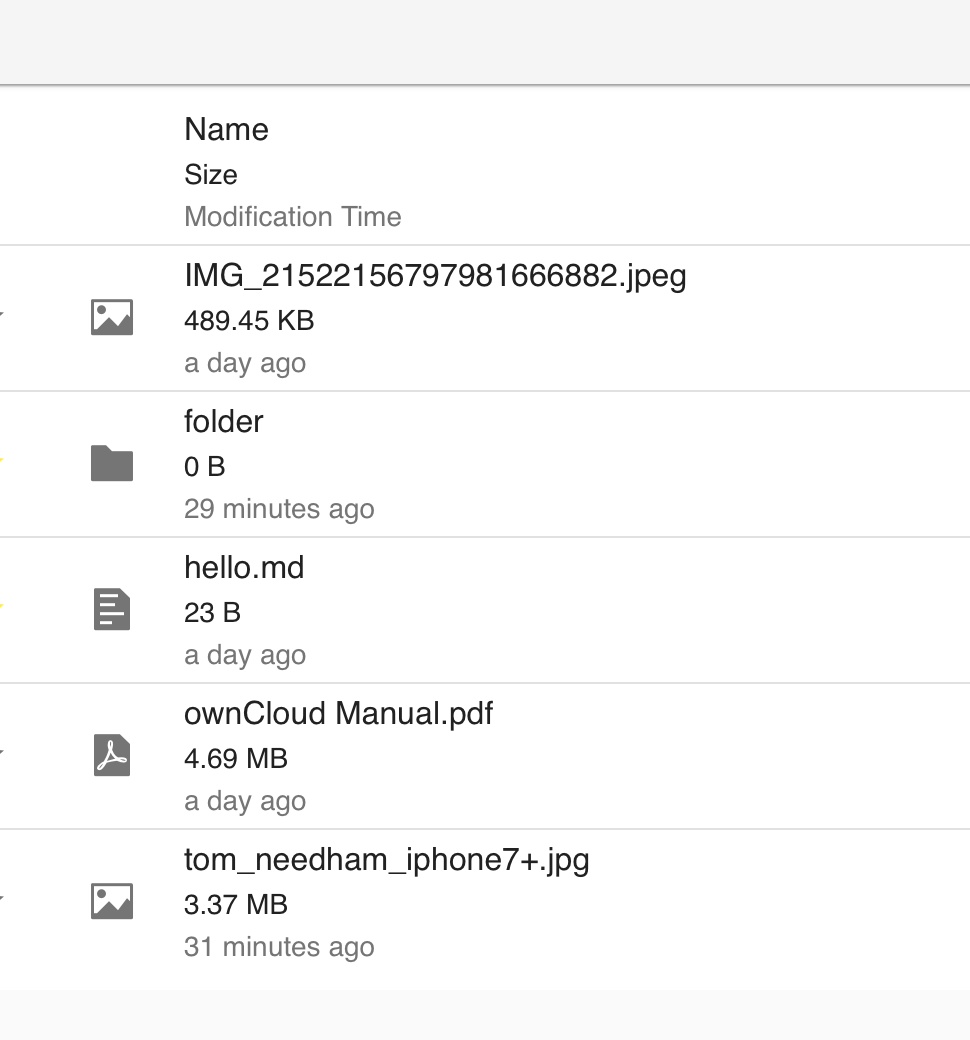
- Metadata for files are stacked on top of each other, essentially in one column
- This makes it hard to scan with your eyes for a particular results
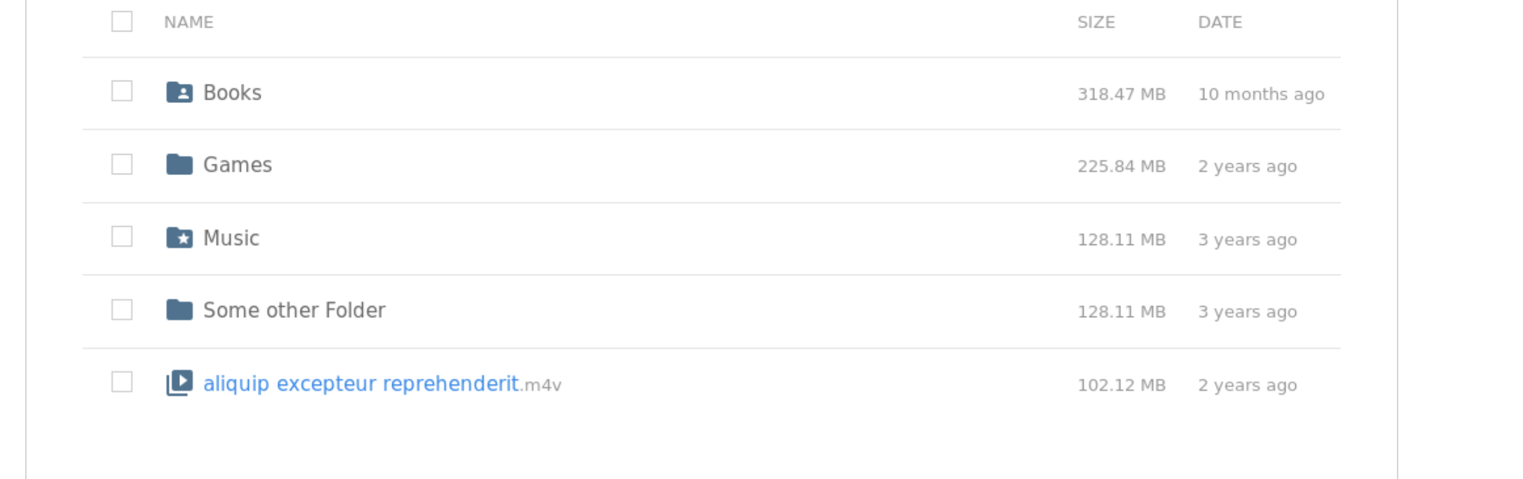
- See native file browsers -> separate columns
- See other cloud browsers -> separate columns
Also allows sorting by column.
Column show/hide is another discussion IMO.
Example of stacked (now):
Example of horiztonal (desire, cleaner, easier to find files, more consistent):
 tomneedham
All 5 comments
Mobile optimised view could have multi-line layout, similar to native mobile apps. (depending on available space)
 michaelstingl
on 31 Jan 2019
michaelstingl
on 31 Jan 2019
They have been stacked because of in case the sidebar is open the space is better used.
I'm far from happy with the current side bar behavior - this needs UX input ....
 DeepDiver1975
on 31 Jan 2019
DeepDiver1975
on 31 Jan 2019
Would rather design a file list that works, than change that, because of another component... :P Seems a bit strange. We can do better! Maybe side bar slides in, and all columns apart from name are hidden
tomneedham
on 31 Jan 2019
Absolutely agree. We can do better and we will so better!
DeepDiver1975
on 31 Jan 2019
Done with ui kit stuff recently
tomneedham
on 1 Apr 2019
Related issues
 PVince81
·
9Comments
DeepDiver1975
·
3Comments
PVince81
·
9Comments
DeepDiver1975
·
3Comments
 LukasHirt
·
4Comments
LukasHirt
·
4Comments
 kulmann
·
4Comments
LukasHirt
·
6Comments
kulmann
·
4Comments
LukasHirt
·
6Comments