As a user I'd like my profile to be representative of my status in Gitcoin.
Profile Refresh
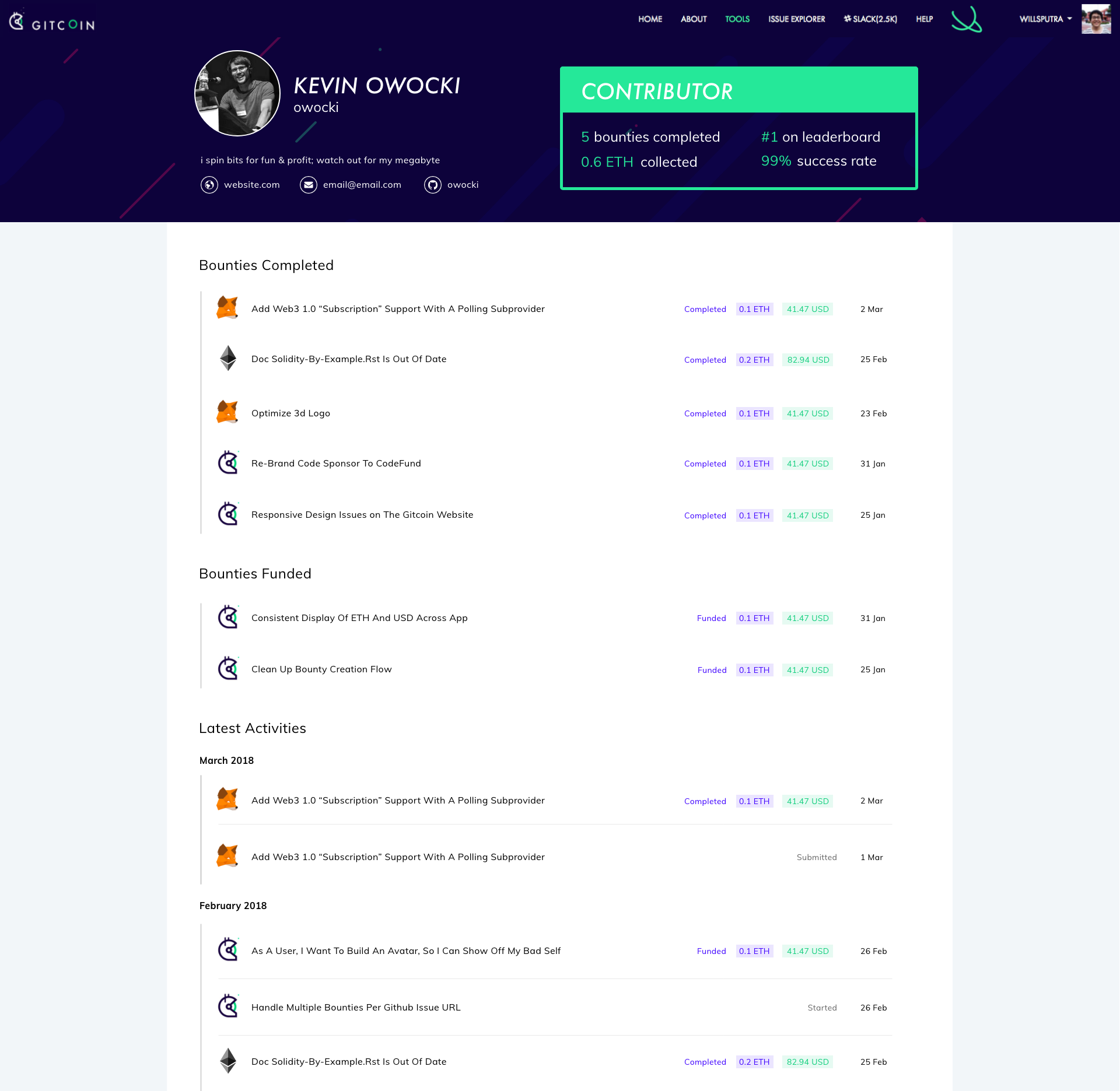
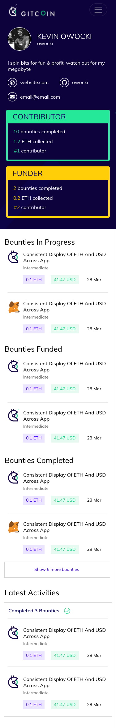
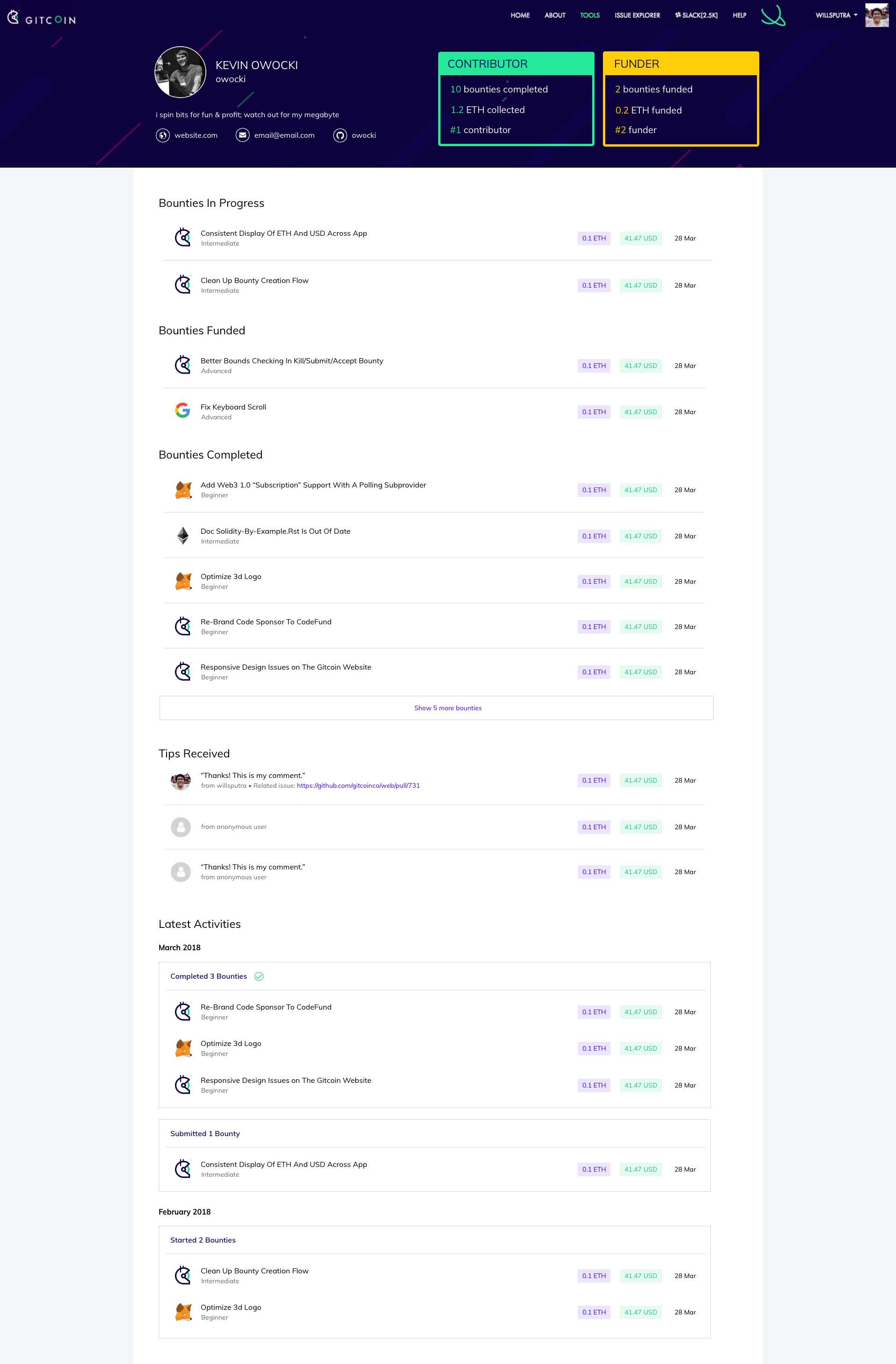
Current gitcoin profiles ( https://gitcoin.co/profile/owocki )
Current Implementation
- some stats i just made up when i was coding the page
- a very rudimentary design
- some responsive design issues
- aren't as purdy as they could be
- doesnt really talk about my core skils
- is not edit-able
- what else?
Bounty
A new profile design with the following items addressed....
Definition of Done
- Designs are based off of @willsputra's initial concept
- Designs and ux that provides a good overview of who I am and what I've done in the system.
- The profile is designed using the Gitcoin UI Kit.
- Designs include the following info: User name, social media info, issues funded, issues completed, success rate, tips, Issue status, Github repos, activity feed, pending transactions.
- Designs include public profile and private profile.
- Finalized designs of desktop / tablet/ mobile view of the profile. Pls allow for 2-3 feedback iterations from the core team
Reviewers
@owocki @pixelantdesign @vs77bb
 owocki
All 58 comments
Some quick thoughts:
- ETH/Fiat buttons should follow consistency from redesigned Explorer
- Text overflow issue in details, probably shouldn't be too difficult to fix
- Recommend following general styling from the Explorer: lead with the Logo of the project on the far left. Font also might be slightly different?
- Might be interesting to include dates for various actions
- Could be interesting to add Filters for top of columns. If Relationship is clicked, that could be filtered A->Z and if clicked again Z->A. Same for status. Bounty amount could go highest -> lowest and then lowest -> highest.
- Hair seems to be wrong in your profile photo? Would recommend fixing this ASAP, very important to stay on brand
 mkosowsk
on 20 Mar 2018
mkosowsk
on 20 Mar 2018
I'll start the ball rolling with one quick idea 😎
mockup (mobile): https://xd.adobe.com/view/6eac6d66-75ed-4a9a-8506-6e13176b2f8f/
some thoughts behind the design:
- I'm guessing each user can be both funder and worker. If that's the case, roles would probably have to be clearer than just Funder/Coder/Newbie.
- I've omitted stats that I (personally) think are less important:
• issue status (do we really need it in the profile?)
• works with, success rate, tips
• github repos
although lemme know which ones are actually important and I'll put them back. - Relationship could be differentiated with different colors.
 willsputra
on 29 Mar 2018
willsputra
on 29 Mar 2018
@PixelantDesign what do you think of the above design? personally i think its a big step up aesthetically from the current profile
owocki
on 4 Apr 2018
@willsputra clever use of bacon ipsum :)
owocki
on 4 Apr 2018
@willsputra do you think this design would expand out to desktop views well?
owocki
on 4 Apr 2018
@owocki Is the section of the profile that has the - Level 1 Funder - Level 3 Worker - ultimately going to reflect the reputation a user builds up? When people look at this, are they thinking "oh this guy is 1/5 here and 3/5 there..." Or is it even on a scale of 5, of 10? Do users know the basis? I like the idea of a certain rating there so people know the quality of the user. I imagine once the reputation system is defined and up and running it will live in this part of the profile.
 skip-carlson
on 4 Apr 2018
skip-carlson
on 4 Apr 2018
maybe instead of levels we can just list the number of bounties youve worked on as a funder / worker
owocki
on 4 Apr 2018
I like the approach proposed by @owocki... Really like a quote from @vs77bb's recent article from Charlie Munger:
Show me the incentive and I will show you the outcome.
At the end of the day, we want to incentivize people working on bounties. By giving people stuff like Level 1 Funder, Level 3 Worker, etc. we introduce complexity for us to maintain and also introduce an artificial mechanism for people to level up on. I think a fair amount of contributors would then focus on gaming this system (human nature, after all) instead of picking the bounties that otherwise would make sense for them to work on.
I think the focus should be on the intrinsic value of completing great work on stuff that interests you (of course incentivized by cold hard ETH 😂) as opposed to an outside leveling system.
mkosowsk
on 4 Apr 2018
Also to reference @mbeylin in one of his past articles on Reputation Tracking:
Anyone who has seen S03E01 of Black Mirror knows the dangers that arise when reputation systems try to take nuanced information and compact them into a single score. A good reputation system should easily explain why someone has a positive or negative reputation, based on clear evidence of their past actions. This also entails the ability for bounty issuers and hunters to be able to post simple reviews of each other, to either flag bad actors or praise individuals.
Perhaps there should be a link to see written reviews of a contributor's reputation.
skip-carlson
on 4 Apr 2018
@owocki Yea will try out the desktop view soon.
Thanks all for the great feedback! For the levels, the thought was:
- In addition to just the number of bounties, should solving more difficult bounties reflect differently on your profile? (example: 1 Advanced bounty vs 10 Beginner bounty)
- If yes, do we need to compile those into a single reputation score/level?
To make it simple, we could also just list the number of bounties worked on, categorised by difficulty like so
owocki has completed:
30 Advanced bounties
256 Intermediate bounties
999 Beginner bounties
willsputra
on 5 Apr 2018
@willsputra Digging the mobile design. Love the bias for action. Couple thoughts, drawing upon the convo from above.
- My sense is a Reputation Score might be out-of-scope for this particular issue. This, as mentioned by multiple people, is something worth thinking critically about and I know the Bounties Network folks have some plans here that I'd be curious to see. If you all think it's critical here though, feel free to speak out.
- If you all agree with this point, I like the number of bounties completed + amount of ETH collected from the original mockup.
- Perhaps add the person's leaderboard position, if that makes sense? From Gitcoin Leaderboard
- Only in one-off situations is someone an active Funder and Hunter. Thus, I think the 'primary role' current profile should be the only section rendered unless the person has a non-trivial amount in both categories (say, 2ETH of both funding and hunting)
Great to see this moving along!
 vs77bb
on 5 Apr 2018
vs77bb
on 5 Apr 2018
Looks good @willsputra!
I do agree with @vs77bb comments on the reputation piece being out of scope for this.
Me Area
I think we have the space to display the information, should we consider displaying?
Activity Area
I like the activity area. Would love to see how pending items could be displayed (if i've submitted work and it's pending a review by a funder or if i've funded an issue and it hasn't completed syncing).
We'd probably also need to determine how much of this displays on my public profile vs. person's private profile.
On the feed item itself, maybe there is a way to pick up the formatting from the explorer view. What do you envision the body copy representing? Could we throw in some real copy to see how that plays out? Are these feed items actionable?
Other Items
Success Rate - Definitely valuable if we can make sure it's calculating properly ( I know there was an issue reported earlier today). I would prioritize this at the top.
Tips - This should probably be a setting that the user can opt to display publicly or not
Issue status - We could show issues the person is currently working on
Works with - This is interesting but I'm not sure how this is currently tracked
Github Repos - This is also nice to have, but could probably be displayed towards the bottom of the page.
I know we don't currently have this, but would love to see how feedback from others would be displayed as well.
Overall I like the direction and would love to see the UI Kit (on the creative repo) applied to this design.
Looking forward to seeing the next iteration!
 PixelantDesign
on 5 Apr 2018
PixelantDesign
on 5 Apr 2018
__This issue now has a funding of 0.26 ETH (98.8 USD @ $380.0/ETH) attached to it.__
- If you would like to work on this issue you can claim it here.
- If you've completed this issue and want to claim the bounty you can do so here
- Questions? Get help on the Gitcoin Slack
- $2365.12 more Funded OSS Work Available at: https://gitcoin.co/explorer
 gitcoinbot
on 5 Apr 2018
gitcoinbot
on 5 Apr 2018
Issue Status: 1. Open 2. Started 3. Submitted 4. Done
__Work has been started__.
-
has committed to working on this project to be completed 1 day, 16 hours ago.
gitcoinbot
on 5 Apr 2018
@vs77bb @PixelantDesign Thanks for the feedback!
My sense is a Reputation Score might be out-of-scope for this particular issue. This, as mentioned by multiple people, is something worth thinking critically about and I know the Bounties Network folks have some plans here that I'd be curious to see. If you all think it's critical here though, feel free to speak out.
Agreed. A more careful discussion might be needed before proceeding with any Reputation Score. 🙂 Will stick with the number of bounties + ETH for this issue.
Perhaps add the person's leaderboard position, if that makes sense? From Gitcoin Leaderboard
Only in one-off situations is someone an active Funder and Hunter. Thus, I think the 'primary role' current profile should be the only section rendered unless the person has a non-trivial amount in both categories (say, 2ETH of both funding and hunting)
Both of this make sense. Will update the design accordingly.
Me Area
I think we have the space to display the information, should we consider displaying?
Which information are you referring to, @PixelantDesign ?
On the feed item itself, maybe there is a way to pick up the formatting from the explorer view. What do you envision the body copy representing? Could we throw in some real copy to see how that plays out? Are these feed items actionable?
I was thinking the body copy would be the issue title, and you can click these items, which would redirect you to the issue details page (example: https://gitcoin.co/issue/gitcoinco/web/656)
About the other items, I'll play around with the design a bit more and see if I can add those. 👍
willsputra
on 5 Apr 2018
Thanks for the detailed response @willsputra. Excited to see where this goes!
vs77bb
on 8 Apr 2018
@willsputra I was just thinking that currently icons are being used to represent github name, email, etc. And since we have teh space, I wondered I thought we could display it. Up to your discretion of course.
PixelantDesign
on 9 Apr 2018
checking in for gitcoin bot 😂
willsputra
on 12 Apr 2018
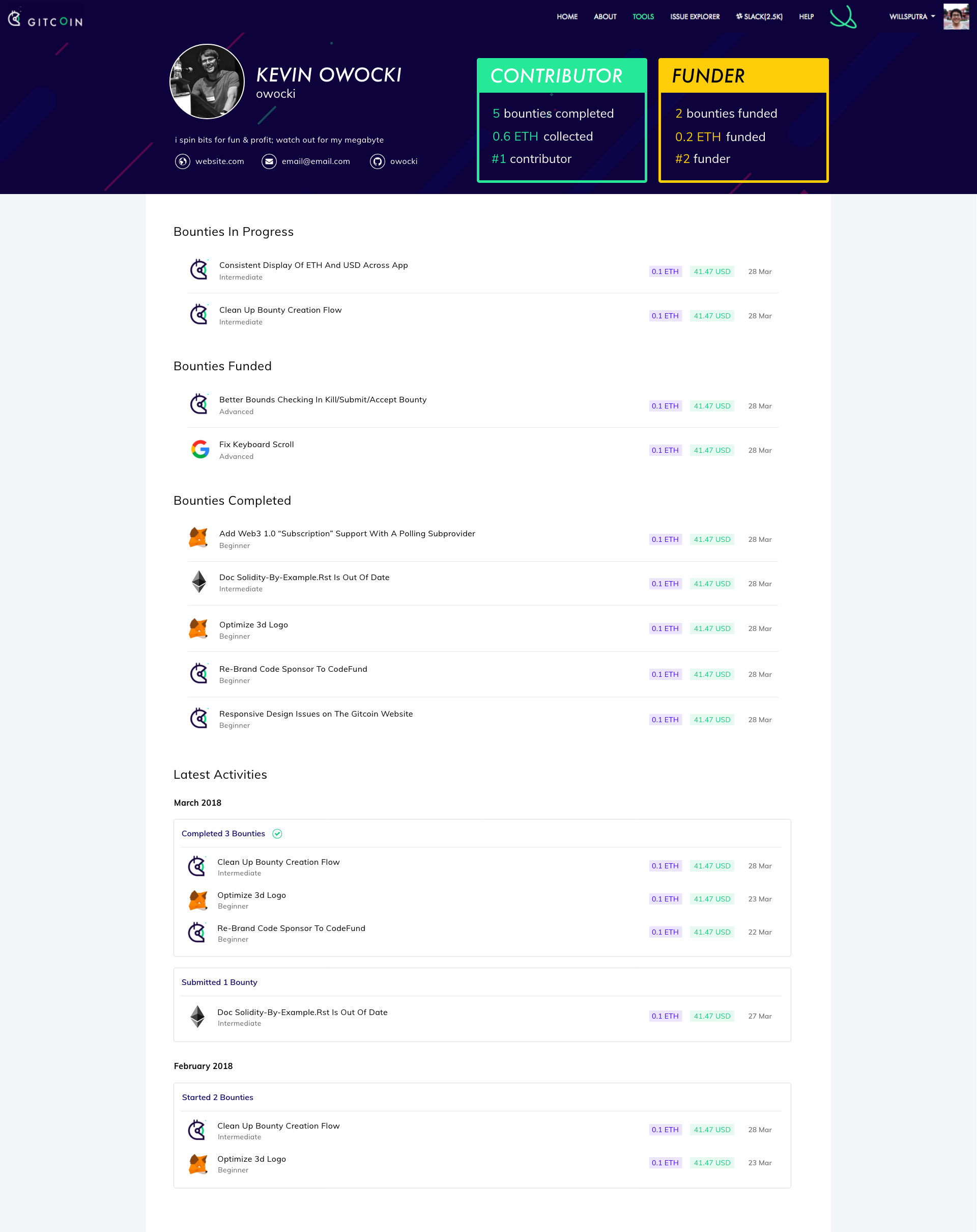
here's what I got so far. thoughts? 🙂
willsputra
on 12 Apr 2018
@willsputra looks great! Couple minor thoughts:
- I think the
FundedandCompletedactions would look a bit better with a black font, think it blends a bit too much into the ETH. This is a matter of opinion tho :) - Would it be possible to include the experience level for the bounties just like the Explorer? Think this provides some good context. Like so:

Great work!
mkosowsk
on 12 Apr 2018
Hi @willsputra looking good!
- What will my title be if I'm a funder and contributor?
- Would it be possible to use the format and styling from the activity feed from explorer detail?
PixelantDesign
on 12 Apr 2018
very excited about this :)
owocki
on 12 Apr 2018
That design 😍
I'm tempted to take up the coding work ! Soo very tempted
 thelostone-mc
on 12 Apr 2018
thelostone-mc
on 12 Apr 2018
@thelostone-mc lets get a finalized design done and lets talk then :)
owocki
on 12 Apr 2018
Thanks all for the feedback! Will improve on it :)
willsputra
on 12 Apr 2018
@willsputra are you still working on this issue?
gitcoinbot
on 17 Apr 2018
yes! @gitcoinbot
willsputra
on 17 Apr 2018
Sorry I did not understand that request. Please try again or use @gitcoinbot help to see supported commands.
![gitcoinbot[bot] picture](https://avatars.githubusercontent.com/in/7735?v=4&s=40) gitcoinbot[bot]
on 17 Apr 2018
gitcoinbot[bot]
on 17 Apr 2018
@gitcoinbot help
willsputra
on 17 Apr 2018
I am @gitcoinbot, a bot that facilitates gitcoin bounties.
Here are the commands I understand:
bounty <amount> <currency>-- receive link to gitcoin.co form to create bounty.submit work-- receive link to gitcoin.co to submit work on a bounty.start work-- receive link to gitcoin.co to start work on a bounty.tip <user> <amount> <currency>-- receive link to complete tippping another github user. help-- displays a help menu
Some currencies I support:
ETH, GIT, TIME & more
Learn more at: https://gitcoin.co
:zap::heart:, @gitcoinbot
gitcoinbot[bot]
on 17 Apr 2018
hmm... gitcoinbot is weird.. thanks for baring with us @willsputra
owocki
on 17 Apr 2018
@owocki. :wave: thanks for the atMention, but you need to install @gitcoinbot on this repo for me to be able to respond. More details in the documentation.
:v:
@gitcoinbot
gitcoinbot
on 17 Apr 2018
Sorry I did not understand that request. Please try again or use @gitcoinbot help to see supported commands.
gitcoinbot[bot]
on 17 Apr 2018
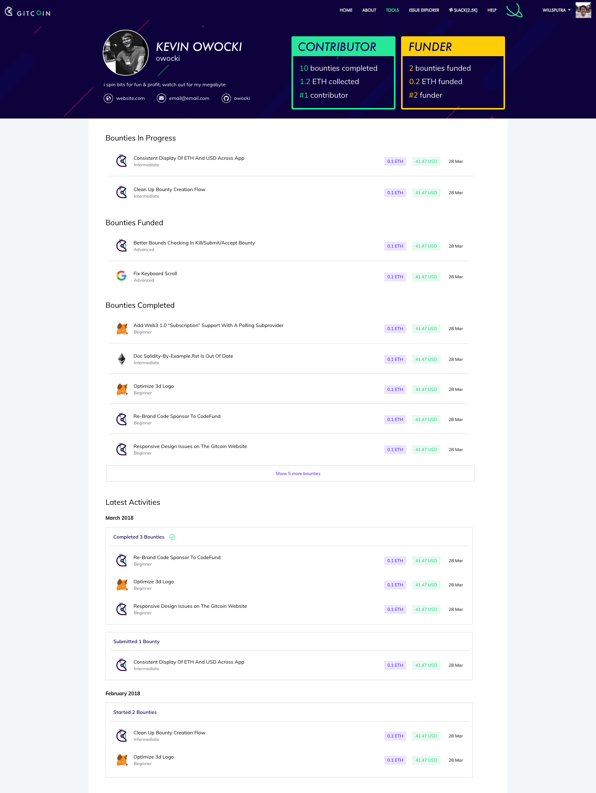
Sorry to keep you all waiting... Here's the latest update, incorporating feedback from both @PixelantDesign and @mkosowsk. Curious to know what you all think 😁
willsputra
on 18 Apr 2018
I <3 it! @PixelantDesign what do you think? i'd love to start getting this coded
owocki
on 18 Apr 2018
hey @willsputra if a user has like 100 bounties like i do could we only show like 10 of them at a time per section and have a '..... 85 bounties not shown, [click here to show more]' button at the end of each section?
owocki
on 18 Apr 2018
Agreed! - I'd like to work with the hunter that picks this up in an effort to modify some of the BE associated with /profile as it seems to be one of our least performant (which could be partially due to it's popularity) views according to Silk. I made a modification to the profile view previously that only utilizes the profile_helper in the event the user is viewing another person's profile, but the helper could probably use a little attention in this iteration.
 mbeacom
on 18 Apr 2018
mbeacom
on 18 Apr 2018
@mbeacom i think that the stats functionality of the old profile is the least performant part (esp for big spenders / hunters).. since that's being removed in this design, that'll help performance too
owocki
on 18 Apr 2018
@owocki saw this before it was posted :)
Looking great @willsputra!
Should we update the CONTRIBUTOR Header font to Navy (Green box)? The white on green is a little hard to read.
I agree with @owocki on the ability to show more bounties for very active funders. We could try showing 10 first with a link to expand to see more or go to a new page that lists them all.
PixelantDesign
on 18 Apr 2018
• Added "Show X more bounties" button
• Changed CONTRIBUTOR Header font to Navy
...and here's the Sketch file: https://drive.google.com/open?id=1AYQMCiBo8N42zZWdDyXFiuRXKjgff3Me
willsputra
on 19 Apr 2018
Thanks @willsputra looks great! I've posted the sketch file on the Gitcoin creative repo as well.
PixelantDesign
on 19 Apr 2018
@willsputra Thoughts on loosing the grey and keeping the background as pure white ? Any chance that might look neater ?
thelostone-mc
on 19 Apr 2018
Issue Status: 1. Open 2. Started 3. Submitted 4. Done
__Work for 0.26 ETH (196.97 USD @ $757.56/ETH) has been submitted by__:
@owocki please take a look at the submitted work:
- (Link Not Provided) by @willsputra
- PR by @willsputra
- Learn more on the Gitcoin Issue Details page
- Questions? Checkout Gitcoin Help or the Gitcoin Slack
$9,648.73 more funded OSS Work available on the Gitcoin Issue Explorer
gitcoinbot
on 19 Apr 2018
@thelostone-mc pure white looks good too! I like them both, don't have a strong opinion on this one. 😂 anyone else have any thoughts?
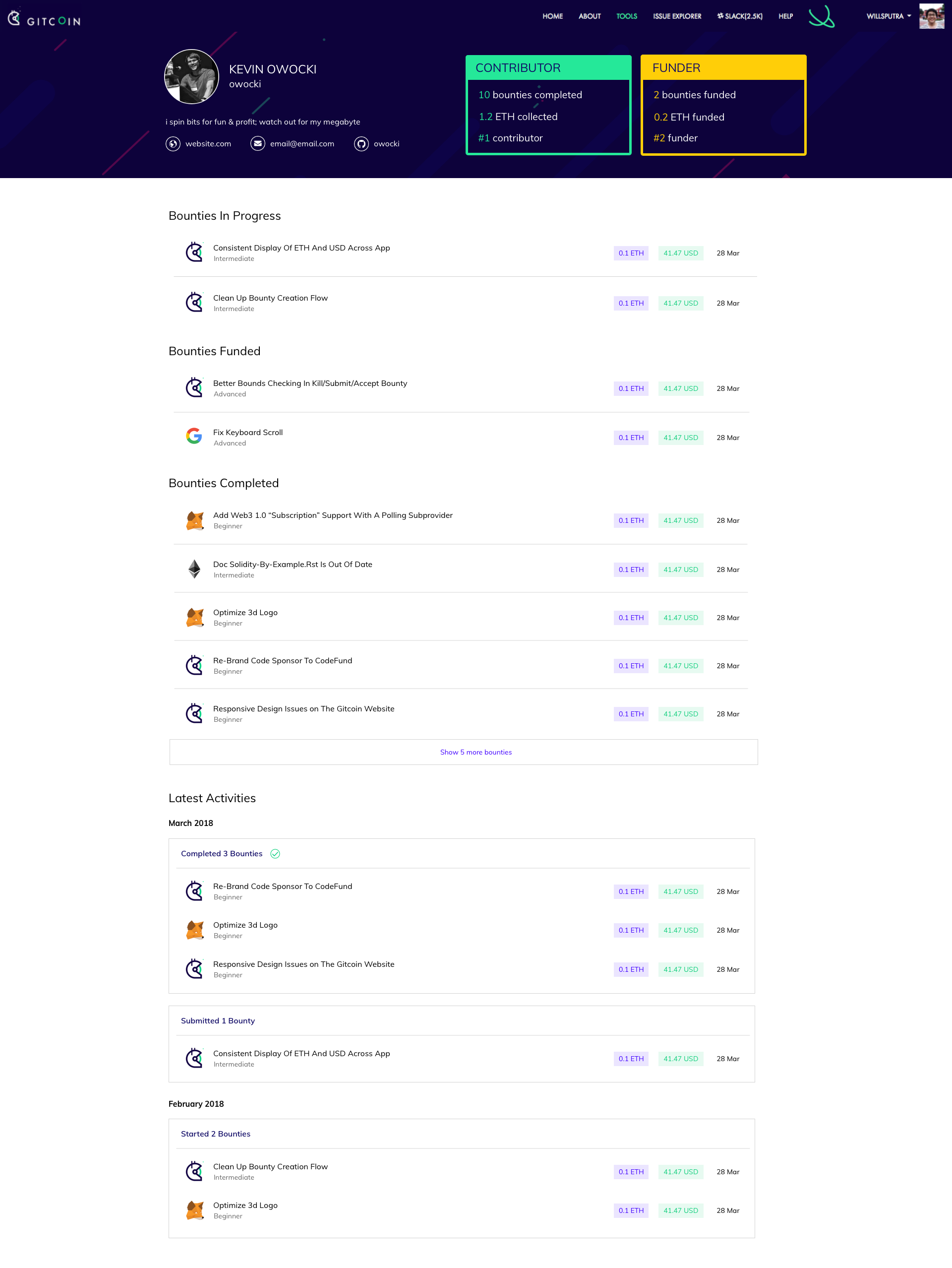
btw I got the mobile view as well. slight change to the header font at the top since the original font was super huge on mobile.
willsputra
on 19 Apr 2018
i'm pumped about this!!1!
owocki
on 19 Apr 2018
anyone working on this?
 mmarinm
on 19 Apr 2018
mmarinm
on 19 Apr 2018
yes @willsputra is
owocki
on 19 Apr 2018
@willsputra @thelostone-mc I think the light gray background gave the center area some definition and focus. The all white makes your eyes wander off to the edge of the screen.
PixelantDesign
on 20 Apr 2018
@PixelantDesign makes sense !!
thelostone-mc
on 20 Apr 2018
@PixelantDesign @thelostone-mc I started to work on the code for the redesign of the profile page. Are the screens from https://github.com/gitcoinco/web/issues/656#issuecomment-382778547 the last iteration of the design process? Can you provide Sketch or PSD files? Not necessary but it would speed up the process.
 michelgotta
on 22 Apr 2018
michelgotta
on 22 Apr 2018
@michelgotta Ah sorry for the confusion !! Ignore the last one
The sketch files are attached along with the design here is final design!
@willsputra quick question : Does the sketch file also have mobile view ?
thelostone-mc
on 22 Apr 2018
@thelostone-mc yep! added the mobile view in the sketch file too
willsputra
on 22 Apr 2018
@willsputra @thelostone-mc Thanks! I skipped the over the link when reading the posts. ^^
michelgotta
on 23 Apr 2018
@PixelantDesign @michelgotta so sorry the Tips Received section was missing from the previous design (also mentioned in #968)... I've added it back below:
willsputra
on 27 Apr 2018
Thanks @willsputra!
PixelantDesign
on 28 Apr 2018
updated the Sketch file too:
https://drive.google.com/open?id=1AYQMCiBo8N42zZWdDyXFiuRXKjgff3Me
willsputra
on 28 Apr 2018
@michelgotta let us know if you need get stuck / just to review stuff ^_^
thelostone-mc
on 29 Apr 2018
Issue Status: 1. Open 2. Started 3. Submitted 4. Done
__The funding of 0.26 ETH (196.75 USD @ $756.73/ETH) attached to this issue has been approved & issued to @willsputra.__
- Learn more at on the Gitcoin Issue Details page
- Questions? Checkout Gitcoin Help or the Gitcoin Slack
- $9,453.89 more funded OSS Work available on the Gitcoin Issue Explorer
gitcoinbot
on 7 May 2018
Related issues
thelostone-mc
·
4Comments
 wizzfile
·
3Comments
wizzfile
·
3Comments
 Skyge
·
3Comments
Skyge
·
3Comments
 kuhnchris
·
4Comments
kuhnchris
·
4Comments
 frankchen07
·
4Comments
frankchen07
·
4Comments
Most helpful comment
@thelostone-mc pure white looks good too! I like them both, don't have a strong opinion on this one. 😂 anyone else have any thoughts?
btw I got the mobile view as well. slight change to the header font at the top since the original font was super huge on mobile.