Wcag: Focus visible using fixed size indicators
Putting an issue from a @jake-abma email here:
An example from the understanding document:

And this one from Jake:
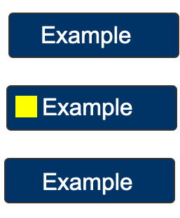
Jake wrote:
For the first one, the indicator is a pass / OK
For the second one I made the buttons just a bit bigger (wider) for increased touch target, but now the indicator fails!
ALSO
When this indicator (the yellow square) is fine for indication, WHY would it not be for other UICs (if the size of the UIC is bigger than for the Example buttons in Alastair's example)
We want the focus indicator to be 'seen' and if the square is enough to be seen, the size of the UIC shouldn't matter anymore for this SC.
My biggest question would be WHY a focus indicator MUST be bigger than others (based on touch target)?
 alastc
All 19 comments
The issue above is from @jake-abma, so this is my comment (chair hat off):
The sizing of touch-targets is a completely different thing to the sizing of focus indicators, I don't see why one would affect the other.
A touch-target assumes you have identified the target, and it is a question of whether you can physically hit the target with a pointer/finger. It is relative to the pointing device (e.g. size of finger).
The focus indicator is something you have to _visually_ track across the screen. To me, tracking a small square (like the yellow box above) within in small boxes like a navigation would be much easier than tracking that same square between large boxes (like the steam example).
If you have a giant box, you need a giant indicator, not a tiny one. Tracking a small box that could appear in the top, left, or bottom of those large boxes (randomly) would be very difficult.
It also doesn't seem to be something people are trying to do, all the focus indicators I've found are borders/backgrounds that go around the element, rather than fixed size icons, which is a good thing.
Overall, I think the results will be easier for the user, and easier to measure in the vast majority of cases if it is a proportional measure.
I.e. if you have good contrast on a standard outline, you pass without anyone needing to get a measuring stick out. If you take it upon yourself to do something custom, then you may need to put more work in to ensure it is large enough across page variations.
Also, in the example above you could make the yellow box proportional to the size of the whole box, and then it would pass on any page variation.
alastc
on 6 Jan 2020
see my example here: https://codepen.io/JakeAbma/full/rNaggxZ
- The menu on the left side is max 200px when @media (min-width: 992px)
- 2 X 200 is 400 px area required
- The focus indicator (green) is 10px X 44px = total: 440px
- focus = fine here
BUT
- zoom 150% / 175 % now menu shows other MQ / tablet / mobile version
- Menu will stretch 100%
- see on tablet or phone direct for 100% stretch
- Width is now: 320px or 480 or 800 or whatever your viewport is on your screen
- focus indicator still 440px area
NEED:
- phone needs 320px X 2 = 640px area?
- tablet with 800px needs now 800 x 2 = 1600 px area?
ALL of the ones WILL FAIL NOW while it is still the same indicator and most important!!!
- the indicator is bigger on the desktop / laptop screen!
- the indicator is bigger on the tablet screen!
- the indicator is proportionately much bigger on phones
So, from a user need perspective it is very hard for the WCAG WG to say one will pass and an equal one or even better ones will fail.
This is due to the need of a solution and the calculation seems a way to try to tackle this need.
Although it solves lots of the need already for certain UICs, it doesn't solve and in my opinion even fails logic compared to different variations.
THE SAME IS TRUE FOR THE EXAMPLES ABOVE WITH THE SQUARE etc.
 jake-abma
on 30 Jan 2020
jake-abma
on 30 Jan 2020
The example convinced me that 2px times longer side is not a good requirement. I would suggest instead:
- for a focus frame around the entire element to define a minimum width (e.g. 2px)
- define a minimum area for a flat focus indicator (e.g. 90 square pixels)
The 90 px are calculated by the 2px times the minimum size for interactive elements on mobile devices (beetween 44-48 px according to Google, Apple and Microsoft)
 JAWS-test
on 30 Jan 2020
JAWS-test
on 30 Jan 2020
@JAWS-test that was exactly my suggestion, we solved half the SC need, the other half we still need to work on (like a minimum size) as the need is to show a properly visible indicator and this means not only based on the click/touch/visible/focussable interactive UIC size.
jake-abma
on 30 Jan 2020
that was exactly my suggestion
I haven't read a suggestion from you here or anywhere else, but only the criticism of the current version of the SC, that's why I made the suggestion. Where can I find your suggestion?
JAWS-test
on 30 Jan 2020
the suggestion was in an internal mail thread and on the calls, but in general the proposed suggestion to look at is to form some kind of a baseline like a minimum size. More thought needs to be put into the idea though.
jake-abma
on 30 Jan 2020
@alastc please think about the following option:
- Minimum area: The focus indication area is greater than or equal to:
- the longest side of the bounding rectangle of the focused control, times 2 CSS pixel, OR;
- the shortest side of the bounding rectangle of the focused control, times 8 CSS pixel, AND;
- The minimum total size is 88 CSS px
Taking the shortest size x 8 will cover the UICs with various widths, like the ones I showed but also cover your examples (30x90 => becoming 30x200, taking the smallest x 8 will need 240px, almost the same as your yellow square)
Only when the target becomes very small, like a 24x24px UICs the "x 8" will not work and also the "x 2" not. For these cases the 88 (based on 2.5.5 Target Size, 2 x 44) will kick in and a solid border will do. (24 x 4 = 96px)
Cheers,
Jake
jake-abma
on 31 Jan 2020
Does the new focus criterion exclude the standard focus of browsers? So far, this exception is not in the criterion, if I see it correctly.
JAWS-test
on 31 Jan 2020
I have a think about that and run it over all the other examples to see if it causes any (different) odd results.
Couple of initial thoughts:
- The minumm size total needs to equate to square pixels, if you were going for 44px x 44px that would be 1,936 CSS pixels, or 44 CSS px squared, not sure which is more understandable.
- The example with a pre-selected item (green bar on the left) fails for change of contrast (green:red = 1.3:1).
alastc
on 31 Jan 2020
Does the new focus criterion exclude the standard focus of browsers?
It means the browser default does not automatically qualify. There are some circumstances where it would, depending on your browser / accessibility support, but in general you would need to apply a custom focus style.
alastc
on 31 Jan 2020
- The minumm size total needs to equate to square pixels, if you were going for 44px x 44px that would be 1,936 CSS pixels, or 44 CSS px squared, not sure which is more understandable.
Was thinking about 44 x 2 (the original calc) equal 88 CSS px squared
- The example with a pre-selected item (green bar on the left) fails for change of contrast (green:red = 1.3:1).
True, will change the color in the example
jake-abma
on 5 Feb 2020
Moving this part of the converstation to this thread, @jake-abma wrote:
my suggestion was simple, a minimum surface of recognition, because that's what we want to achieve in the first place (people 'seeing' the focus).
But in practice that doesn't seem to work well across scenarios. If you go through a range of sizes & control types (e.g. this testing page), having a 88px indicator on giant 'cards' is impossible to spot.
It also makes testing harder. For example, the smallest controls I can see on this page are the editor buttons (AA, B, i etc), which are 26 x 29px. A 1px outline around those would be a surface area of 110px, or the mimimum from the current text would be 2 * 29px = 58px.
Having a non-proportional minimum (like 88px) actually makes it harder to understand & test across elements on a page, as then you have to do the maths based on the size of the element, rather than just looking at the thickness of the indictor.
I need to run through some examples with "shortest side of the bounding rectangle of the focused control, times 8 CSS pixel" to see how that works, but I'm skeptical about a non-proportional minimum size.
alastc
on 7 Feb 2020
another live example failing the SC from the new design of Adrian Roselli.
The 'drop down menu items focus state' (the arrow menu within the 'Blog' category) https://adrianroselli.com/2020/01/my-priority-of-methods-for-labeling-a-control.html
jake-abma
on 11 Feb 2020
The width of the link is 141px, so we're aiming for focus indicator area of 282.
The height of the block that appears is 35px, so the width of the block needs to be at least 8 (i.e. 282 / 35 = 8).
The block is defined as 0.5em, the font size is (by default) 16px so I think an 8px wide block passes...
A pain to work out, but I couldn't see responsive variations changing the size calculation?
alastc
on 16 Feb 2020
8 x 35 = 280 on my calculator... ;-) or may we smuggle a little with the data?
(If so, is 2.9:1 also OK for contrast... OR are our thresholds the bare minimum?)
jake-abma
on 17 Feb 2020
(also all menu's alike, just a tad wider, will fail as mentioned. will the 8px smallest side make the extension to the SC?)
jake-abma
on 17 Feb 2020
So we've picked up discussion on this SC again, and on the last call seemed to agree that, of the options I put together, version 3 is the best direction to go with. That's a refinement of the current text:
https://docs.google.com/document/d/1F83m-HXRkXz1QCF6_QNtQGzIULugMiFSLgtqDRgKA-s/edit#
I didn't include an update from this issue because I wanted to tackle the wider 'simplify this' issues first.
The 'size' bullet in the updated version is:
Minimum area: The focus indication area is greater than or equal to a 1px border of the focused control.
That slightly ups the actual size requirement in favor of being simpler to understand. From @jake-abma's proposal above, I don't think the 88px minimum is needed, a control would have to be under 22px on each side.
The question is then about adding something like:
the shortest side of the bounding rectangle of the focused control, times 8 CSS pixel;
But looking at the example, I still think that a proportional indicator (preferably outline or background change) is better than a block on one short side. What if that were applied to the WCAG 2.1 spec for example? (In the left hand nav on a large screen.)

You're either trying to catch a small block on the left, or a long indicator on the bottom. That proportional indicator makes it easier to catch as your focus moves.
So as a counter-proposal: Let's not add a separate size requirement for blocks and remove the block-example. If people want to work around the more default-method of focus indicators, that's their choice, but we don't have to include it as an example.
alastc
on 6 May 2020
So we have added the 8px min-border aspect (understanding), can this be closed now?
alastc
on 15 Jul 2020
yes!
jake-abma
on 15 Jul 2020
Related issues
 SuzanneTaylor
·
5Comments
SuzanneTaylor
·
5Comments
 yatil
·
6Comments
yatil
·
6Comments
 patrickhlauke
·
8Comments
patrickhlauke
·
8Comments
 smhigley
·
8Comments
smhigley
·
8Comments
 goetsu
·
10Comments
goetsu
·
10Comments