Waveboxapp: Option to hide duplicate service icon in sidebar
- Wavebox Version: 3.14.9beta
- Operating System & Version: Mac OSX 10.13.6
Is your feature request related to a problem? Please describe.
It's not a problem, just a recent change in behavior. In a recent beta, I think 3.14.8, the primary service icon was duplicated in the sidebar. The primary service icon now brings up the last used child service (e.g. Calendar) rather than always opening the primary service itself (Inbox).

Is your feature request related to an account type?
I only use multiple services with Google accounts, but presumably other accounts have the same behavior.
Describe the solution you'd like
I believe the rationale is that specific service selection can now be made using the child service icons, and clicking the primary service icon will bring up whatever most recently used service was. However, I find the old behavior more intuitive, where the primary service icon was specifically attached to the primary service (e.g. Inbox), so that clicking the Inbox icon would always open Inbox. It's also more space efficient. It would be nice if there were an option to restore the previous behavior (i.e., hide the duplicate service icon, make the primary icon always select the primary service).
 jason0x43
All 18 comments
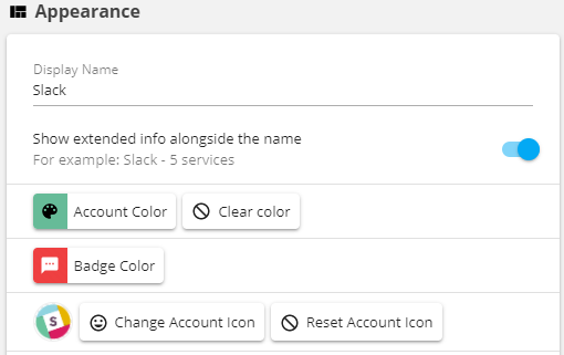
Just a question. But you have the option to replace the icon in the main service also, that is not enough?
The example below is what I use for the slack services (therefore I am wondering):
 nmat
on 27 Jul 2018
nmat
on 27 Jul 2018
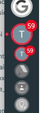
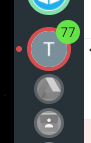
It's not that I want a different icon graphic for the main service, but that I'd prefer to not have multiple buttons that do similar things. The original UI had one icon for each service:

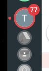
In the example above, the main service icon is "Inbox", and each child service has an icon under that (Hangouts and Calendar). The new UI has a main "Google" service icon, then separate icons for each Google service under that (including Inbox).
Basically, I (personally) preferred the previous layout. I don't find a generic "Google" icon to be particularly useful; when I click one of the service icons, I want to bring that specific service up, not "the last Google service I was using". I would also prefer not to waste vertical space with an icon that I don't need.
The new layout isn't a huge problem for me, it just seems like a minor usability regression (for my usage pattern :) ).
jason0x43
on 27 Jul 2018
This one has been a bit of a headscratcher for us and we have changed the behaviour between this version and the previous versions.
We used to have a concept of a default service (normally gmail or ginbox) which would have a special set of behaviours associated with it (e.g. always first position, can't be moved, only one with sync, etc...). This has been removed in the beta channel to support some new features.
Whilst adding the new features became apparent that the item in the first slot could get lost because of the following...
- Placement of items in the sidebar and toolbar - we now have to guess which item is "first" and it could be a toolbar item rather than a sidebar item. We have a hidden ordering for things like switching to the desired service when switching to an account when there's no last used service, or when long-pressing an account etc. The hidden ordering can be changed under settings be we wanted it to just work out the box and not be an extra config thing. It could be a bit confusing
- Switching back to the last used service rather than the first one - might not always switch to the top service no visual way to switch back to the first one
- Moving the top service around isn't possible if not displayed
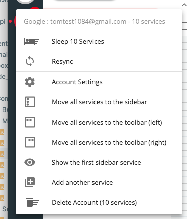
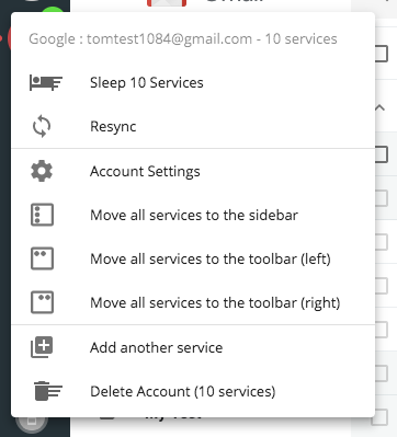
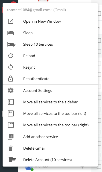
- Providing sync basic options (.e.g resync, reauthenticate, etc..) in the context menu of the larger account icon doesn't make sense as multiple items can resync and reauthenticate
All that said, I do agree with you in it that it brings wasted space into the UI. Our thinking was that it mimics the behaviour of the toolbar more closely (where the first item is displayed) and gives a visual home to all the tooling around the service. I'm trying to think of things that we could do to remove it but still keep it functional. Perhaps if we added an extra switch to prioritize the first sidebar item in which we can do...
- Hide it in the sidebar
- Always place it first in the hidden ordering - most other things just work from here
I guess the caveats to this would be:
- To move it, you'd need to de-prioritize it from settings
- There would be no visible representation in the UI for things like reloading, reauthing etc so there may be instances down the line where it needs to be de-prioritized again to make changes
Not 100% sure what the best course of action would be - happy to take ideas though!
 Thomas101
on 27 Jul 2018
Thomas101
on 27 Jul 2018
What if
- The
defaultservice were an explicit option - The default service could be hidden from the list of child service icons
- The primary icon would show either aggregate info (e.g. the badge) or info for the default service based on whether the default service was hidden or not.
jason0x43
on 27 Jul 2018
Our thinking was that it mimics the behaviour of the toolbar more closely
The sidebar and toolbar really seem like two different environments. For the toolbar you probably don't want to hide the main service icon, because when you're using the toolbar, the sidebar icon is really just an overall service icon (it chooses a context, and the toolbar buttons select a service).
That doesn't make as much sense with the sidebar, though, especially when you leave all the service icons visible all the time (which I normally do). In that use case there's no utility in having one icon select a context, because all the contexts are always visible.
jason0x43
on 27 Jul 2018
I'll have a look to see what I can do :)
Thomas101
on 27 Jul 2018
This is what I've playing with (8d4b018738d5047a0eeed2b872006736d89dbac6), would be good to get your input on it though...
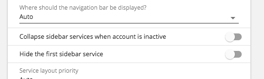
Add an option into
hidethe first service
Once this is done it turns the sidebar from this to this...
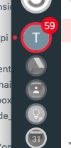
If hide is enabled we add an option into the context menu to show it again...
We also change the account switcher so when you click on the account in the sidebar it always takes you back to the first sidebar service (if available)
Would that help, is there anything that might be missing?
Thomas101
on 27 Jul 2018
That sounds like just what I was looking for. 👍
jason0x43
on 27 Jul 2018
This has just gone out in the latest beta :)
Thomas101
on 30 Jul 2018
Very nice!
I noticed that the "Show total unread count from all services" switch has to be on to show the unread badge on the main icon (or I missed something). Does it still show the aggregate when the "Hide the first sidebar service" switch is enabled, or does it only show the unread count for the first service?.
jason0x43
on 30 Jul 2018
It just shows the aggregate at the moment
Thomas101
on 30 Jul 2018
Ah, it'd be nice to revert to a service-specific badge in that case.
jason0x43
on 31 Jul 2018
I'll take a look :)
Thomas101
on 1 Aug 2018
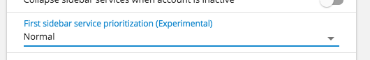
I think this might be closer to what you're after. I've changed the way the setting works but haven't included migration (it's beta) so you'll need to re-change this (sorry!).
It now consists of 3 modes (normal, collapsed & primary)
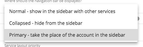
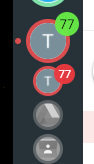
Normal gives you something like below. I've changed the account icon to green so you can see the difference. If there was another service with a count of 10, the green count would always be 87...
Collapsed is similar to what you've been trying out with the aggregate count...
Then primary replaces the account icon badges and counts etc with the sidebar one effectively making the top item the service...
The popover has had some changes too. When it's in normal it looks as it does now...
However if using collapsed or primary we're including options for both account and service. It gets a bit long but I think it's okay. This removes the need to re-show the service to get options on it
I think that's going to work better, but feedback would be great, particularly on the wording in settings. Anything to make it clearer what it does would be great. This will ship in the next beta shortly :)
Thomas101
on 2 Aug 2018
Yes, this definitely looks like it's going in a good direction.
Possibly "Hidden" would be a better term than "Collapsed". Collapsed things may expand at some point, but the hidden service icon won't be shown again (I assume) unless the user changes the setting.
I think it makes sense to include both the account and service icons in the popover. The menu isn't unreasonably long, and it's where a user (well, where I) would intuitively expect to find both sets of options.
jason0x43
on 2 Aug 2018
Sorry it's taken a little bit of time to get the release out, but the option is available in 3.14.14 :)
Thomas101
on 15 Aug 2018
Hi, this has just been released in the latest version of Wavebox (4.0.0). You can get the update by using the Application/File menu and clicking Check for Update or by downloading the latest version from our releases page or download page. Thanks!
Thomas101
on 10 Sep 2018
@Thomas101 is this feature in Wavebox 10? (I can't find it)
If not, any plans to add it?
Thanks
 cdeutsch
on 30 Nov 2020
cdeutsch
on 30 Nov 2020
Related issues
 texelate
·
3Comments
texelate
·
3Comments
 Tahini-123
·
4Comments
Tahini-123
·
4Comments
 MichaelTunnell
·
3Comments
MichaelTunnell
·
3Comments
 dctucker
·
4Comments
cdeutsch
·
3Comments
dctucker
·
4Comments
cdeutsch
·
3Comments