Walletwasabi: [Mega Thread] Wasabi is Not User Friendly
I keep getting these reports lately. This is bad. Very bad. I'll start collecting the reports here, since the people who don't succeed with Wasabi are not the ones who are on GitHub.
 nopara73
All 42 comments
nopara73
on 25 Apr 2019
Maybe you need something looking like:
Could be in a new "Home" tab? With automatic mixing in the background for non-technical users?
*edit: drew a fancy Home tab that beginners could be less intimidated by
 kravens
on 26 Apr 2019
kravens
on 26 Apr 2019
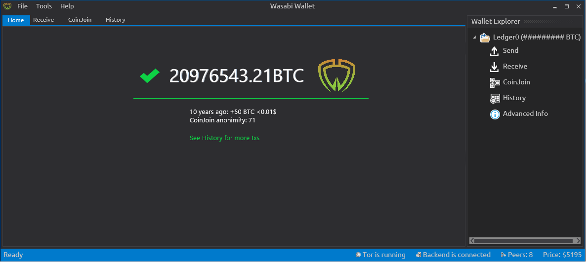
@kravens I don't understand what any of these numbers mean.
10 years ago: ???
 Transisto
on 27 Apr 2019
Transisto
on 30 Apr 2019
Transisto
on 27 Apr 2019
Transisto
on 30 Apr 2019
nopara73
on 2 May 2019
color, https://github.com/zkSNACKs/WalletWasabi/issues/1394 Gonna make it easier to create day mode.
labels,
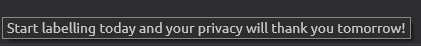
requiring label can decreases privacy in some situations, It for sure increase paranoia but if these label get leaked it can compromise privacy offchain.
IMO It's counter productive to privacy to require a "source of fund" to be recorded in the wallet to increase privacy.
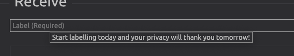
The Label required pop-up fast and this tooltip may not be seen by anyone:
suggestion: Remove mandatory label and replace with a popup explaining the benefit of labeling with a "Do not show anymore toggle"
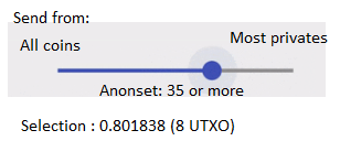
- Coinjoin tab
We could have a simple UI design that focus on having two categories of coins
Non-Private and Private with an action to make more of them private.
There would be a default anon-set and customizable threshold to mark an UTXO as being part of one category or another.
In the meanwhile a step by step walk-through of the UI on first start might best way to bring important concept onto new users.
That most-all other wallet don't recognize the concept of UXTOs should not be our problem.
- Sending
For now should definitely have "select all private" as default selection.
Suggestion for a simpler coin selection interface
Transisto
on 2 May 2019
Dropping here these two recent interviews those extensively questioned the UX:
nopara73
on 5 May 2019
In General: I am a Wasabi user myself and think the feature set is great.
Being a user with a technical background and knowing the basic Bitcoin jargon, I might even be representative of the current target audience for the wallet app.
Nevertheless I think the app could be more approachable for non-technical users, as not everyone wants to spent his time getting familiar with deeper knowledge first.
And I truely believe that everyone should have easy access to a wallet that protects the users privacy and guides them towards best practices by default.
I imagine the improvements to happen in at least two stages:
- Tackle some low hanging fruits and make it easier for the current audience:
Users that might not be discouraged when encountering technical terms and explanations. - Once the app works great for early adopters, we can take on optimizations for non-technical users.
Tuning the UI and workflows for general adoption by abstracting technical intricacies.
Let me start by covering just the onboarding experience as an example.
This way we can see if my ideas and suggestions fit your expectations and if so, how they can be integrated in the future.
Onboarding
This is the first time the user gets into contact with the app after installing it.
Evaluation
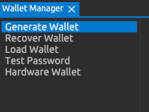
Right now the user is greeted with the "Generate Wallet" screen:
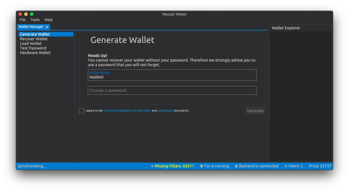
There are three use cases this screen needs to support:
- First time setup for a completely new user: Generate a new wallet.
- Recurring user who maybe lost his data: Recover an existing wallet.
- Connecting the users hardware wallet and take it on from there.
Suggestions
Focusing on these three cases would benefit new users as well es existing ones.
The screen could be decluttered by leaving out the other features, which all require at least one wallet to be setup:
- Load Wallet
- Test Password
- Wallet Explorer
Wasabi should defer presenting them to the stage where the user has advanced and setup his wallet.
Same holds true for the status bar at the bottom: At this stage it is not necessary to present this kind of information to the user, especially if it is a new user. The status might eventually be useful for debugging purposes, but should be hidden in the menu at this point in time. (see Peter McCormack's remarks in the interview)
As the "Wallet Manager" is the only tab being present at this moment, it should also be eliminated.
Bringing together all of these clean-ups, we could arrive at a more focused and welcoming onboarding screen like this:

Each of these sections could be followed up with a similarly cleaned up version of the current screens.
Let me know what you think – I'm looking forward to your feedback. I'd be willing to brush up the UX of other screens and workflows as well if that's desired.
Notes
I could not figure out which font is used so I took a similar one.
Icons made by EpicCoders from www.flaticon.com is licensed by
CC 3.0 BY.
 dennisreimann
on 5 May 2019
dennisreimann
on 5 May 2019
Additions to Dennis Reimann's comment
Really like @dennisreimann comment! I'd like add a few remarks, some suggestions to it.
Generate ...
- Title says "Generate", than it's "Create". Why not just use "New Wallet"?
- This action should have a "+" symbol
Recover ...
- Title says "Recover", than it's "Restore". Why not just use "Load Wallet" (load from disk, load from seed, .. )?
- This action should have a "arrow down" symbol
Hardware ...
- ...
Random remarks
Some other remarkes I'd like to mention. I know Wasabi is in an early state and a working, bugless core is more impartent than UX and the UI, but why not address them and make thing better on the go.
- Sign Wasabi app for mac OS

- Why? Aren't we _permissionless, .._ ??
- Better contrast, more ~white~ black space and set a bigger font.
- Difference between "Load" and "Recover", see ^^
- Wording: "Choose a Password" vs. "Set a Wallet Password". Choose whould be from a drop down, selection or something similar.
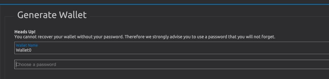
- Why not use empty passwords?
- First thought was "Why not us dots like every other app does it?"

The intention about the masking
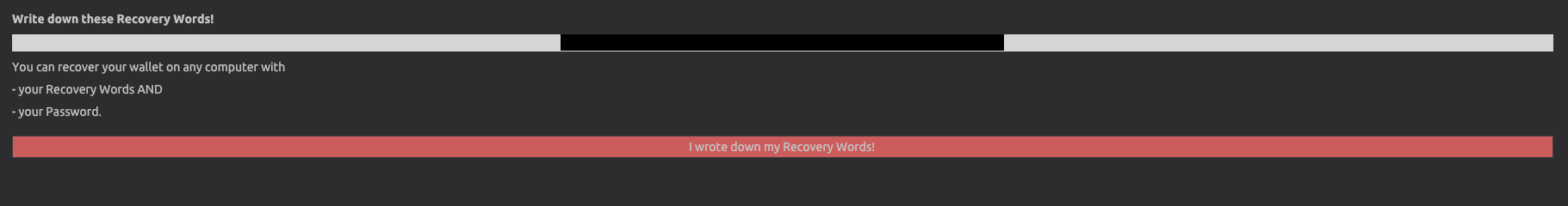
will be explained later. This could be done here already. - Wording seems too simple here. Why not go a bit into the details? (Seed? Mnemonics? Is it BIP39 compatible, ..)
- Contrast, font, animation – could be improved.
- And more context based info. What is a "Label" in this context? What is it used for later.

Why?
- Why not compute the complete estimated percentage and value in BTC based on the anonymity sets?
More explaination could help here (or a link to the docs). - This design pattern makes not much sense if only one wallet can be loaded at the same time.
- $ Price in the lower right: What $ (CAD; USD ; .. ?) Has this a relevance? Not really - why not drop the fiat value as Samourai did?
Receive
- not just copy the address once to the clipboard
- show receive address for verification
(more to come)
Thanks for making Wasabi Wallet.
 xavierfiechter
on 8 May 2019
xavierfiechter
on 8 May 2019
Some additional suggestions;
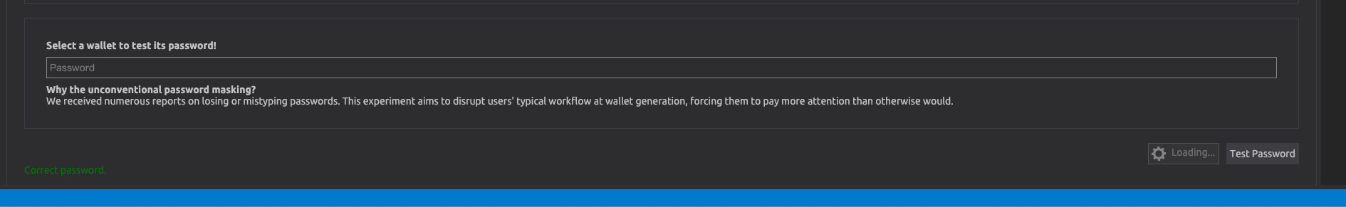
The paragraph about unconventional password masking may confuse new users who don't know what 'password masking' means. Suggestion: switch to * style & paragraph saying to record the password securely.
A a new user may not know whether to 'Load Password' or 'Test Password'? Suggestion: Make Test Password a more faded colour to discourage clicking.
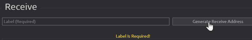
Suggestion: Have the label text box appear after clicking generate receive address, rather than letting the user click generate with no label and get a warning.
'Copied' text when generating a new address appears and disappears too quickly. Suggestion: increase time to fade
QR is not central in the white box (in the bottom right hand corner). Suggestion: Make central.
'Receive' is the first tab you are sent to but it is the rightmost tab (Send | CoinJoin | History | Receive). Suggestion: re-order to indicate typical workflow (Receive | CoinJoin | Send | History).
Many new users will not know what 'CoinJoin' is. Suggestion: Just title that tab 'Mix'
Do users need (or want) to see the Key path of the address? Same with the public key. Suggestion: Hide this more detailed info behind a button or display on hover over the QR code.
The label assigned to an address is just floating to the right of the address. Suggestion: Label the label, i.e. if the label given is 'Demo' then have 'Labels: (Demo)' rather than simply 'Demo'.
Not obvious how to see a QR code. Suggestion: Make it easier to get QR code by showing a thumbnail which enlarges when clicked.
You can right click an address and click 'Show QR code' but you can't right click and 'Hide QR code'. Suggestion: Add 'Hide QR code' if right clicked address has QR showing.
 6102bitcoin
on 9 May 2019
6102bitcoin
on 9 May 2019
Guys, I love this thread, the suggestions here are gold. It'll be a breeze to come back to this issue and create a comprehensive plan to tackle this issue. I think we should spend a whole development cycle dealing with these.
nopara73
on 11 May 2019
I found this thread because I'm just trying to load the test net to debug Avalonia's problems with large lists. I've loaded the TestNet.json that @danwalmsley sent me and this is what I see:

The spinning "Loading" icon suggests that everything is working as expected, but this is taking a _long_ time and I keep getting "Missing Blocks: 1" popping up, together with "Missing Filters: 19000". Here's what's going through my head:
- What does this all mean?
- Is everything working or not?
- Is it normal that the load would take >10 minutes?
- Is it actually doing _anything_?
Not sure what would help here, but some sort of message saying "This may take a long time" and some sort of progress bar might give me confidence everything is going as expected, as well as maybe not flashing up "Missing Blocks: 1" every second or so?
 grokys
on 13 May 2019
grokys
on 13 May 2019
@grokys are you on latest master code, this was an issue I was also struggling with recently but has gone away now.
 danwalmsley
on 13 May 2019
danwalmsley
on 13 May 2019
Glad to offer some feedback too, as an end user who is not super technical!
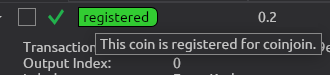
I've learned recently about UTXOs and believe the above tooltip is about a UTXO, yes?
Anyway, if that is too technical, "This coin" would be more accurate as "These coins". "This coin" sounds strange, as if there's one coin of some sort (1 BTC).
In the History tab,
- the dark red on blue color scheme for the amounts is hard to read:

- as Wasabi doesn't have an export transactions feature that I could find, I'd like to be able to copy to the clipboard the amount of the transaction, so I can paste it in a spreadsheet (and the date, too). The TX ID actually is less useful, and a small privacy risk (maybe worth informing the user about pasting it in block explorer sites over a non-Tor connection?).
- I can't see the fee. I see Date, Amount (BTC), Transaction ID, but not the fee.
- I can't see the label I was asked to enter when I sent some coins.
- The confirmation status is either a green checkmark, or nothing. In other clients, there was more information, like how many confirmations were received.
PS: please let me know if I should create separate issues for some of these observations.
 cryptal
on 14 May 2019
cryptal
on 14 May 2019
This is the only peer reviewed paper on the usability of bitcoin in general as far as I know. It may have some insights to a general user's thinking and what can be improved from a high level: A First Look at the Usability of Bitcoin KeyManagement
 DanGould
on 23 May 2019
nopara73
on 26 May 2019
DanGould
on 23 May 2019
nopara73
on 26 May 2019
I think such a beginners guided tour at first wallet start will help greatly with UX of n00bs!
1500
 MaxHillebrand
on 27 May 2019
MaxHillebrand
on 27 May 2019
What led to the choice of Avalonia UI? Wouldn't Xamarin.Forms be a better fit for the cross-platform UX and, because of the larger community, already have platform-specific details ironed out through trial and error?
DanGould
on 27 May 2019
@DanGould I can't recall. I remember I was trying to make that work without any success, but I can't recall the architectural differences anymore.
nopara73
on 28 May 2019
Less technical error messages.
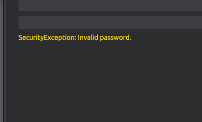
"Please enter your password and press
to CoinJoin. "
- or something similar.
Place the error message where the button is (or near the password input) to reduce eye fixations. New they are distributed over 3 places in the UI.
Suggestion to use can be found here: How to Make Your Form Error Messages More Reassuring
xavierfiechter
on 5 Jun 2019
nopara73
on 11 Jul 2019
nopara73
on 11 Jul 2019
Here is an incomplete inventory of wallet UI patterns. Thanks @21ChenYe.
please help if you see something changed
https://docs.google.com/presentation/d/1Ka6it_XDITuo_EGHXhWuOhoQ2QgoCM8NZShQIuKP_Xc/edit?usp=sharing
DanGould
on 12 Jul 2019
@DanGould Wow, that's great and will definitely help cleaning up and consolidating!
dennisreimann
on 12 Jul 2019
I think there should be a lightweight interface that is a bit more hip and light. Made a mockup here: https://imgur.com/WwxohGt a lot of functionality could be hidden at the start. Right now the user is overwhelmed with options. (perhaps there could be a light and advanced interface?)
 Mixelated
on 19 Jul 2019
Mixelated
on 19 Jul 2019
We've discussed the idea of having two modes - one lightweight, one power user - but keeping track of two separate GUIs is alot of additional hassle.
I like your mockup @mixelated, thanks!
MaxHillebrand
on 19 Jul 2019
What I could imagine: not having two separate modes/GUIs, but shifting the approach towards offering a simpler UI by default and making more advanced/less used features accessible via the menu or toggles (depending on the context).
I also have ideas around that but cannot come up with the code as I‘m not a C#-coder. I thought about building a clickdummy with Vue.js, but that‘d be more work initially and I‘m not sure whether or not it is worth it.
dennisreimann
on 19 Jul 2019
agreed. I think in general theres only 3 sections needed that would need to be consistent throughout the app. A tools bar (same one as we currently have) , a sidebar and a details screen. The navbar could also have some easy access tools such as privacy: https://imgur.com/a/d19iTrc
Mixelated
on 19 Jul 2019
I really like this @Mixelated, thank you!
Everything is nicely in one screen, and I'm not missing much.
This will be especially awesome with multi-wallet support coming in #twoweeks.
When you press Receive, how about a pop-up with all all recently created addresses and labels, with drop down for the address details and QR, as well as a new address labeling field.
I'd also like to have the fee slider with the send tab.
What do you want to do with the Privacy Mode in the top right?
MaxHillebrand
on 19 Jul 2019
Privacy mode for hiding balances although I’m not sure how relevant that would be for a desktop app. Yes the send and receive would both be modals with all properties. Will spend some more time thinking about it in the upcoming week. Will also look a bit more at the user feedback as I need more insight in how users use the wallet. Personally I’d love to see overview of my crypto when opening the wallet (last used wallet) but others might be more interested in their privacy status of the wallet. Think the goal here is to please the majority without trying to please everyone and clutter it.
Mixelated
on 21 Jul 2019
I find it important to note the Reddit support and website are also part of the user experience and must be taken into consideration when creating a cohesive experience
DanGould
on 23 Jul 2019
Yes @DanGould! FYI, working on a new documentation archive.
MaxHillebrand
on 23 Jul 2019
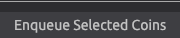
I had created /generated a hardware-wallet-address in my wasabi-wallet, which I should have not done, since coinjoining is impossible anyway. for a newbie or inexperienced user like myself, this is totally confusing- now i know why my mix-attempts last couple of times did not work. i hope i figured out the correct way how to generate a NON-hardwarewallet-receiving-address for coinjoining. finally, i found the "enqueue selected coins"-function within the coinjoin-section. you guys are doing an amazing committed work, but we have long way to go until we have an "idiotproof", easy-intuitive userfriendly and pretty much By Default-application. For exactly this reason, I had an interview with Patrica Estevao (UX, UI, graphicdesign etc.) on my show. Can we simplify the coinjoin-process. All newbies and inexperienced users want is to send their satoshis from their exchange to their hardware-wallet, but with full privacy and fungibility...
Thank you all for your awesome work! Thank you MaxHillebrand and nopara73 for your precious feedback and help.
 TheTotalConnector
on 9 Aug 2019
nopara73
on 28 Aug 2019
TheTotalConnector
on 9 Aug 2019
nopara73
on 28 Aug 2019
@nopara73 thanks for sharing the link, here's the published story: https://uxdesign.cc/the-mythical-privacy-in-the-age-of-bitcoin-and-what-were-doing-about-it-bd9d166d9dfa
 mayankchhabra
on 2 Sep 2019
mayankchhabra
on 2 Sep 2019
Dashbord brainstorming: https://github.com/zkSNACKs/WalletWasabi/issues/2366
nopara73
on 30 Sep 2019
I would like to move this issue to the design repository. What are your opinions?
 molnard
on 14 Oct 2019
molnard
on 14 Oct 2019
@molnard The way I look at it, usability became an issue in wasabi because design and engineering have been treated as distinctly separate endeavors. Engineering decisions must be made with UX design in mind if we are to bring these now distinct camps into one to resolve this issue. I think separating this issue into the design repo removes the issue from the source when the source is precisely where it must be tackled.
DanGould
on 14 Oct 2019
I went through this issue again and I think you are right. This specific issue is closely-coupled with the current design and the current workflow and mainly contains suggestions on how to fix current UX problems.
However, in the second part, I would disagree. A separate place is needed where only the UX can be discussed from the beginning. We have a nice business logic at the background which will do the job but I am not sure we would build the interface according to that. My recommendation is to attach the UX to the users instead of attaching it to the source-code. Later if we will figure out the proper UX bring it back and try to implement it.
molnard
on 14 Oct 2019
I am collecting the challenges of wasabi UI in this survey. Please fill in if you have a spare 5 minutes. Your contribution is very valuable as u are the most concerned user about Wasabi-UI.
https://forms.gle/jarWQ1qoWppyRM4XA
molnard
on 16 Oct 2019
May I share this UX concept that emerged after a brain storming with @nopara73.
The scenario is that we have implemented a full JoinMarket functionality, P2EP, and even "naive CoinJoin" which are unequal value batched transactions. Also, we have figured out how to send precise amounts within a ZeroLink CoinJoin. Now that we have this fancy CoinJoin magic, we want to provide a simple UX where the user gives enough information about his preferences so that Wasabi can make a good judgement on what CoinJoin to use.
This picture shows the four questions [black] with the possible answers [blue] and the technique that will result [green].
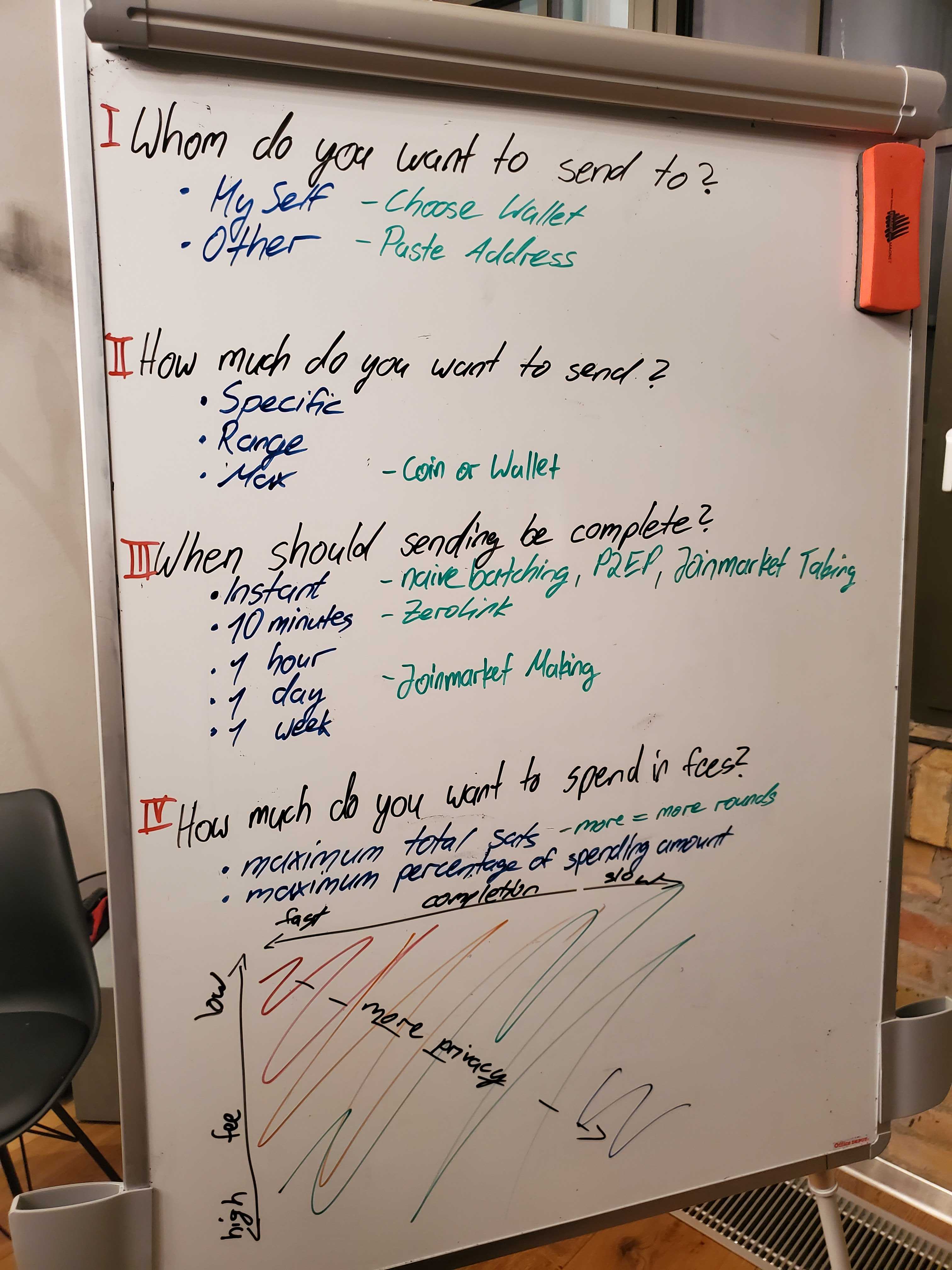
Question 1] and 2] are trivial, and already part of any Bitcoin transaction. Though we also assume that we have proper multi wallet support, and thus there is an easy drop down menu to select spending from your hot wallet to your cold wallet, for example. This makes 1] even more easy for users.
Although the question 2] works with the GUI coins too, we might be at a point with sufficient smart and private automatic coin selection, which would further de-clutter the UI.
Now comes the interesting question 3], where the user sets his time preference on when the whole sending process should be complete. Notice that this is similar UX to the onchain confirmation target, however, fundamentally it is much deeper. For example, a user specifying a 1 day period, can do 10 zero link mixes. A user with high time preference of 1 hour, can only do 1 zero link mix. Thus, this time estimation includes the quantity of mixes, as well as the mining fee priority. In general, the longer the wait, the higher the privacy. For example JoinMarket making makes only sense for longer time periods of well above 1 day. And ZeroLink is not possible for instant transactions, but naive mixes or P2EP are.
And finally question 4], where the user sets the maximum fee he is willing to pay for the entire ceremony. Either in total sat amount, or in percentage of spending amount. Again, rather similar UX to what is done currently with the mining fee, but it goes deeper. This fee includes both mining fee, as well as the coordination fee for zero link or joinmarket taking, as well as the profit taken from joinmarket making. In general, the higher the maximum fee the user is willing to pay, the higher his privacy. If a user wants low fees, but can wait a long time period for the completion, then he can do a lot of Joinmarket making and thus earn sats that cover the fees elsewhere.
The user input for 1] and 2] are the same as they have always been [well, the drop down from multi wallet support is a nice addition]. Though I think we can make a very beautiful and intuitive input for 3] and 4] too. This is the bottom matrix, that has the completion speed on the x axis, fast is left, slow is right; and the maximum fee paid on the y axis, top is low, bottom is high. Depending on the coin situation of the user, there is a color gradient within this matrix to show the privacy level that will be achieved with the given constraints of time and fee. For example, when the user has all un-mixed coins, then if he sends fast and low fees, he gets almost no privacy, thus the upper left corner is large red. Contrarily, if the user has all his coins mixed already, he can send a fast transaction paying almost no fee, and still have good privacy, thus the top corner is even green in this case. It can be "gamified" that a user is rewarded when he has all mixed coins, and thus all of his matrix is green, with a Wasabi shield icon in it.
So the user has the constraints of maximum fee and completion time, and he will choose whichever trade-off gives him the privacy level he desires. The input is a simple click into any place within the matrix, and the fee and time is deduced from this.
The user journey is rather simple, yet it gives sufficient information to make smart decisions on which CoinJoin mechanism to use.
MaxHillebrand
on 17 Feb 2020
Created a brainstorming space in the design repository about Wasabi's new Startup screen.
https://github.com/zkSNACKs/WasabiDesign/issues/10
Anyone who feels inspiration is welcomed!
molnard
on 8 Apr 2020
Related issues
 yahiheb
·
3Comments
yahiheb
·
3Comments
nopara73
·
3Comments
yahiheb
·
3Comments
yahiheb
·
3Comments
nopara73
·
3Comments
 RiccardoMasutti
·
3Comments
RiccardoMasutti
·
3Comments
 2pac1
·
3Comments
2pac1
·
3Comments
Most helpful comment
In General: I am a Wasabi user myself and think the feature set is great.
Being a user with a technical background and knowing the basic Bitcoin jargon, I might even be representative of the current target audience for the wallet app.
Nevertheless I think the app could be more approachable for non-technical users, as not everyone wants to spent his time getting familiar with deeper knowledge first.
And I truely believe that everyone should have easy access to a wallet that protects the users privacy and guides them towards best practices by default.
I imagine the improvements to happen in at least two stages:
Users that might not be discouraged when encountering technical terms and explanations.
Tuning the UI and workflows for general adoption by abstracting technical intricacies.
Let me start by covering just the onboarding experience as an example.
This way we can see if my ideas and suggestions fit your expectations and if so, how they can be integrated in the future.
Onboarding
This is the first time the user gets into contact with the app after installing it.
Evaluation
Right now the user is greeted with the "Generate Wallet" screen:
There are three use cases this screen needs to support:
Suggestions
Focusing on these three cases would benefit new users as well es existing ones.
The screen could be decluttered by leaving out the other features, which all require at least one wallet to be setup:
Wasabi should defer presenting them to the stage where the user has advanced and setup his wallet.
Same holds true for the status bar at the bottom: At this stage it is not necessary to present this kind of information to the user, especially if it is a new user. The status might eventually be useful for debugging purposes, but should be hidden in the menu at this point in time. (see Peter McCormack's remarks in the interview)
As the "Wallet Manager" is the only tab being present at this moment, it should also be eliminated.
Bringing together all of these clean-ups, we could arrive at a more focused and welcoming onboarding screen like this:
Each of these sections could be followed up with a similarly cleaned up version of the current screens.
Let me know what you think – I'm looking forward to your feedback. I'd be willing to brush up the UX of other screens and workflows as well if that's desired.
Notes
I could not figure out which font is used so I took a similar one.
Icons made by EpicCoders from www.flaticon.com is licensed by
CC 3.0 BY.