Vuetify: [Feature Request] Add prop to prevent v-btn from staying in active state after it has been clicked
Problem to solve
This has been discussed in #8436
I know that this is according to MD2 specification but I assume many users would like to have this configurable.
It's ok if by default this is left as-is at the moment (as per MD2 specs) but option to disable it would be greatly appreciated.
Proposed solution
Add prop to disable this behavior.
 milost1982
All 6 comments
Actually this might be a reason for me to rollback to Vuetify 1.5 version, as it appears to bring a really bad user experience 😿
 sebght
on 23 Aug 2019
sebght
on 23 Aug 2019
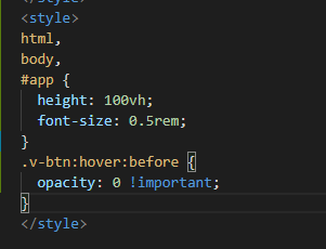
I use it globally
.v-btn:hover:before {
  opacity: 0 !important;
}
 zhzhh7378
on 4 Sep 2019
zhzhh7378
on 4 Sep 2019
Adding this prop would also fix another related bug unexpected tooltips:
- Click any button that has a tooltip on it
- Switch the tab or window
- Get back to your app after a few seconds (or minutes)
- Enjoy an unexpected unwanted tooltip to flash in your face and confuse you because the button you clicked a few minutes ago decided to stay active
This prop should definitely be true by default.
I have no idea why would anyone want to:
- Have one of the buttons in their app to always weirdly glow out of place
- Have unexpected unwanted tooltips to show up every time you switch tab / window
 AlexSHoffman
on 4 Sep 2019
AlexSHoffman
on 4 Sep 2019
This is something we have discussed and want to implement. Shooting for v2.1
 johnleider
on 5 Sep 2019
johnleider
on 5 Sep 2019
The default v1.5 behavior has been added back with a new prop retain-focus-on-click which has a default value of false. Closing as this is considered resolved.
johnleider
on 11 Oct 2019
To stop seemingly random highlighting of v-btn on iOS, I used javascript to detect a mobile device and assign classes using :hover to desktop and :active to mobile. This fixed the problem of the hover style being assigned incorrectly on iOS. Then altering the .v-btn:before style hides the default gray color of highlighted buttons.
I'm not sure why I had to do this. Everything was fine on Chrome dev tools, even in mobile preview, but on actual phones, buttons were sometimes rendering as having focus or selection. Adding a :key to force creation of a new component each time props changed helped, but not 100%. (The component displays multiple v-btns. It is reused with new props each time one of the buttons is clicked.)
.qbutton:hover {
  background-color: blue;
  color: white;
}
.mobile-qbutton:active {
  background-color: blue;
  color: white;
}
.v-btn:before {
  background-color: transparent !important;
}

.qbutton:focus, .mobile-qbutton:focus {
  background-color: blue;
  color: white;
}
 Lynne-Daniels
on 20 Nov 2019
Lynne-Daniels
on 20 Nov 2019
Related issues
 efootstep
·
3Comments
efootstep
·
3Comments
 KuroThing
·
3Comments
KuroThing
·
3Comments
 aaronjpitts
·
3Comments
aaronjpitts
·
3Comments
 dohomi
·
3Comments
dohomi
·
3Comments
 radicaled
·
3Comments
radicaled
·
3Comments
Most helpful comment
I use it globally