Vuetify: [Feature Request] Provides Input fields Browser Autofill Color Support
Trying out Vuetify Input fields, I've seen that using Google Chrome autofill (which is useful to quickly fill adresses/names/phone number/etc..) was not CSS overrided by Vuetify, which make forms visually not so nice.
What problem does this feature solve?
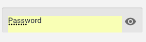
Using Google Chrome Autofill it makes text fields "not so nice" with this default pale yellow, or at least there is some missing padding around the label :

What is your proposed solution?
1) Add some CSS override around Vuetify global CSS. See https://css-tricks.com/snippets/css/change-autocomplete-styles-webkit-browsers/ to see how to change this autofill background/border color.
2) [Optional] Provides new prop OR documentation to easily change the color when the field has an "autofill" state.
 kevinmarrec
All 14 comments
I agree. This looks hideous specially with paddings around input. And label also doesn't work. And hard to click small inputs.
 ghost
on 15 Oct 2018
ghost
on 15 Oct 2018
Is there currently any solution for this problem?
 KatePavlovich
on 22 Mar 2019
KatePavlovich
on 22 Mar 2019
@KatePavlovich Use something else or make one yourself. An example for you -> https://codepen.io/atilkan/pen/GYpRwx
ghost
on 23 Mar 2019
If the padding and margins were on different sections I think it might solve my problem. The color seems fine on mine (Chrome) but it doesn't fill the entire input area.

 onx2
on 30 May 2019
onx2
on 30 May 2019
Unfortunately this did not make the cut for v2.0 release. Thank you for your patience.
 johnleider
on 19 Jun 2019
johnleider
on 19 Jun 2019
@kevinmarrec @atilkan @onx2 @johnleider Is there currently any solution for this problem? 🤔
 alexquintero-deeplegal
on 3 Sep 2019
alexquintero-deeplegal
on 3 Sep 2019
@alexquintero-deeplegal This is something that has been pushed to the v2.x.x milestone for now, as it's tagged as a feature request.
So unless it becomes tagged as a bug and that someone works on it, it will be kept pending for now.
kevinmarrec
on 3 Sep 2019
@kevinmarrec Ok 😃, anyway a temporary solution is this:
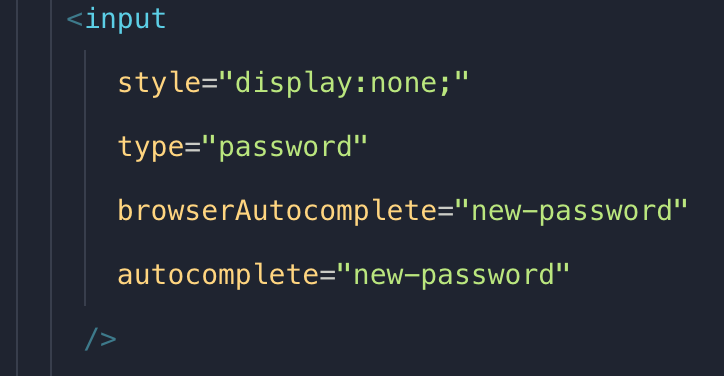
Create an input as it is in the image inside the form.
It worked for me. good luck 🥳🎉
alexquintero-deeplegal
on 3 Sep 2019
temporary solution can be implemented like this:
https://stackoverflow.com/questions/2781549/removing-input-background-colour-for-chrome-autocomplete
 mimbo119
on 28 Oct 2019
mimbo119
on 28 Oct 2019
In the link mimbo119 mentioned, these is a solution posted by a user (Steve) that works with a minor tweak:
@-webkit-keyframes autofill {
    0%,100% {
        color: inherit;
        background: transparent;
    }
}

input:-webkit-autofill {
    -webkit-animation-delay: 1s; /* Safari support - any positive time runs instantly */
    -webkit-animation-name: autofill;
    -webkit-animation-fill-mode: both;
}
This appears to make the background transparent and the color inherit the intended field color, I tried this out on an outlined input field and it worked.
 marcnewton
on 22 Jan 2020
marcnewton
on 22 Jan 2020
The solution I have adopted is divided into two parts:
1 detect the autofill through css animation:
<style>
:-webkit-autofill { animation-name: onAutoFillStart;}
:not(:-webkit-autofill) { animation-name: onAutoFillCancel;}
@keyframes onAutoFillStart { from {} to {}}
@keyframes onAutoFillCancel { from {} to {}}
</style>
2 add a placeholder = " " attribute to the autofilled input or remove it when empty
on template:
<v-text-field v-bind="inputAttrs" @animationstart="checkAnimation"/>
on methods:
checkAnimation(e) {
            if (e.animationName == "onAutoFillStart") {
                this.inputAttrs = {placeholder: ' '}
            } else if (e.animationName == "onAutoFillCancel") {
                this.inputAttrs = {}
            }
        }
 tsilicani
on 31 Jan 2020
tsilicani
on 31 Jan 2020
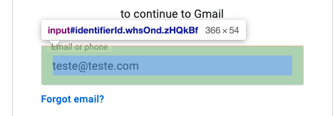
Here it is an example of how Google is applying the autofill style on their logins screen.
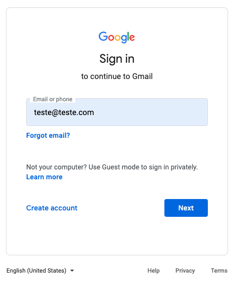
The input fulfills the component, and the spaces are managed using padding.
So far, I'm removing the style as presented by @marcnewton, but it would be nice to see Vuetify improving it.
Thank you, guys.
 netoramalho
on 4 Jun 2020
netoramalho
on 4 Jun 2020
I have created the following CSS styles. They work for light and dark themes and look great to me. Maybe it helps somebody.
Edit: I use them as global styles. Works on v-text-field, v-input, ... because they extend the standard input.
```css
label.theme--dark + input:-webkit-autofill,
input:-webkit-autofill:hover,
input:-webkit-autofill:focus,
input:-webkit-autofill:active {
transition: background-color 5000s ease-in-out 0s;
-webkit-text-fill-color: #fff !important; /* inherit only works in Safari */
-webkit-text-size-adjust: inherit !important;
}
label.theme--light + input:-webkit-autofill,
input:-webkit-autofill:hover,
input:-webkit-autofill:focus,
input:-webkit-autofill:active {
  transition: background-color 5000s ease-in-out 0s;
  -webkit-text-fill-color: #000 !important; /* inherit only works in Safari */
  -webkit-text-size-adjust: inherit !important;
}

/* When dark theme, then make keychain icon white */
label.theme--dark + input::-webkit-credentials-auto-fill-button{
  background-color: #fff !important;
}

/* Hide credentials-auto-fill-button in password inputs, only visible on other inputs */
input[type=password]::-webkit-credentials-auto-fill-button{
  visibility: hidden;
  display: none !important;
  pointer-events: none;
}
```
 valentingavran
on 21 Jun 2020
valentingavran
on 21 Jun 2020
I've added this style below on my v-text-field wrapper so that Chrome will not mess the text style filled by the autofill.
input:-webkit-autofill::first-line {font-size: $input-font-size;font-family: $body-font-family;}
netoramalho
on 25 Jun 2020
Related issues
 itanka9
·
3Comments
itanka9
·
3Comments
 sebastianmacias
·
3Comments
sebastianmacias
·
3Comments
 ricardovanlaarhoven
·
3Comments
ricardovanlaarhoven
·
3Comments
 gluons
·
3Comments
gluons
·
3Comments
 KuroThing
·
3Comments
KuroThing
·
3Comments
Most helpful comment
@kevinmarrec Ok 😃, anyway a temporary solution is this:
Create an input as it is in the image inside the form.
It worked for me. good luck 🥳🎉