Vuetify: [Feature Request] Combined pickers
Combining date and time pickers in a single picker would provide better user experience while, for example, scheduling an event, because an event could be scheduled in a single field, instead of two fields.
An example implementation:

Furthermore, in time picker, disabling selection of minutes might also be a useful feature, for situations where it is not desirable for users to select minutes.
 mmajcenic
All 25 comments
This is something that would not be part of the Vuetify core, but the front-end addon pack planned later this year. For now I'll let the issue reside here and will move it over once that repo is started.
 johnleider
on 28 Apr 2017
johnleider
on 28 Apr 2017
What do you mean by addon pack? Let us know your future plans?
 donPuerto
on 31 May 2017
donPuerto
on 31 May 2017
After the Vuetify core is done I'll begin work on a frontend and backend package.
johnleider
on 31 May 2017
very nice, so can we recommend a request feature like calendar... By the way do we have walkthrough on how to integrate this to Laravel ?
donPuerto
on 1 Jun 2017
No walk-through, but it would be helpful. Once everything stabilizes with the package, I have lots of developer QoL updates I'd like to make in the way of guides and tutorials.
johnleider
on 1 Jun 2017
any update on this?
 scgm11
on 9 Apr 2018
scgm11
on 9 Apr 2018
It's marked for the Front-end Pack milestone. Don't worry, I will be making it :)
johnleider
on 9 Apr 2018
Please do not comment +1 on issues, comments are for discussion. If you'd like to show your interest in this ticket, please Vote on OP's comment with the 👍 emoji.
 bdeo
on 23 May 2018
bdeo
on 23 May 2018
the date picker and time picker are not very handy and i hope there's a new component to improve these:
- The binding data type should be Date
- expose data during the input. for example when user pick minute, how can i know which hour and date they just picked? the allowed-minutes cannot not return expected value without the informations.
- customize the input order. default is date -> hour -> minute ,but date->hour or hour->minute should be ok,
 maxzhou0
on 2 Oct 2018
maxzhou0
on 2 Oct 2018
In the past we used the Date object but it became a nightmare in regards to localization. Your suggestions are also unrelated to this particular feature request @maxzhou0 . Please create a new Feature Request at https://issues.vuetifyjs.com
johnleider
on 2 Oct 2018
are you evaluating using moment?
scgm11
on 2 Oct 2018
No. I believe the goal is to ensure we can easily hook up to other libs/functionality.
johnleider
on 2 Oct 2018
I also would like this combined component. I have found the Vuetify Date and Time pickers to be quite clunky compared to the other components. The best pickers I have found (Date, Time, and Date/Time) are here (https://material-ui-pickers.dev/api/datetime-picker) but these are React-based. I would like to see Vuetify match the styling, features, and smoothness with which these work.
 mviens
on 23 Mar 2019
mviens
on 23 Mar 2019
Was hoping vuetify had combined date-time pickers. This would go a long ways towards adding that extra bit of usability to the framework. It's awkward to have separate date and time fields.
I greatly look forward to seeing this in the future!
 douglasg14b
on 19 Apr 2019
douglasg14b
on 19 Apr 2019
I've also been in great need of this component recently, and the experience is so important that I've tried other components and it's always been indecent, and I'd hope Vuetify to support this feature. I noticed that this issue was raised 2 years ago, has not yet been resolved, and was not set to new Component in the 2.0 version, and I sincerely hope that developers will be able to value this feature.
 The-Mojoo
on 6 May 2019
The-Mojoo
on 6 May 2019
This is such an important component, I'm even surprised how deeply I need it at the moment. I hope it comes very soon to Vuetify.
 moonsphinx
on 14 May 2019
moonsphinx
on 14 May 2019
Any progress on this?
 Mikilll94
on 20 Jun 2019
Mikilll94
on 20 Jun 2019
I made a workaround for this in the meanwhile with this component: https://codepen.io/xristian/pen/VoLRYa
 cristianmatos
on 22 Jul 2019
cristianmatos
on 22 Jul 2019
@cristianmatox Can I custom datetimepicker to be like this https://ibb.co/NptQsgR? I get it from here : https://vuetifyjs.com/en/getting-started/consulting-and-support. is there a component like that in vuetify? @johnleider Maybe you can give several answer choices
 positivethinking639
on 4 Oct 2019
positivethinking639
on 4 Oct 2019
Is it going to be implemented soon?
Mikilll94
on 18 Oct 2019
@cristianmatox If you add z-index: 1; to the AM/PM buttons the dropshadow won't be clipped.
douglasg14b
on 18 Oct 2019
@johnleider can you give an ETA to this?
 andreafonso
on 4 Mar 2020
andreafonso
on 4 Mar 2020
Hey,
I'm found 2 great concepts about DateTimePicker.
First with tabs and made for Vuetify:
https://darrenfang.github.io/vuetify-datetime-picker/
And second with (in my opinion) better TimePicker concept:
https://mariomka.github.io/vue-datetime/
What do you think about that?
 makeit-mh
on 4 Apr 2020
makeit-mh
on 4 Apr 2020
This'll probably be added in v3 with a complete pickers rewrite.
 sh7dm
on 4 Apr 2020
sh7dm
on 4 Apr 2020
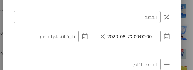
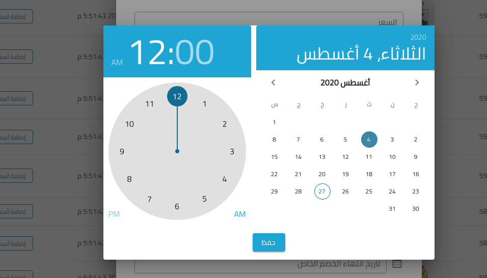
In case anybody came here for a very quick solution without using additional plugins.
<template>
  <div>
    <v-dialog ref="offerStartedDateDialog" :return-value.sync="offer_started" width="650px">
      <template v-slot:activator="{ on }">
        <v-text-field
          dense
          readonly
          full-width
          outlined
          dir="ltr"
          v-on="on"
          clearable
          label="بداية الخصم"
          prepend-icon="mdi-calendar-month"
          :value="offer_started_date"
        ></v-text-field>
      </template>
      <div class="white">
        <div class="d-flex justify-space-between">
          <div>
            <v-date-picker
              v-model="offer_started.date"
              scrollable
              width="350px"
              flat
              locale="ar"
            />
          </div>
          <div>
            <v-time-picker
              locale="ar"
              flat
              v-model="offer_started.time"
            />
          </div>
        </div>
        <div class="text-center py-4">
          <v-btn color="primary" @click="$refs.offerStartedDateDialog.save(offer_started)">حفظ</v-btn>
        </div>
      </div>
    </v-dialog>
  </div>
</template>


<script>
export default {
  name: "record-form",


  data: function () {
    return {
      offer_started: {
        time: '00:00',
        date: new Date().toISOString().substr(0, 10)
      },
      form: {},
    };
  },


  computed: {
    offer_started_date: function () {
      if (!(this.offer_started.date && this.offer_started.time)) {
        return `${new Date().format('Y-m-d')} 00:00:00`;
      }

      return `${this.offer_started.date} ${this.offer_started.time}:00`
    }
  },


  methods: {
    addPrices(form) {
      this.form.offer_started_date = this.offer_started_date;

      // ...
    }
};
</script>
- and here is the result:
 abdelaziz321
on 27 Aug 2020
abdelaziz321
on 27 Aug 2020
Related issues
 jofftiquez
·
3Comments
jofftiquez
·
3Comments
 Antway
·
3Comments
Antway
·
3Comments
 radicaled
·
3Comments
radicaled
·
3Comments
 smousa
·
3Comments
smousa
·
3Comments
 SteffenDE
·
3Comments
SteffenDE
·
3Comments
Most helpful comment
It's marked for the Front-end Pack milestone. Don't worry, I will be making it :)