Vue-storefront: As a user I want to choose number of columns of products I see on the category view
What is the motivation for adding / enhancing this feature?
[not for mobile]
The number of columns determine two aspects:
- Size of product image thumbnails on the category page. Less columns - bigger images.
- Amount of products displayed. More columns - more products visible.
Could different column layout affect site ROI? It must affect. But there cannot be a generic rule for this, each e-commerce belongs to different markets, different users, different products, this should be adaptative to each business model.
How can we enhance this to develop an intelligent solution that maximizes clicks on products?
v1 - As I user I want to select the number of columns. (this could be a good start)
v1- As I user I want my selection to be remembered
v2- As a product owner I would like to get data on which column configuration got more sells (by cart total), which was the most selected among users, and decide default columns and available numbers.
v3- As a product owner I dream that we could use Tensorflow to bring some machine learning to this and other components.

Which Release Cycle state this refers to? Info for developer.
Pick one option.
- [x] This is a normal feature request. This should be available on https://test.storefrontcloud.io and then after tests this can be added to next Vue Storefront version. In this case Developer should create branch from
developbranch and create Pull Request2. Feature / Improvementback todevelop. - [ ] (Pick this option only if you're sure) This is an important improvement request for current Release Candidate version on https://next.storefrontcloud.io and should be placed in next RC version. In this case Developer should create branch from
releasebranch and create Pull Request3. Stabilisation fixback torelease. - [ ] (Pick this option only if you're sure) This is a critical improvement request for current Stable version on https://demo.storefrontcloud.io and should be placed in next stable version. In this case Developer should create branch from
hotfixormasterbranch and create Pull Request4. Hotfixback tohotfix.
### What do you think?
 pmaojo
All 23 comments
I'll take it.
 heyfets
on 24 May 2019
heyfets
on 24 May 2019
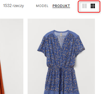
@heyfets maybe @StasiekDivante will suggest some graphic solution like image-size?

 alinadivante
on 24 May 2019
alinadivante
on 24 May 2019
@alinadivante not sure what's the issue here, could you elaborate?
 StasiekDivante
on 28 May 2019
StasiekDivante
on 28 May 2019
@StasiekDivante I want to ask if you have any suggestions/ideas how we can do selection options for displaying the number of products columns on the category page?
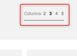
Which solution is better?
or
alinadivante
on 29 May 2019
I believe numbers are a better solution here, as the meaning of icons might not be clear in this case
StasiekDivante
on 29 May 2019
I believe numbers are a better solution here, as the meaning of icons might not be clear in this case
I agree.
pmaojo
on 31 May 2019
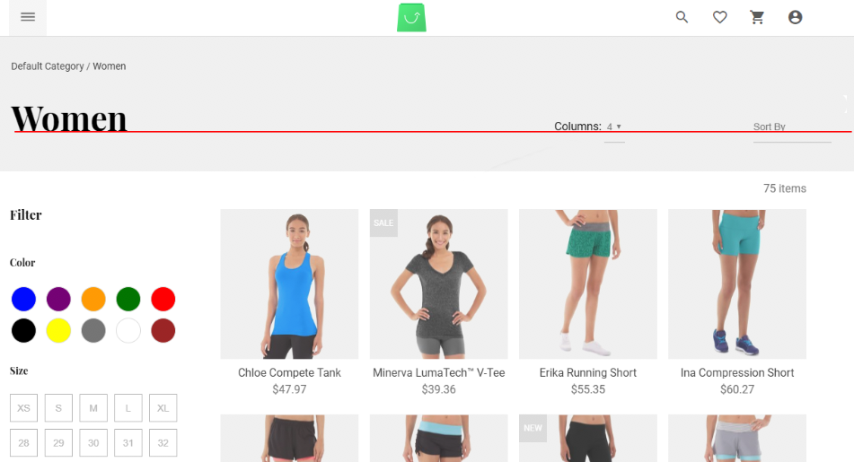
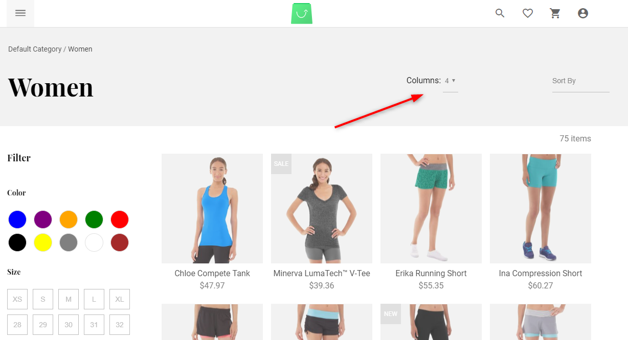
@vishal-7037 IMHO products column change functionality is located in wrong place and it doesn't look good. Maybe we can move it a little bit closer to Sort by option? (but at the same time remembering about changes from issue #2935 )
alinadivante
on 5 Jun 2019
@alinadivante could you share a screenshot how it looks now?
StasiekDivante
on 5 Jun 2019
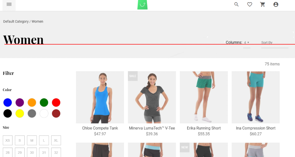
@StasiekDivante

alinadivante
on 5 Jun 2019
@alinadivante yeah, just go on and move it closer to sort by
StasiekDivante
on 5 Jun 2019
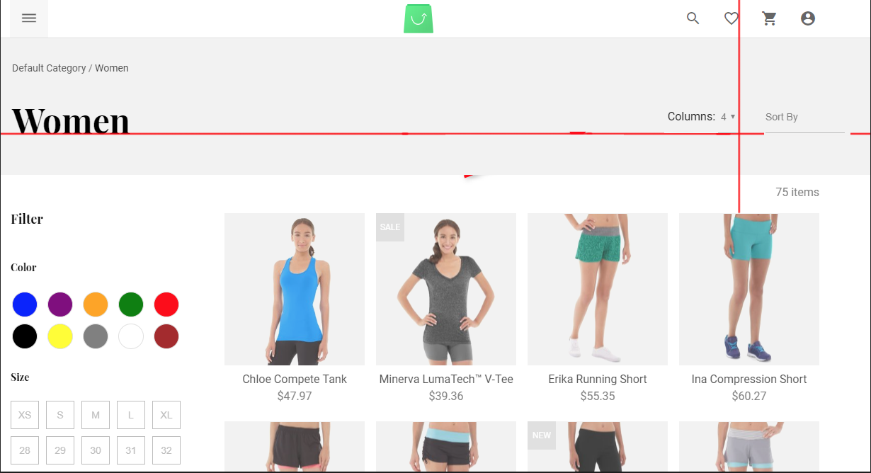
I suggest also aligning both inputs horizontally with the title "Women"
pmaojo
on 5 Jun 2019
Sure thing @pmaojo! I made a simple graphic to help you with this
StasiekDivante
on 5 Jun 2019
@alinadivante , @StasiekDivante
Okay, Working on it.
 vishal-7037
on 5 Jun 2019
vishal-7037
on 5 Jun 2019
pmaojo
on 5 Jun 2019
@StasiekDivante yes :D
pmaojo
on 5 Jun 2019
@pmaojo tbh It would be more visually pleasing if you had text lying on one baseline (check img from my previous post), I wouldn't mind underlines going beneath this text baseline 😄
And vertically it's perfect!
StasiekDivante
on 5 Jun 2019
@StasiekDivante ,
So no need to work on alignment issue. right?
vishal-7037
on 5 Jun 2019
Hey @vishal-7037, this is how it is now:
and that's how it should be:
StasiekDivante
on 5 Jun 2019
@StasiekDivante Okay, Got it.
vishal-7037
on 5 Jun 2019
@vishal-7037 sure, it just needs vertical and horizontal alignment
StasiekDivante
on 5 Jun 2019
@vishal-7037 Please remember to take into account changes regarding: #2935
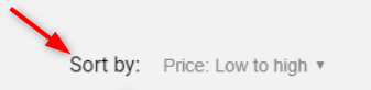
Sort by will be looks like on this screenshot
alinadivante
on 5 Jun 2019
@alinadivante, @StasiekDivante I've updated design as per your suggestion and also according to https://github.com/DivanteLtd/vue-storefront/issues/2935
Please review https://github.com/DivanteLtd/vue-storefront/pull/3017 and let me know.
Thank you.
vishal-7037
on 6 Jun 2019
@vishal-7037 thank u for your fixes :)
alinadivante
on 10 Jun 2019
Related issues
 benjick
·
4Comments
benjick
·
4Comments
 ArjanStudent
·
3Comments
ArjanStudent
·
3Comments
 filrak
·
4Comments
filrak
·
4Comments
 cartooncatfish
·
3Comments
cartooncatfish
·
3Comments
 slightlyoff
·
3Comments
slightlyoff
·
3Comments
Most helpful comment
@alinadivante , @StasiekDivante
Okay, Working on it.