Vscodium: [PLEASE VOTE] [Discussion] Icon design and/or configuration should be improved
Comment hijacked by project maintainer: please vote on the project's icon below: https://github.com/VSCodium/vscodium/issues/491#issuecomment-691597222
Original issue from @cdata below.
TL;DR would one or both of the following things be possible:
- Improve the existing icon to have a relatively high contrast ratio across at least as many common contexts as the old logo
- Make it possible to easily configure a preferred icon as a matter of editor configuration (so that it follows configuration across installations)
Background
Hey y'all, just want to start by saying that I love this project. I use it on all of my machines and benefit greatly from the work that this community has done to support the existence of a relatively liberated, modern code editor.
In https://github.com/VSCodium/vscodium/issues/313, there was some discussion and worthy design ideation around the creation of a new logo. Speaking for myself, I had no idea this discussion was taking place, although it is nice to know that it happened out in the open. As suggested in this comment, I am one of the folks who had no idea this change was happening until I updated.
Proposal
I read through the design ideation for the new icon. I think the new icon is okay. However, I also believe that the older icon was better on a couple of dimensions:
- Subjectively, the older icon was prettier; I personally find the official VSCode logo to be pretty corporate and blah, but even that logo is subjectively prettier to me. It seems like there is a lot of agreement expressed in https://github.com/VSCodium/vscodium/issues/472
- Objectively, the older icon stood out well against a wider range of background colors. Some of this issue is alluded to in https://github.com/VSCodium/vscodium/issues/477
I would like to open the discussion for ways in which the icon could potentially be improved, or perhaps - in the hope of avoiding an impossible bike shed design argument - ways we could make icon customization a little bit easier so that there are more options available to suit users' preferences.
Humble request
The decision to change the design seems to have been driven by a single community member's subjective assessment of the icon (note: I only have the context of #313, and I do not know if there was some consensus being driven elsewhere). However, a change like this has a broad impact on the community overall. I hope we can have an open and respectful conversation about this with the goal to keep VSCodium being the best code editor that it can be.
 cdata
cdata
All 88 comments
To be honest, I preferred the previous logo; but I think this one could look better with some refining and redimensioning. It looks too big on macOS, for example.
 ivan-avalos
on 30 Aug 2020
ivan-avalos
on 30 Aug 2020
As an additional note: #472 does include suggestions for how one might change the logo with a script. However, such a suggestion is tantamount to leaving this problem in the laps of VSCodium users.
I use VSCodium on Windows, Linux and OSX, and in order to keep my environments consistent I rely on a scripted install/update workflow. It is relatively easy for someone like me to add an additional script to change the icon. However, that is a fair amount of shell/batch that I do not wish to maintain myself. And, I suspect that many users who care won't have the wherewithal to do the same.
Ideally, we could improve the icon instead, or else make icon customization a detail of portable editor configuration.
cdata
on 30 Aug 2020
The icon could be improved dramatically by reverting to the previous version.
Looking at #313, at no point was there an option of Retain/Change given, the only options every given were to proceed with one member's new designs.
Jan 3 member suggests a new logo, is pointed at #4
Jan 8 new logo established.
Feb 9 Hobson's Choice Poll Created
Apr 27 Vote for Colour.
 dg01d
on 1 Sep 2020
dg01d
on 1 Sep 2020
Thanks to the originators of the VSCodium project for bringing it into existence and shepherding it this far. Thanks to those who have respectfully shared their agreement about the subjective/objective regressions caused by the new icon.
Open source projects are offered to us as they are, with no guarantees regarding governance or community involvement. That said, this icon change comes off to me as a vain choice, made without much attention to community feedback. Confusingly, it seems worse than the icon it replaced in at least one important dimension (see original issue). I hope that the project maintainers will consider that as their community grows, so too will the burdens put on that community by choices like this.
In the mean time, I'm planning to hold my nose and return to VS Code. It makes me sad to say that. I hope I'll find a reason to switch back in the future. I might also check out Theia.
Thanks again, and good luck everyone!
cdata
on 12 Sep 2020
Really appreciate your thoughtful comments and approach, @cdata; thanks for opening this discussion issue (and I guess bye as well 👋 ).
It's a really fair call-out that all the recent votes that took place didn't include a "leave the icon alone" option. I would be open to making another vote, something like a) use the current icon from @estatra, possibly improve upon it; b) revert to the old "codium" style icon. I really want to give a nod to @estatra for (at least from some perspectives) taking the initiative to improve this project with his designs, and of course a nod to @jaredreich for the same initiative 2 years ago.
In fact, I will just make this comment the vote.
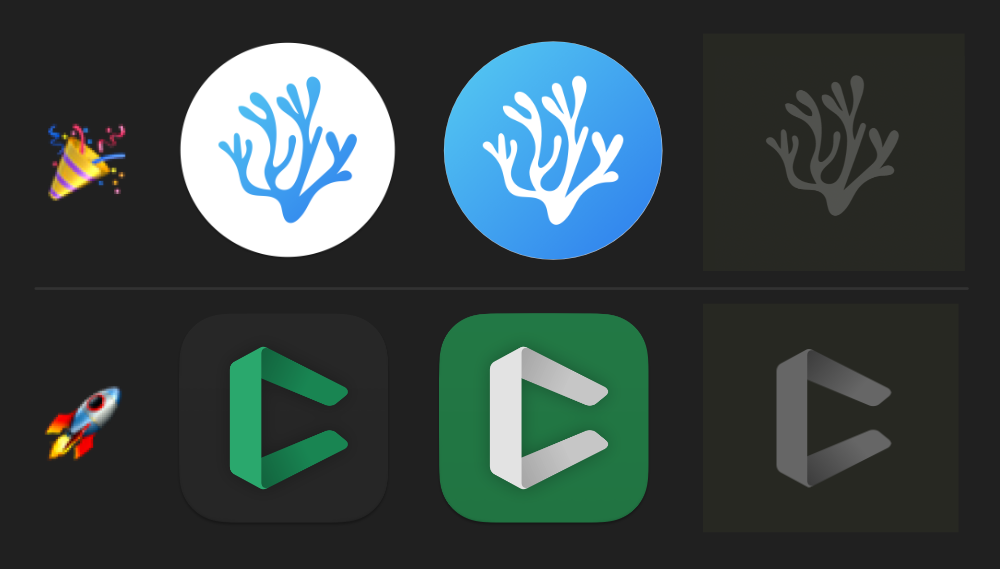
🎉 == Continue with the icon from #313 (actually now #485)
🚀 == Revert to the icon/s from #4
Also... I'm all ears for a better way to have these polls / get broader participation. Fully aware that the issue tracker isn't effective in this regard.
Will give this informal vote at least 2 weeks to try catch as many eyes as possible.
 stripedpajamas
on 13 Sep 2020
stripedpajamas
on 13 Sep 2020
I will vote for the two, actually. For one part, I'm confident that @estatra's logo can improve a lot. I liked the fixed version for macOS with shadows and Big Sur-esque style. But I also liked the previous one from @jaredreich, it was clean and nice, and plays with the name of the project.
ivan-avalos
on 13 Sep 2020
Also... I'm all ears for a better way to have these polls / get broader participation. Fully aware that the issue tracker isn't effective in this regard.
- Perhaps, if possible, announce changes, logo or otherwise, on the "What's new in version x.x.x"? I'm unaware if this is feasible or not.
- Make a news header on the main project's page announcing and calling for participation on impactful or major changes to the project that you desire more community participation.
 cristianovitorino
on 13 Sep 2020
cristianovitorino
on 13 Sep 2020
Thank you for the thoughtful reply. I want to call out that although I prefer the old icon myself, I believe the new design could be improved to offer better contrast. Ultimately my preference for the old design is subjective. I want to acknowledge that there is a significant chunk of folks who like the new design or at least are not bothered by it.
cdata
on 13 Sep 2020
I would guess that software like the VSCodium project tends to attract folks who don't want to sign up for things like marketing newsletters, but one approach for wider visibility when you want community input could be offering an option to join an email group on the homepage, and you send out occasional/infrequent requests for input/feedback to that group. If you're clear about it being a "user feedback group" or something instead of a newsletter, and if you don't break that promise, then it seems like something folks who have strong opinions wouldn't mind participating in.
Plus, then whenever discussion like this crops up, admins can drop the link to the page where you join the email list, and say something like "we encourage people who want to get early opportunities to give feedback to join our email group."
 chadlavi
on 18 Sep 2020
chadlavi
on 18 Sep 2020
rocket == Revert to the icon/s from #4
It would be https://github.com/VSCodium/vscodium/issues/4#issuecomment-427070331 , right? I do not remember icon design appearing in initial posts of #4
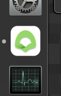
I remember old icon as quite nice and distinguishable from others and recognizable as something organic (coral).
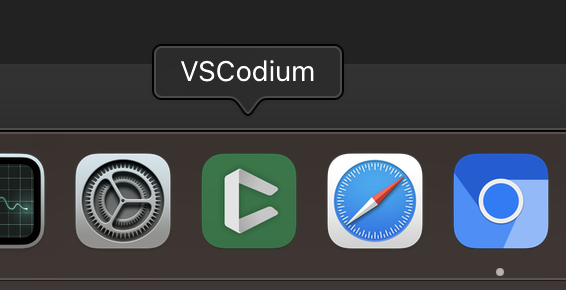
While new one is displayed as a green blob, and at least in icon size is not resembling anything.
EDIT: after looking it in full size it is still not resembling anything. Green ribbon?? Green hood of ghostly monk??? (Yes, I know that making icons is hard - but I strictly prefer older one, not sure what was wrong with it)
 matkoniecz
on 19 Sep 2020
matkoniecz
on 19 Sep 2020
Also... I'm all ears for a better way to have these polls / get broader participation. Fully aware that the issue tracker isn't effective in this regard.
Have some info on https://vscodium.com/ ? I visited that page and learned about vote only because I got irritated by unreadable text and reported it as a bug.
Note that pining issue worked well!
I ctrl-f that page for word icon (also with adblock disabled) and nothing was found.
Also, maybe mailing newsletter? (though personally I would probably would not subscribe to it. Maybe I would subscribe to special one with posting announcing solely referendums. And would not include any surveys, announcements, request for feedback. And would include solely polls that would directly influence decisions.)
matkoniecz
on 19 Sep 2020
@cdata
Thank you for the thoughtful reply. I want to call out that although I prefer the old icon myself, I believe the new design could be improved to offer better contrast. Ultimately my preference for the old design is subjective. I want to acknowledge that there is a significant chunk of folks who like the new design or at least are not bothered by it.
Yeah, I can see your angle, I agree, I'll see what I can do to improve the design overall. I'll update when I have something relevant.
@matkoniecz It represents the _Codium Algae_ while paying homage to the VS Code logo. if you want to understand the metaphor proposal and discussion you can read it here: #313
cristianovitorino
on 19 Sep 2020
@estatra While I prefer old icon, I am very thankful for your work! (I kind of know how irritating is to work on something and then it gets rejected because some of people preferred other/old variant. But I still have no good idea how to thank for work that someone did and at the same request rejecting it without making it weird.)
matkoniecz
on 19 Sep 2020
@estatra While I prefer old icon, I am very thankful for your work! (I kind of know how irritating is to work on something and then iyt gets rejected because some of people preferred other/old variant. But I still have no good idea how to thank for work that someone did and at the same request rejecting it without making it weird.)
Haha thank you, no problem, I'm used to this, it comes with the line of work. Art is very subjective by nature.
I'll try to improve it with the feedback given so far when I have some time and update when relevant progress is achieved.
cristianovitorino
on 19 Sep 2020
I thought that such a vote makes no sense as there are only few users involed. I'm satisficated with the new icon so I won't come here to complain about it and notice this vote. How about a notification on the welcome page?
 linsui
on 22 Sep 2020
linsui
on 22 Sep 2020
Hello, this is for the part about the improvement of the current logo, not to be confused with the poll above for voting to reverse the logo to the old one. This is a feedback poll, no decisions is being made. It serves the purpose of the improvement part of the issue, to feel direction to improve the current logo. To vote for the icon reversal or not, the above poll should suffice.
People that desire the reversal to the old logo can vote above and ignore this post. This is for people interested in the improvement suggestion, so for any future decision that is made, we will have explored as many suggestions as possible.
_Body contrast improvements can be added later if needed._
Flat = 👍
3D = 🚀
Flat

3D

Flat
3D
cristianovitorino
on 25 Sep 2020
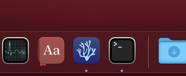
How new new icon works if it is in the bottom bar? (I know that old one works well)

matkoniecz
on 25 Sep 2020
@linsui this poll makes more sense than a previous one, choosing a new icon. Before there were only people who frequent issue tracker, now they are still here AND people, who were unsatisfied enough to go to issue tracker, have joined.
@estatra why make second poll in the same thread? By doing this, and again without offering an old icon as an option, you make discussion and voting less focused. (That said, 3D design is better than flat, but old icon was better nevertheless.)
 officerats
on 25 Sep 2020
officerats
on 25 Sep 2020
this poll makes more sense than a previous one, choosing a new icon. Before there were only people who frequent issue tracker, now they are still here AND people, who were unsatisfied enough to go to issue tracker, have joined.
Not at all. This will only make more bias, instead of more sense.
linsui
on 25 Sep 2020
@estatra I prefer the 3D, but it would be better a tiny tiny bit larger and with a thicker stroke. Maybe white instead of black.
ivan-avalos
on 25 Sep 2020
I thought we were voting to go back to the better previous icon? None of these changes fix the root problem of the icon itself.
chadlavi
on 25 Sep 2020
@officerats
@estatra why make second poll in the same thread? By doing this, and again without offering an old icon as an option, you make discussion and voting less focused. (That said, 3D design is better than flat, but old icon was better nevertheless.)
This is asking for feedback, not making decisions. It's a feedback poll. But I see that it was not clear enough, I'll make it clearer on the post. And this one is for improving the current one (my part). If reverting to the old logo is desired that's not my area, I'm trying to help out with what the post suggested on the improvement part.
@ivan-avalos
I'll try that, thanks.
@chadlavi
There is a vote above, I'm merely trying to help with the improvement, if reversing to the old logo is desired that's totally fine, I'm trying to help out with the improvement part of the current one as suggested by the OP.
cristianovitorino
on 25 Sep 2020
@matkoniecz
Looks like this:

@ivan-avalos
Looks like this:

cristianovitorino
on 25 Sep 2020
@estatra I think that looks definitely better, with 3D effect would look even better! And maybe a white shadow instead of black, I'm not sure if that would improve it.
ivan-avalos
on 25 Sep 2020
I'm trying to help out with the improvement part of the current one as suggested by the OP.
But the thread has since been hijacked - as specified in the OP. Please take this conversation about your logo to a new issue, as it stands the "vote" referenced in the Subject is now unclear
dg01d
on 26 Sep 2020
@stripedpajamas time to make a decision. this issue has proven that any attempts at fixing/improving this new logo will always fail and garner disapproval from most. plus, the majority of the vote indicated that most users want the old logo back. in fact, the vote was pretty much decided within an hour of it starting. lets be real, this new logo will never be good, and issues like these will keep popping up until it gets reverted. i think most of us can agree its time to revert it back
 poopidk
on 3 Oct 2020
poopidk
on 3 Oct 2020
@poopidk I deleted your other comment as it violated our code of conduct.
stripedpajamas
on 3 Oct 2020
as it stands the "vote" referenced in the Subject is now unclear
Yes; @estatra I will be hiding these improvement comments for now. If you want feedback in the form of a vote please open a separate issue (I can definitely pin that one as well if that seems to be a helpful mechanism).
stripedpajamas
on 3 Oct 2020
I know this would not be idea but I suggest to at least keep svg/icon version of the old and new (with different names, obviously) and if this is possible provide a "switch-icon" script allowing people to change that after-installation (or update :-( ) Reason: some people definitely like the "old" more, others the "new"and we should not provide a duplicate set of the binaries just to choose the icon...
 GitMensch
on 5 Oct 2020
GitMensch
on 5 Oct 2020
Being able to switch sounds nice, but we need to pick a default. Although I think the new logo has potential, I vote to revert to the old logo. How much longer are we going to leave this open to a vote?
 jmauss
on 7 Oct 2020
jmauss
on 7 Oct 2020
For whatever reason at least two people dislike the idea of shipping both icons...
Giving the votes above (although I question that they are representative, as there was no announcement I've seen [and I'd count myself a rather curious user of software] - I've just stumbled over this issue by chance]) it is clear that the bigger part of the voters favors the "old" logo, possibly polished (there were obviously reasons to create the new icon...).
@stripedpajamas, as you've opened the "poll" - Is this something that can be done for upcoming 1.50?
(Apart from the down-votes for that idea I'd still suggest to co-ship the "new" logo as some people definitely prefer it.)
GitMensch
on 8 Oct 2020
For whatever reason at least two people dislike the idea of shipping both icons...
Because adding options to software is not free. Every boolean option doubles testing effort.
And if you manage fork that is pulling changes from much, much larger upstream project it becomes even worse because you have one more place for conflicts and that needs to be updated when upstream changes something related. This is based on a personal experience.
And case of logo/identify is a really poor place of "lets have multiple completely divergent things".
matkoniecz
on 8 Oct 2020
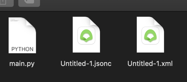
It looks like a green baby potty. this icon needs to be changed urgently. Also the file icons all look the same, icns files doesn't work on macos Catalina.


 hazarek
on 13 Oct 2020
hazarek
on 13 Oct 2020
Came to this thread from the [PLEASE VOTE] link - I'm having some difficulty figuring out where to vote.
Can anyone politely and gently nudge me the proper direction - where do I vote on the icon?
 pixelclef
on 19 Oct 2020
pixelclef
on 19 Oct 2020
@pixelclef react with an emoji to this comment
stripedpajamas
on 19 Oct 2020
@stripedpajamas I really think the voting can be considered over, can you pull the change-trigger and close this issue, please?
GitMensch
on 19 Oct 2020
Thanks for the note, @stripedpajamas - sad I didn't get to vote. But it's quite alright!
pixelclef
on 19 Oct 2020
@cdata @stripedpajamas I think we pull the trigger on this, then. Looks like there is overwhelming favor to revert to the old icon for now, and we have gone plenty past the deadline given for the voting.
jmauss
on 27 Oct 2020
@stripedpajamas stop stalling and pull the trigger
poopidk
on 31 Oct 2020
What's the status of this revert?
 jacksongoode
on 31 Oct 2020
jacksongoode
on 31 Oct 2020
I always hated the old icon, can't even find it quickly in the taskbar cuz bad contrast and too stringy (small details).
New one isn't perfect, but vastly superior and more in line with other modern app icons.
 Frotty
on 6 Nov 2020
Frotty
on 6 Nov 2020
I always hated the old icon, can't even find it quickly in the taskbar cuz bad contrast and too stringy (small details).
New one isn't perfect, but vastly superior and more in line with other modern app icons.
I think both are bad, the original vscode icon is better than all.
hazarek
on 6 Nov 2020
I really like the old one (with blue tree), but the new one is not bad at all!
 PietroMB
on 7 Nov 2020
PietroMB
on 7 Nov 2020
Any update? Seems like an overwhelming majority to revert, 81 to 19.
 kotx
on 9 Nov 2020
kotx
on 9 Nov 2020
In case anyone's looking to get a better match in the dock for macOS Big Sur, I used the https://macosicons.com/ Figma file template to make new and old versions:


chadlavi
on 17 Nov 2020
I use my custom icon on BigSur. You can use it if you like it. Codium's first letter C and folded codium leaf.
https://yadi.sk/d/tpWWIE6QFDVr9A?w=1


hazarek
on 17 Nov 2020
@chadlavi @hazarek These are somewhat off-topic for this issue IMHO.
kotx
on 17 Nov 2020
@chadlavi @hazarek These are somewhat off-topic for this issue IMHO.
what is topic?
hazarek
on 17 Nov 2020
@hazarek Voting to revert to the old icon or to keep the new icon. You can vote in a comment above, please read.
kotx
on 17 Nov 2020
I've already voted, and so have many others. It's pretty clear among the votes what users want. It doesn't seem like the maintainers plan to listen (it was supposed to be 2 weeks, as of September...), so I commented to offer others the solution I'm using for myself.
chadlavi
on 17 Nov 2020
@hazarek Voting to revert to the old icon or to keep the new icon. You can vote in a comment above, please read.
I voted a long time ago. I'm trying to revive the abandoned repository.
hazarek
on 17 Nov 2020
It doesn't seem like the maintainers plan to listen (it was supposed to be 2 weeks, as of September...)
Yeah, it seems like they expected a different result...
kotx
on 17 Nov 2020
hazarek
on 17 Nov 2020
Looks like there's an easy way to change the icon on a Mac.
https://9to5mac.com/2019/01/17/change-mac-icons/
I used the image file here to restore the glorious old icon:
https://upload.wikimedia.org/wikipedia/commons/5/56/VSCodium_Logo.png
 ivanjonas
on 17 Nov 2020
ivanjonas
on 17 Nov 2020
@ivanjonas this is somewhat off-topic for this issue IMHO.
hazarek
on 17 Nov 2020
@hazarek I actually like your custom logo, but I think it's way too similar to VSCode, not sure what Microsoft would think about it. In general, I prefer @chadlavi's old icon in Big Sur squircle. But in case the project developers refuse to let go the current logo, then @chadlavi's current logo in Big Sur squircle is way better.
ivan-avalos
on 17 Nov 2020
but I think it's way too similar to VSCode @ivan-avalos
? VScode and VScodium are the same software. Like chrome and chromium icons. also there is similar issue ungoogled-chromium
@chadlavi's icon has a pure white background. it's not nice. especially for those who always use dark mode.
hazarek
on 17 Nov 2020
but I think it's way too similar to VSCode @ivan-avalos
? VScode and VScodium are the same software. Like chrome and chromium icons. also there is similar issue ungoogled-chromium
Not talking about similar-wise, but rather trademark-wise. Since VSCodium is not an official Microsoft project, perhaps Microsoft can do something about it being similar. Chromium is Google's, VSCodium is not Microsoft's.
ivan-avalos
on 18 Nov 2020
Chromium is Google's, VSCodium is not Microsoft's.
Chromium is not Google's. Chromium is an open-source browser. You can change everything logo, source code etc.
Chromium is an entirely free and open-source software project. The Google-authored portion is released under the 3-clause BSD license.[13] Other parts are subject to a variety of licenses, including MIT, LGPL, Ms-PL, and an MPL/GPL/LGPL tri-license.
hazarek
on 18 Nov 2020
Chromium is Google's, VSCodium is not Microsoft's.
Chromium is not Google's. Chromium is an open-source browser. You can change everything logo, source code etc.
Open source ≠ public domain. Even as an open source project, Chromium is owned by Google.
ivan-avalos
on 18 Nov 2020
Talking about Chromium in a VSCode fork... dunno about you, but I definitely think this is off-topic.
kotx
on 18 Nov 2020
Talking about Chromium in a VSCode fork... dunno about you, but I definitely think this is off-topic.
I don't think every single word in a thread has to be always directly on-topic. We were talking about how Chromium is owned by Google, but VSCodium is not owned by Microsoft, and therefore, the project is vulnerable to copyright claims by Microsoft. Is that really off-topic?
ivan-avalos
on 18 Nov 2020
I don't think MS will take action for using a VSCode fork using a logo similar to theirs, pretty sure that's not how copyright works. The original repository is under MIT, and IIRC it also includes the icons.
kotx
on 18 Nov 2020
I don't think MS will take action for using a VSCode fork using a logo _similar_ to theirs, pretty sure that's not how copyright works. The original repository is under MIT, and IIRC it also includes the icons.
Not because the icons are included in the repo does it mean you have rights over them. Firefox, for example, doesn't allow you to distribute modified builds using their logo.
ivan-avalos
on 18 Nov 2020
https://github.com/microsoft/vscode-icons/blob/master/LICENSE
https://creativecommons.org/licenses/by/4.0/
Adapt — remix, transform, and build upon the material
for any purpose, even commercially.
This license is acceptable for Free Cultural Works.
The licensor cannot revoke these freedoms as long as you follow the license terms.
 hazarek
on 18 Nov 2020
hazarek
on 18 Nov 2020
Not because the icons are included in the repo does it mean you have rights over them. Firefox, for example, doesn't allow you to distribute modified builds using their logo.
We're not using VSCode's logo here though.
kotx
on 18 Nov 2020
https://github.com/microsoft/vscode-icons/blob/master/LICENSE
https://creativecommons.org/licenses/by/4.0/Adapt — remix, transform, and build upon the material
for any purpose, even commercially.
This license is acceptable for Free Cultural Works.
The licensor cannot revoke these freedoms as long as you follow the license terms.
Those are the icon pack, not the VSCode logo itself.
ivan-avalos
on 18 Nov 2020
Not because the icons are included in the repo does it mean you have rights over them. Firefox, for example, doesn't allow you to distribute modified builds using their logo.
We're not using VSCode's logo here though.
But Microsoft can claim copyright if we use a logo that is similar enough to VSCode, such as @hazarek's. Not sure, though.
ivan-avalos
on 18 Nov 2020
Using the same design system or whatever probably isn't "similar enough" IMO.
kotx
on 18 Nov 2020
Using the same design system or whatever probably isn't "similar enough" IMO.
anyway, I don't think the developers will make my icon default.
hazarek
on 18 Nov 2020
I think that C logo is great, and very distinct from the other one, it's hard to believe someone would try to claim copyright infringement over that.
 geekley
on 26 Nov 2020
geekley
on 26 Nov 2020
Also, if some feature to customize the logo isn't implemented, would it be theoretically possible to change the logo (in-editor, in the titlebar and start page) with some extension? If yes, maybe someone could just publish one in open-vsx allowing to set custom icons somehow (if this is simpler than changing code in this repo).
geekley
on 26 Nov 2020
Also, if some feature to customize the logo isn't implemented, would it be theoretically possible to change the logo (in-editor, in the titlebar and start page) with some extension?
That would probably trigger the corrupted build notification, but it's probably possible. VSCode would probably need to be run with admin privileges in some cases though.
kotx
on 26 Nov 2020
:disappointed: welp
In any case, I think trying to implementing customization is the best thing to do. It doesn't seems like this discussion will go anywhere, or get to a good consensus. I personally don't really like either the new or the old logo; I think the C one is far superior (and totally the best to use as default), but that's of course just my opinion.
I think this customization would make Codium more generic, THE definitive fork of Code, and is in line with the project's goals:
The VSCodium project exists so that you don’t have to download+build from source.
Although I can change launcher icons easily (in Linux, with .desktop files) the titlebar and start page icons still bother me quite a bit... but changing them manually will probably not work with updates.
So, if someone wants to implement customization (here or upstream), here are some steps and possibilities for consideration:
- Provide some way to override the icon paths (so the defaults can be replaced); it could be one of these, whatever is easier:
- Editor Setting (most user friendly solution)
- Override Path (in user config / appdata replacing the defaults if files are present there, e.g.
~/.vscode-oss/branding/*) - Command line argument (you would just need to edit
~/.vscode-oss/argv.jsonand provide the icon paths there) - Just making sure the icons aren't replaced on package upgrade somehow (worst solution)
- Replace all references to the icon paths in code (might need to implement this upstream?)
- Instructions in home page / README
Did I miss anything?
geekley
on 26 Nov 2020
I think this repo needs to be protested, it needs volunteers to take time to develop the codium. This project has potential, but it's dying here slowly. must be continued in another fork.
hazarek
on 27 Nov 2020
I think this repo needs to be protested, it needs volunteers to take time to develop the codium. This project has potential, but it's dying here slowly. must be continued in another fork.
Maybe. It's really confusing why the maintainers have gone silent on this issue.
kotx
on 27 Nov 2020
Frankly I hate the new logo, what happened to the beautiful coral icon?
 tauin
on 27 Nov 2020
tauin
on 27 Nov 2020
Frankly I hate the new logo, what happened to the beautiful coral icon?
That had some issues and was replaced as the replacement also was considered to solve these. Actually this is quite detailed in the topic starting post...
GitMensch
on 27 Nov 2020
I don't think anyone specified what issues they considered the old one posed.
One contributor stated that they felt the icon needed refreshing. No issues regarding the #4 icon were presented, just one person decided their subjective assesment.
No opportunity to oppose this "refresh" was permitted of until the vote back in Sep-Oct.
Since then, nothing.
dg01d
on 27 Nov 2020
@stripedpajamas any thoughts recently?
jacksongoode
on 27 Nov 2020
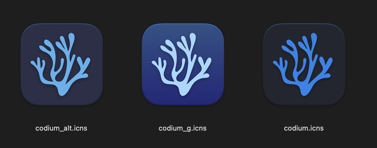
@stripedpajamas please update icons for macOS Big Sur. here is icns files;
https://yadi.sk/d/7panbPEU2VXytA?w=1
I recommend codium_g.icns, which contrasts well on all backgrounds.
hazarek
on 28 Nov 2020
Frankly I hate the new logo, what happened to the beautiful coral icon?
That had some issues and was replaced as the replacement also was considered to solve these. Actually this is quite detailed in the topic starting post...
what was the issue? any why not just modify it?
tauin
on 29 Nov 2020
No idea what the issue was (I guess the complexity), the single person that actually put in some work to fix that created a new logo and it was pulled in.
We have now the logos (I personally like the C most) and need someone with write access to this repo to pull the trigger to either the old one out the C.
And it is obvious that people would like to have a styling option (one binary, but an adjustable logo) which need a PR upstream (if it isn't too complex we could add that to the build scripts here, too - but again someone would have to do the changes first, and no one came up with code changes to allow the style be changed after the install).
GitMensch
on 29 Nov 2020
We have now the logos (I personally like the C most) and need someone with write access to this repo to pull the trigger to either the old one out the C.
The majority want the old icon but the branches are too detailed for an amblem. i updated the old one instead of C for macOS Big Sur. Society should leave design to designers. that's why open source softwares looks "Kitsch".
hazarek
on 29 Nov 2020
Regardless of all the awesome designs people come up with, VSCodium needs an official logo for application and website branding. I think alternate logos are a fine idea, but I think the main topic of this discussion is reverting the default logo/branding to the original.
jmauss
on 29 Nov 2020
old vscodium ICNS available on https://macosicons.com/
hazarek
on 29 Nov 2020
@stripedpajamas please update icons for macOS Big Sur. here is icns files;
https://yadi.sk/d/7panbPEU2VXytA?w=1I recommend codium_g.icns, which contrasts well on all backgrounds.
I vote for this
 nclsbayona
on 14 Dec 2020
nclsbayona
on 14 Dec 2020
@nclsbayona You can change the app icon manually, but it will revert original icon with every update. That's why I made a request.
hazarek
on 15 Dec 2020
Related issues
 in-in
·
20Comments
in-in
·
20Comments
 CuriousFu
·
15Comments
cristianovitorino
·
80Comments
CuriousFu
·
15Comments
cristianovitorino
·
80Comments
 amankkg
·
24Comments
amankkg
·
24Comments
 dmfed
·
21Comments
dmfed
·
21Comments
Most helpful comment
Really appreciate your thoughtful comments and approach, @cdata; thanks for opening this discussion issue (and I guess bye as well 👋 ).
It's a really fair call-out that all the recent votes that took place didn't include a "leave the icon alone" option. I would be open to making another vote, something like a) use the current icon from @estatra, possibly improve upon it; b) revert to the old "codium" style icon. I really want to give a nod to @estatra for (at least from some perspectives) taking the initiative to improve this project with his designs, and of course a nod to @jaredreich for the same initiative 2 years ago.
In fact, I will just make this comment the vote.
🎉 == Continue with the icon from #313 (actually now #485)
🚀 == Revert to the icon/s from #4
Also... I'm all ears for a better way to have these polls / get broader participation. Fully aware that the issue tracker isn't effective in this regard.
Will give this informal vote at least 2 weeks to try catch as many eyes as possible.