Vscodium: [Discussion] New logo for the project - Final vote, last post
Hello!
I fell in love with VSCodium and what the community is doing with it!
But I think the icon could use some improvement.
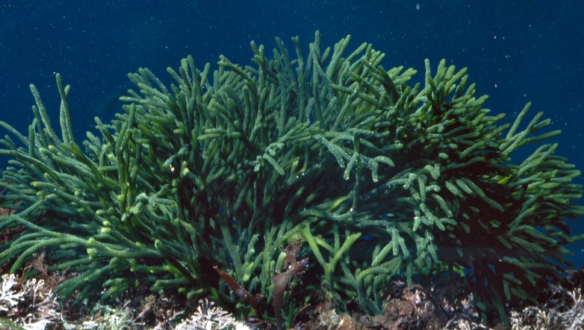
I wanted to explore the good metaphor work that @jaredreich did for the current logo and expand it a bit. Keeping to the theme of _Codium tomentosum_, the algae, and the color voted at the time on #4 . Also maybe it could use some more expanded branding, like a logotype. Make the whole thing a tad bit more modern.
Sorry I don't know how to change or add a proper label, I'm not sure I have permission?
Sources
Reference images for inspiration: Google and Wikipedia
Font: Open Sans Family - Apache License 2.0
Proposal


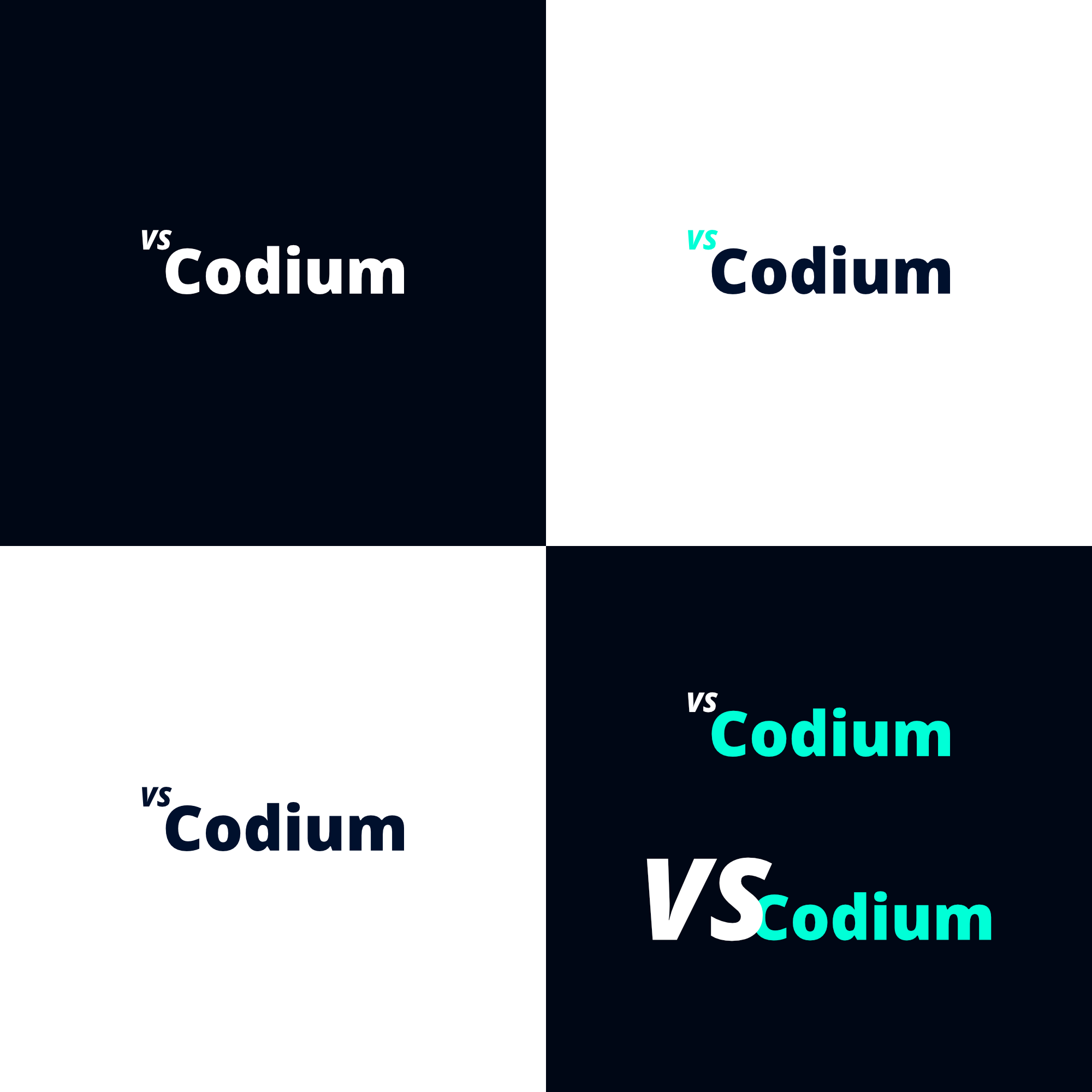

Reference

 cristianovitorino
All 80 comments
This discussion was pretty exhausted in #4
 jaredreich
on 4 Jan 2020
jaredreich
on 4 Jan 2020
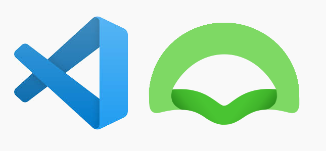
Since the May 2019 update, the VScode logos are frameless gradient shapes :
![]()
![]()
It's a shame to enclose the algae in a circle, it would be more in the current trend was alone, and highlighted by a slight gradient.
What do you think?
 Antoine-Derouin
on 8 Jan 2020
Antoine-Derouin
on 8 Jan 2020
It's a shame to enclose the algae in a circle, it would be more in the current trend was alone, and highlighted by a slight gradient.
What do you think?
Good point. Something along these lines?
I like this direction more. I tried to go along with the VSCode logo style, chunkier, more flat. Also, Atlassian relatively recent rebranding came to mind, quite inspiring. All that while keeping the Codium algae in mind.
cristianovitorino
on 8 Jan 2020
I liked the shape of your proposal last night.
I recognize less coral in this new shape, but I love the shadow folding effect that refers directly to the vscode logo!
Antoine-Derouin
on 9 Jan 2020
I liked the shape of your proposal last night.
Oh I removed it, was a bit ashamed of the hushed work haha.
I recognize less coral in this new shape, but I love the shadow folding effect that refers directly to the vscode logo!
Yeah, me too, less coral, also reminds me of a shell maybe? Still ocean related, but then again, VSCode one reminds me of a fish. And it is still somewhat the shape of the Codium algae, with the added connection with the VSCode logo.
cristianovitorino
on 9 Jan 2020
If you have other ideas for shapes with the same style of shadow folding, don't hesitate!
Now we have to see if the dev & community likes it...
Antoine-Derouin
on 9 Jan 2020
If you have other ideas for shapes with the same style of shadow folding, don't hesitate!
Perhaps this? I'm out of ideas for now. Best to wait for feedback indeed.

cristianovitorino
on 10 Jan 2020
I like it !
Antoine-Derouin
on 10 Jan 2020
Hi @cristianovitorino and everyone on this thread 👋
Thanks so much for the fresh looks. I am open to changes; I am fond of the current logo but I'm all for seeing other options as well. There isn't really a way to get everyone using VSCodium to come vote, but I can leave this issue open for a while to see what kind of reactions we get. I recommend putting ideas in a single comment and asking for votes with emojis as was done with the previous icon thread. We can leave it open for maybe a month or so and see the results.
💙
 stripedpajamas
on 9 Feb 2020
stripedpajamas
on 9 Feb 2020
Hey @stripedpajamas, sounds good to me!
--
Vote for the style, color can be decided on a second round of votes.
:thumbsup: = 1
:heart: = 2
:smile: = 3
:rocket: = 4

cristianovitorino
on 10 Feb 2020
I'm pretty fond of the current icon. Maybe just removing the current icon from it's circle would be a satisfactory change for me.
 JohnRyanAudio
on 19 Feb 2020
JohnRyanAudio
on 19 Feb 2020
I don't really like the current icon, I agree that the biggest problem is the circle.
Aside from aesthetics, the current logo is mostly white space, with the blue having insufficient contrast against it. This results in it blending into general screen-clutter as compared to other app icons in the dock or in the cmd-tab switcher.
I really like the green and blue options presented above, and I prefer the ones with a bit of depth-shading to them, despite what current trends in flatness (is that over yet?) might tell us.
 JonnieCache
on 19 Mar 2020
JonnieCache
on 19 Mar 2020
I really like the green and blue options presented above, and I prefer the ones with a bit of depth-shading to them, despite what current trends in flatness (is that over yet?) might tell us.
Flat is still standard, but "neumorphism" is trending amongst the design community right now, which I find horrifying... but to each their own. Personally I love flat when well done, but I like to use it as a base to improve upon when we're talking logos and branding, it can benefit from extra "muscle" to give it more unique personalities, pure flat is awesome and sufficient for small Icons and some logos, certain cases, etc, but I love a bit of shading and perspective in the correct places and in the right ammount, applied properly and subtly.
If approved, I already know how to improve/tweak a lil bit the proposed redesigns above and make their color iterations for the final choice voting.
cristianovitorino
on 19 Mar 2020
Hello again @stripedpajamas.
[...] We can leave it open for maybe a month or so and see the results.
It has been almost 3 months. How should we proceed with this? Are the current amount of votes enough? There is 26 total at the time I'm writing this. Should we leave it a bit longer? Should I proceed further? Or should I close the issue?
cristianovitorino
on 25 Apr 2020
I would say move on. Doesn't seem the conversation is really going to pick up.
JohnRyanAudio
on 27 Apr 2020
Hi @cristianovitorino -- so sorry for the long wait time on this issue. It looks like # 1 wins! Can you do another quick round for color choice?
stripedpajamas
on 27 Apr 2020
Hi @cristianovitorino -- so sorry for the long wait time on this issue. It looks like # 1 wins! Can you do another quick round for color choice?
For sure. I'll get to it soon.
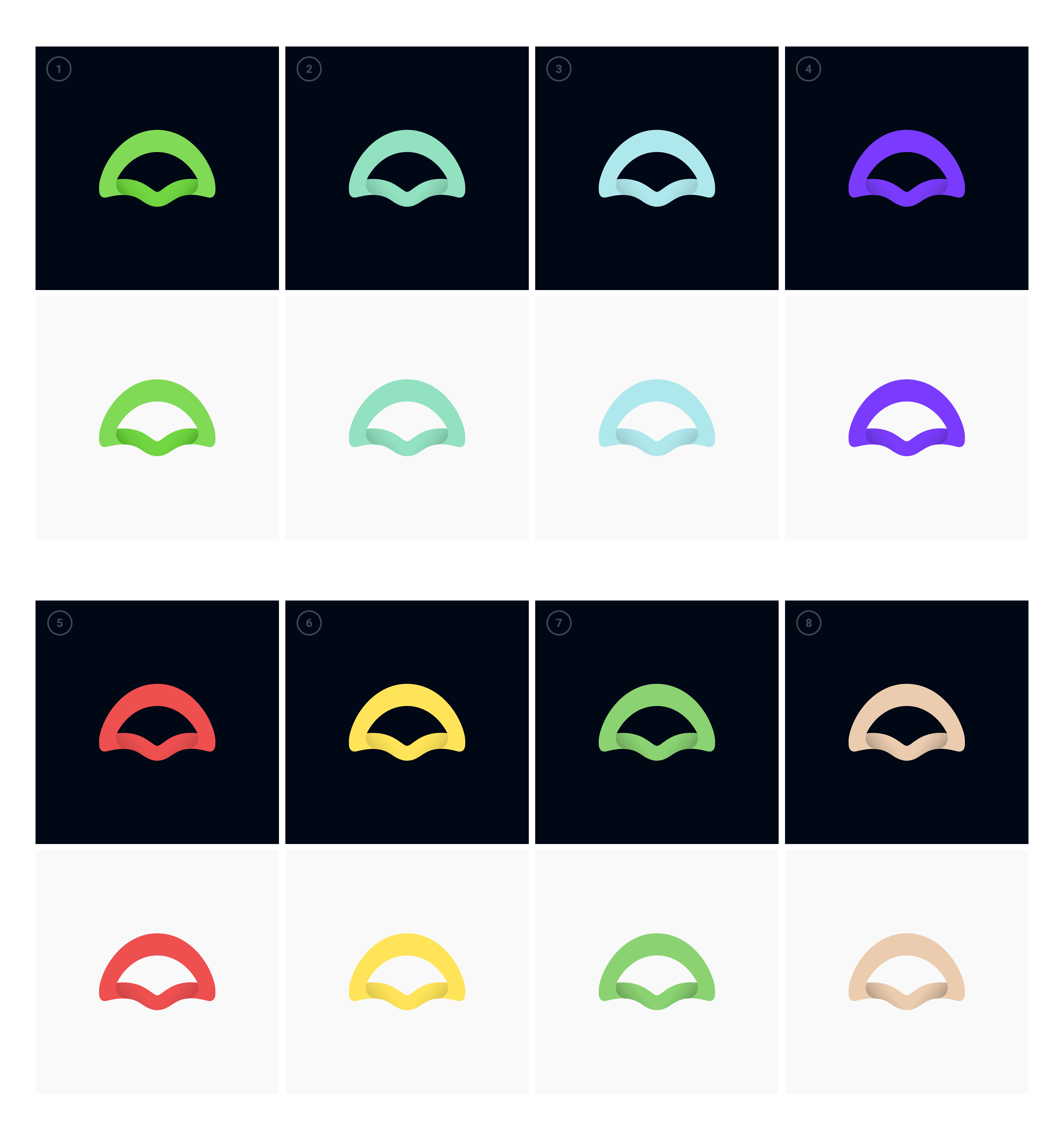
cristianovitorino
on 27 Apr 2020
Color choice round. Please keep in mind the metaphor for the logo when choosing, Codium is an algae.
Click on the image for full view.
1 = :+1:
2 = :-1:
3 = :smile:
4 = :tada:
5 = :confused:
6 = :heart:
7 = :rocket:
8 = :eyes:
cristianovitorino
on 27 Apr 2020
Well, i really think this is perfect.

 rejedai
on 4 May 2020
rejedai
on 4 May 2020
It does indeed look good.
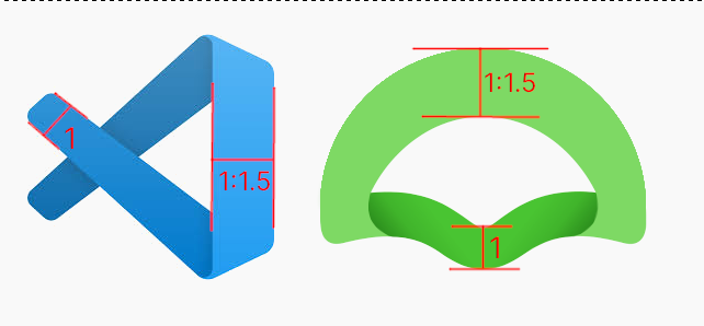
The only detail that bothers me a little is that the aspect ratios (height/width) make it visually small compared to the others.
Antoine-Derouin
on 5 May 2020
It does indeed look good.
The only detail that bothers me a little is that the aspect ratios (height/width) make it visually small compared to the others.
Other than constructing a completely new metaphor and style, or staying with the current aspect ratio, perhaps something like this could be a good compromise candidate?
_Lamé's special quartic was used to construct the outer shell versions._
VSCode for reference
Outer shell

Outer shell with a symmetric logo inside
cristianovitorino
on 5 May 2020
No no, this circle is bad. Just look at that.
You can make it a little fatter or just increase the top (ideally, maintaining the relationship, as in the original). I think good idea make bottom darker.
rejedai
on 5 May 2020
Indeed the circle is a regression on the reflection we have led.
I was just imagining a path closer to in ratio 1:1.
I'm thinking something like this :
(I did a stretch, hence the dirty look.)
Antoine-Derouin
on 5 May 2020
Unfortunately, 1:1 is not always achievable. Unless of course not lose in presentability.
rejedai
on 5 May 2020
No no, this circle is bad. Just look at that.
Calm down, it was a SUGGESTION. BTW destructive ego boosted criticism is unnecessary and a waste of everybody's time, this was free and unwarranted. I don't remember displaying disrespect towards you. Adopt proper conversation etiquette or I'm not interested in interacting with you further. "No no" and "this circle is bad" is a useless feedback. "Just look at that" is plain insult at my attempt of collaboration.
Aside from that I agree that different ratios can be an alternative, although I discourage mimicking the Microsoft VSCode logo to every single pixel and ratios.
[...] I think good idea make bottom darker.
I Disagree. Again I think this is getting too much from the VSCode logo, decreasing the proposal personality.
I was just imagining a path closer to in ratio 1:1.
Tried that. Looks odd. Still thinking about a possible solution.
Unfortunately, 1:1 is not always achievable. [...]
True.
cristianovitorino
on 7 May 2020
"No no" and "this circle is bad" is a useless feedback. "Just look at that" is plain insult at my attempt of collaboration.
Forgive me, I don’t know English well enough, and I don’t yet know what language constructs are disrespectful or insulting. I translated from Russian, and before the translation it did not sound rude or not respectful. _And I really liked your concept of the icon, and also tried to offer something._
rejedai
on 7 May 2020
"No no" and "this circle is bad" is a useless feedback. "Just look at that" is plain insult at my attempt of collaboration.
Forgive me, I don’t know English well enough, and I don’t yet know what language constructs are disrespectful or insulting. I translated from Russian, and before the translation it did not sound rude or not respectful. _And I really liked your concept of the icon, and also tried to offer something._
I see. I understand now, it was a miscommunication error, lost in translation. All is good then.
Let's proceed. I'm iterating and trying new solutions based on the above feedback.
cristianovitorino
on 7 May 2020
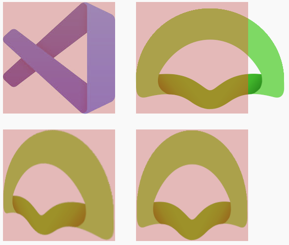
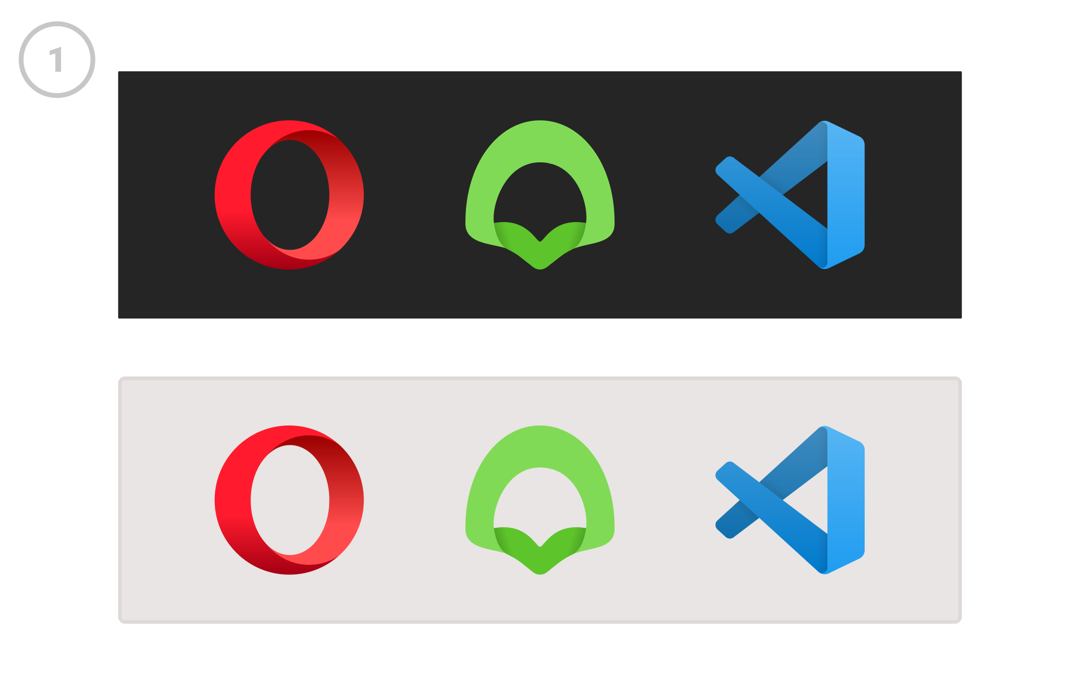
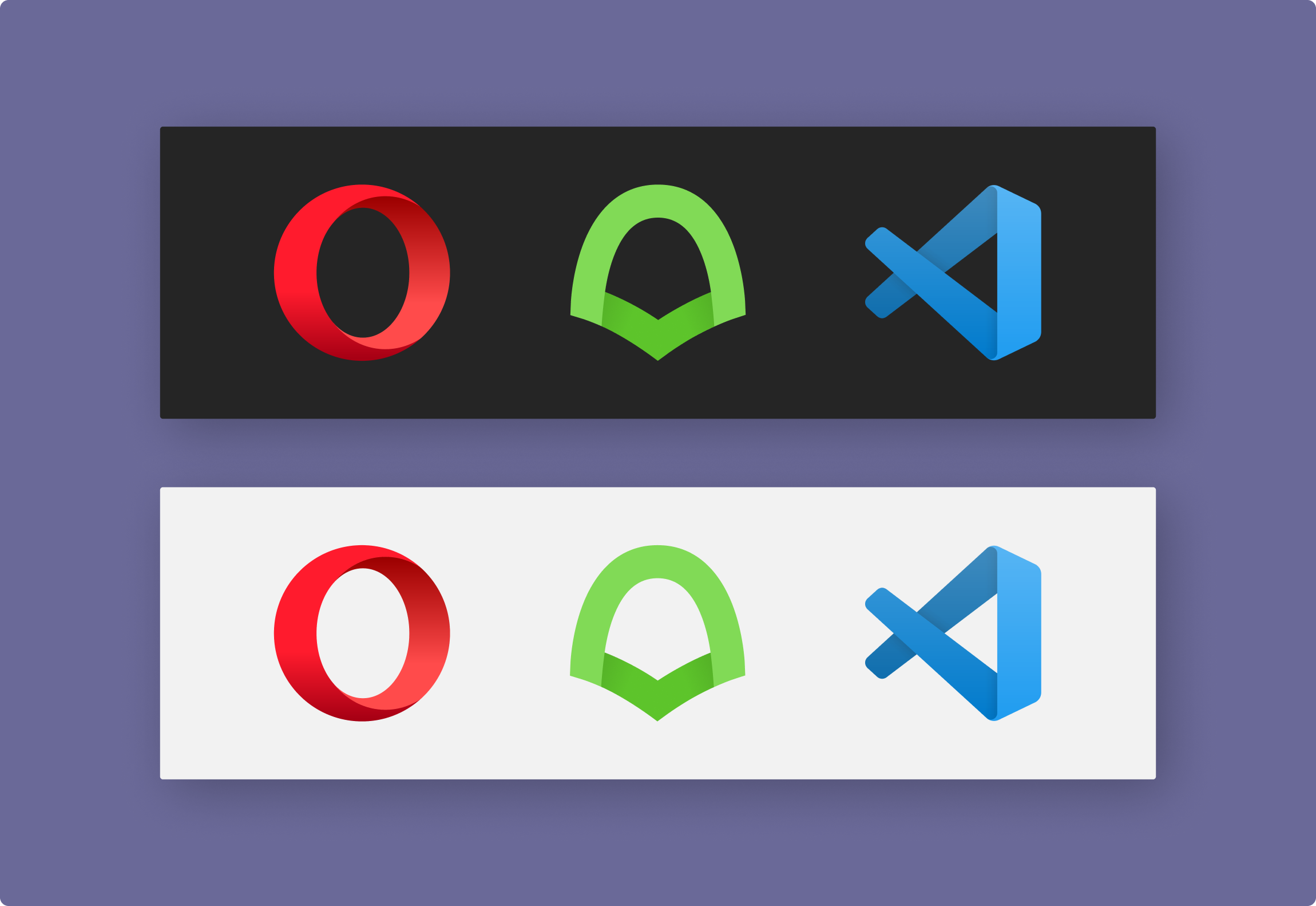
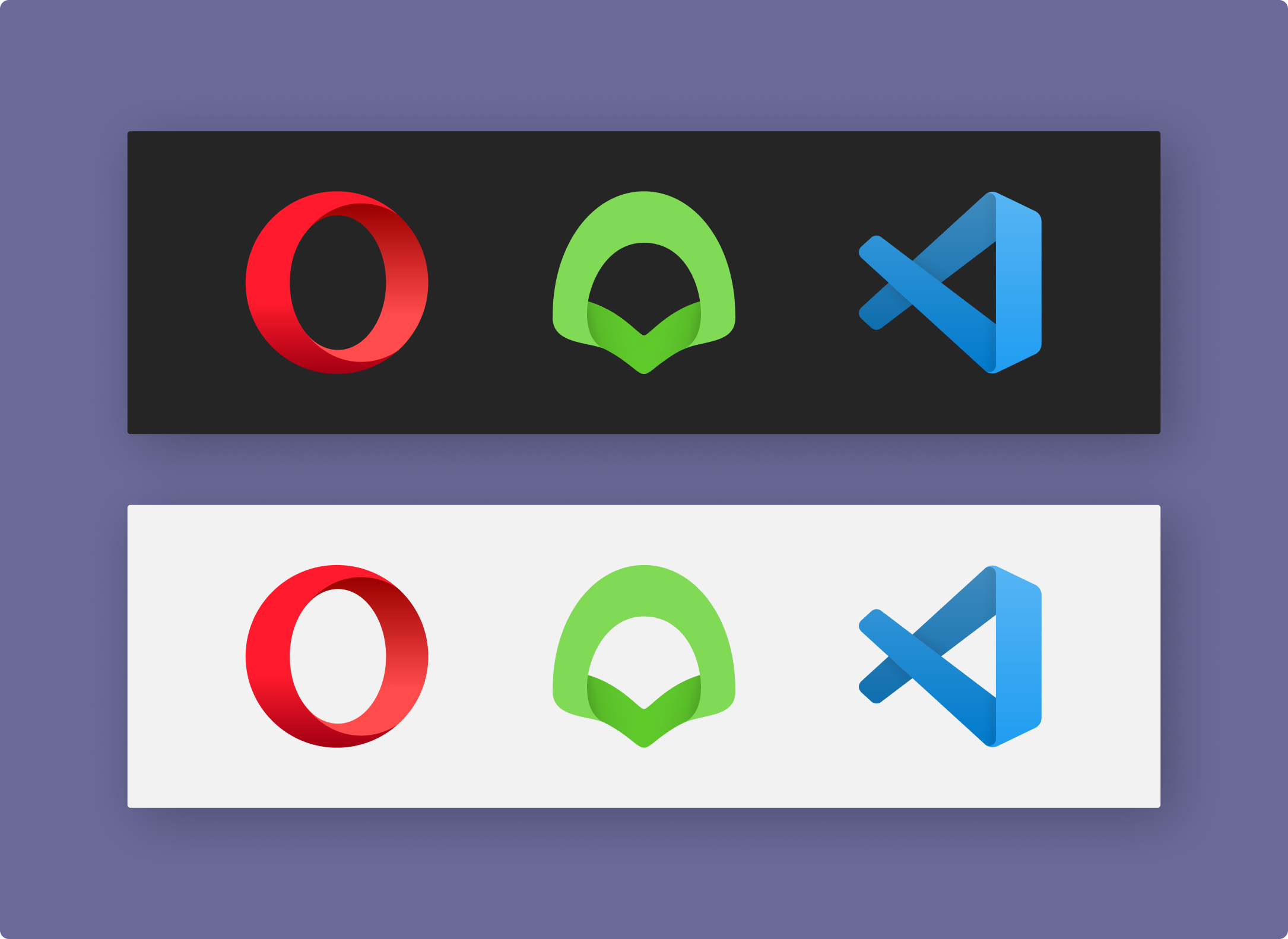
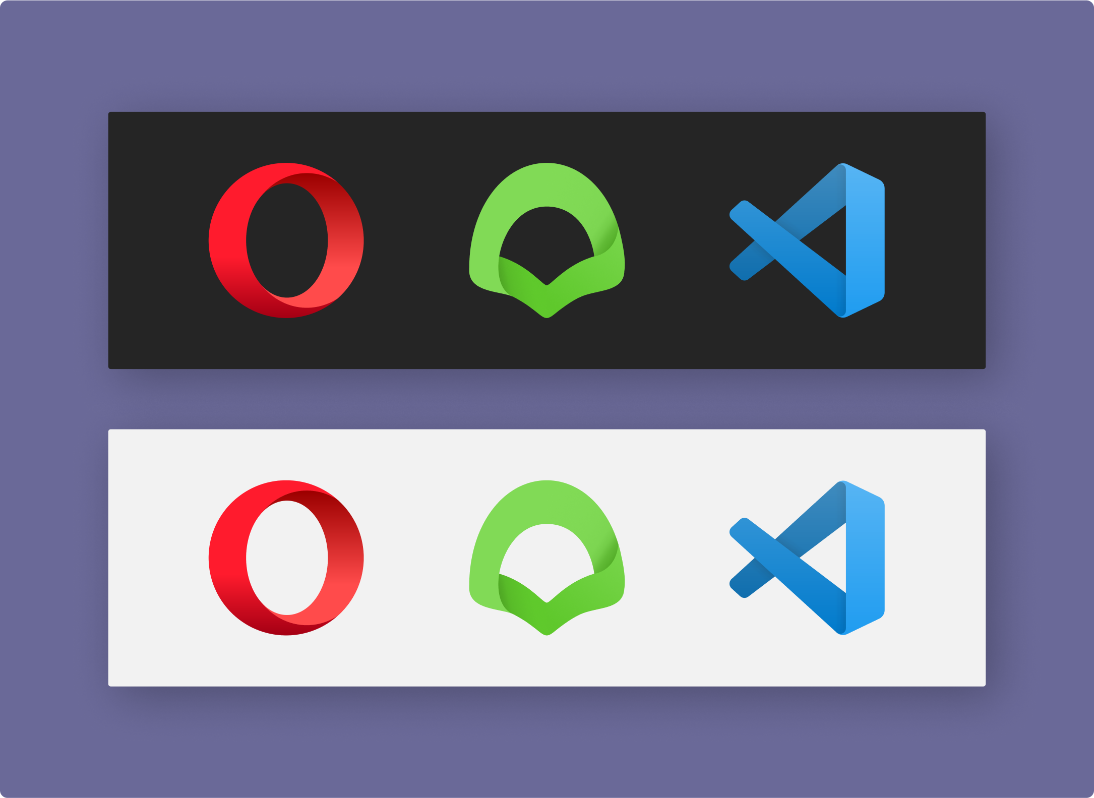
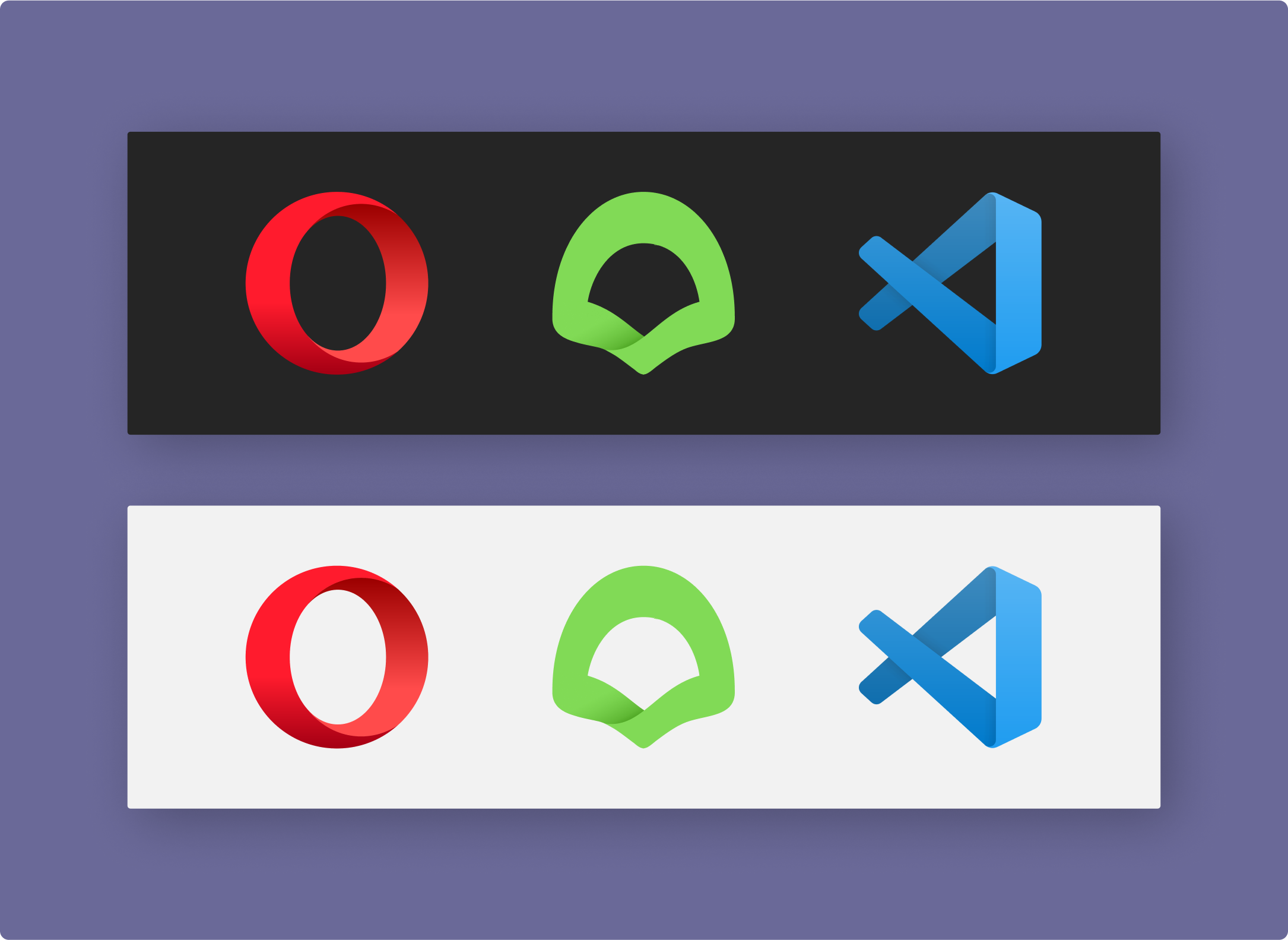
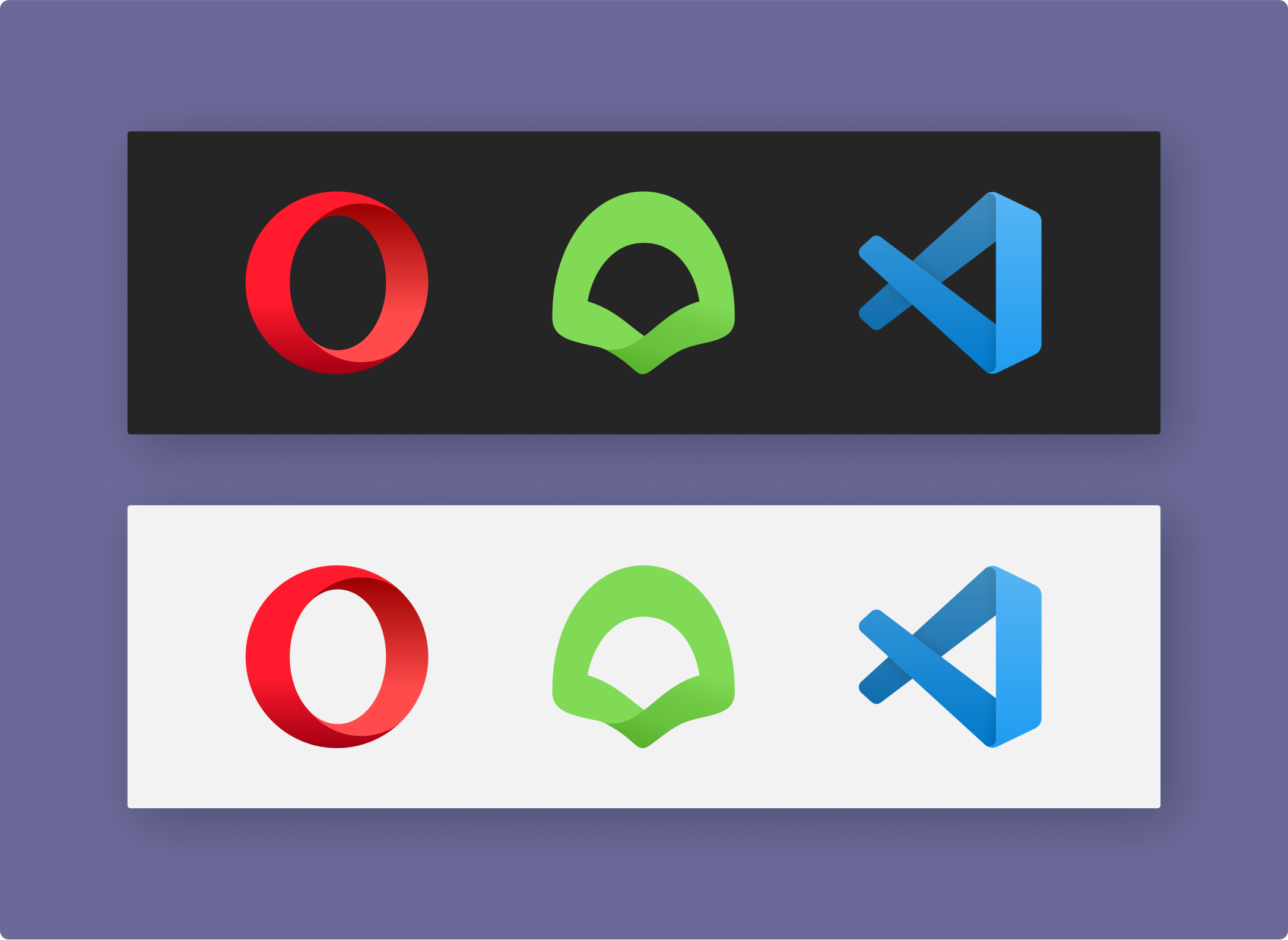
@Antoine-Derouin This is a perfect construction of the current proposed VSCodium logo design side-by-side with the Opera and Affinity Designer logos for reference. The proportion is 1:1 horizontally for the VSCodium logo.
Does it still bothers you?

In this suggestion, in an attempt to achieve a 1:1 proportion both horizontally and vertically, I introduced the metaphor of an Isopod, a sea creature, on top of the Codium algae metaphor. A bit weird isn't it? Maybe can help derive something else.

Other than that, we can either follow rejedai's suggestion and mimic VSCode logo proportions, or continue to iterate variations.
Or discard the proposal, your're the project owner, no hard feelings. If you're not 100% with the design and I keep failing to deliver a final proper redesign that improves the project image, you shouldn't feel obliged to anything.
cristianovitorino
on 7 May 2020
When I said ratio, I meant the overall shape, not the size of the ribbon.
The real question is, am I the only one who's disturbed by it? :joy:
Antoine-Derouin
on 8 May 2020
@Antoine-Derouin Well I don't speak French, but since we both speak romance languages (my mother language is Portuguese) and I have a bit of help from Google Translator, I think I got what you said.
I see what you mean. I'll try to do a less stretched version but try to keep the 1:1 that you seek so much :joy:
cristianovitorino
on 8 May 2020
@Antoine-Derouin Well I don't speak French, but since we both speak romance languages (my mother language is Portuguese) and I have a bit of help from Google Translator, I think I got what you said.
Sorry, a moment of tiredness and haste, I forgot to translate...
Thank you for your patience, it's never easy when it comes to graphic design and community stories.
Antoine-Derouin
on 8 May 2020
Sorry, a moment of tiredness and haste, I forgot to translate...
Thank you for your patience, it's never easy when it comes to graphic design and community stories.
No problem, it's fun for me, I'm used to the iteration process. And I pretty much understood what you said the first time, we share a common ancestor language : )
cristianovitorino
on 8 May 2020
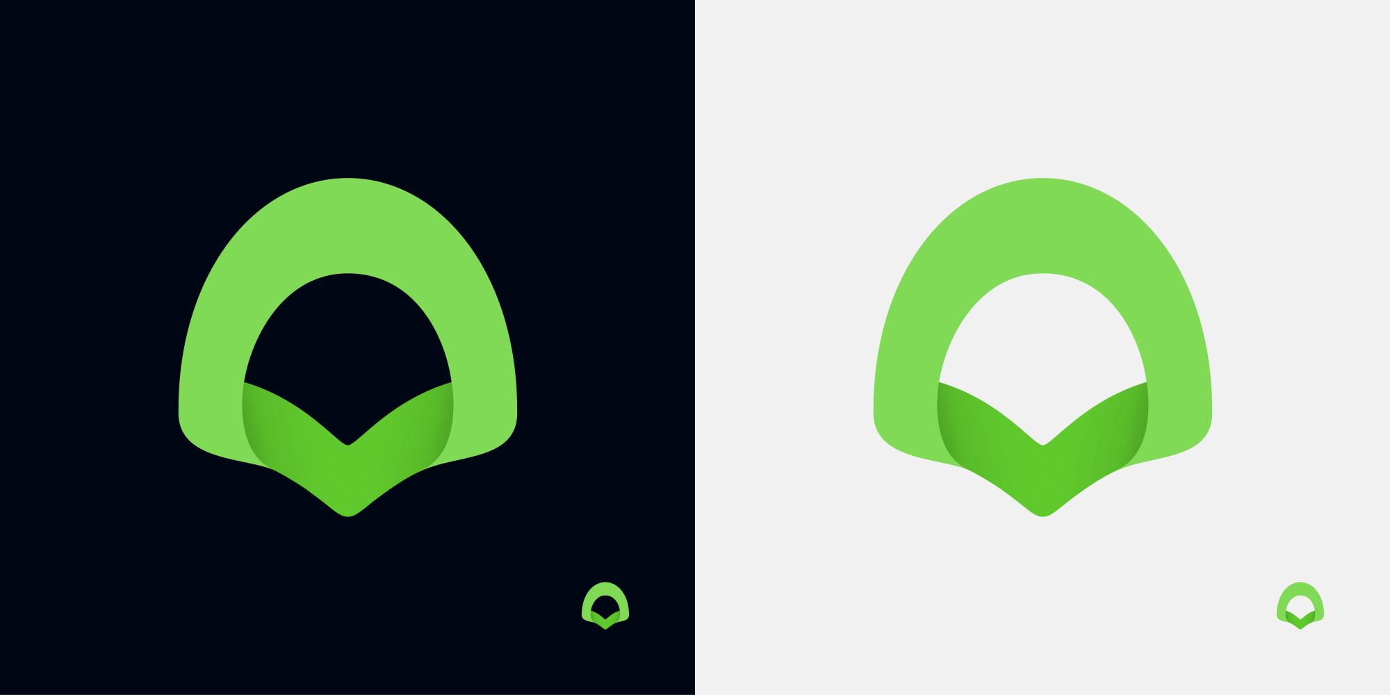
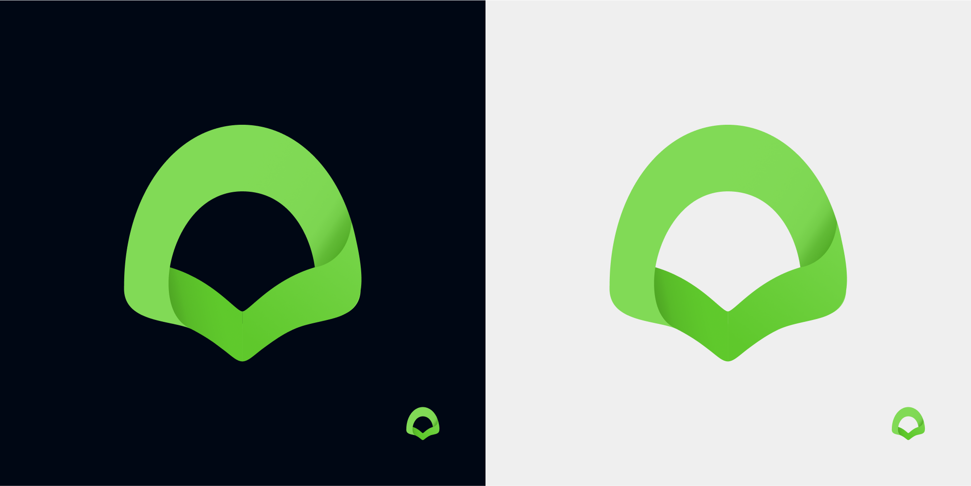
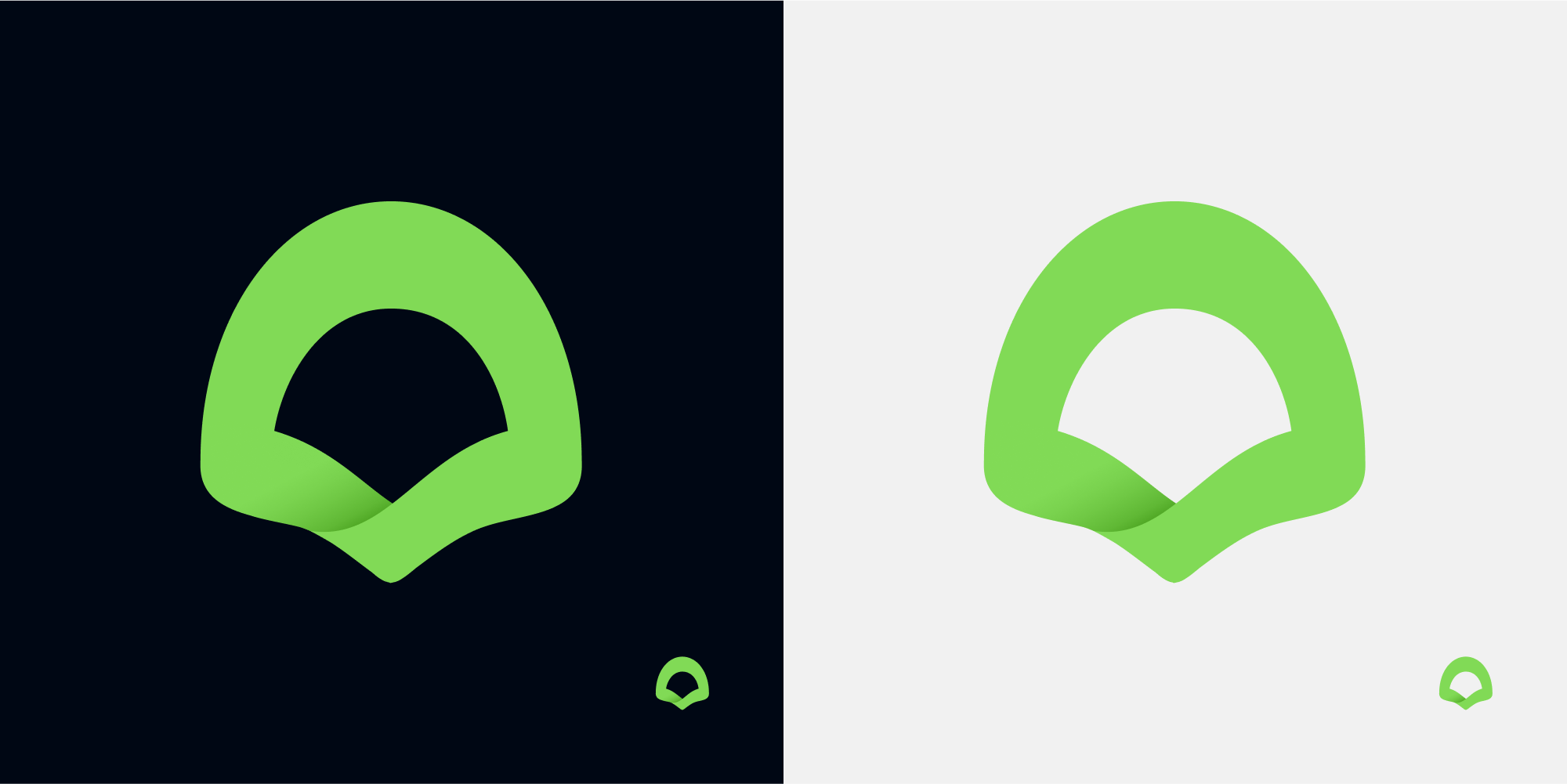
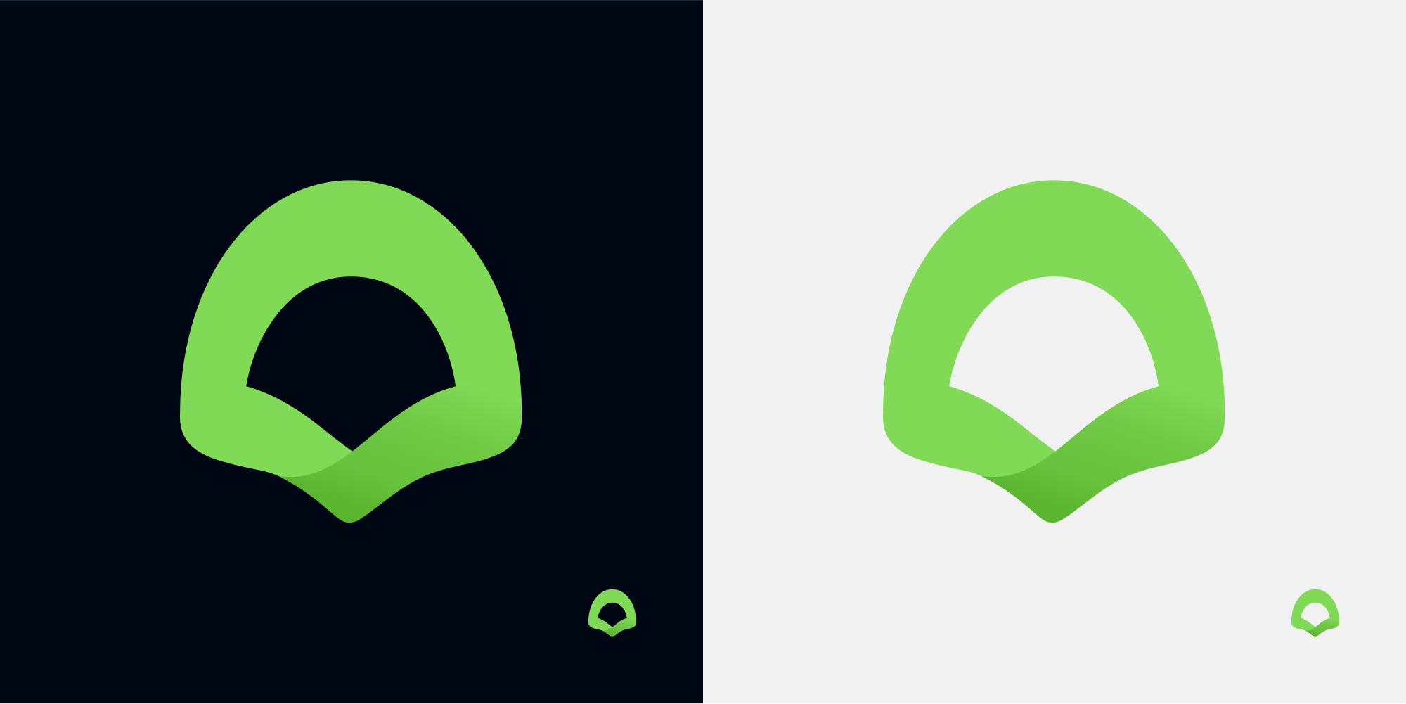
@Antoine-Derouin How about this? 3 different versions, reworked from your idea.


cristianovitorino
on 9 May 2020
@cristianovitorino I have a preference for the last two.
The second one gives the impression that the folding comes first, it's very nice too!
But it looks a bit like a mouth sticking out its tongue, doesn't it?
I like less the first one with its thinner ribbon.
Antoine-Derouin
on 9 May 2020
@Antoine-Derouin
@cristianovitorino I have a preference for the last two.
So we have at least a way forward :smile: But are you happy with it? Or not 100% yet? Need more iterations?
cristianovitorino
on 9 May 2020
@cgimenes For the size ratio and the sensational aspect of the icon's size compared to the others, all three are very good!
Thank you!
I have a preference for the second, but I think we can take a vote, no?
Antoine-Derouin
on 9 May 2020
@cgimenes For the size ratio and the sensational aspect of the icon's size compared to the others, all three are very good!
Thank you!
No problem : )
I have a preference for the second, but I think we can take a vote, no?
But you said you had a preference for the third, I'm confused. But sure, let's put it to a vote, let me know which one you prefer also so I have an idea what you're looking for. I'll number the candidates this time.
cristianovitorino
on 9 May 2020
@Antoine-Derouin There we go : )
1 = :heart:
2 = :+1:
3 = :rocket:

cristianovitorino
on 9 May 2020
@cristianovitorino First off, thank you for your hard work and initiative on this.
Quick, blunt initial reactions from someone seeing it for the first time: looks very suggestive (open mouth, tongue). I would avoid.
Skimming through the thread, I far prefer the tree-like logo idea in https://github.com/VSCodium/vscodium/issues/313#issuecomment-583909540
As a third alternative: how about riffing off of the idea that “codium” sounds like a drug (perhaps to fix what’s wrong with VSCode?) Perhaps we can veer away from a literal reinterpretation to a slightly tongue-in-cheek homage with a bit of unique character?
Quick sketch:
- Use of colour to pay homage to its origins but with contrasting green (from your logo) to portray difference
- Pun on the name sounding like a drug.
- Could also be stylised differently (this is more about the idea)
- VSCodium text set in all-caps Hack font.
- Happy to share the simple Gravit designer or SVG if anyone wants it.
Thoughts? (I’m not married to anything about it; please feel free to shoot it down, etc. Just wanted to share it as I thought it was fun.) :)
<3
 aral
on 28 May 2020
aral
on 28 May 2020
Please give without drugs.
rejedai
on 28 May 2020
@aral Hey thanks for contributing, it's an open thread, decisions are up to the project author and the community.
The tongue perception is up for interpretation, as I never saw that that way myself, until the author pointed it out off one of the proposed designs. I fail to see a mouth metaphor. I can say for example that the official Visual Studio Code logo looks like a fish to me. Your interpretation It's purely psychological, for anyone in doubt or interested look up _Rorschach Test_. If _it is_ a relevant issue, it needs to be tested first or made relevant/raised either by the author or the community.
To me, that bottom part is obviously a band fold, and that's what it should represent at a style perspective, at a metaphor perspective it should be the root of the algae or the back of a clam shell.
That doesn't mean that the design can't be challenged or iterated further if it has significant issues. But we need to be careful not to do this ad infinitum, looking at every nook and cranny for defects with each new iteration and keep iterating forever. Ponderation of the overall design needs do be done, and it's currently on vote.
My intent is to keep to the marine theme, both representing the overall shape of the Codium algae and of a Clam Shell.
I disagree with the drug interpretation, I don't endorse any kind of drug, licit or illicit unless your health is at risk and you need real medication for real healthy problems, I don't think the metaphor serves a purpose on this project, as it's not related to the either the pharmaceutical industry nor any health organization.
cristianovitorino
on 28 May 2020
Not my circus; not my horses ;) Feel free to use, not use, iterate on, abandon, set on fire, as you wish :)
aral
on 28 May 2020
@Antoine-Derouin Is this a relevant issue? Should I add, perhaps, this, in a new round with the current winner?
cristianovitorino
on 28 May 2020
I think a more rounded version is better.
@Antoine-Derouin Is this a relevant issue? Should I add, perhaps, this, in a new round with the current winner?
I think a more rounded version is better.
rejedai
on 28 May 2020
I have nothing against this, but as @rejedai said, the logo with roundish were warmer.
Just a thought, it could be nice to have a "Möbius strip" variation, couldn't it?
Antoine-Derouin
on 28 May 2020
I have nothing against this, but as @rejedai said, the logo with roundish were warmer.
Just a thought, it could be nice to have a "Möbius strip" variation, couldn't it?
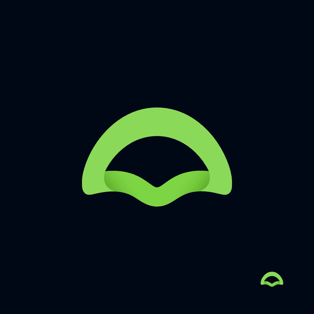
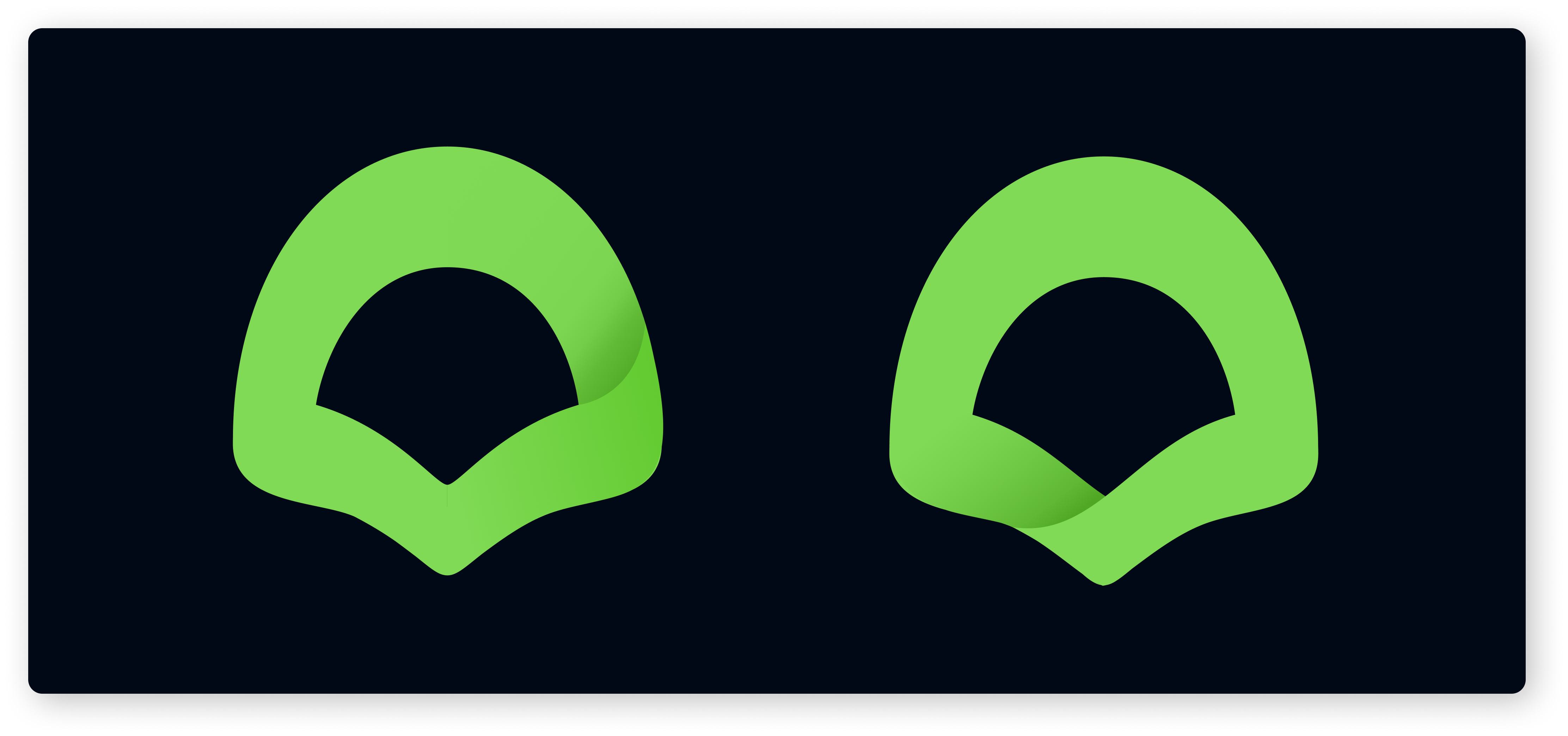
Current winner, improved, polished
A "Möbius Strip" version
cristianovitorino
on 28 May 2020
I have nothing against this, but as @rejedai said, the logo with roundish were warmer.
Just a thought, it could be nice to have a "Möbius strip" variation, couldn't it?Current winner, improved, polished
A "Möbius Strip" version
first perfect, imho
rejedai
on 28 May 2020
I need to tweak the Möbius one, It's not accurate.
cristianovitorino
on 28 May 2020
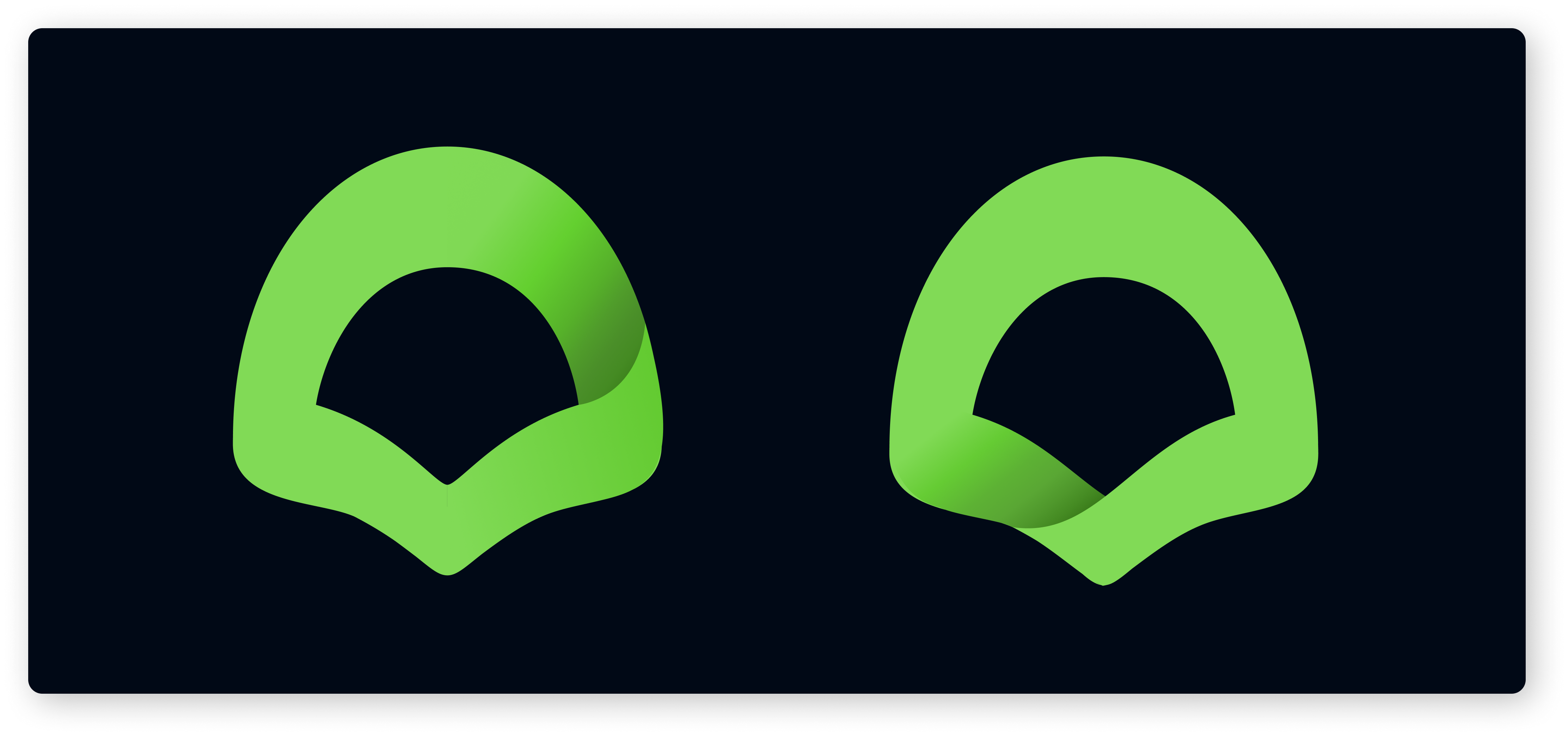
Correct Möbius version.
cristianovitorino
on 28 May 2020
@Antoine-Derouin What do you think? How should we proceed?
cristianovitorino
on 28 May 2020
it seems not bad, but at the same time there is a feeling that something is missing. possibly due to the fact that there are fewer dark areas.
rejedai
on 28 May 2020
I do love the direction the moebius version is going (the asymmetry is appealing); the "Current winner, improved, polished" is also still looking fine to me.
stripedpajamas
on 28 May 2020
are we allowed to make the same official VScode logo but with different color?
 ghost
on 28 May 2020
ghost
on 28 May 2020
are we allowed to make the same official VScode logo but with different color?
If you can get a written permission from their legal team, yes. Otherwise, no.
cristianovitorino
on 28 May 2020
@Antoine-Derouin This an "inverted" accented shadow of the Möbius version. Do you have any more suggestions or ideas? If you're happy with the latest iterations, should we put this to a final vote?
cristianovitorino
on 28 May 2020
@cristianovitorino I had a preference for the visual contrast of the verse with two folds.
The last proposal is a bit "geolocation", isn't it?
Anyway I really like what you've done with the Möbius idea!
Antoine-Derouin
on 28 May 2020
@cristianovitorino I had a preference for the visual contrast of the verse with two folds.
The last proposal is a bit "geolocation", isn't it?
Anyway I really like what you've done with the Möbius idea!
@Antoine-Derouin But the "double fold" version is not a real Möbius, just letting you know. Only the last two corrected versions are.
We can always find problems with any iteration, different perceptions, etc, the thing is how much of a problem it is. We can't do this forever. If the "good" parts overweight the "bad" parts, specially if it's personal perception related, the design is valid and a viable candidate.
How should we proceed? Final Vote? Thoughts? New ideas?
cristianovitorino
on 28 May 2020
It's true.
Can you test with a larger area of shadow, please?
It's the gradient color I find visually pleasing.
Or maybe place the fold somewhere else?
Antoine-Derouin
on 28 May 2020
It's true.
Can you test with a larger area of shadow, please?
It's the gradient color I find visually pleasing.Or maybe place the fold somewhere else?
Something like this?
cristianovitorino
on 28 May 2020
@Antoine-Derouin Perhaps darker, longer shadows is what you mean?
cristianovitorino
on 28 May 2020
@cristianovitorino That's very good! I'll let the others have their say.
Antoine-Derouin
on 28 May 2020
Last revision. Final vote. Please choose wisely.
Any further work from me will be just polish if needed.
1 = :heart:
2 = :+1:
3 = :rocket:
4 = :tada:
5 = :smile:


cristianovitorino
on 28 May 2020
It looks like 2 is the winner 👍
PRs welcome to transition over to the new icon -- there are a couple variations that would need to be created (I think they are all in https://github.com/VSCodium/vscodium/tree/master/src).
Thanks everyone for sticking with this thread!
stripedpajamas
on 8 Jun 2020
@stripedpajamas Gonna work on that as soon as possible.
cristianovitorino
on 8 Jun 2020
@stripedpajamas The PR is ready for review.
cristianovitorino
on 9 Jun 2020
I know I'm far too late on this, but I only just discovered VSCodium... anyway although I like the new icon design that was chosen I must say it doesn't look at all like a codium algae anymore, if that was the idea behind it I really think it's missed the mark. Just my 2 cents... 🙂
 SimonBrazell
on 15 Jul 2020
SimonBrazell
on 15 Jul 2020
413 merged; closing this issue. Thanks again @estatra
stripedpajamas
on 29 Jul 2020
What a shock to see that new logo. I know colors and styles are very personal, but that's 180 degrees turn 🙄
 rdewolff
on 15 Aug 2020
rdewolff
on 15 Aug 2020
Any openness to revising this?
 sdaitzman
on 18 Aug 2020
sdaitzman
on 18 Aug 2020
What a shock to see that new logo. I know colors and styles are very personal, but that's 180 degrees turn :roll_eyes:
Any openness to revising this?
The proposal was up for 8 months with votes open and a large number of iterations and meaningful discussion.
Any thought, answer, comment or decision on your questions is up to the project owner.
I don't particularly see any problem in suggesting a better design or improvement on the current one, but that window is unfortunately gone now after 8 months of iterations and discussion, as the process is finished and a new VSCodium version with the new logo is already released, currently in the process of minor bug fixing on the main icon paddings.
cristianovitorino
on 18 Aug 2020
@estatra I think the new logo is a definite improvement over the old one, and I appreciate your effort on this.
If I was around to vote on this I would have gone for the runner up (4) in this comment, as it looks much more like a codium while still in keeping with the vscode logo design. But that's just me and as I said, I know I'm too late on this.
Anyway I think it's a great addition to the project. Cheers!
SimonBrazell
on 18 Aug 2020
If I was around to vote on this I would have gone for the runner up (4) in [this comment] [...]
Yeah a few people really liked that one, I'm a bit ashamed of it as I think a did a poor job, if it went through to later phases I would have polished it a lot more.
I appreciate the feedback, thanks : )
cristianovitorino
on 18 Aug 2020
I'm a bit ashamed of it as I think a did a poor job
We are often our own worst critic 🙂 I think it looks cool as is, like an abstract representation of algae!
Hard to get feedback on something like this, other than an issue like this there is no other channel, and obviously people will only come looking for it once it's already changed...
SimonBrazell
on 18 Aug 2020
Yep it's clear that people will go here once it's already changed as we look at issues when we have... issues. It's good sign that people don't look at it ^^.
Maybe change it directly by a temporary "prototype icon" (the first proposal was not horrible) could have pushed more people to get there before working 8 months with a very small number of people.
I don't even understand what was the problem with the older icon so that's why I didn't look here while I am rather interested in the subject (design).
I just find the new one a little weird, it feel like it is not proportional (in height) in comparison with my other icons on Mac OS, but maybe it's me as it look like you already work on that subject.
The style is OK, it is difficult to satisfy everyone anyway ^^' good job !
 CyberDuck79
on 20 Aug 2020
CyberDuck79
on 20 Aug 2020
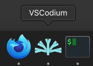
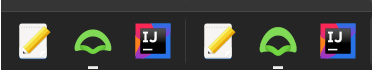
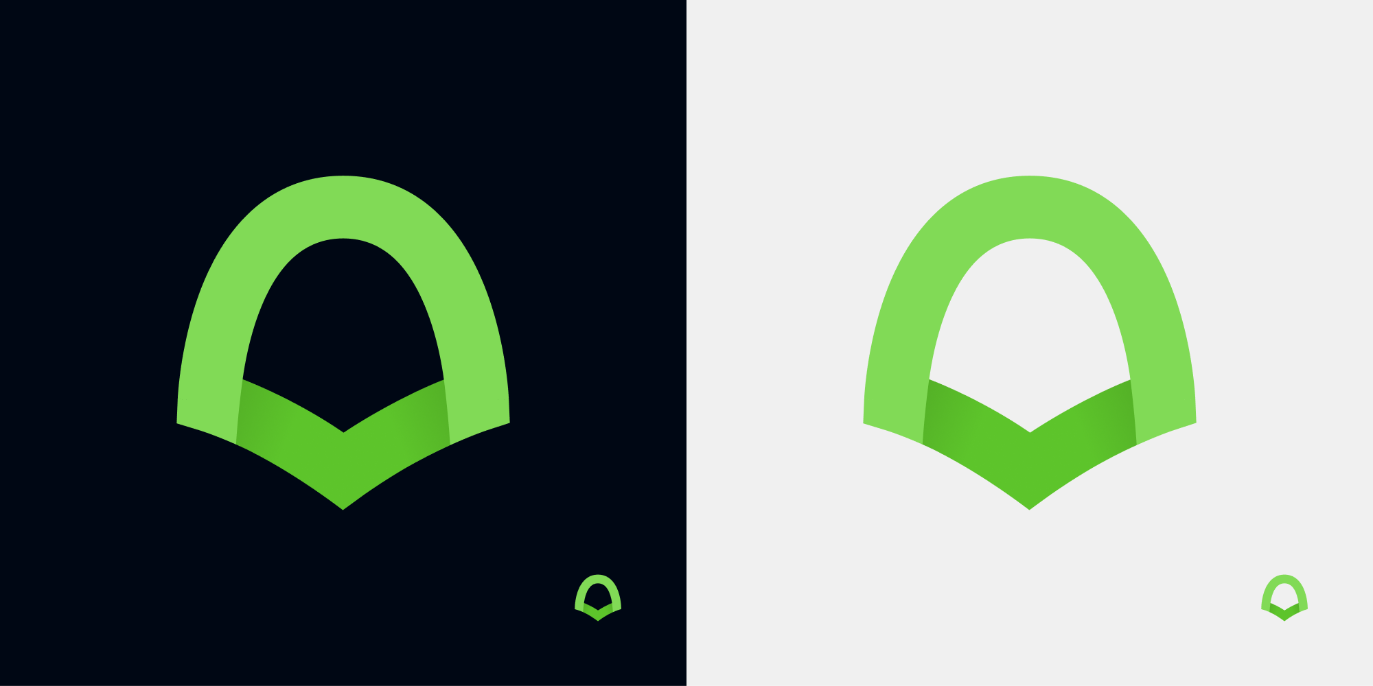
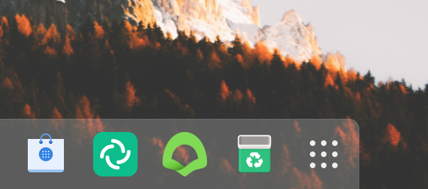
:) I liked the previous icon better. The new one isn't bad either and I will just get used to it. But it could use some slight improvement - if I may suggest please give it just a bit more contour so it's stands out from the background (especially when on a grayish one, please compare how easier on the eyes is that Element's icon in the picture, also greenish).

All in all a good icon.
 piotrekzurek
on 20 Aug 2020
piotrekzurek
on 20 Aug 2020
@CyberDuck79
Maybe change it directly by a temporary "prototype icon" (the first proposal was not horrible) could have pushed more people to get there before working 8 months with a very small number of people.
Not a very small number of people. The issue was displayed on the first page for months. Perhaps you mean interest? As people stumbling upon this when trying to solve bugs is not the same behavior as seeing the proposal on the front page for months and choosing not to participate, or not caring, that's an issue on the interest in the subject. Requests for a complete revamp or new proposals after 8 months is not doable, but as I said before, I don't mind new proposals at all, It's just that I felt the VSCodium could use some more modernization on the icon and did a formal proposal, was discussed, accepted and voted upon, it's just not up to me at this point as the process is finished on my part.
The project owner and the community is completely free to move on from here and change things, and I see no problem with that.
And the title was changed several times to reflect the development cycle of the new icon. It started as a normal and formal proposal, was well received and evolved from there.
I just find the new one a little weird, it feel like it is not proportional (in height) in comparison with my other icons on Mac OS, but maybe it's me as it look like you already work on that subject.
It's a bug that is already being working on. As I don't use macOS myself, I'm waiting for the project owner to give me some help when he's available to apply the fix.
cristianovitorino
on 20 Aug 2020
@piotrekzurek
:) I liked the previous icon better. The new one isn't bad either and I will just get used to it.
Humans always get grumpy with changes, me included haha. Give it time and it will grow on you : ) I remember when Instagram last changed their logo, oh the horrors on the internet haha I doubt anyone today even remembers that that was even a thing.
But it could use some slight improvement - if I may suggest please give it just a bit more contour so it's stands out from the background (especially when on a grayish one, please compare how easier on the eyes is that Element's icon in the picture, also greenish).
Element's (Riot's ) new redesign is actually flat. You might be using a custom, third party icon theme? You also seem to have a rendering issue on your side, which I'm unable to see on mine.

All in all a good icon.
Thanks!
cristianovitorino
on 21 Aug 2020
Oh sorry first page of what ? 😮
That's not lack of interest it's ignorance.
There nothing on my startup page.
The change logs ? I was thinking it was the same as vs code.
But if you mean GitHub this is what I talk about, a very few people (I mean users) look at it and participate if they don't have issues about the code mainly.
I just predict that there will be more people on that subject now the that the icon is effectively changed and the subject is closed 😅 so it's pity but maybe I'm wrong.
CyberDuck79
on 21 Aug 2020
Oh sorry first page of what ?
GitHub Issues page for this project.
That's not lack of interest it's ignorance.
Not at all. There is no discussion forum for this project, the issue was up and visible for months.
There nothing on my startup page.
Of course not, it was a 8 month process, it wouldn't last forever on the first page.
The change logs ? I was thinking it was the same as vs code.
Nothing to do with logs.
But if you mean GitHub this is what I talk about, a very few people (I mean users) look at it and participate if they don't have issues about the code mainly.
As I said, there is no community forum for VSCodium. Issues and changes are discussed here, and it was visible for months on the first page, it's not ignorance, it's interest.
I just predict that there will be more people on that subject now the that the icon is effectively changed and the subject is closed so it's pity but maybe I'm wrong.
I think you're mistaken indeed. Of course people will take notice now that the new icon is up, completely normal, it's not a project part of a business with a marketing campaign to spam people "Hey, we're discussing changing the logo". Or to spam people's emails. And a lot of open source projects chooses to discuss such changes internally, it varies from project to project, in VSCodium's case it's quite open, and this issue was open for 8 months on the main channel for issues.
All issues are discussed on the project's GitHub issue section.
Again, as I said before, it was a long process, parts interested chipped in, it evolved and got to a conclusion, it's up to the project owner and the community to do whetever it is necessary from now on, my contribution is done.
And I'm still helping out solving the issues relating to the icon, the padding problem also affects VS Code as well and VSCodium inherited it unknowingly, people don't need to worry about that, for VSCodium one PR is up and done, and another is in the making.
cristianovitorino
on 21 Aug 2020
Currently VSCodium uses the issue tracker + GitHub reaction emojis to "vote" on changes. If you want to stay up to date on ideas/changes and/or vote for or against them, you can choose to watch the repo.
This logo change was open since January, we got votes and discussion. We may revisit the logo in the future, but not right now. Much appreciation to @estatra for the logo and the continued edits/tweaks.
stripedpajamas
on 21 Aug 2020
Related issues
 wmhilton
·
30Comments
wmhilton
·
30Comments
 JL2210
·
55Comments
JL2210
·
55Comments
 tyu1996
·
29Comments
tyu1996
·
29Comments
 linsui
·
20Comments
linsui
·
20Comments
 dmfed
·
21Comments
dmfed
·
21Comments
Most helpful comment
Hey @stripedpajamas, sounds good to me!
--
Vote for the style, color can be decided on a second round of votes.
:thumbsup: = 1
:heart: = 2
:smile: = 3
:rocket: = 4