Verify the BLUE icon (macOS, Linux, Windows) on STABLE (!):
Verify (macOS, Linux, Windows) on STABLE (!):
- the new icon is in and its the blue VSCode logo with full border shape (no "Rautenmuster"):

- Test the icon shows up in
- Windows
- [ ] Task Bar
- [ ] Window
- [ ] File associations BUG: https://github.com/Microsoft/vscode/issues/35380
- [ ] Letterpress background (when no editor is opened, visible in dark, light and HC themes)
- [ ] Welcome (icon for the tab)
- [ ] Installer
- [ ] Tile in the Start Menu ("pin to start"):
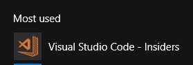

- Linux
- [ ] Dock
- [ ] Window
- [ ] Letterpress background (when no editor is opened, visible in dark, light and HC themes)
- [ ] Welcome (icon for the tab)
- macOS
- [ ] Dock
- [ ] File associations
- [ ] Letterpress background (when no editor is opened, visible in dark, light and HC themes)
- [ ] Welcome (icon for the tab)
Note: sometimes the OS decides to cash the old icon. In that case, try to uninstall and reinstall. On Windows there is a trick to flush the icon cache: from an admin powershell session, run (ls “$env:ProgramData\Microsoft\Windows\Start Menu\Programs\[Shortcut].lnk”).lastwritetime = get-date where Shortcut is the VScode name.
 bpasero
All 18 comments
@bpasero Is this already on todays insiders? I don't see a new icon, is there a special trick needed?
 jrieken
on 28 Sep 2017
jrieken
on 28 Sep 2017
@jrieken yes all in, but I see that each OS has its own issues with caching the icon somewhere. On what OS are you checking?
bpasero
on 28 Sep 2017
mac
jrieken
on 28 Sep 2017
@jrieken yeah good catch, I have code that refreshes the icon cache on macOS but this code will only run once when we updated to our orange icon a while ago. I pushed a change so that we update the icon cache once again, so for tomorrow we should see the new green icon for insider automatically showing up.
Btw, I think we should verify this on stable once we have some stable builds tomorrow.
bpasero
on 28 Sep 2017
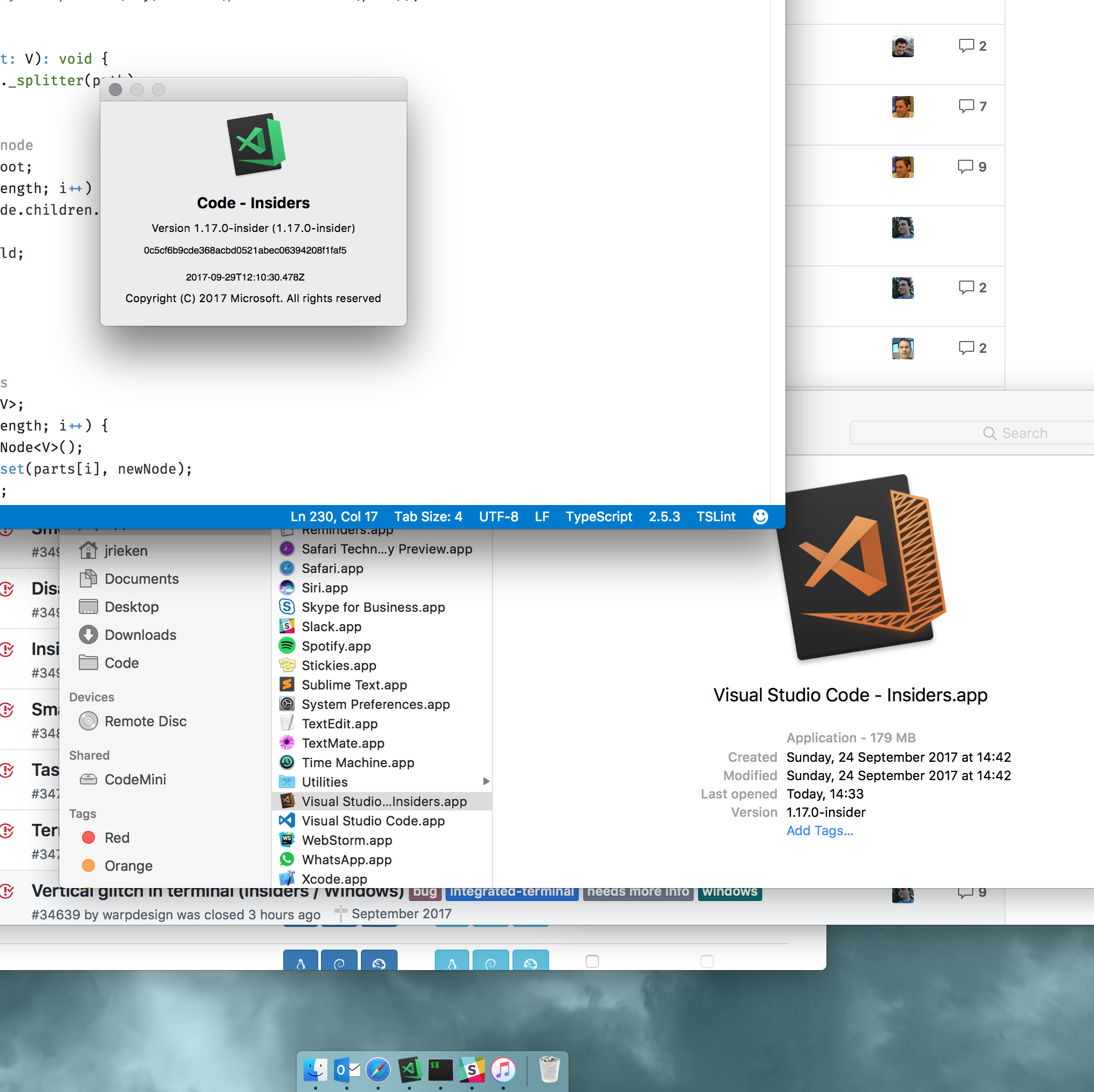
Unsure why but I do see a mix of icons...
jrieken
on 29 Sep 2017
@jrieken weird, maybe my cache invalidation trick does not help for the finder. However seeing the right icon in the dock and about dialog is good.
bpasero
on 29 Sep 2017
I see the right icon when downloading the stable candidate
jrieken
on 29 Sep 2017
Marking macOS as verified, also for me.
bpasero
on 29 Sep 2017
Windows looks OK except for the file associations icon (https://github.com/Microsoft/vscode/issues/35380 @chrisdias)
bpasero
on 29 Sep 2017
I'm still very confused about this. Is the icon supposed to have the tilted rectangular background on Linux, or not? The first post in this thread seems to indicate it shouldn't, yet the build I just pulled today still does... This was also the same conclusion I came to after the last thread that was widely publicized that also seemed to indicate the Linux icon shouldn't have the weird rectangle backdrop.
This is from: code_x64_1.17.0.1505281268.tar.gz:
$ pacman -Ql visual-studio-code-insiders | grep pixmaps

/usr/share/icons/visual-studio-code-insiders.png
And this is the icon file itself:

 colemickens
on 2 Oct 2017
colemickens
on 2 Oct 2017
Sorry, this issue looks related to Stable. I can open a new issue in a bit if someone doesn't correct my understanding. Thanks!
colemickens
on 2 Oct 2017
Stable: Orange, Insiders: Green. What you see is correct.
bpasero
on 2 Oct 2017
fyi - with todays (signed) builds I am back to the old icon...
jrieken
on 3 Oct 2017
Why did you switch the previous icon to _this_? What does it solve? It seems like a massive step backwards and reminds me of something from the Office Clip-art era.
 GeorgeSapkin
on 6 Oct 2017
GeorgeSapkin
on 6 Oct 2017
Can the icons at least be uniform across operating systems? Not liking the Mac icon. I'd much prefer the transparency of the Windows one.
 TankedThomas
on 6 Oct 2017
TankedThomas
on 6 Oct 2017
It looks a little too much like Sublime Text for comfort...

 lochstar
on 8 Oct 2017
lochstar
on 8 Oct 2017
The blue with the white border was much more visually distinctive and the new one just looks too busy. I understand the green for insider builds, but why change the color for the stable builds? Not to mention all the merch that has the old icon that's out in the world. This feels like a "change for the sake of change" as opposed to a constructive improvement.
 areddicks1014
on 9 Oct 2017
areddicks1014
on 9 Oct 2017
Come on! What are we, ST3?!
 tfrijsewijk
on 11 Oct 2017
tfrijsewijk
on 11 Oct 2017
Related issues
 jez9999
·
234Comments
jez9999
·
234Comments
 ozsay
·
247Comments
ozsay
·
247Comments
 mariusa
·
219Comments
mariusa
·
219Comments
 Brakkar
·
364Comments
Brakkar
·
364Comments
 lw-schick
·
229Comments
lw-schick
·
229Comments
Most helpful comment
Why did you switch the previous icon to _this_? What does it solve? It seems like a massive step backwards and reminds me of something from the Office Clip-art era.