Vocabulary: Line break issue in `card` components
@kgodey
Description
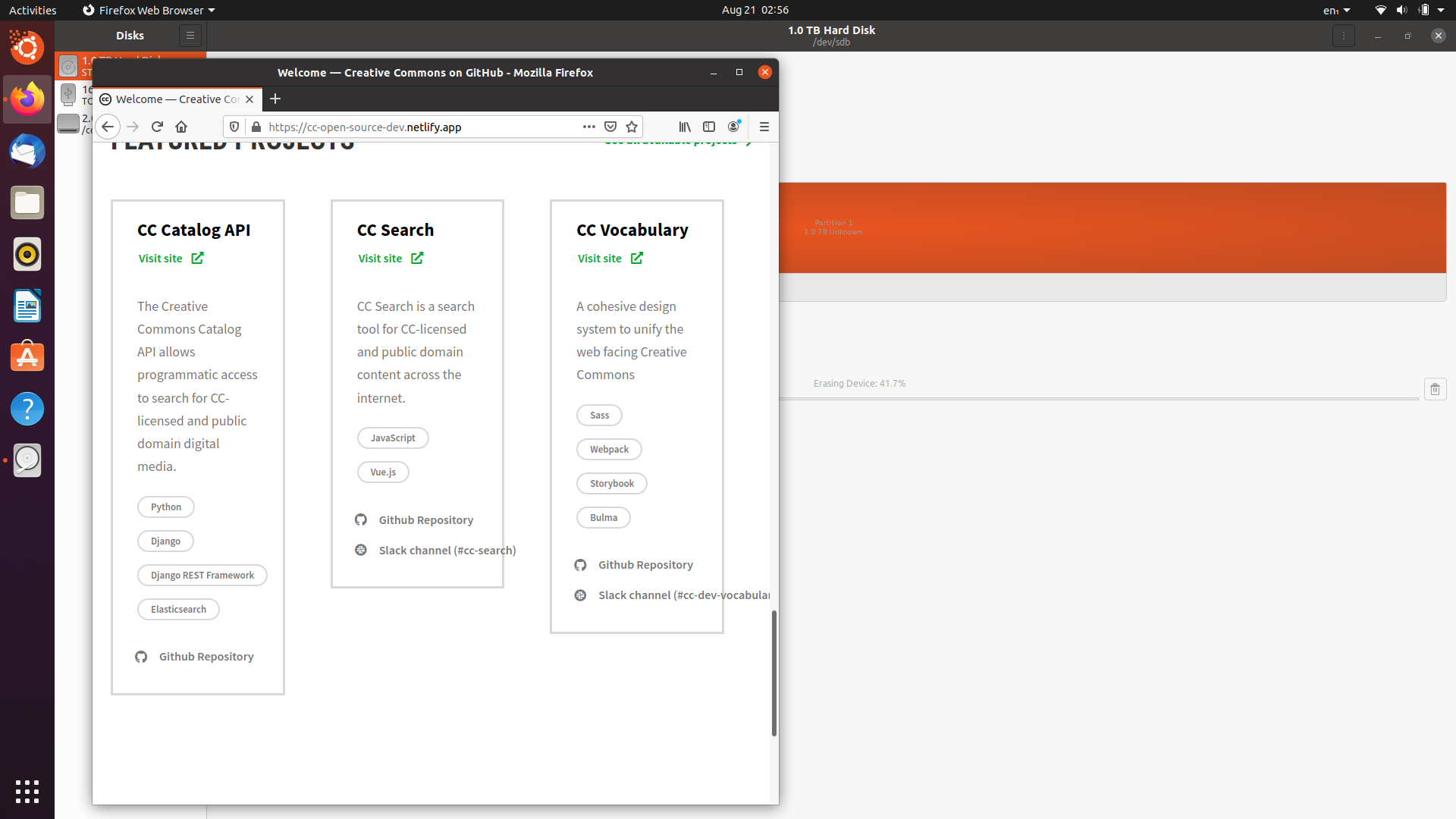
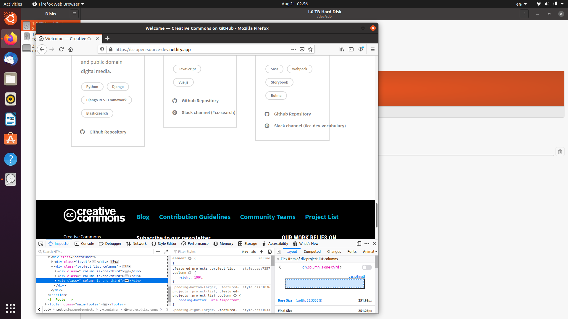
One of the featured proejct's content gets out of the box when checked the responsiveness.
Expectation
The content should remain inside the box on every dimensions.
Screenshots
Resolution
- [x] I would be interested in resolving this bug.
 Aakash2408
All 18 comments
I think we should move this issue to Vocabulary.
 Dhruvi16
on 21 Aug 2020
Dhruvi16
on 21 Aug 2020
@Dhruvi16 go ahead
@Aakash2408 the CSS for this component lives in Vocabulary, our design system, so we'll move the issue to that repo.
 kgodey
on 21 Aug 2020
kgodey
on 21 Aug 2020
so is @Dhruvi16 doing this or i can take this?
Aakash2408
on 21 Aug 2020
You can go ahead @Aakash2408 .
Dhruvi16
on 21 Aug 2020
Thanks!😅
Aakash2408
on 21 Aug 2020
@Dhruvi16 its code is in this repo or the other one i.e, creativecommons source
Aakash2408
on 21 Aug 2020
@kgodey ?
@Dhruvi16 its code is in this repo or the other one i.e, creativecommons source
Aakash2408
on 21 Aug 2020
@Aakash2408 the card styles can be found here
also, you don't need to tag @ kgodey she automatically gets notifications anyway 😆
 zackkrida
on 21 Aug 2020
zackkrida
on 21 Aug 2020
How to run this project in local environment?
Aakash2408
on 22 Aug 2020
Hey @Aakash2408 sorry for the late response. Here is the contributing guide.
Dhruvi16
on 22 Aug 2020
@Aakash2408 looks like you got your answer, but in the future, please be patient 🙂. we all have a lot to do and it can take us up to a couple of days to answer questions, repeatedly pinging us will not help.
kgodey
on 22 Aug 2020
@Dhruvi16 sorry I was not able to check the code past few days due to some tests.I will surely check the code today .Thanks for assigning it to me.
Aakash2408
on 26 Aug 2020
Wanted to check in and see if this still needs to be worked on. If so I can jump on this and knock it out ✌
 heykc
on 12 Sep 2020
heykc
on 12 Sep 2020
go ahead @heykc
kgodey
on 14 Sep 2020
I didn't want to put this up for review just yet because I have a question. These changes that I made to the button.scss file could be made and the fix would be implemented, however, I do think there's some weight in suggesting that the language of the button elements themselves be revisited. The name of the slack channels are listed in the buttons themselves, but how necessary is this?
By removing the additional name (so having it only say "slack channel") and also removing what seems like some superfluous padding on the right of each card element (note: the added padding-right is not coming from the vocabulary library), this issue would resolve itself without ever having to edit any styling from vocabulary directly.
I'm not sure which option sounds more appropriate, but if you feel allowing line breaks for .tag and .is_text buttons is necessary, then I will change the status of my PR to ready for review 😃
heykc
on 15 Sep 2020
I'm personally into the idea of hiding the channel names. But, I also think we need to think about handling multi-line buttons in vocabulary. Is that something we think we need to support? Especially considering i18n, where some translations are much longer than the original English.
I would say, yes! make your button pull request, but maybe we'll shorten the channel names too 😆
zackkrida
on 15 Sep 2020
I agree with @zackkrida we need to think in multi-line buttons and maybe for others elements too. Also, I'm in favor of hiding channel names 😄
 hugosolar
on 15 Sep 2020
hugosolar
on 15 Sep 2020
PR is ready for review! Wasn't sure if I should ask this question here or directly in the PR, but would it make sense to have a .multi-line class for buttons rather than only making these changes to .tag and .is-text classes? that way we can have this feature across all buttons depending on use case.
heykc
on 15 Sep 2020
Related issues
zackkrida
·
3Comments
zackkrida
·
6Comments
 obulat
·
4Comments
zackkrida
·
5Comments
zackkrida
·
5Comments
obulat
·
4Comments
zackkrida
·
5Comments
zackkrida
·
5Comments
Most helpful comment
@Aakash2408 the card styles can be found here
also, you don't need to tag @ kgodey she automatically gets notifications anyway 😆