Vocabulary: Update responsive nature of Table Component.
Problem
There is a need for an update in the responsive nature of the table component to make it more visible in smaller screens. As table-container class from Bulma is not much of our use.
Referencing conversation - Intern guide issue
Implementation
- [x] I would be interested in implementing this feature.
 Dhruvi16
All 13 comments
Hey @hugosolar. I saw the code used here - https://codepen.io/team/css-tricks/pen/wXgJww?editors=1100 and checked out other such code too. And the idea here is they are adding a column(that consists of header) in every row through CSS and I don't think we can do that because the header will be different for every table.
Dhruvi16
on 20 Jul 2020
I found this as a more usable solution - https://codepen.io/brunodplima/pen/rzpaLO
Dhruvi16
on 20 Jul 2020
Tagging @dhruvkb @panchovm for their views
Dhruvi16
on 20 Jul 2020
just chiming in, i tend to like tables on mobile that allow for horizontal scrolling and maybe have a 'fixed' header (it stays at the top even when there's more rows than the height of the screen).
this is a decent example functionality-wise: https://codesandbox.io/s/f71wj
 zackkrida
on 20 Jul 2020
zackkrida
on 20 Jul 2020
I think the horizontal scroll adds complexity to the natural behavior of touch devices (vertical scroll). Besides, depending on device size, the visible area of the table might change too much.
 panchovm
on 20 Jul 2020
panchovm
on 20 Jul 2020
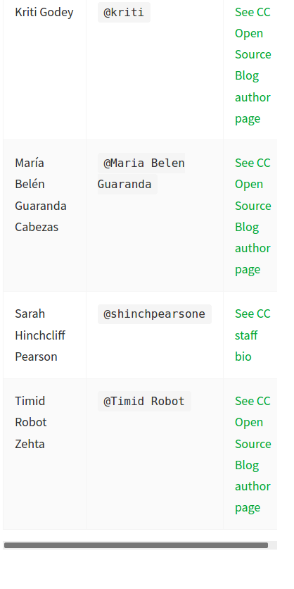
For more clarity, the problem was this -
Bulma already provides us with the horizontal scroll but before the scroll comes into picture content is squeezed too much like this -
Dhruvi16
on 20 Jul 2020
I think what @zackkrida says it makes sense for big tables but this is a small table with overflow text.
@Dhruvi16 you're right, I didn't check the code @panchovm sent, but it's not applicable to the tables built in Lektor.
I can think in something like this: https://get.foundation/sites/docs/table.html#stacked-table
see how the table transform on small screens, they just hide the table header and show the info as a stack, and the row is determined with the background color
 hugosolar
on 24 Jul 2020
hugosolar
on 24 Jul 2020
I like that it is clean, but hiding the header might be confusing when having big amounts of data or multiple pages.
panchovm
on 24 Jul 2020
I agree with @panchovm on this. More rows can make it difficult for the user to access the desired data.
Dhruvi16
on 26 Jul 2020
We discussed during sprint planning. @panchovm is working on updating the design library.
 kgodey
on 29 Jul 2020
kgodey
on 29 Jul 2020
Here is a reasonable way to present tables on mobile devices using media queries.
 dhruvkb
on 29 Jul 2020
dhruvkb
on 29 Jul 2020
I was exactly thinking on that @dhruvkb. Thanks. I will update the Design Library
panchovm
on 29 Jul 2020
Here is the responsive version of the table.
panchovm
on 4 Aug 2020
Related issues
zackkrida
·
5Comments
zackkrida
·
4Comments
 rajat2502
·
6Comments
zackkrida
·
3Comments
rajat2502
·
6Comments
zackkrida
·
3Comments
 obulat
·
4Comments
obulat
·
4Comments