Visidata: [www] Create favicon for visidata.org
 anjakefala
All 35 comments
What would you think about crowdsourcing this on a site like https://www.designcrowd.com/ ? I'd be willing to sponsor with < $100
 deinspanjer
on 13 Sep 2018
deinspanjer
on 13 Sep 2018
Hey @deinspanjer, that's an interesting idea, and very generous of you. Do we need to have a conceptual direction outlined before starting that process? I've never paid for crowdsourced design like this before.
 saulpw
on 13 Sep 2018
saulpw
on 13 Sep 2018
It certainly doesn't hurt, but it isn't strictly necessary. Here is the pitch I was thinking about:
FavIcon needed for the VisiData project's website. If a variant of the design is also suitable for a larger app icon, that would be great.
Link to project's logo: https://github.com/saulpw/visidata.org/blob/master/vdlogo.svg
VisiData is an interactive multitool for tabular data. It combines the clarity of a spreadsheet, the efficiency of the terminal, and the power of Python, into a lightweight utility which can handle millions of rows with ease.
Theme ideas:
Something that matches well with the logo is a good start. Images that evoke the concepts of tabular/relational data or spreadsheets are most interesting. Note that VisiData is run entirely within a terminal (command prompt) rather than having a standalone window such as you'd see with an application like Excel, so an image that ties into that would be a plus.
deinspanjer
on 14 Sep 2018
That sounds good to me! Do you want to just run with this and see what comes out of it?
saulpw
on 15 Sep 2018
Sounds good. I'll do so. Obviously, I'll make sure you have all copy rights to whatever comes out of it.
deinspanjer
on 16 Sep 2018
You are lovely @deinspanjer :purple_heart: =)
anjakefala
on 17 Sep 2018
Maybe it's also worth it to mention that vd is the actual command name?
saulpw
on 17 Sep 2018
I'll add that to the brief now. As soon as any proposals come in, I'll share links to them here.
deinspanjer
on 17 Sep 2018
deinspanjer
on 17 Sep 2018
deinspanjer
on 17 Sep 2018
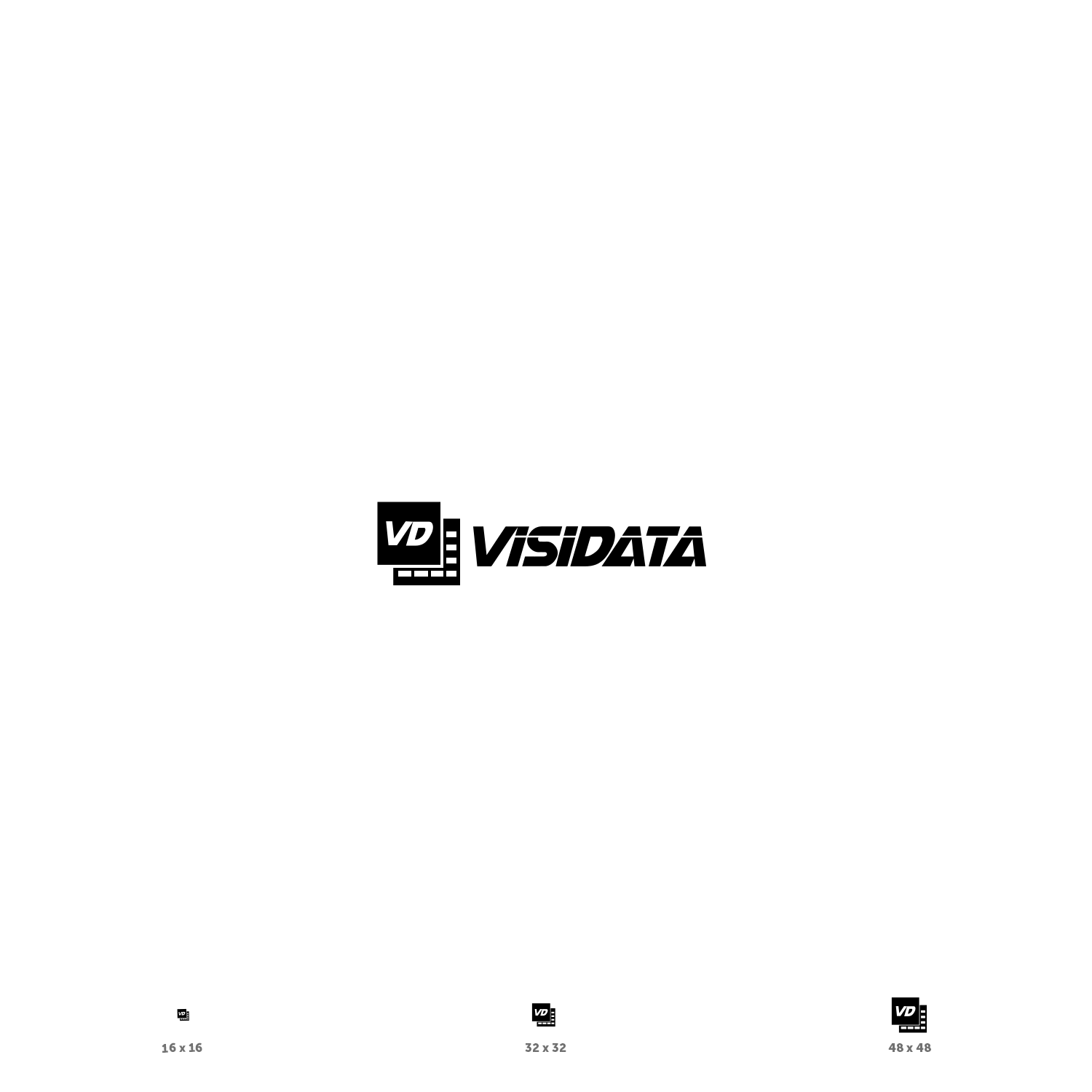
Many of these are very close to the vim logo, which I think we should avoid. Also many of these seem like they wouldn't render well at 32x32. Maybe we should be more explicit about using it as a favicon?
saulpw
on 18 Sep 2018
I was pretty explicit about that, but I agree on the feedback, and I've noted such on my feedback to the designers.
I suspect the issue is that the first pool of designers are the lower-tier trying to get something in quickly in the hopes of a quick and easy close.
That said, I did like this one in particular: https://dcassetcdn.com/design_img/3602876/687234/687234_19747419_3602876_64611145_image.jpg
I will continue pushing toward more favicon friendly designs and suggest people avoid just the "V" as that conflates with vim.
deinspanjer
on 18 Sep 2018
I've closed the previous polls and opened this one that captures my favorites. I don't believe I excluded anything that was voted 3 stars or higher by anyone, but if there is another you would like to be in this poll, please let me know.
deinspanjer
on 18 Sep 2018
If we settle on one or two choices, we can definitely ask for further revisions and tweaks from those designers.
deinspanjer
on 19 Sep 2018
I liked two of them, the one you pointed out above, and the one with two stacked "sheets". What do you think about adding some color to them? Or should the logo and favicon stay monochrome?
saulpw
on 20 Sep 2018
I love a logo / app icon with some color, but I do find that for website favicons, black only tends to give the best visibility. The github favicon is a good example there.
Not strongly tied to it though, if you'd like to see some alternatives, I'm happy to ask.
With the designs that have been submitted, I think we can pretty easily come out of this with two icons, one favicon and something larger that could be used in the project logo, if you want.
deinspanjer
on 20 Sep 2018
Are you leaning toward one or the other more? I think I'm pretty tied on them. I like the eye one because it feels visually distinctive while still a little abstract. I like the stacked sheets because it ties very strongly into the purpose and operation of the app.
deinspanjer
on 20 Sep 2018
I like the stacked sheets because it ties very strongly into the purpose and operation of the app.
I voted a preference for the stacked sheet one for this reason!
anjakefala
on 20 Sep 2018
I like the stacked sheet one too, I think (similar reasons). Looking at it more, I think it would be better if there were 4 or 5 "rows" on the bottom sheet (instead of 3) packed closer together (so only 2-3 pixels spacing between them instead of the same height rows and spacing). Also @anjakefala suggested that it might be good to have some indication of columns on the underlying sheet, which I think is a good idea if it's not too busy/cluttered. Can we get the designer to make those changes? That one seems like it would work pretty well like that.
saulpw
on 20 Sep 2018
Okay, I'm going to go ahead and lock it down on that one and then get the designer to give us some options.
deinspanjer
on 21 Sep 2018
Hi
Thanks again for selecting my design I will be online to try make sure I can attend to the changes as per your requests
KingCozy (The designer from Designcrowd)
 KingCozy
on 21 Sep 2018
KingCozy
on 21 Sep 2018
KingCozy
on 21 Sep 2018
Yeah I like it. Let's convert it to favicon 32x32 and see how it looks.
saulpw
on 22 Sep 2018

KingCozy
on 22 Sep 2018
Great, that's a lot crisper than it seemed in the other picture at that size. What do you think, @deinspanjer and @anjakefala, should we use this as the favicon?
saulpw
on 22 Sep 2018
That was my top vote and the adjustments are wonderful. =)
anjakefala
on 22 Sep 2018
Thank you for the feedback, I can have the icon ready in svg and other formats as soon as you all approve on the final look
KingCozy
on 24 Sep 2018
Alright! I'll close it out this now. :)
deinspanjer
on 24 Sep 2018
Great :) let me upload the files required on designcrowd if you need to contact me I will be available here or designcrowd
KingCozy
on 24 Sep 2018
Thank you for approving the payment I have uploaded the files to designcrowd, I can drop the zip folders here if need be, it has been a pleasure to create this icon for you
Kind regards
Cozy
KingCozy
on 24 Sep 2018
KingCozy
on 24 Sep 2018
Thank you again KingCozy. :)
deinspanjer
on 27 Sep 2018
@anjakefala @saulpw Is there anything more you need from me to finish this up?
deinspanjer
on 10 Oct 2018
@deinspanjer Hi! =) Once again thank you so much for driving this.
The favicon has been added here.
You can get a preview of the favicon live here.
We are currently in the process of updating visidata.org. I think the current consensus is that we will close this issue once the new version of the website has been shipped.
anjakefala
on 10 Oct 2018
@deinspanjer We are live! https://visidata.org/ :tada: =) =)
anjakefala
on 21 Nov 2018
Related issues
 khughitt
·
14Comments
khughitt
·
14Comments
 p3k
·
21Comments
p3k
·
21Comments
 frosencrantz
·
11Comments
khughitt
·
12Comments
frosencrantz
·
11Comments
khughitt
·
12Comments
 aborruso
·
12Comments
aborruso
·
12Comments
Most helpful comment