Victory: When graph is too big, the xaxis is cut on the right and the VictoryBar is overflowing...and the yaxis is not showing all ticks
Not sure what I'm missing here but the graph looks fine with a smaller data set. But when a larger data is supplied, I'm seeing an overflow in the right side. The x axis data point is cut and not shown.
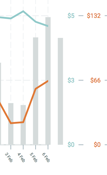
Why is this happening?
 Ashwin117
All 14 comments
I tried playing with VictoryChart width and padding, but I can't get to my solution.
Ashwin117
on 13 Feb 2018
It looks like the last tick is also being cut off on the y axis. Like in big data sets (60 values +), it feels as though the graph is too big for the y axis to cover and also overflows on the x axis side.
I had configured my graph to have 5 ticks, but only the first 4 show up
Ashwin117
on 14 Feb 2018
Have you tried the domainPadding prop (passed to VictoryChart)?
eg. <VictoryChart domainPadding={{ x : [20, 20] }}>
 walternicholas
on 14 Feb 2018
walternicholas
on 14 Feb 2018
Yes, I have this
domainPadding={[100, 100 - (dataLength * 2)]} where dataLength is number of data points I have have.
Ashwin117
on 14 Feb 2018
But this doesn't explain why the graph looks like its been cut off at the top. 5 ticks should show, but I only see 4.
Ashwin117
on 14 Feb 2018
Here's what I see.
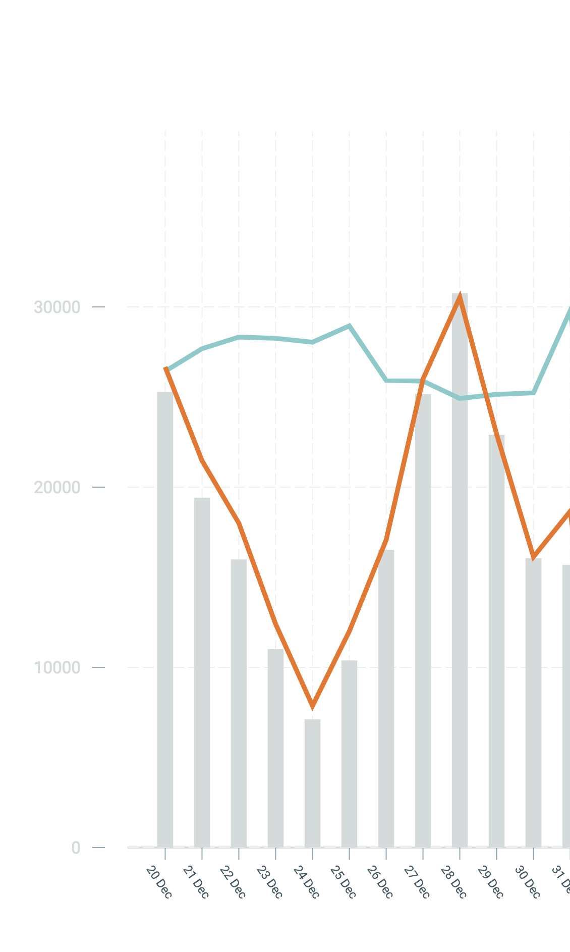
I see only 4 ticks on the y axis.. and this is the graph with the xaxis overflow.
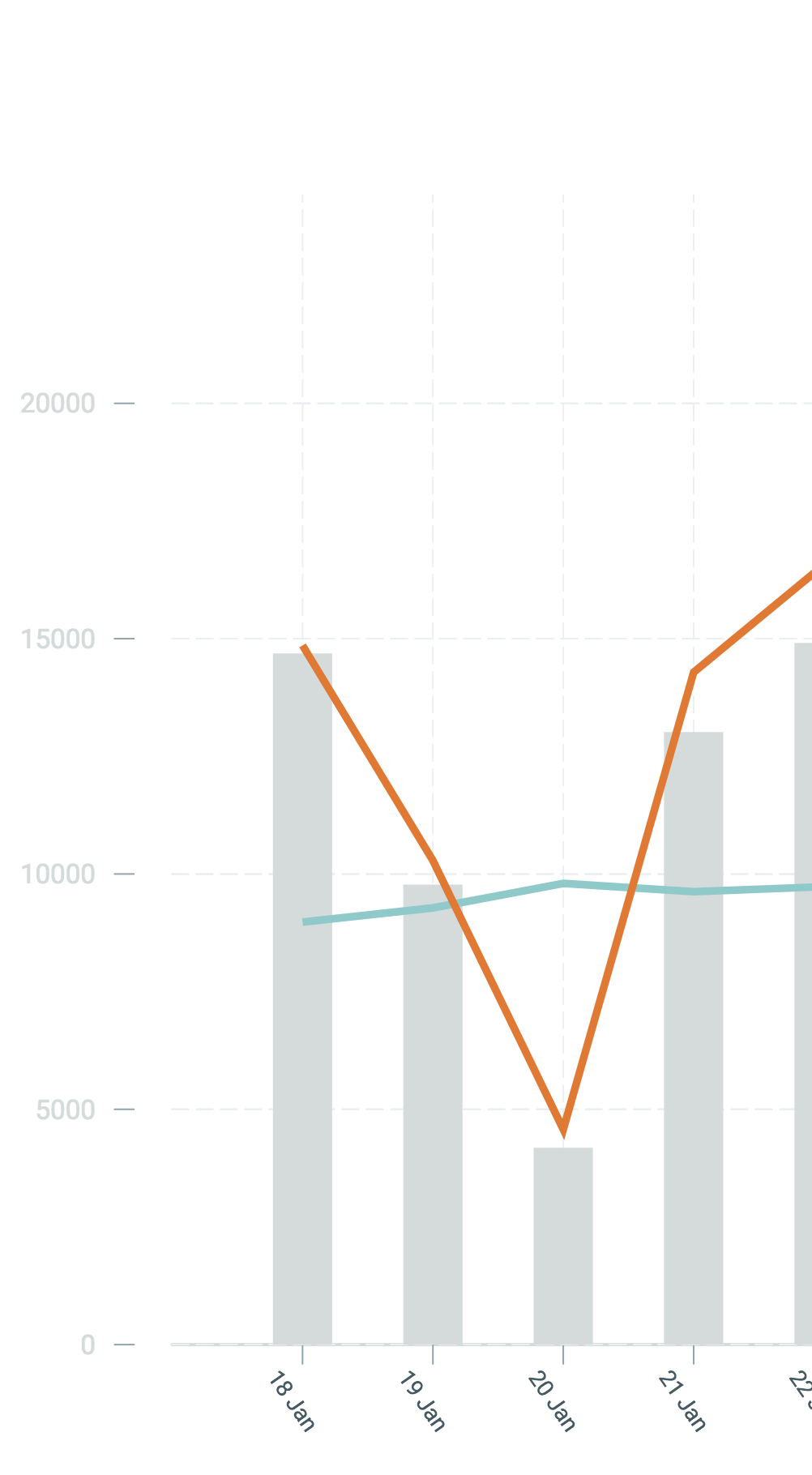
With a smaller data set, there is no xaxis overflow. And the yaxis ticks, all 5 of them appear.
Ashwin117
on 14 Feb 2018
Is there an update for this? This is pretty urgent...
Ashwin117
on 15 Feb 2018
Not sure what is causing all the problems you listed. I don't mind taking a
quick look at your Victory code if you'd like some help with these bugs.
Disclaimer: I have no affiliation with Victory. I have merely used the library for a fairly intensive graphing project with success.
walternicholas
on 15 Feb 2018
Here's my VictoryChart
<VictoryChart
          theme={VictoryTheme.material}
           width={900}
          padding={{ bottom: 50, right: 80, left: 50}}
          domainPadding={[100, 100 - (dataLength * 2)]}
          containerComponent={
            <VictoryVoronoiContainer
              voronoiDimension='x'
              labels={(d) => {
                return dataPropertyNames.reduce((filtered, value) => {
                  if (!!d[value]) {
                    filtered = `${graphDisplay[value].label}: ${graphDisplay[value].prefix || ''}${d[value]}`;
                  }
                  return filtered;
                }, '');
              }}
              labelComponent={
                <VictoryTooltip
                  style={{ fontSize: 8 }}
                  cornerRadius={3}
                  pointerLength={10}
                  flyoutStyle={{ fill: 'white' }}
                />}
            />
          }
        >
Here's my Bar/Line components. GraphType can be either VictoryBar or VictoryLine (which I get from graphDisplay[<name>].type
      let GraphType = graphDisplay[value.y_name].type;
      const dataObj = {
        [graphDisplay[value.y_name].brush]: graphConstants.colors[key],
        width: 400 / dataLength * 0.85
      };

      return (
        <GraphType
          alignment="middle"
          barRatio={0.8}
          style={{data: dataObj, labels:{fill: graphConstants.colors[key]}}}
          animate={{ duration: 2000 }}
          data={value.data}
          x={graphDisplay[graphData.x_name].dataFormat()}
          y={graphDisplay[value.y_name].dataFormat(maxima[key])}
          key={key}
        />
      );
Hmm okay this helps a bit.
I think the problem might be with your domainPadding. I think domainPadding is typically expecting positive numbers. If you supply it { x: [20, 30] }, then it should push in your bars 20 pixels in from the left edge and 30 pixels in from the right edge.
Yours is [100, 100 - (dataLength * 2)].
You said the problems happens with larger data sets (60+ values).
Let's say your dataLenth == 60.
Then dataLength * 2 == 120.
Then 100 - (dataLength * 2) == 100 - 120 == -20
So that second value is actually negative. Since positive values of domainPadding push your bars inwards, I imagine a negative value might push your bars outwards (outside the container of your chart). Could this be the problem?
The other problem could be "GraphType". While a clever solution, it assumes VictoryLine and VictoryBar take the exact same props... which I'm not sure is the case.
If you need more help, shoot me an email at walter.nicholas @ freshconsulting.com
walternicholas
on 16 Feb 2018
@walternicholas You're absolutely correct about the negative values! Making the domain constant with domainPadding={[20, 20]} helps solves the issue. But I'm running into another issue here. With a smaller data set, the VictoryBar is overflowing the xAxis because its...fatter... 😄
See pic:
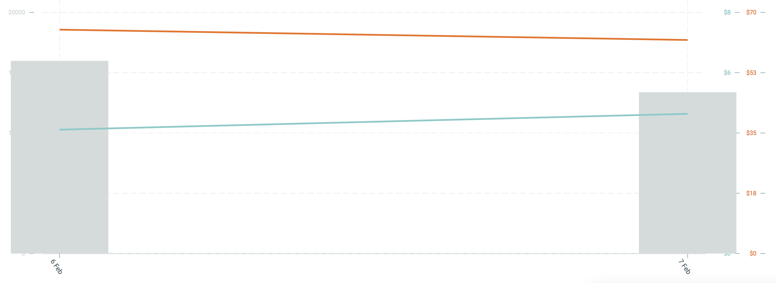
Which is why I did the dynamic padding thing to avoid this issue.
Ashwin117
on 16 Feb 2018
Ok, I've modified my domain padding like this:
domainPadding={[20 + (100 / dataLength), 20 + (100 / dataLength)]}
No matter what, it will always be a positive value. This seems to fix things. Feel free to close this. Thanks for the input.
Ashwin117
on 16 Feb 2018
Awesome!
Yeah, I think domainPadding was designed to use on VictoryBar (although it will work on other types as well). If you are using VictoryBar (with wide bars) and VictoryLine within the same VictoryChart, you may be trying to implement an impossible design!
Anyway, happy to help.
walternicholas
on 16 Feb 2018
Related issues
 iffy
·
5Comments
iffy
·
5Comments
 seddonm1
·
5Comments
seddonm1
·
5Comments
 robinwkurtz
·
3Comments
robinwkurtz
·
3Comments
 devth
·
4Comments
devth
·
4Comments
 michowski
·
4Comments
michowski
·
4Comments
Most helpful comment
Hmm okay this helps a bit.
I think the problem might be with your domainPadding. I think domainPadding is typically expecting positive numbers. If you supply it { x: [20, 30] }, then it should push in your bars 20 pixels in from the left edge and 30 pixels in from the right edge.
Yours is [100, 100 - (dataLength * 2)].
You said the problems happens with larger data sets (60+ values).
Let's say your dataLenth == 60.
Then dataLength * 2 == 120.
Then 100 - (dataLength * 2) == 100 - 120 == -20
So that second value is actually negative. Since positive values of domainPadding push your bars inwards, I imagine a negative value might push your bars outwards (outside the container of your chart). Could this be the problem?
The other problem could be "GraphType". While a clever solution, it assumes VictoryLine and VictoryBar take the exact same props... which I'm not sure is the case.
If you need more help, shoot me an email at walter.nicholas @ freshconsulting.com