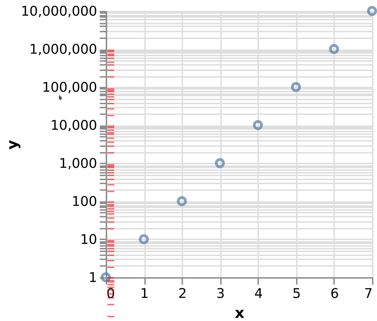
Some log plots show a strange spacing between the minor ticks. It can be seen in the example from the documentation
{
  "$schema": "https://vega.github.io/schema/vega-lite/v5.json",
  "mark": "point",
  "data": {
    "values": [
      {"x": 0, "y": 1},
      {"x": 1, "y": 10},
      {"x": 2, "y": 100},
      {"x": 3, "y": 1000},
      {"x": 4, "y": 10000},
      {"x": 5, "y": 100000},
      {"x": 6, "y": 1000000},
      {"x": 7, "y": 10000000}
    ]
  },
  "encoding": {
    "x": {"field": "x", "type": "quantitative"},
    "y": {"field": "y", "scale": {"type": "log"}}
  }
}
Looking carefully at the output, one can see that the ticks of every second decade have a different spacing. To illustrate this, I've taken the SVG output from the definition above and manually (in a SVG editor) shifted the ticks by one decade (those in red). In principle, on a log plot the gray and the red ticks should be aligned. Of course if the ticks don't correspond to the same interval it is OK but this not intuitive. People expect that the tick right below 10 is 9 and that the tick right below 1000 is 900, etc (at least when there is no label).
 divico
All 4 comments
Moving to Vega
 domoritz
on 16 Mar 2021
domoritz
on 16 Mar 2021
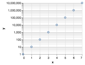
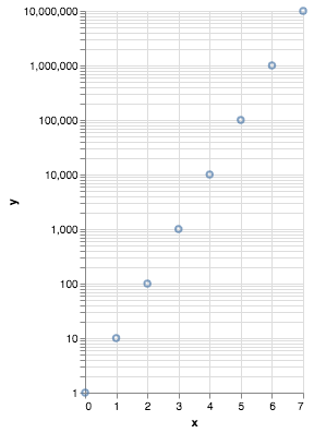
This is probably related to the fact that the view's height is not divisible by the number of decades. The coordinates are rounded to pixels a bit differently for each decade. If you specify a height that is a multiple of the number of decades, you get the expected result. Examples: 175 and 350 px.
 tuner
on 17 Mar 2021
tuner
on 17 Mar 2021
Yes this works thank you!
Would sort of warning message makes sense here? If you understand how the plot is built, then you can handle this correctly. However if you don't pay attention to this (and vega-lite or altair users won't), you basically get a plot WHICH IS WRONG, and this is not acceptable. I understand that these are "just rounding errors", unfortunately in a log plot these have a big impact. Take the tick right below 1'000, it should be 900, but on my first graph it shows ~800, etc
How is this handled in other libraries? The obvious alternative is to force the view. As a scientist, I prefer to get a correct plot in a slightly adjusted view. I understand that in other applications you may prefer the opposite. Therefore a warning message may fit both needs. Or would a boolean flag on the view makes sense, like per default it would adjust the view unless the boolean is True.
divico
on 17 Mar 2021
The underlying issue here is a difference in how the axes and marks are configured.
The axis ticks and gridlines by default "snap" to the pixel grid by rounding to the nearest integer. This avoids anti-aliasing artifacts the otherwise show up, and in the majority of cases does not have a substantial effect on chart reading. You can change this default by setting
"tickRound": falsewithin an axis specification.Alternatively, you can make the mark coordinates snap to the pixel grid by rounding. To do this (in Vega, not sure about Vega-Lite), you can set
"round": truewithin anxoryencoding channel definition. Note that this still might not match exactly in the case of marks (such as Vega-Lite'stickmarks, which map the Vegarectmarks) that use centered (xcoryc) channels, as these are additionally offset by half the width of height of a mark.
Here is a Vega example with these attributes explicitly defined so you can change them and see the effect.
I'm not sure we want to change Vega's default behavior here, there are trade-offs either way. A robust workaround for the current issue would be to add an axis config that disables tick rounding. In Vega-Lite this would be:
"config": {
  "axis": { "tickRound": false }
}
Here is a full Vega-Lite example using the updated config. Note that the data-driven tick marks are slightly offset from the axis ticks and gridlines -- they do not perfectly align. This is expected due to the marks being centered at their respective x/y coordinates (with a 1-pixel thick rectangle, the rectangle edges are 0.5 pixels off from the center point).
 jheer
on 17 Mar 2021
jheer
on 17 Mar 2021
Related issues
 keizer619
·
3Comments
keizer619
·
3Comments
 kanitw
·
3Comments
kanitw
·
3Comments
 chadbr
·
6Comments
chadbr
·
6Comments
 arvind
·
5Comments
arvind
·
5Comments
 donghaoren
·
5Comments
donghaoren
·
5Comments