My new love is this activity monitor thing. It is fun to look at demos or games and to learn how they are using the Amiga. And it looks so nice.😍
While playing with it, I did asked me why can't we display the CPU activity as well, like in the activity monitor of macos?
Then I instantly rejected my question because I thought that it is maybe not possible to let the old 68k CPU do nothing.🥴 But I remembered that there was a special 68k command.
NOP
Execution continues with the instruction following the NOP instruction. The NOP instruction does not begin execution until all pending bus cycles are completed.
Count all commands as activity except NOP ? My guess is that the CPU would always show 100%.😫🤪
What the heck is the macos CPU activity monitor showing us ? Maybe it counts only the bus activity? 🤨
What about this strategy: Whenever the 68k-CPU accesses memory there is CPU (bus)-activity, we could count that. Or maybe it is even better to count only CPU writes to the memory as activity? This way we could blame games which are moving graphical objects with CPU instead of the blitter.🙃
_Originally posted by @mithrendal in https://github.com/dirkwhoffmann/vAmiga/issues/205#issuecomment-546730926_
 dirkwhoffmann
All 61 comments
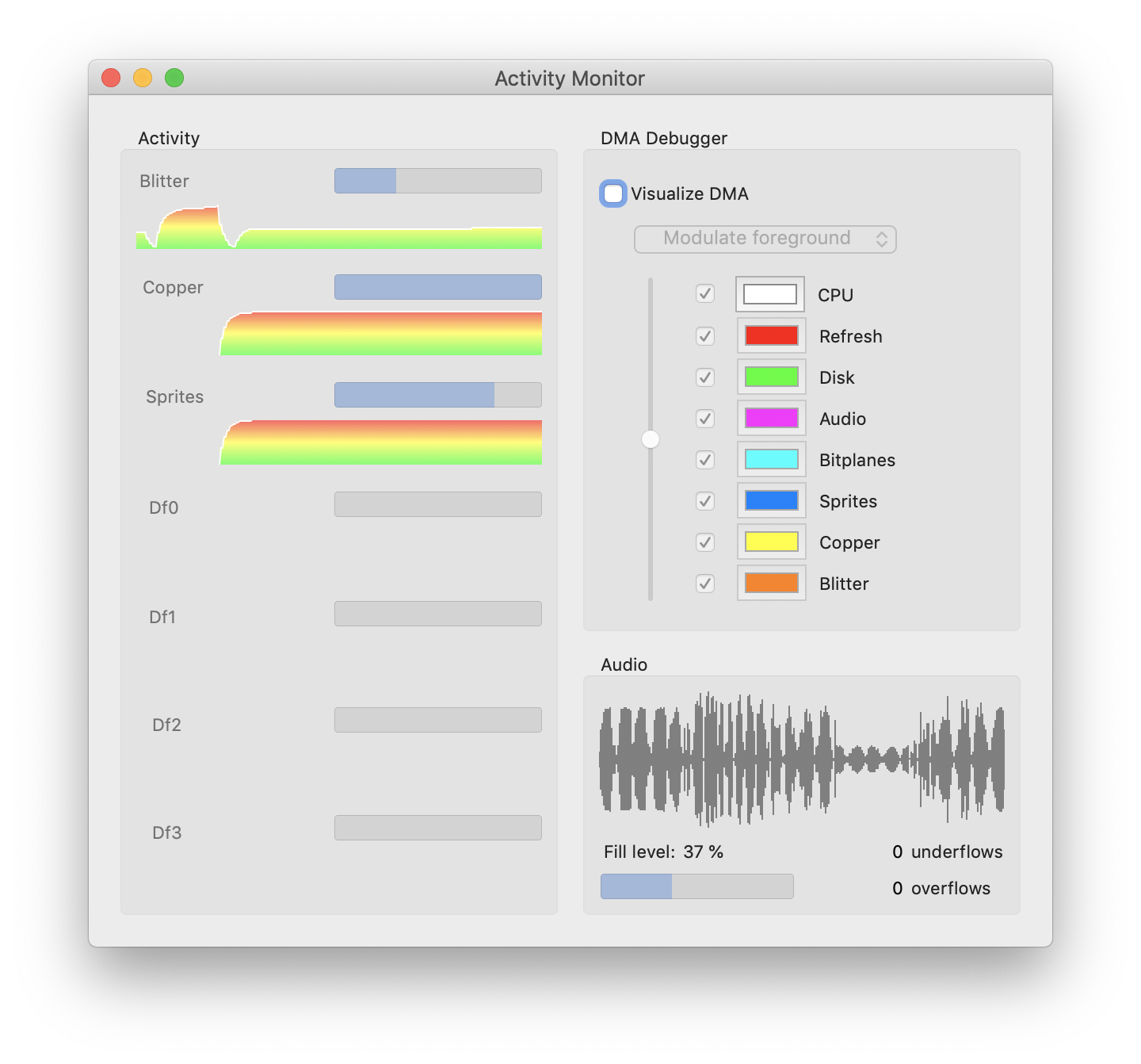
The activity monitor in v0.43 is just a first shot and leaves much room for improvement. I opened up this thread to collect ideas.
Here are mine:
Add autoscaling. The scrolling banner image will automatically perform y-axis scaling according to the highest value. I am already doing a similar thing with the audio waveform.
Colorize. Auto-scaling will have the drawback that the user can't judge if a value is high or low. To cope with this, we could colorize the vertical bars from green (low value) over yellow (medium value) to red (high value).
Disk activity could be split into reads and writes. Each vertical bar could be separated into two segments (e.g., red = write, blue = read). Another idea is to start drawing in the middle. Reads will produce a line going up, writes will produce a line going down. This would visualize the data flow graphically (read = from drive, write = to drive).
dirkwhoffmann
on 28 Oct 2019
Count all commands as activity except NOP ?
I agree that monitoring the CPU would be cool, but I think it's hardly possible. Two reasons:
- As you already pointed out, in old CPUs there is no such thing as being idle.
- There are many many ways to fake idle state. NOPs are one possibility. Others are jump-loops which can be implemented with almost any branch command.
What we could do is to visualize CPU bus activity. We can count reads and writes and display them the same way as disk activity.
What the heck is the macos CPU activity monitor showing us ? Maybe it counts only the bus activity?
To be honest, I don't really know how modern CPUs deal with idle state. I am pretty sure that they can be idle, because it won't make sense to run 31 out of 32 CPU cores in a NOP loop if only a single thread is running. Also, I am pretty sure that modern CPUs do have some hardware-based thread-management on board, but I never looked up the details. What I know is that modern CPUs do collect statistical information. e.g., about branching. With the right tools in hand, you can read from the CPU how many times branch-prediction was right or wrong. Unfortunately, I never found such a tool for macOS, but I know that it is possible on Linux.
dirkwhoffmann
on 28 Oct 2019
Offtopic: in germany you can right now buy the "CT Retro 2019 - 16 Bit Revolution" magazin. Including a gratis "Amiga 8 forever" software licence💅🏿. They mention all the 5 big 🤤amiga emulators out there. Oh no 😤 how could they dare and miss to mention our beloved vAmiga.
 mithrendal
on 28 Oct 2019
mithrendal
on 28 Oct 2019
Including a gratis "Amiga 8 forever" software licence
Does this include a license for the Amiga Roms?
Oh, just found the answer: "die Software-Sammlung Amiga Forever 8 Value-Edition inklusive Kickstart-ROMs gibt es für Leser des Hefts praktischerweise gratis dazu."
🤤
how could they dare and miss to mention our beloved vAmiga.
☹️ Ignorants.
Maybe we should invest more into marketing 🤔. vAmiga cups, vAmiga mouse pads, vAmiga cushions, vAmiga blankets, vAmiga umbrellas, vAmiga underpants...
dirkwhoffmann
on 28 Oct 2019
CT Retro 2019
Back from shopping. Bought a copy from my trusted magazine dealer. Busy reading ... 🤤
Amiga Roms for EUR 6,90. Awesome deal.
dirkwhoffmann
on 28 Oct 2019
I did various experiments, but didn't find a satisfying solution yet:
What I found out so far:
- Auto-scaling is not a good idea. It confuses the viewer, because already drawn parts shrink and expand vertically.
- Drawing with a gradient doesn't look as good as expected:
Next thing to try out:
- Colorize the background according to the cumulative activity (green = low activity, yellow = medium, red = high). Overlay the activity graph with a semi-transparent color.
dirkwhoffmann
on 29 Oct 2019
That doesn't look good either 🙈
Maybe it's time to have a look at some good-looking professional activity monitoring graphs.
dirkwhoffmann
on 29 Oct 2019
Another idea: Combine Blitter, Copper, CPU into a single graph similar to this:
The graph will show the number of used bus cycles for each component.
dirkwhoffmann
on 29 Oct 2019
yes I like the last one.
Then the theoretical max buscycles on chipram will be 100%? How to read / interprete this beautiful thing😳?
mithrendal
on 29 Oct 2019
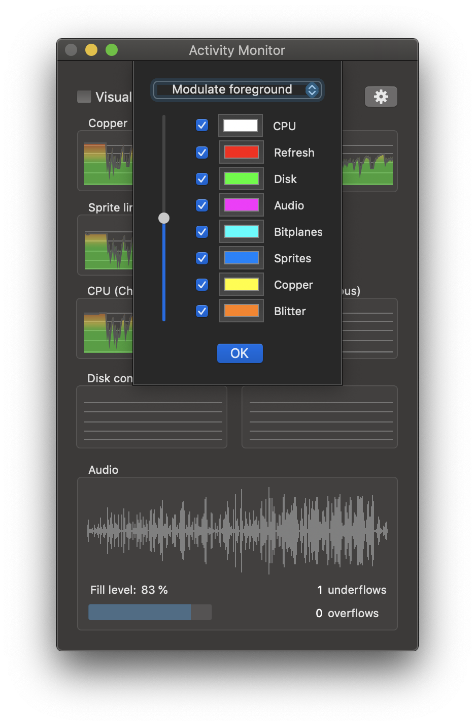
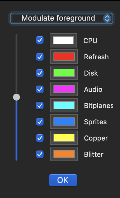
I think a "bus monitor" really makes sense. I'll place it next to the DMA debugger control panel and use the DMA debugger colours for drawing the graph. Hence, each vertical line will be split into 8 differently coloured segments (CPU, Refresh, Disk, etc.).
Then the theoretical max buscycles on chipram will be 100%?
Yes, there are 226 * 312 bus cycles per frame. This will be 100%.
If the Blitter is active, let's say for 23500 cycles, 33% of the line will orange. The bus monitor will simply count the coloured pixels that are displayed by the DMA debugger. In other words: The bus monitor is a numerical view and the DMA debugger a positional view of the same data set.
The disk drives will be handled separately.
dirkwhoffmann
on 29 Oct 2019
Cool thing that you also plan to visualise bus activity of the CPU. But what if CPU operates on FASTRam? Is it the same bus?
mithrendal
on 29 Oct 2019
But what if CPU operates on FASTRam? Is it the same bus?
Hmm, I didn't think about that. It's a different bus. No reads or writes from or to this bus would show up.
dirkwhoffmann
on 29 Oct 2019
When I look at the amiga dma slot diagram then it shows the slots dedicated to each component. Also some components have more priority and will reduce the maximal available free slots for lower priotized components.
That said. I can also imagine separate graphs for each component as you had until now. The theoretical maximum amount of bus cycles for a component would be 100% in a graph. A red line would mark the left over buscycles e.g. after higher priotized components have reduced the possible amount of cycles.
Maybe not so helpful for you? 👀
mithrendal
on 29 Oct 2019
The theoretical maximum amount of bus cycles for a component would be 100% in a graph.
This was the idea I pursued first. The problem: In theory, the Copper can have half of the available bus cycles in a frame and the Blitter could have all, but in most cases, they only uses a fraction of it. The result is that the graph is hardly visible unser normal circumstances and only large if Shadow of the Beast or R-Type II is running. To solve this, I did experiment with auto-scaling algorithms which turned out to be confusing to the user.
dirkwhoffmann
on 30 Oct 2019
The combined graph has also drawbacks despite it is very sexy. Imagine the used buscycle of the blitter (which is the orange color and sits on top of the other colors stacks) will increase slowly over time, you will not be able to see it because the NullPoint will constantly move, which is because the used buscycle of the other components (underlying e.g. higher priotized) is steadily changing. Do you get what I mean?
mithrendal
on 30 Oct 2019
will increase slowly over time, you will not be able to see it because the NullPoint will constantly move, which is because the used buscycle of the other components (underlying e.g. higher priotized) is steadily changing.
I don't expect this to be an issue, because the user would see the orange area expanding (although the bottom line will vary).
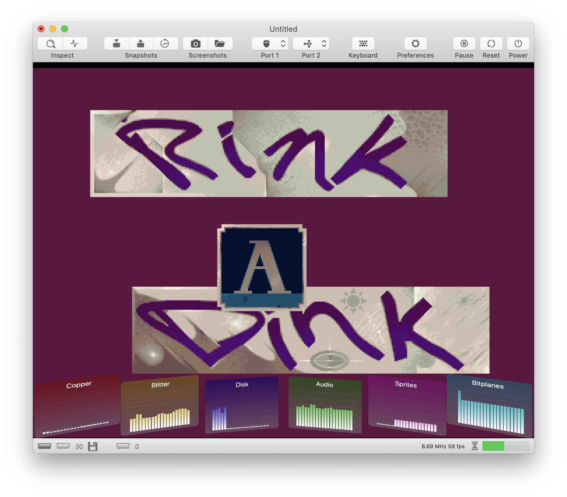
For me, the main issue here is that such a graph looks 🤮 in reality. This is what Rink a Dink produces.
dirkwhoffmann
on 30 Oct 2019
For me, the main issue here is that such a graph looks 🤮 in reality
maybe only a question of colors? BTW: why did you choose this brown or is it dark gray? Maybe better going pastell ? I like this for example https://colorhunt.co/palette/31046
I think the graph shows what "rink a dink" does your machine do. No more and no less.
But I also have to say that I liked the old existing separate graphs per system component. Could you leave them in? I mean next to the new combined graph? (1. I like them, 2. the more moving parts the more interesting... ) Only change request: give them the component colors. So that we can recognize them by only looking at the color.
mithrendal
on 30 Oct 2019
maybe only a question of colors?
Yes, it's (also) a question of colours. It seemed to be straight-forward to use the same colours that are used by the DMA debugger. The problem is that the DMA debugger has other requirements to look good. It needs bright colours that are very distinct to each other.
Among the things I already tried, I think this one looks best.

Maybe it makes sense to develop this further. I also think that auto-scaling needs to come back 🙄. Maybe auto-scaling is less confusing if some horizontal lines are drawn. They would form a lattice that helps to visualise the drawing scale.
dirkwhoffmann
on 30 Oct 2019
https://en.wikipedia.org/wiki/Pastel_(color) more colors I like. A bit more distinct...
Autoscale Question: To what does it auto scale? To the amount of cycles which are left over in a frame for the particular component?
mithrendal
on 30 Oct 2019
To what does it auto scale?
VAAST: VAmiga AutoScaling Technology (TM) 😎. Very hot. It determines the largest value among the displayed values and scales everything such that the largest value spans the whole vertical range (like a zoom). To avoid "jumps", the scaling factor can only change slowly over time. This produces a smooth zoom in / zoom out effect.
https://en.wikipedia.org/wiki/Pastel_(color) more colors I like
You want me to make the Blitter look like the "pink bra from the 1940s"? Seriously? 😲
dirkwhoffmann
on 30 Oct 2019
"pink bra from the 1940s"?
Oh you discorvered the easter egg !
there is another: the article also describes that these are the colors from the Miami Vice television series from 1984 to 1990 (Matches exactly the time of OCS !) ...
_In particular, the NBC television police series Miami Vice popularized what was already a growing trend even further as its lead character Sonny Crockett (Don Johnson) exclusively wore pastel shirts and suits, setting a fashion that stood popular years after the show ended._
mithrendal
on 30 Oct 2019
BTW, I usually use the color table from here:
dirkwhoffmann
on 30 Oct 2019
Just added VAAST(TM) to remove it minutes later. Auto-scaling just doesn't look good 🙈.
Next idea: We use a logarithmic scale for the Blitter and the Copper. This solves the problem that normal usage level are invisible if no auto-scaling is applied. Drives can be displayed with a linear scale, because their bandwidth is limited and they are either running at the 0% or 80% level. Same for sprite lines (possible range is limited to 0 .. 312).
dirkwhoffmann
on 30 Oct 2019
yes logaritmic scale is a very good approach, because we also want to measure some importance to the very small values. I think this is very clever and will solve the scaling problem.
mithrendal
on 30 Oct 2019
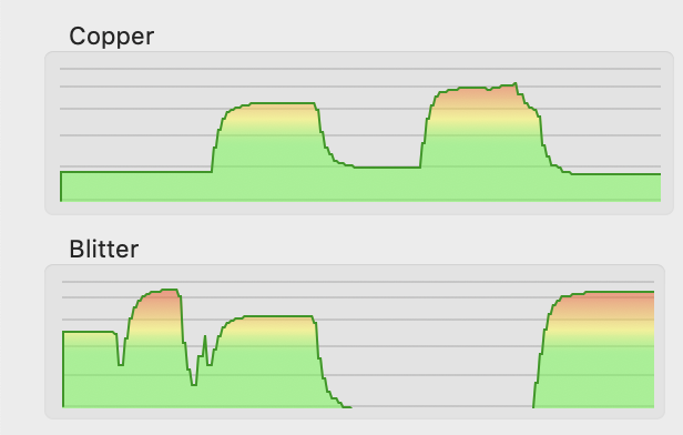
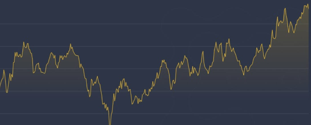
Logarithmic scaling in action. Much better than previous attempts:
dirkwhoffmann
on 31 Oct 2019
Nice implementation !!! Very good scaling.
For the colors. I am not sure what is better.
The color interpolation of high and low values as in the picture above.
_advantage:
you see it not only from the graph but also from the red color when the component uses its max buscycles_Or for each graph the solid color of the DMA debugger (e.g. for copper = yellow and for blitter = orange).
_advantage:
you don't have to look at the graph title description as you can identify the components graph solely by the color_
mithrendal
on 31 Oct 2019
Using the DMA debugger colors results in this (running Rink a Dink):
The gradient method (green -> yellow -> red) has the advantage that it visually supports the logarithmic scale. Values in the upper red area mean that the Copper resp. the Blitter do run full throttle.
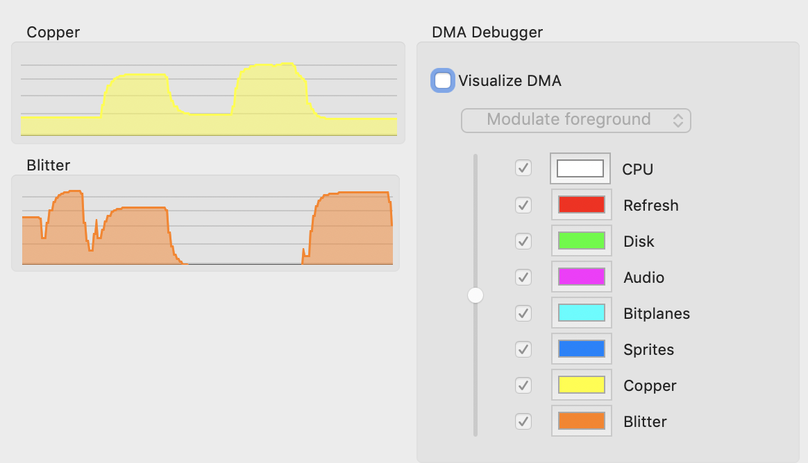
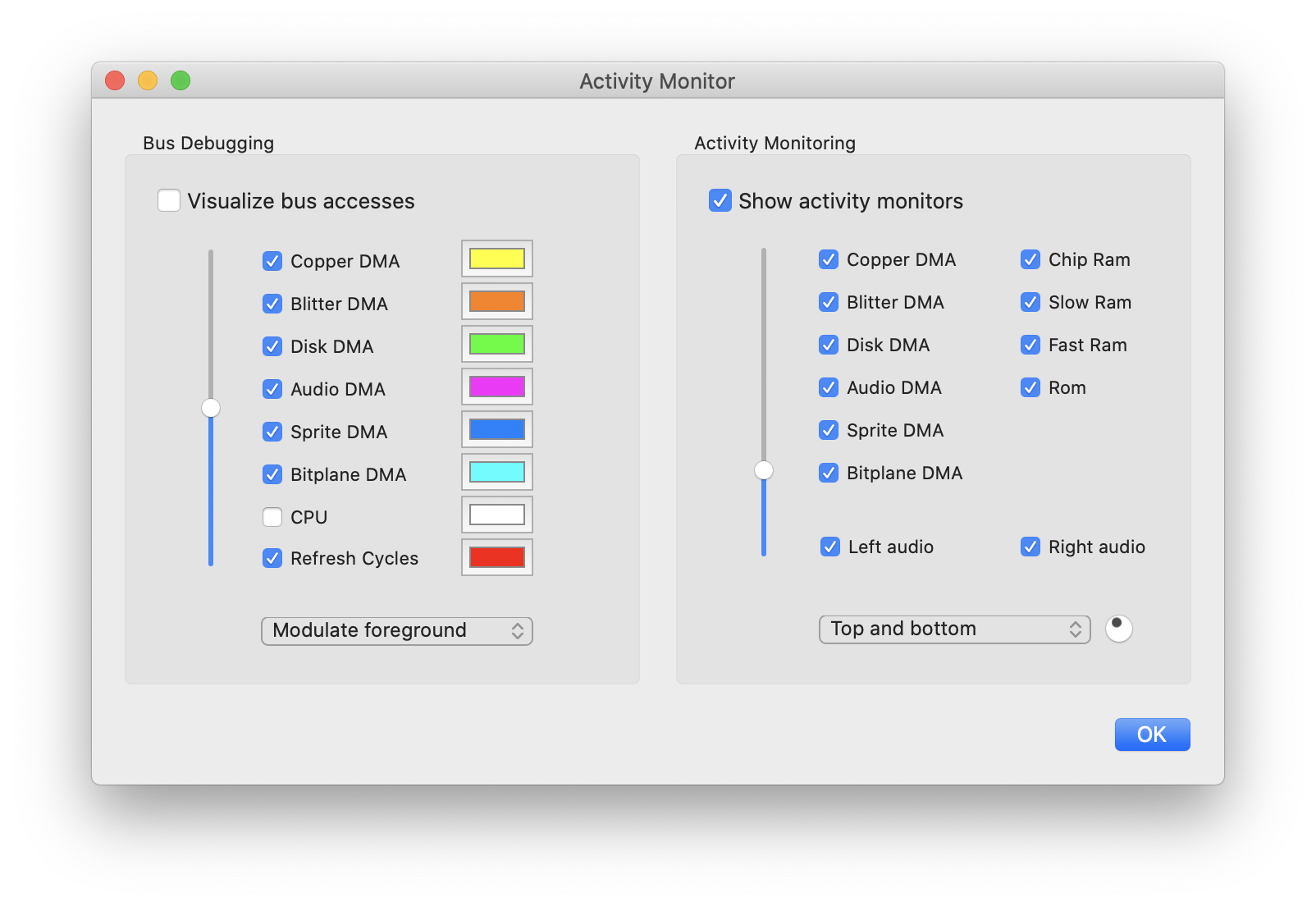
BTW, I am planning to move the DMA debugger config stuff to a separate sheet. Doing so allows us to shrink the window horizontally. If the window is narrow, it can be displayed side by side to the main emulator window without overlap.
dirkwhoffmann
on 31 Oct 2019
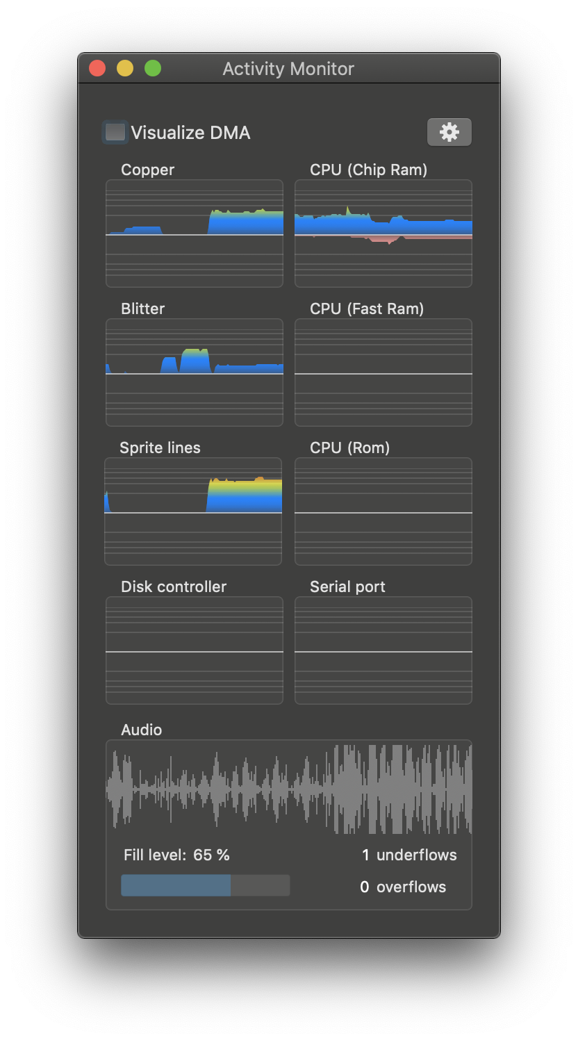
Dark mode:

dirkwhoffmann
on 31 Oct 2019
Wow darkmode is a beautiful beast. 🤤
I really like that clear and crisp solid color more. But I also see the advantage of the colorgradient.
🤔
You decide.
mithrendal
on 31 Oct 2019
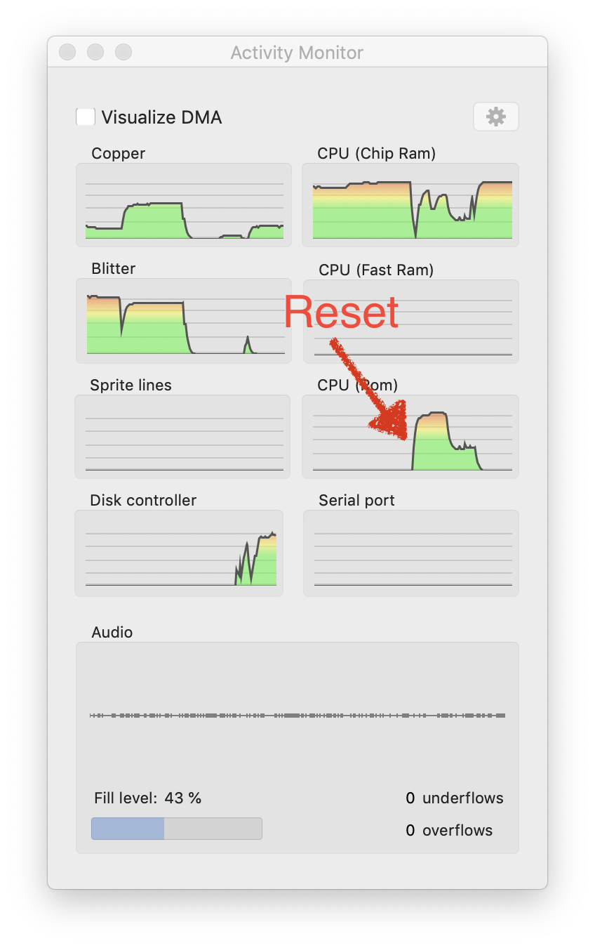
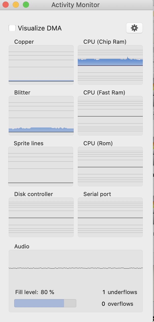
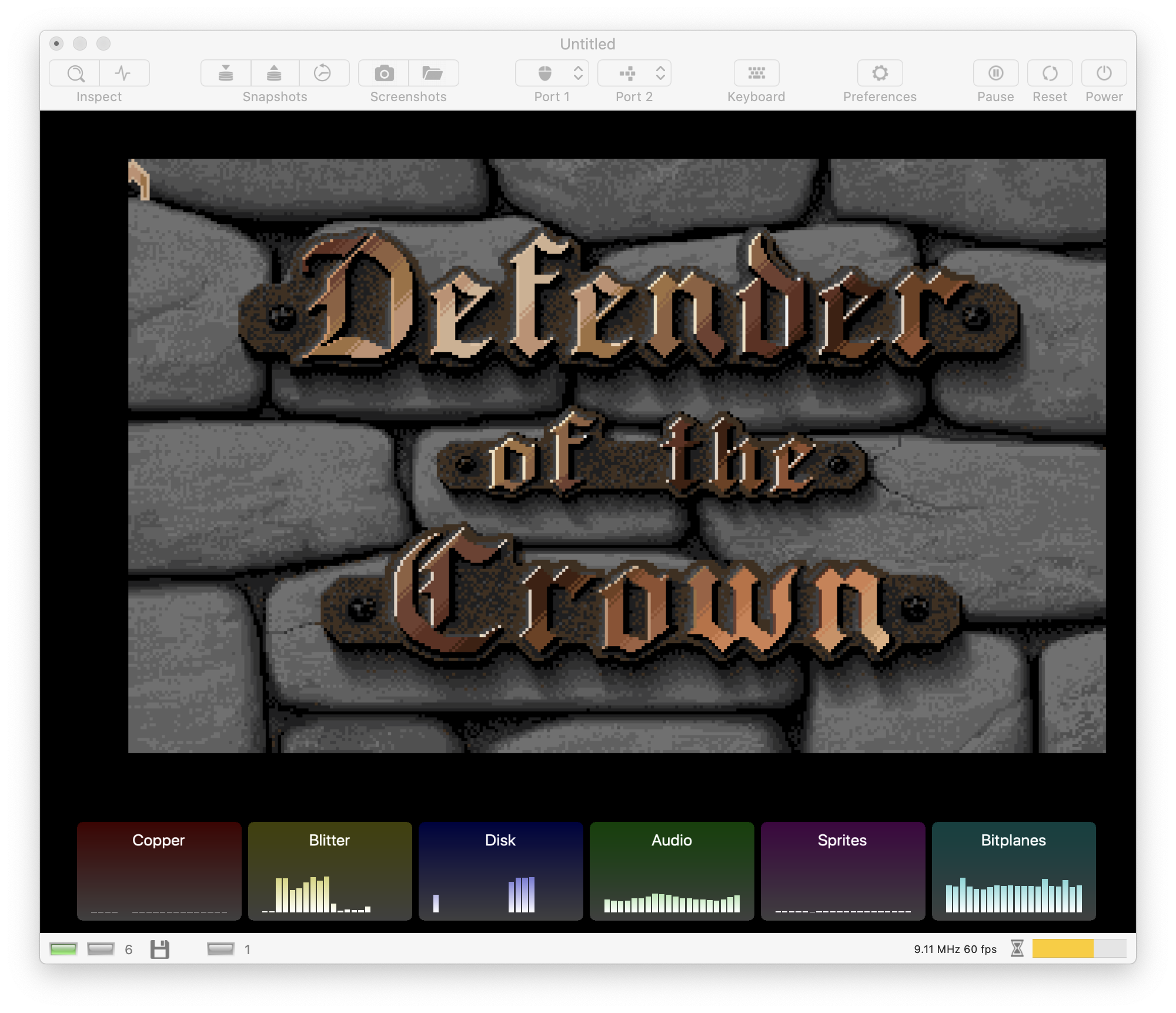
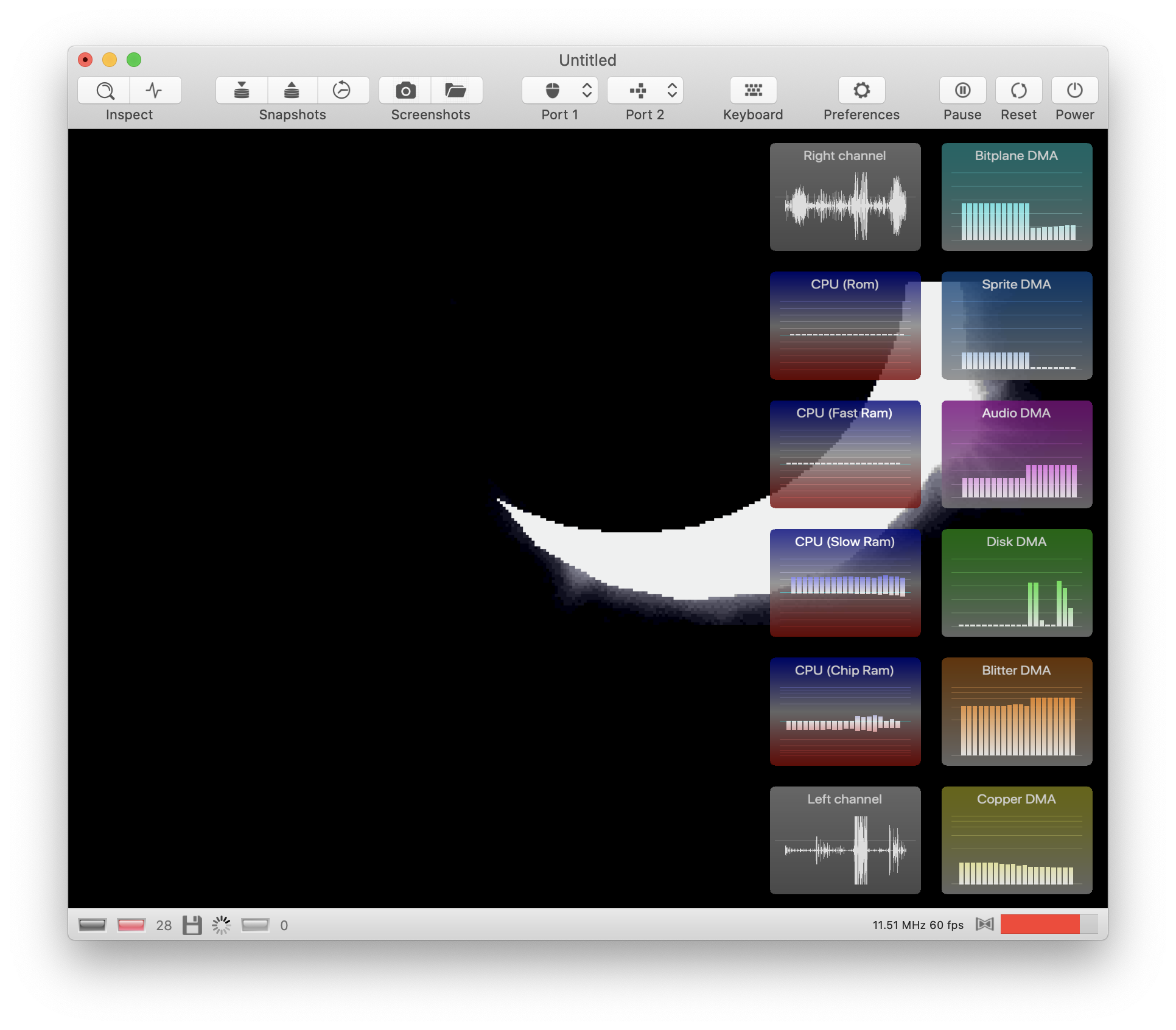
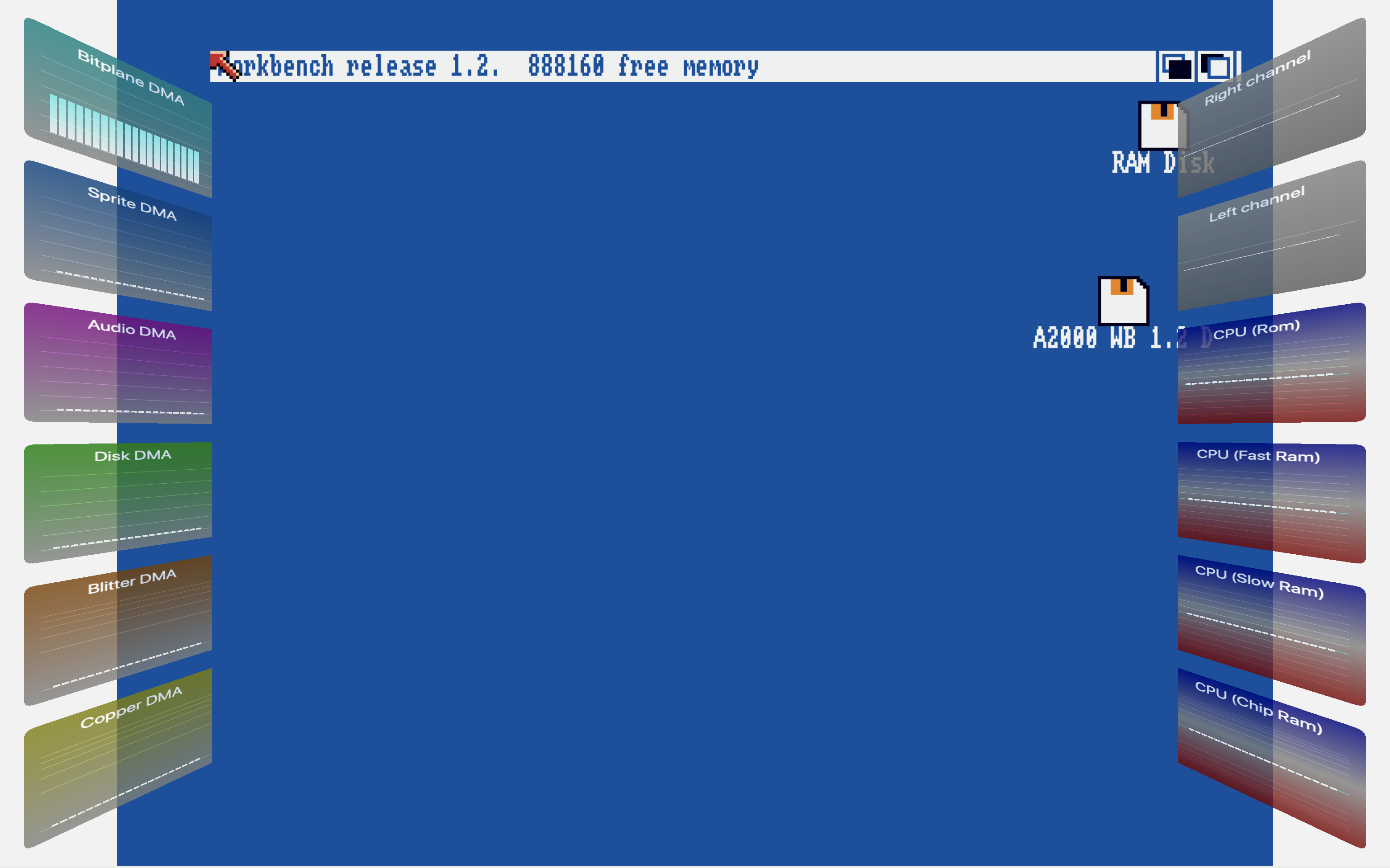
This is what I have so far:
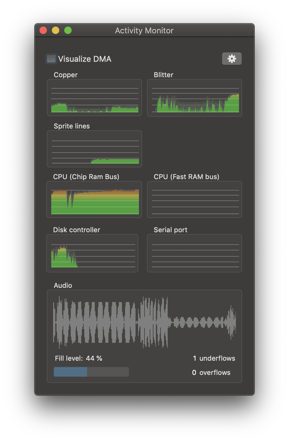
There is still a lot of work to be done:
- CPU Rom accesses are not observed
- Chip Ram bus statistics needs verification and better scaling
dirkwhoffmann
on 31 Oct 2019
Lovely! 🤤🤤🤤 it looks great !!
mithrendal
on 31 Oct 2019
When the CPU runs in ROM OS-routines it is also counted as FASTRAM I think... That will be interesting as it might allow us to guess whether a game uses commodore graphic.library bobs / animation / line drawing functions which also reside in ROM.
mithrendal
on 31 Oct 2019
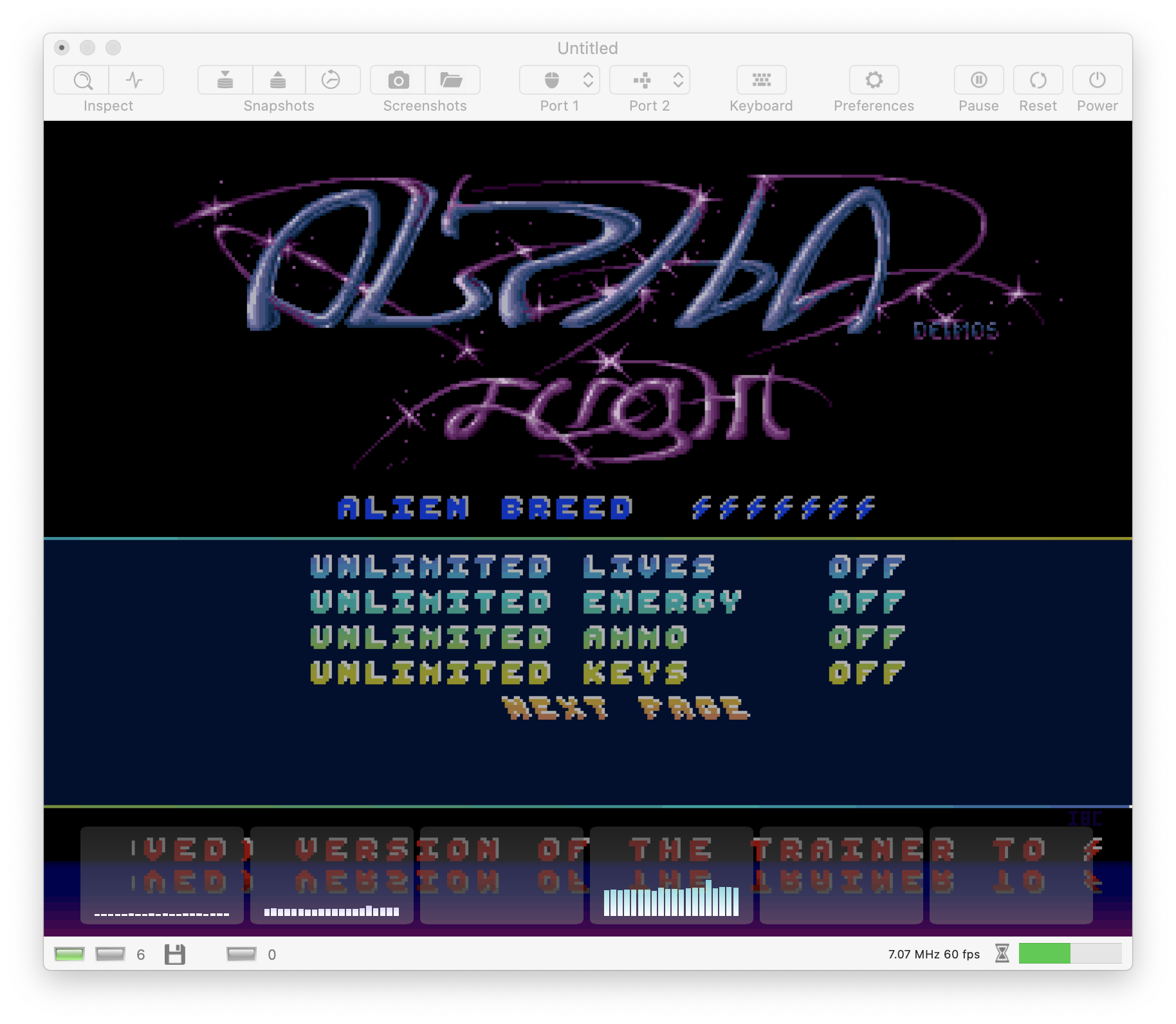
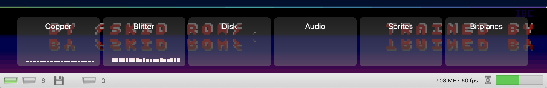
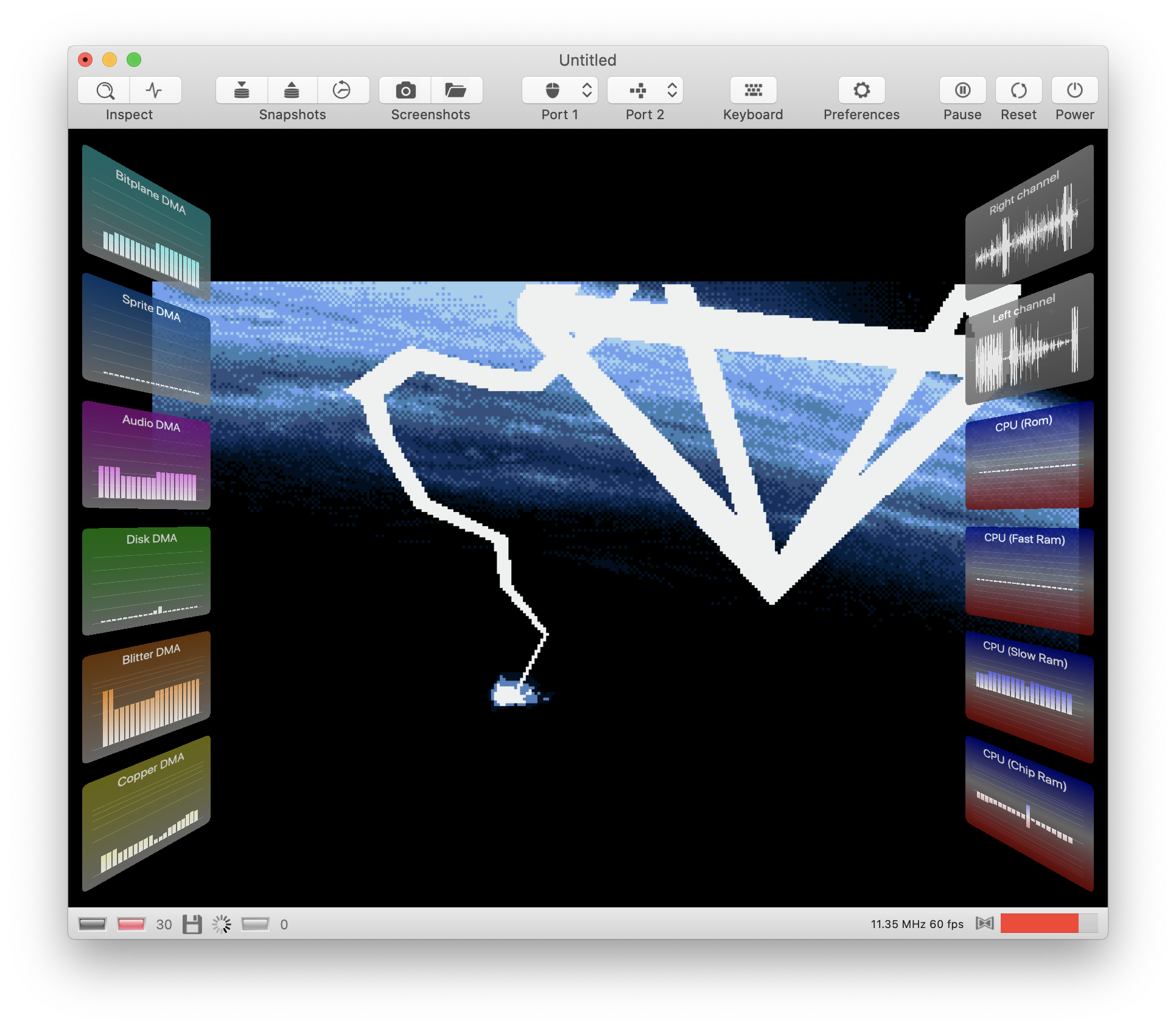
Turns out to be nice toy to play around with:
When the CPU runs in ROM OS-routines it is also counted as FASTRAM I think...
Yes, but it's easy to count them separately. The target for each memory access can be read directly from vAmiga's page mapping table.
Next step will be to turn the view into a "split view" that distinguishes between reads and writes.
dirkwhoffmann
on 31 Oct 2019
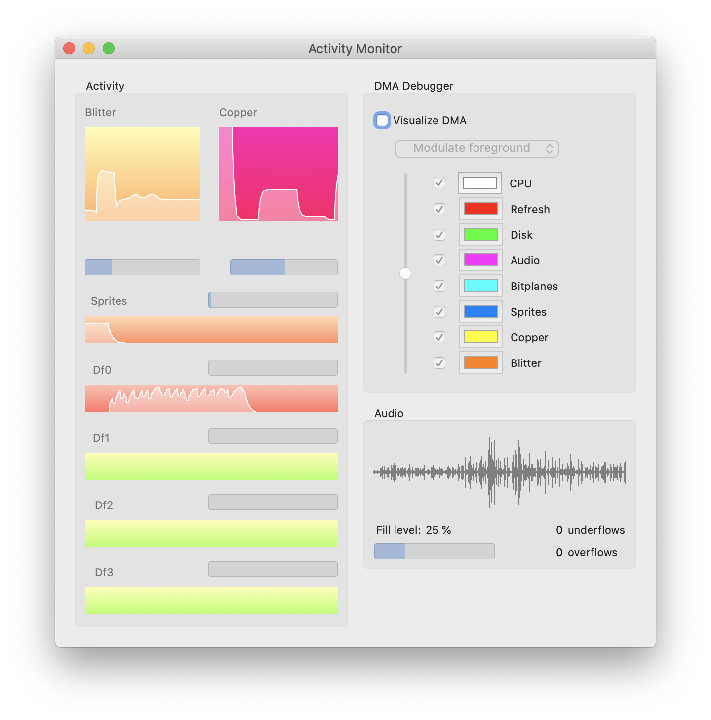
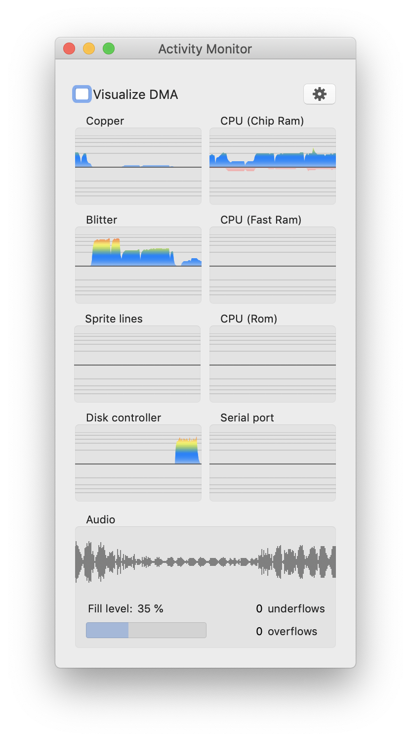
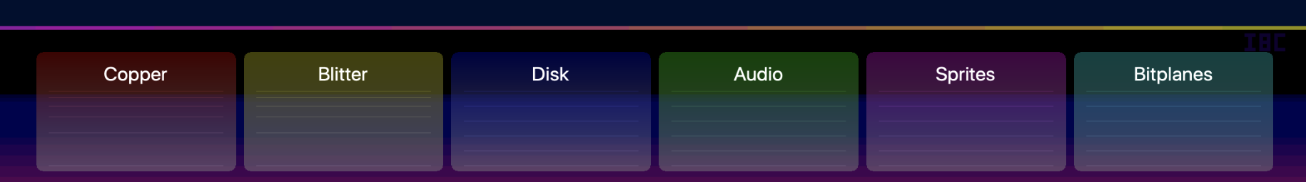
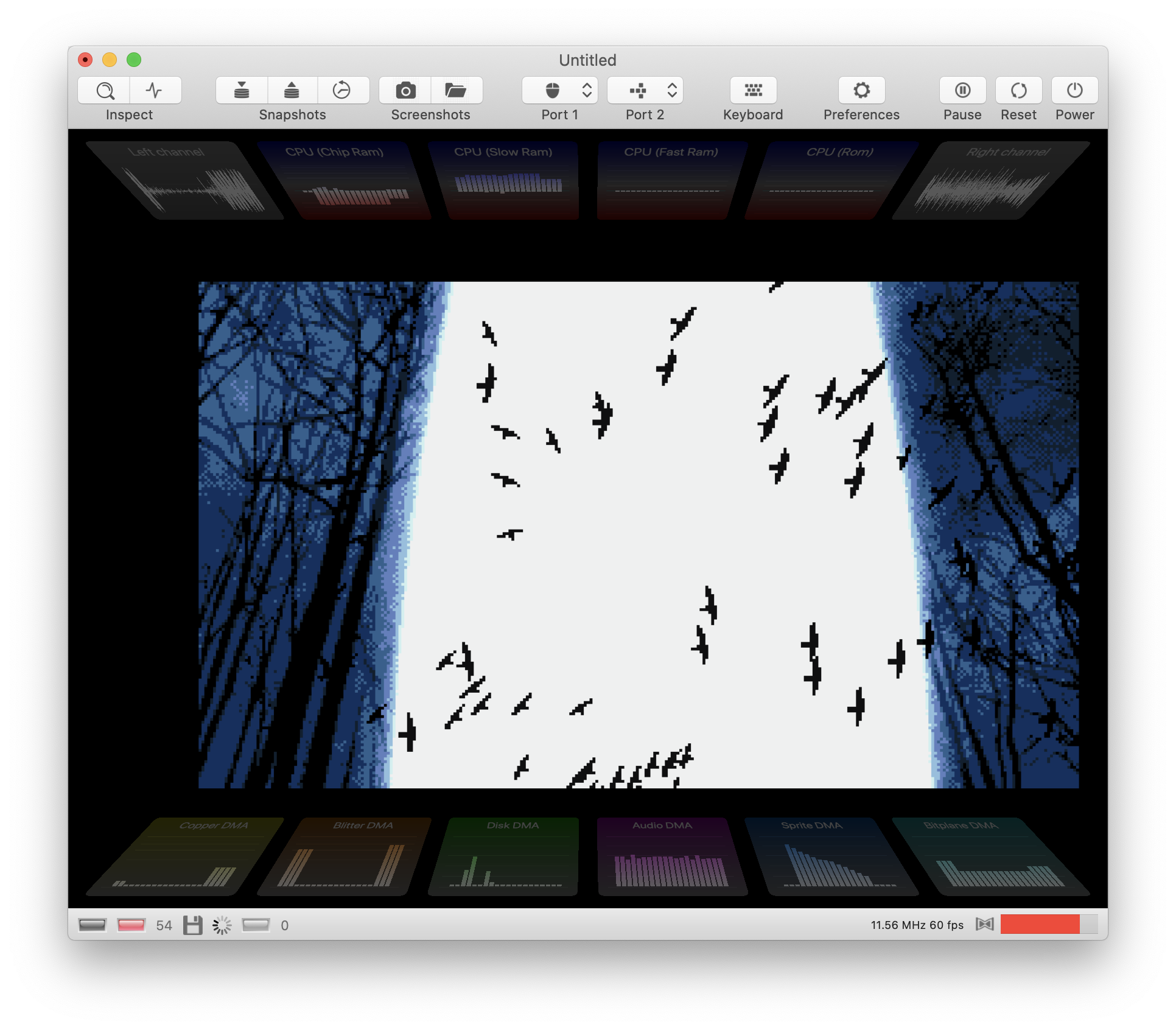
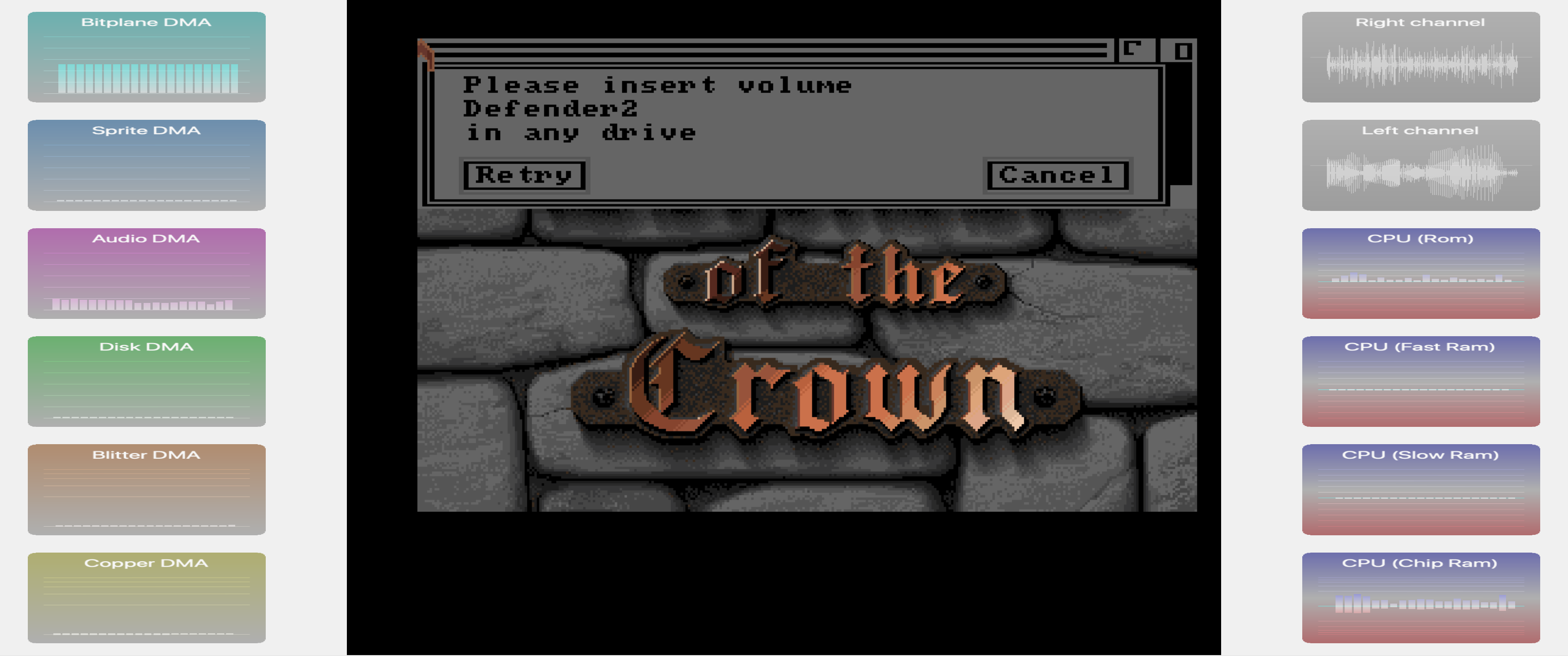
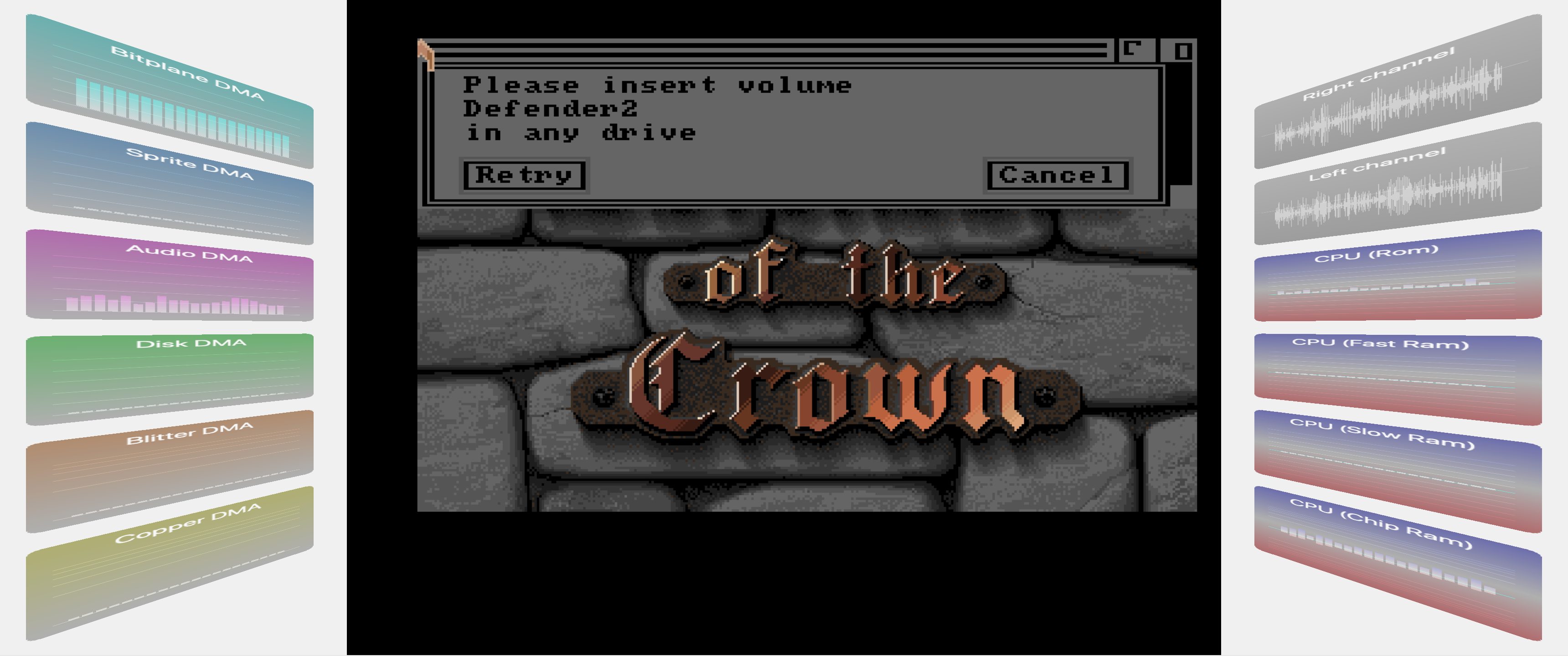
Now, all monitors work with a logarithmic scale to make it consistent. In addition, most views draw an upper graph and a lower graph to distinguish between reads and writes (upper = reads, lower = writes).
Also, I tweaked the colors a little to make the monitor look better in light mode (the base color is a shaded blue for reads and a light pink for writes).
dirkwhoffmann
on 1 Nov 2019
looks perfect.
another fancy idea: For the Audio you could do four separate graphs. Each channel one graph. Give them different colours and mix them togehter. Or if that is too difficult maybe one separate graph for left and right channels?
mithrendal
on 1 Nov 2019
For the Audio you could do four separate graphs.
This would hit performance, because I read directly from the audio ringbuffers. There are only two ringbuffers for performance reasons (one for the left and one for the right channel).
maybe one separate graph for left and right channels?
My plan is to incorporate both channels into a single graph. Right now, the lower part of the waveform is identical to the upper part (just mirrored). My plan is to use the upper part for the left channel and the lower part for the right channel.
dirkwhoffmann
on 1 Nov 2019
The waveform view has been split (upper half = left channel, lower half = right channel).
In the new code, it's also possible to apply different colours in light mode and dark mode.
If somebody wants to experiment with different colours, simply edit this function in Xcode:
   func setupColors() {

        // Check for dark mode
        var darkMode = false
        if #available(OSX 10.14, *) {
            darkMode = NSApp.effectiveAppearance.name == NSAppearance.Name.darkAqua
        }

        if darkMode {

            color1 = NSColor.init(r: 102, g: 178, b: 255, a: 255)
            alpha1a = NSColor.init(r: 102, g: 178, b: 255, a: 50)
            alpha1b = NSColor.init(r: 102, g: 178, b: 255, a: 150)

            color2 = NSColor.init(r: 255, g: 102, b: 178, a: 255)
            alpha2a = NSColor.init(r: 255, g: 102, b: 178, a: 50)
            alpha2b = NSColor.init(r: 255, g: 102, b: 178, a: 150)

        } else {

            color1 = NSColor.init(r: 0, g: 102, b: 204, a: 255)
            alpha1a = NSColor.init(r: 0, g: 102, b: 204, a: 50)
            alpha1b = NSColor.init(r: 0, g: 102, b: 204, a: 150)

            color2 = NSColor.init(r: 204, g: 0, b: 204, a: 255)
            alpha2a = NSColor.init(r: 204, g: 0, b: 204, a: 50)
            alpha2b = NSColor.init(r: 204, g: 0, b: 204, a: 150)
        }
    }
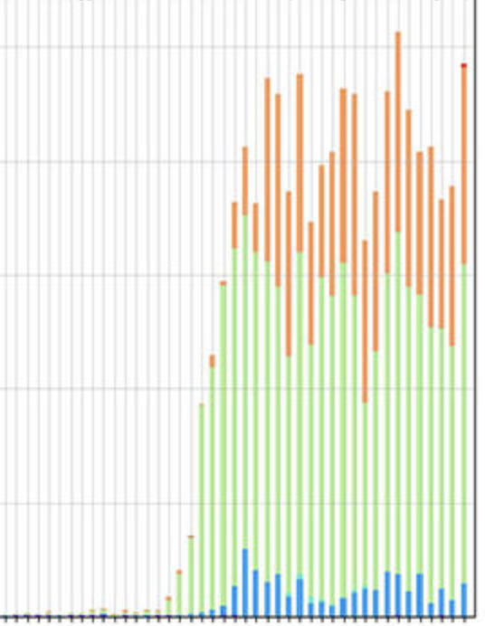
I found this in a spam mail that asked me to change all my money to Bitcoins. I didn't buy the Bitcoins, but I liked the design of the chart. Maybe the activity monitor can be tweaked to look similar in a future release...
dirkwhoffmann
on 16 Dec 2019
Because I wasn’t in the mode to get back to low-level stuff, I decided to do some more GPU programming. As the last bigger feature before releasing vAmiga 0.9, I want to rework the monitor panel. Although I really liked it in the beginning, I now think that the panel doesn't look good enough for being included in the release version of vAmiga. Besides, I am never really used it 🙄. What I do like is vAmiga's DMA debugger, because it produces freaking cool overlays 😎. To make a long story short: I think overlays are the way to go.
My plan is
- to clean up (by removing the old monitoring panel)
- to simplify (by visualizing bus usage only, similar to what the DMA debugger shows)
- to spice up (by overlaying the emulator texture with bar charts)
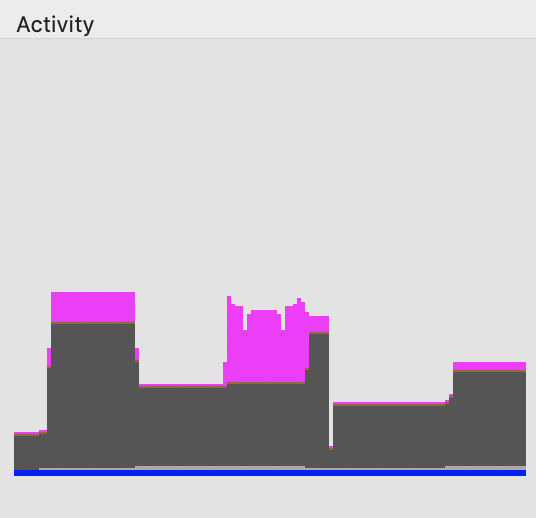
Drawing bar charts via the GPU is 🥵, but I think I finally nailed it. Here is an experimental chart, filled with random numbers and superimposed onto the emulator texture:
In the final version, I’ll use the same colors that are used in the DMA debugger view.
dirkwhoffmann
on 8 Apr 2020
Sorry, I posted an old picture. In the meantime, I played around a little bit with gradients and the alpha channel 😎:
dirkwhoffmann
on 8 Apr 2020
to simplify (by visualizing bus usage only, similar to what the DMA debugger shows)
Oh no ! 😢 I liked it so much to see the blitter / cpu chip ram / fast ram dma activity ... I liked it so much .... It showed me whether a game was a cheap AtariST conversion or a full flegde amiga release which used all the power of it... It was so nice to see what is going on ...😭
😏Maybe tomorrow you change your idea and come back to the old concept
mithrendal
on 8 Apr 2020
It was so nice to see what is going on ...😭
But Blitter activity would still be there. My plan is to visualize:
- CPU bus usage (would only measure Chip and Slow Ram activity, no FastRam or Rom)
- Disk DMA activity
- Blitter DMA activity
- Blood pressure of princess
- Copper DMA activity
- Sprite DMA activity
- Bitplane DMA activity
This requires 6 bar charts that fit nicely in the bottom part of the screen.
dirkwhoffmann
on 8 Apr 2020
This requires 6 bar charts that fit nicely in the bottom part of the screen.
but but 😪... are there labels for them so I can know what bar is what for ? vertical display of them has the advantage that the time axis begins at the same horizontal position 😢... do I have to display these bars in the coming web version too ? 😏 Oh yes that is indeed an advantage, we can see these activity also in fullscreen 🤓
mithrendal
on 8 Apr 2020
but but 😪... are there labels for them so I can know what bar is what for ?
No labels 🙄, but different colors 😇. See it from the positive side: No need for internationalization 😃.
that the time axis begins at the same horizontal position 😢
This could be made customizable. Like the dock where you can choose to display vertically or horizontally.
do I have to display these bars in the coming web version too ? 😏
Definitely! A must have! Overlays are the future 😎.
see these activity also in fullscreen 🤓
😬 Not yet. Fullscreen has it's own rendering routine which doesn't render the bar charts yet. The cool thing about GPU rendering is that we can rotate the canvases freely. We could slightly rotate them around the y-axis to get a cover flow like appearance. I need to experiment a little with the projection matrices 🤤.
dirkwhoffmann
on 8 Apr 2020
The new view now runs side by side with the old view:
I get your point that the new view misses labels. A possible solution could be to use separate background textures for all canvases and symbolize the data source in form of a pictogram (very subtle, dark grey on black or something). Unfortunately, there is no standardized symbol for the Blitter or the Copper. 🤔
Of course, the meaning of the different canvas will be clear to the user whenever the monitor panel is open (and he has to open it to start displaying the monitoring charts). There will always some control like the old one here:
dirkwhoffmann
on 8 Apr 2020
I like the old view. Can we let it be live in parallel for some time until the fresh hot exciting overlay thing is robust enough ?😳
mithrendal
on 8 Apr 2020
I like the old view.
I'm not giving up. I will sell this to you 😎. Stay tuned...
dirkwhoffmann
on 8 Apr 2020
bro, your web cam live stream is on ... 😬
https://media1.tenor.com/images/445148a0e7faf03b2b8379c7a2969375/tenor.gif?itemid=6186560
mithrendal
on 8 Apr 2020
I've managed to wrap a CGContext around a buffer, write a string into it, and convert that buffer into a texture. This results in labelled overlays. It sounds easier than it is, because a lot of stuff has to be made right (pixel format, endianness etc.). In addition, Apples Core Graphics API is 🤮, especially when it comes to drawing text. Now it looks like this 😎:
Still dislike it? Think about twice...

dirkwhoffmann
on 9 Apr 2020
I know him .... already did see this guy somewhere ... must be a far relative from us .... do you think he likes to have a cup of coffee ?
better now I think 🤗... now I know what I am staring at ... The colors ? Will there be different colors ? I guess you will stay with the bar diagram and not go with the log scale as before, no, yes ? Before when the values became high you interpolated that with colorchange to red.... when value was low you stayed with a cool blue... these old rendering results where also nice (ok, ok I will shut my mouth 🤐... ) Your new stuff is more modern design 🤔 I guess ...

mithrendal
on 9 Apr 2020
not go with the log scale
I think, I'll use a log scale for the Copper and the Blitter view. For all others, a linear scale seems appropriate.
Will there be different colors ?
My colorization code is pretty flexible now. In this version, the chosen color is used for background drawing, too.
dirkwhoffmann
on 9 Apr 2020
Oh yes ... now I see it ... it changes colors too when displaying high values... log scale for copper and blitter is cool too ... I am more and more loving the new overlay activity monitoring ...

what about CPU bus access ?
mithrendal
on 9 Apr 2020
Grid lines are back:
what about CPU bus access ?
Hoped you forget about them. 🙄
See, other users are thrilled even without CPU metrics: 😃

dirkwhoffmann
on 9 Apr 2020
I've added a perspective matrix to the canvas drawing code together with the option to specify a rotation angle. I think it doesn't make sense to rotate the panels when they are being used, but it enables me to add a cool animation effect when enabling / disabling the panels. Eventually, they will smoothly rotate in and out 😎.
dirkwhoffmann
on 9 Apr 2020
The latest code changes bring back memory observers 🥳. There are four different observers: One each for Chip Ram, Slow Ram, Fast Ram, and Rom. The panels use the same split view style as the old ones (reads are displayed in the upper half in blue, and writes are displayed in the lower half in red).
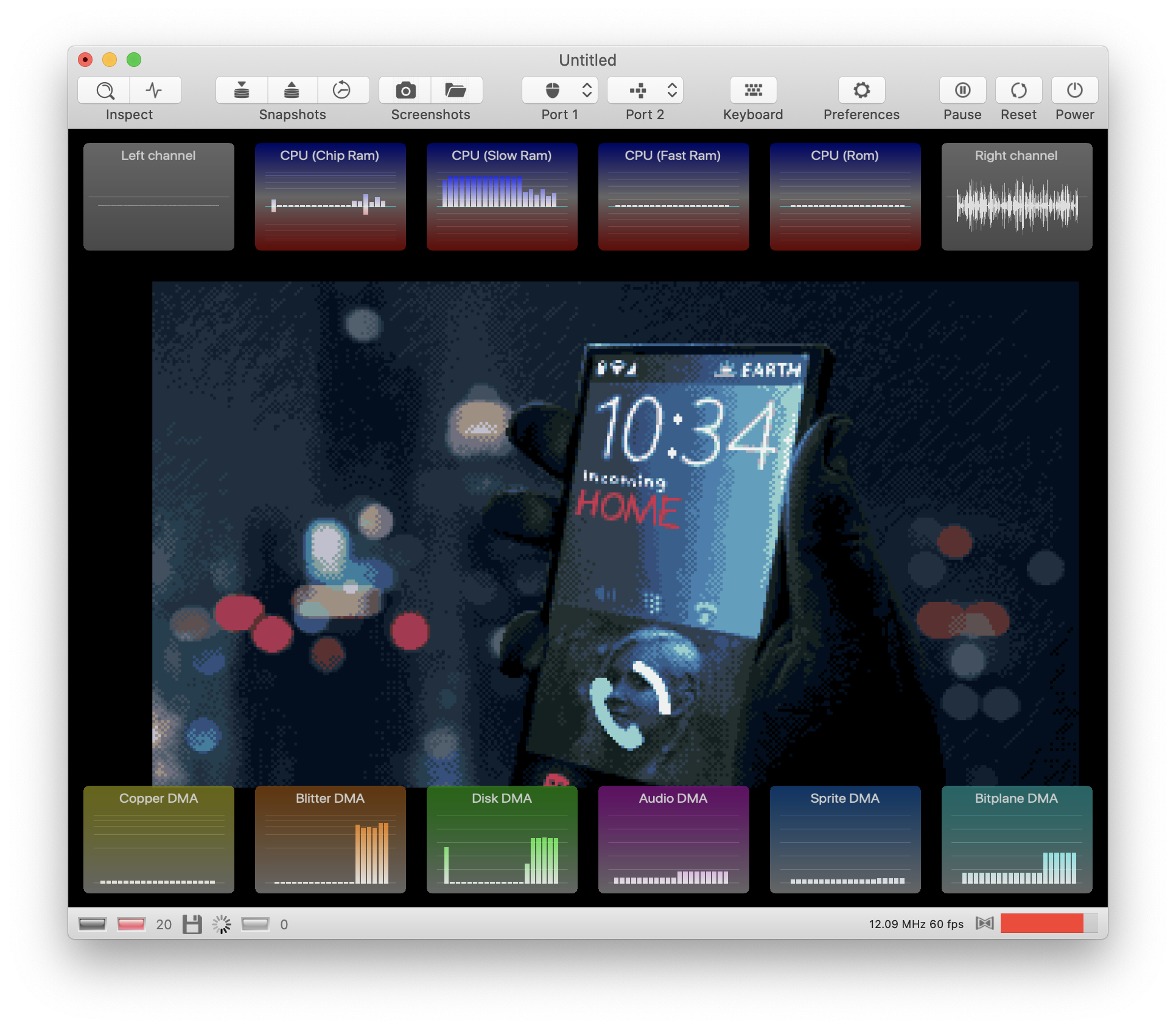
In addition, there are two new waveform panels. In the old version the waveform was displayed inside the monitor window. This window is still there, but it doesn't display any information any more. Now, it serves solely as the control center for the bus debugger and the activity monitors.
As you can see in the panel, the latest version supports different layout schemes. E.g., this one:
You don't like the flat design? Just bend the panels 😎:
It's too opaque? Just increase the transparency level:
Anybody still loving the old panels?

(No, there is no need to worry about me. It's just that I had a snack after midnight and I didn't brush my teeth this morning. I'm a little worried about the black spots on my ears, though)
dirkwhoffmann
on 12 Apr 2020
Oh this looks gorgeous 😍😍😍... well done ... I am in love with the new panels 😍... 🙋🏿When keeping the correct aspect ratio of the Amiga 4:3 (the robin hood story) but we are displaying on a wide screen (possibly fullscreen)... is it possible to get the activity panels out of the Amiga pixels and to display just left and right on the black empty sides ? Ok then this is no overlay anymore 😬... but a HUD in the right and left black space
mithrendal
on 12 Apr 2020
but we are displaying on a wide screen (possibly fullscreen)... is it possible to get the activity panels out of the Amiga pixels and to display just left and right on the black empty sides ?
You've got a point here. Almost all modern display have a larger width/height ration than the old 4:3 monitors. Hence, we could just increase the window size horizontally when displaying the activity panels. Unfortunately, this is not so easy to implement. There are many projection matrices involved in the current implementation and it would almost certainly screw up everything. But it should be doable in fullscreen mode. If the aspect ratio is kept, there are two black stripes on the left and on the right. It should be easy to render the activity panels there.
dirkwhoffmann
on 12 Apr 2020
Hmm, on my MacBook the unused areas are not as large as expected. It looks like this in fullscreen mode:
I'm curious how it looks on my widescreen TFT. Unfortunately, I cannot connect my MacBook easily. The monitor has HDMI, but my MacBook only has USB C. I'll grab a hammer and make the connectors fit... stay tuned...
dirkwhoffmann
on 12 Apr 2020
I didn't find a hammer, but I spotted an HDMI output on my wife's MacBook...
And here is the result: vAmiga goes widescreen... 😎
But it's not perfect yet. vAmiga gets confused by the second monitor. Sometimes it grabs the wrong aspect ratio and I even managed to align the emulator texture to the very left (didn't know that my code is capable of doing that 🤔). But we're still in alpha phase, so nothing to worry about.
dirkwhoffmann
on 12 Apr 2020
Changed clear color to black in v0.67. Aspect ratio should be correct on all monitors now.
dirkwhoffmann
on 12 Apr 2020
MEGA COOL! :-)
 sy2002
on 9 May 2020
sy2002
on 9 May 2020
Related issues
dirkwhoffmann
·
5Comments
dirkwhoffmann
·
3Comments
 Gianmarco72
·
4Comments
dirkwhoffmann
·
3Comments
Gianmarco72
·
4Comments
dirkwhoffmann
·
3Comments
 KenDFish
·
3Comments
KenDFish
·
3Comments
Most helpful comment
This is what I have so far:
There is still a lot of work to be done: