Valkyrie: UItext not scaling correctly scaling with different aspects
Description of Problem or Question
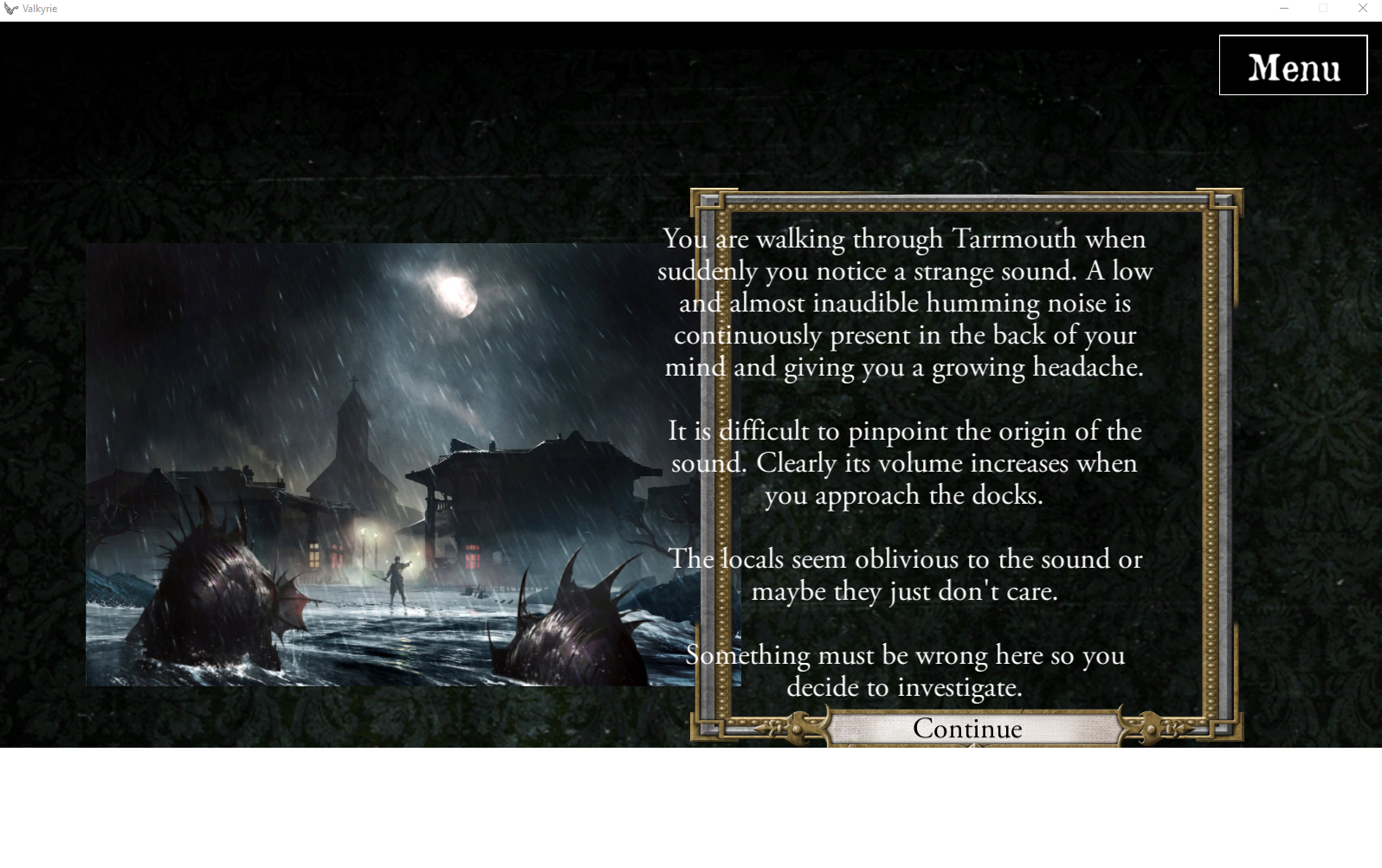
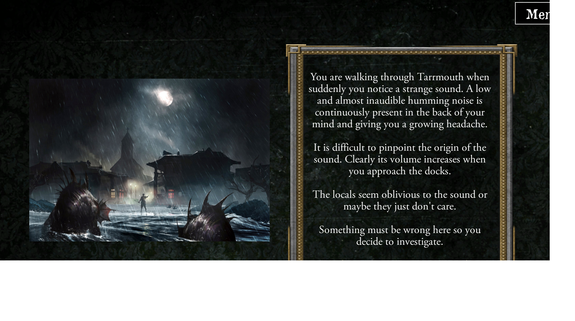
UIPicture and UItext not scaling correctly scaling when playing in windowed mode:
Windowed
Fullscreen
Valkyrie Version
2.1.5
 antontimmermans
All 21 comments
I have also encountered this issue while testing my scenario. I can provide a copy if you need a test bed.
 EwenDC
on 14 Jan 2019
EwenDC
on 14 Jan 2019
Bear in mind there are 2 supported aspect ratios, 16x9 and 16x10. You should be careful with your locations to support both. This is likely what is happening here (what resolutions are you using for full screen and windowed)?
 NPBruce
on 14 Jan 2019
NPBruce
on 14 Jan 2019
Windowed: 1600x1024 (incorrect placement & sizing)
Windowed: 1600x900 (correct placement & sizing)
Windowed:1366x768 (correct placement & sizing)
Windowed:1280x720 (correct placement & sizing)
fullscreen: 1920x1080 (correct placement & sizing)
fullscreen: 1600x1024 (incorrect placement & sizing)
So that must be the 16x9 vs 16x10 scaling diffeerence that you described.
I would not know how to design UI optimally for both sizes. Or how to design two UI's and show only the one fitting the correct scaling. I would expect the graphics engine of the valkyerie app would handle the scaling.
OR.. please help us scenario designers with a proper description on how this positoning/sizing works for the two scaling options.
OR.. make only one of the scaling options available
antontimmermans
on 14 Jan 2019
The important part is if you have UI elements with different units (horizontal/vertical) or different align anchor they will move with respect to each other at different aspect ratios. If you want them lined up these need to be the same. For example, both should be offset from the top right corner and scaled with screen height.
There is an aid where parts of the UI elements that will cut from the screen are shown in white. Unfortunately the parts that will be added in on the other aspect can't be easily shown.
NPBruce
on 14 Jan 2019
Could we have the option save the UIs parent as "screen", "4x3", "16x9", "16x10"?
 redwolf2
on 14 Jan 2019
redwolf2
on 14 Jan 2019
The important part is if you have UI elements with different units (horizontal/vertical) or different align anchor they will move with respect to each other at different aspect ratios. If you want them lined up these need to be the same. For example, both should be offset from the top right corner and scaled with screen height.
Do we have an example of scenario where this kind of placement is implemented ?
It would make sense to add it to the wiki and tutorial.
 BenRQ
on 17 Jan 2019
BenRQ
on 17 Jan 2019
@redwolf2 adding an option to save screen format with the UI component would just guide people into doing more work I think.
It would make sense to add an option to change screen format while implementing/testing though to make sure implementation is OK.
BenRQ
on 17 Jan 2019
In the pictures above I have been trying to align the:
- Frame around the text size and position
- Continue 'button-background' size and position
- Continue text size and position
- Text size and position.
When creating a scenario introduction page and placing the UI items it is very difficult to see the end result. Each item is placed and visible only one at a time. To align the above, I actually put sticky notes on my screen and played with the x/y -size until they fit in the 'sticky-note-box'. I would not even dare to make a more complicated UI part on the left side of the screen since you can't see it while editing (it is under the UIItem editing screen). To much trail & error for my taste. Maybe its only me with his problem, since I am not very good with graphics but, a better description of the UI placement and resizing parameters would indeed help a lot. Or.. An overlay grid with x-y so you can actually see what you are doing (probably to complicated).
- Scaling graphics seems to work OK with the different screen sizes. The text frame and continue button look OK on the different scaling settings (not visible on pictures above).
- Positioning seems to work as well once you understand the mechanics. in the example above: all items on the right side of the screen are placed with right-side-'anchor'. The picture in the example was placed with left-side-anchor). I guess I will change all to just use center-'anchor'. Better documentation/examples on this topic would be appreciated.
- Text size does seem to behave different. In the example above you can already see it, but In the new scenario I am developing its even worse. It looks as if the text size is not scaling with the rest. Can this be improved? (to prevent that the scenario writer has to set a one-size-fits-all small font size).
antontimmermans
on 18 Jan 2019
One advice from @NPBruce on Discord on this:
As long as you use the same anchor point and scaling method the screen aspect should be fine
if you mix them things will move around
One advice from @scrubbless
Use images of the same size
Then layer your puzzle over the top and use a smaller "button" UI (which has a blank PNG) to lay over the top for clicking
Thats how I do it
I worry about the same issues
If all of the same images are say 600 x 600, then they will all "missalign" the same way
For example, for a puzzle I use GIMP
I build the base layer then layer each puzzle piece on top of the other (using the GIMP layers). Then export each layer as its own PNG (all with transparancy) then use UI elements to layer them on top of each other
It's a bit of a juggle
The order is important as only the top UI is clickable.
So you need to lay the UI images, then lay the invisible buttons over the top after
BenRQ
on 1 Feb 2019
@BenRQ I have all of my UI elements on the same anchor, but I'm getting the effect @antontimmermans shows in his pictures. All of the images scale perfectly with the aspect ratio change but the text doesn't scale down at all, overflowing completely. It's frustrating because I'm having enough trouble fitting in the same amount of exposition that the official FFG scenarios have while having the text still readable, without having to compromise that for the 16:10 aspect ratio.
EwenDC
on 1 Feb 2019
Actually that is a good point, the box will scale but the text itself will always be scaled with height. So if text scale is important any graphics around it should also be scaled with height.
NPBruce
on 1 Feb 2019
@NPBruce The graphics from the FFG app seem to have been made with overflow for different ratios in mind (specifically the background of their intros). They seem to scale theirs by height and have overflow on the sides of the image to account for any extra screen space due to the ratio. Valkyrie should definitely be working this way too, as scaling to fit the whole image in the screen is just guaranteed to break positioning and make it impossible to set up any UI that won't break at some obscure resolution.
EwenDC
on 1 Feb 2019
@BenRQ I changed the title so it better reflects the remaining issue under discussion. Would this be a candidate for 2.2 scope?
antontimmermans
on 1 Feb 2019
Perhaps the simplest solution is to just letterbox all 16x10 screens. If this support is added valkyrie can also support all resultions, just letterbox to 16x9.
NPBruce
on 1 Feb 2019
Limitation to 16x9 seems to be supported for standalone platform (windows, mac, Linux), but not for Android.
There is however a max aspect ratio in android that I can set to 16.9, but I don't know how it would behave with a device 16.10 (scaling, or letter box ?).
I can provide a test version here for test on Android if someone has a device in this resolution and wants to test.
BenRQ
on 1 Feb 2019
In Android Studio you can click on Tools -> AVD Manager -> Create your device there (Pixel 2 XL should have a 2:1 display size) -> Start it -> Drag & Drop APK file to emulator screen. Or you can send me the file, no problem.
redwolf2
on 1 Feb 2019
I was thinking of doing this in Valkyrie not Unity. That way Unity can run at any resolution and it is a step towards dynamic rescaling.
NPBruce
on 2 Feb 2019
@NPBruce, agreed, a solution in Valkyrie would be better.
BenRQ
on 4 Feb 2019
@BenRQ is this one included in 2.2 scope? Because if it isn't, i'll start adding a disclaimer in my scenario's that they are best played in a 16*9 ratio. I would not know how else to solve the text scaling in the scenario.
antontimmermans
on 12 Feb 2019
No this won't be part of the release 2.2
BenRQ
on 12 Feb 2019
Ok, so after experimenting with the existing tools I think I can safely conclude that this isn't a bug and can be closed.
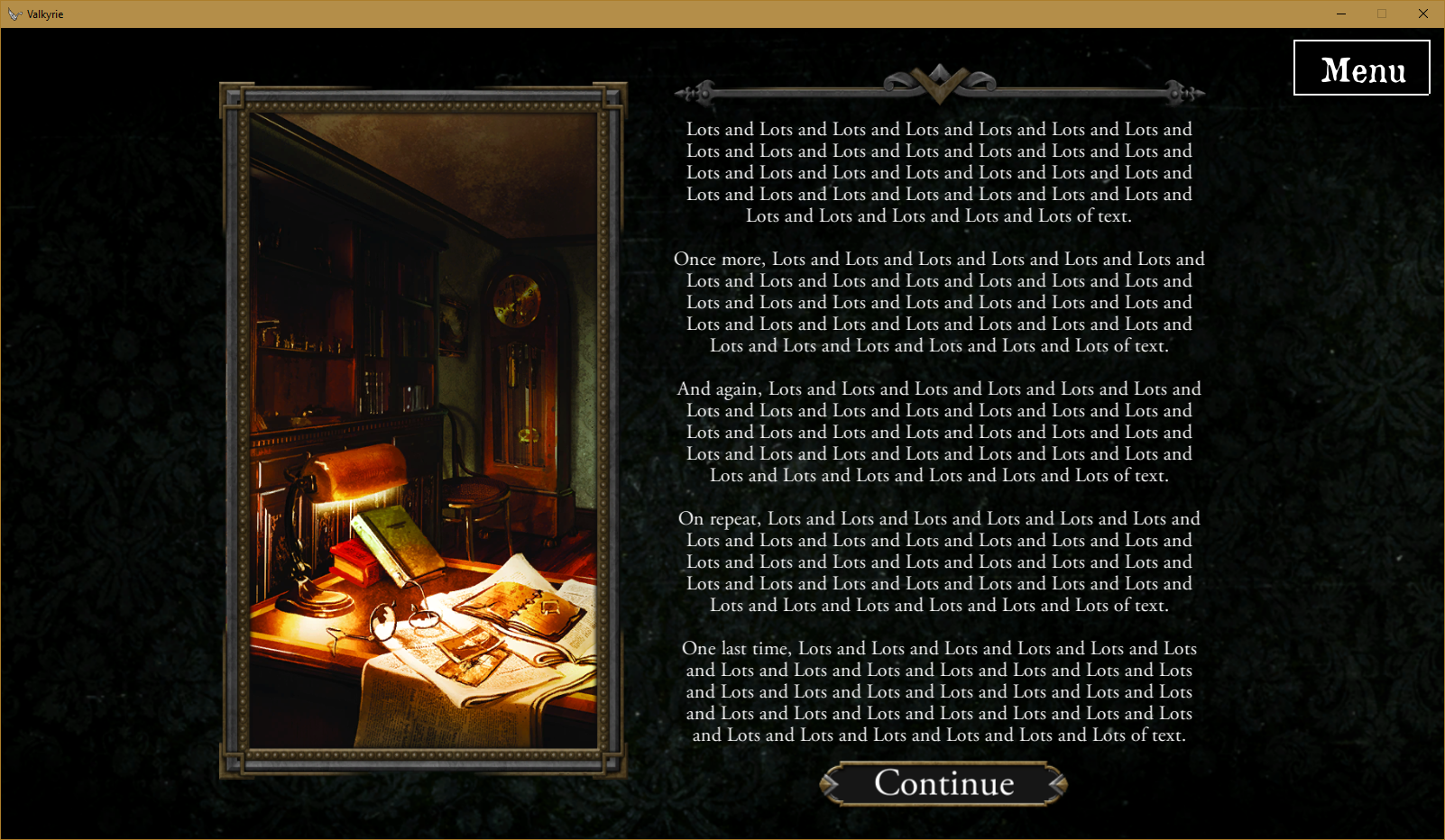
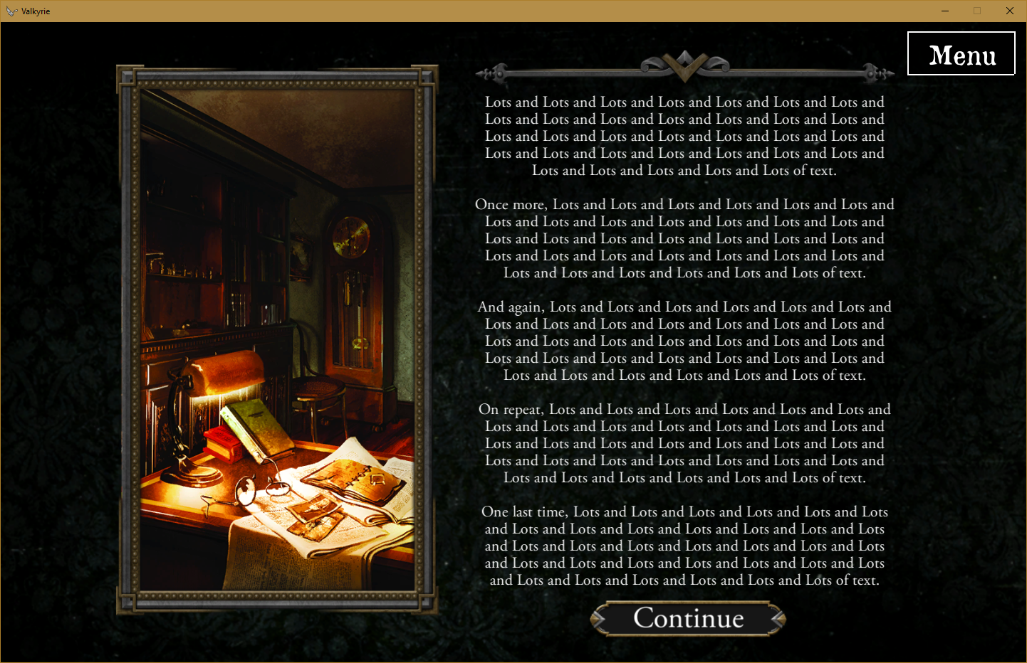
In this thread I said these scaling issues could be fixed by vertical scaling, and I noticed that the option to do that is actually already there. By setting all of your UI elements to vertical scaling and centre anchored they work at all aspect ratios (so long as you leave space for cropping on narrower ratios and image overflow to fill the screen on wider ratios). I was successfully able to replicate the official app's prologues right down to the correct aspect ratio scaling.
16:9
16:10
This scaling would also theoretically work for ratios as narrow as 4:3 and 5:4 since FFG's design has left a lot of dead space at the sides that can be safely trimmed. I have uploaded a template scenario with the composite image used to create the FFG style prologue and the correct UI element positioning to https://github.com/EwenDC/ValkyrieFFGPrologueTemplate
EwenDC
on 9 Mar 2019
Related issues
 EMILIPULIDO
·
8Comments
EMILIPULIDO
·
8Comments
 copytco
·
4Comments
copytco
·
4Comments
 jlederer2
·
7Comments
antontimmermans
·
8Comments
BenRQ
·
3Comments
jlederer2
·
7Comments
antontimmermans
·
8Comments
BenRQ
·
3Comments
Most helpful comment
Ok, so after experimenting with the existing tools I think I can safely conclude that this isn't a bug and can be closed.
In this thread I said these scaling issues could be fixed by vertical scaling, and I noticed that the option to do that is actually already there. By setting all of your UI elements to vertical scaling and centre anchored they work at all aspect ratios (so long as you leave space for cropping on narrower ratios and image overflow to fill the screen on wider ratios). I was successfully able to replicate the official app's prologues right down to the correct aspect ratio scaling.
16:9


16:10
This scaling would also theoretically work for ratios as narrow as 4:3 and 5:4 since FFG's design has left a lot of dead space at the sides that can be safely trimmed. I have uploaded a template scenario with the composite image used to create the FFG style prologue and the correct UI element positioning to https://github.com/EwenDC/ValkyrieFFGPrologueTemplate