This is a working draft with some ideas I had in the areas I need help with:
- [x] Better first screen, more visually apparent “drag files here or browse”: 1. embedded Dashboard, 2. modal Dashboard, 3. mobile dashboard;
- [x] Mobile UI tweaks
- [ ] File type icons --> just use colors and extensions (.jpg) to save those kilobytes and also extra work with picking icons for each file type
- [x] Try adding optional whitelabel “powered by uppy.io”, maybe muted small uppy logo that gains color on hover
- [x] StatusBar: less detailed progress
- [x] Provider UI (Google Drive, Dropbox...): where to place search button, file name / modified date columns
- [ ] Refresh website frontpage
- [x] Restrictions UI: note, something else?
- [x] dashboard: try adding optional whitelabel “powered by uppy”, maybe muted small uppy logo that gains color on hover (@nqst, @arturi)
- [x] This file came from ... Google Drive, place icon below the preview?
- [ ] Modal overlay color
- [x] Close button positioning
- [ ] Small widget in the edge of the screen when Uppy window is minimized/closed
- [x] File names break into new lines https://github.com/transloadit/uppy/issues/192#issuecomment-328138064
 arturi
All 7 comments
while we are at it, is there any room for instagram file type icons as well? To distinguish videos from images while looking through the grid? Currently it just displays thumbnails for both images and videos
 ifedapoolarewaju
on 20 Jul 2017
ifedapoolarewaju
on 20 Jul 2017
Good point about the distinguishing videos from images, Ife! I think we can do it like Instagram, but maybe with play (triangle) icon instead of the camera.

 nqst
on 20 Jul 2017
nqst
on 20 Jul 2017
Some nice (paid) icon sets:
nqst
on 20 Jul 2017
@nqst We won't be able to play these videos on uppy. It would just be an indication to the user to know the media type.
ifedapoolarewaju
on 20 Jul 2017
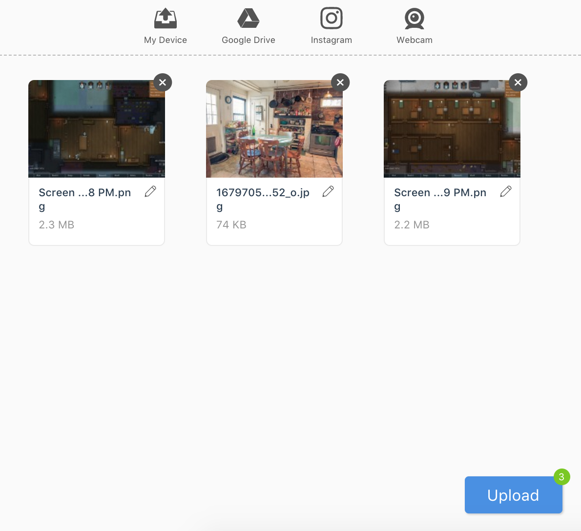
Tried a text-based upload button:

arturi
on 20 Sep 2017
As for me, this text-based button looks much better than an icon-based one! 👍
However, I'm not sure about that badge with the number of files in the top right corner, that's quite an unusual UI. I would simply change the text on the button: _Upload 3 files_. Without that badge, the design will be simpler and less code will be used.
What do you think?
nqst
on 20 Sep 2017
We’ve covered most of these, others will be handled later, work being done in Sketch. Closing this issue 🙏
arturi
on 3 May 2018
Related issues
 skunkwerk
·
3Comments
skunkwerk
·
3Comments
 ghost
·
3Comments
ghost
·
3Comments
 evanoberholster
·
3Comments
evanoberholster
·
3Comments
 yaegor
·
3Comments
yaegor
·
3Comments
 NihadOb
·
3Comments
NihadOb
·
3Comments
Most helpful comment
As for me, this text-based button looks much better than an icon-based one! 👍
However, I'm not sure about that badge with the number of files in the top right corner, that's quite an unusual UI. I would simply change the text on the button: _Upload 3 files_. Without that badge, the design will be simpler and less code will be used.
What do you think?