I was wondering how open are you for changes in the overall design of the unigram app?
Besides adding fluent design to the app, and changing the color pallet (at least for the dark theme), I think unigram should take more influence from skype for windows 10 rather then Telegram for windows 10.
Many of the features implemented in telegram are also implemented in Skype, and I think, in terms of UX - Skype for windows 10 does much of it better, not sure about the mobile version, but the PC version is pretty great. Along with the fact that it is the only capable UWP chat app in the store.
Note: I dislike hamburger menus, a lot, and I think they should disappear - the Skype did it pretty well I think.
I am willing to try designing it myself, I just need to know you are open to it first...
 gilmishal
All 13 comments
I'm not a Skype fan nor a Skype design fan, expecially when talking about the UWP app.
Since Windows 10 user base is quite small and there isn't a real UX for complex apps like Telegram I prefer to offer users the same experience they find in the other Telegram apps, rather than in the other UWPs, also because they're all different.
 FrayxRulez
on 26 Oct 2017
FrayxRulez
on 26 Oct 2017
But what about Fluent Design in general?
Something like https://www.microsoft.com/en-us/store/p/awesome-tube-youtube-to-your-heart/9nblggh69mg4?SilentAuth=1&wa=wsignin1.0
I would help @gilmishal to present some prototype for your review
 xperiandri
on 26 Oct 2017
xperiandri
on 26 Oct 2017
I disagree about disliking the Skype UWP design, but I can understand wanting a uniform design with other telegram apps.
How about changing the color pallet, and adding fluent design elements - such as acrylic - maybe rounding a few corners and adding some lines? - basically UI changes, but no UX changes.
The dark version of Unigram is way too dark, and should use colors more similar to telegram dark theme on android.
gilmishal
on 26 Oct 2017
Unigram dark theme uses the system dark palette, so the fluent design colors. All the colors used in the app are system provided, in both dark and light theme
FrayxRulez
on 26 Oct 2017
I'm starting using this app and I think the design works OK with my dark theme on Windows 10, but there are a couple of details that I think worth discussion:
- I know my accent color is a weird one, but just to point out some text contrast problems:

- I think that placing my messages aligned to right margin of the window is a mistake: on fullscreen looks odd and disconnected from the rest of the chat.
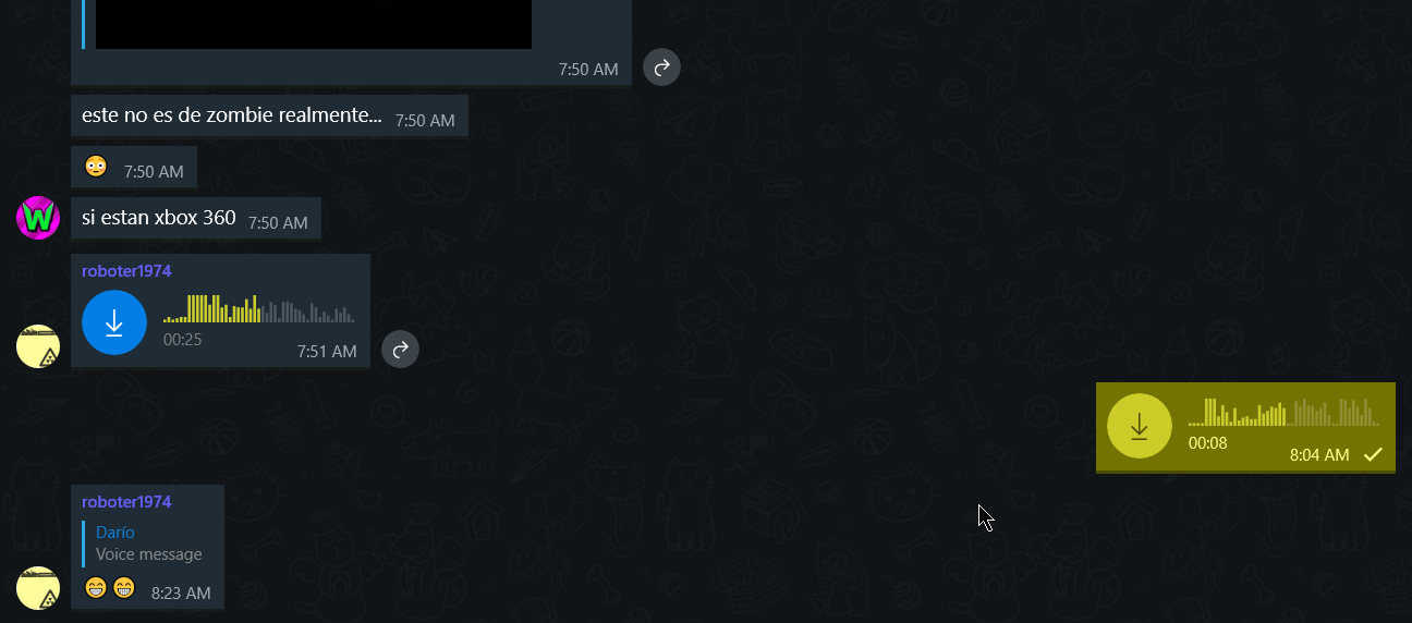
Skype does that, but the chat area is never that wide (at some point it stops growing and becomes a center-box), so, messages are always close to each other.
- Also, separation between messages is not optimal: you have a 3px shadow/border and then a 6px margin if the message is from the same contact, and a 12px margin if the message is from a different contact. That is kind of wasted space.
In my eyes, 3px is the max separation messages should have, and perhaps glue together messages from the same contact in one box.
Again, I think this app is great and visually pleasing, but with some tweaks can be even better.
 druellan
on 12 Nov 2017
druellan
on 12 Nov 2017
Even if there are no plans to change the colour scheme (which I agree should not be done if they are system-provided) Unigram should definitely consider taking on some Acrylic elements.
 AdamWrighter
on 20 Nov 2017
AdamWrighter
on 20 Nov 2017
Yeah, acrylic in Unigram would be awesome!
 ImagoPL
on 25 Nov 2017
ImagoPL
on 25 Nov 2017
Please, keep in mind that mobile devices will not work with acrylic and other new controls from Fall Creators Update. Despite the fact some system apps does.
 vladkasianenko
on 24 Dec 2017
vladkasianenko
on 24 Dec 2017
Those system apps use custom, internal-only Microsoft APIs (not system ones, custom-built). In fact, the main reason Unigram does not employ Fluent Design is because of the lack of support for it in Mobile. Mobile makes up a significant portion of the Unigram userbase, and so we must maintain support for those users.
 callummoffat
on 25 Dec 2017
callummoffat
on 25 Dec 2017
But the question is how long will Unigram mainly refer to W10M? W10M dies a relatively fast death and user base is quite small compared to other Windows Phone versions.
 jp-weber
on 21 Jan 2018
jp-weber
on 21 Jan 2018
Unigram doesn’t and probably never referred mobile as the main target. However the app must adapt to small window sizes as well.
FrayxRulez
on 21 Jan 2018
This is nice and good to hear.
jp-weber
on 21 Jan 2018
Interface on PC has been recently redesigned and it's possible to use system accent color, closing this issue
 MarcAnt01
on 15 Sep 2018
MarcAnt01
on 15 Sep 2018
Related issues
MarcAnt01
·
4Comments
 rabiet
·
4Comments
rabiet
·
4Comments
 TheGuardianWolf
·
4Comments
TheGuardianWolf
·
4Comments
 larsschellhas
·
3Comments
larsschellhas
·
3Comments
 ArmeF97
·
4Comments
ArmeF97
·
4Comments
Most helpful comment
I'm starting using this app and I think the design works OK with my dark theme on Windows 10, but there are a couple of details that I think worth discussion:
Skype does that, but the chat area is never that wide (at some point it stops growing and becomes a center-box), so, messages are always close to each other.
In my eyes, 3px is the max separation messages should have, and perhaps glue together messages from the same contact in one box.
Again, I think this app is great and visually pleasing, but with some tweaks can be even better.