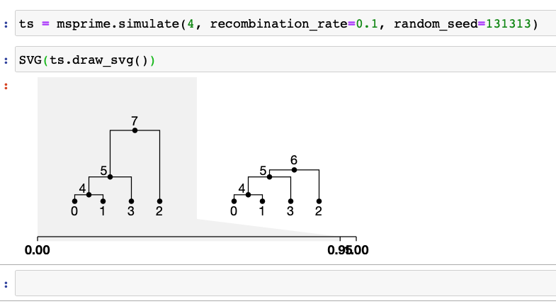
This is using the development version of tskit, btw. It looks like the axis ticks have been scaled by genome length but the trees haven't. Not sure if this is the expected behaviour? (But feel free to close if it is)
 gtsambos
All 9 comments
This is expected behaviour @gtsambos - the little grey box is supposed to show how much of the sequence the tree covers. Maybe this isn't so obvious though?
cc @hyanwong
 jeromekelleher
on 21 Sep 2020
jeromekelleher
on 21 Sep 2020
I think a dark line on the diagonal boundary might help.
 benjeffery
on 21 Sep 2020
benjeffery
on 21 Sep 2020
Yes, @gtsambos - do let me know if you can think of a clearer way. The shading is probably more obvious where there are 4 or more trees in the TS. Previously we didn't even scale the axis, and just placed the ticks on the axis such that breakpoints were uniformly separated (i.e. the axis scale was entirely non-linear). I wondered whether to squash the trees, but that doesn't work very well when some cover only a very small fraction of the genome. The background shading was the best solution I could come up with.
You can hide the background shading easily enough using css, if that's confusing.
 hyanwong
on 21 Sep 2020
hyanwong
on 21 Sep 2020
I think a dark line on the diagonal boundary might help.
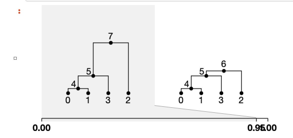
I'm trying to avoid a proliferation of lines, but if it's grey, not black, that might work. Rotating the axis tick mark labels would probably help in this case. Here's a way of doing it (a bit grim to have to use !important to scale the figure to fit the rotated labels in: we should probably have a nicer way)
display(SVG(ts.draw_svg(style="svg {height: 110% !important;} .axis text {transform: translate(-0.5em, -0.5em) rotate(90deg); text-anchor: start}")))
I think a dark line on the diagonal boundary might help.
Like this, or extending all the way up?
hyanwong
on 21 Sep 2020
Oooo, yeah I like the grey better. To my eye all the way up, but lets see what @gtsambos thinks.
benjeffery
on 21 Sep 2020
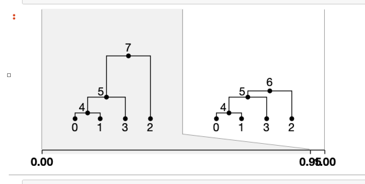
What do we do on the RHS here - i.e. when the last tree has a white background? I guess a line too (and on the left, come to think of it).
Edit - here's roughly what that would look like. I'm still worried about too many lines.
hyanwong
on 21 Sep 2020
@hyanwong Any chance we can get a quick PR for this?
benjeffery
on 29 Sep 2020
I'm really not convinced that the lines are an improvement here. Should we have a vote on it? What does @gtsambos think, as she raised the original issue.
hyanwong
on 18 Nov 2020
Related issues
 awohns
·
7Comments
jeromekelleher
·
9Comments
hyanwong
·
3Comments
jeromekelleher
·
7Comments
awohns
·
7Comments
jeromekelleher
·
9Comments
hyanwong
·
3Comments
jeromekelleher
·
7Comments
 bhaller
·
5Comments
bhaller
·
5Comments
Most helpful comment
What do we do on the RHS here - i.e. when the last tree has a white background? I guess a line too (and on the left, come to think of it).
Edit - here's roughly what that would look like. I'm still worried about too many lines.