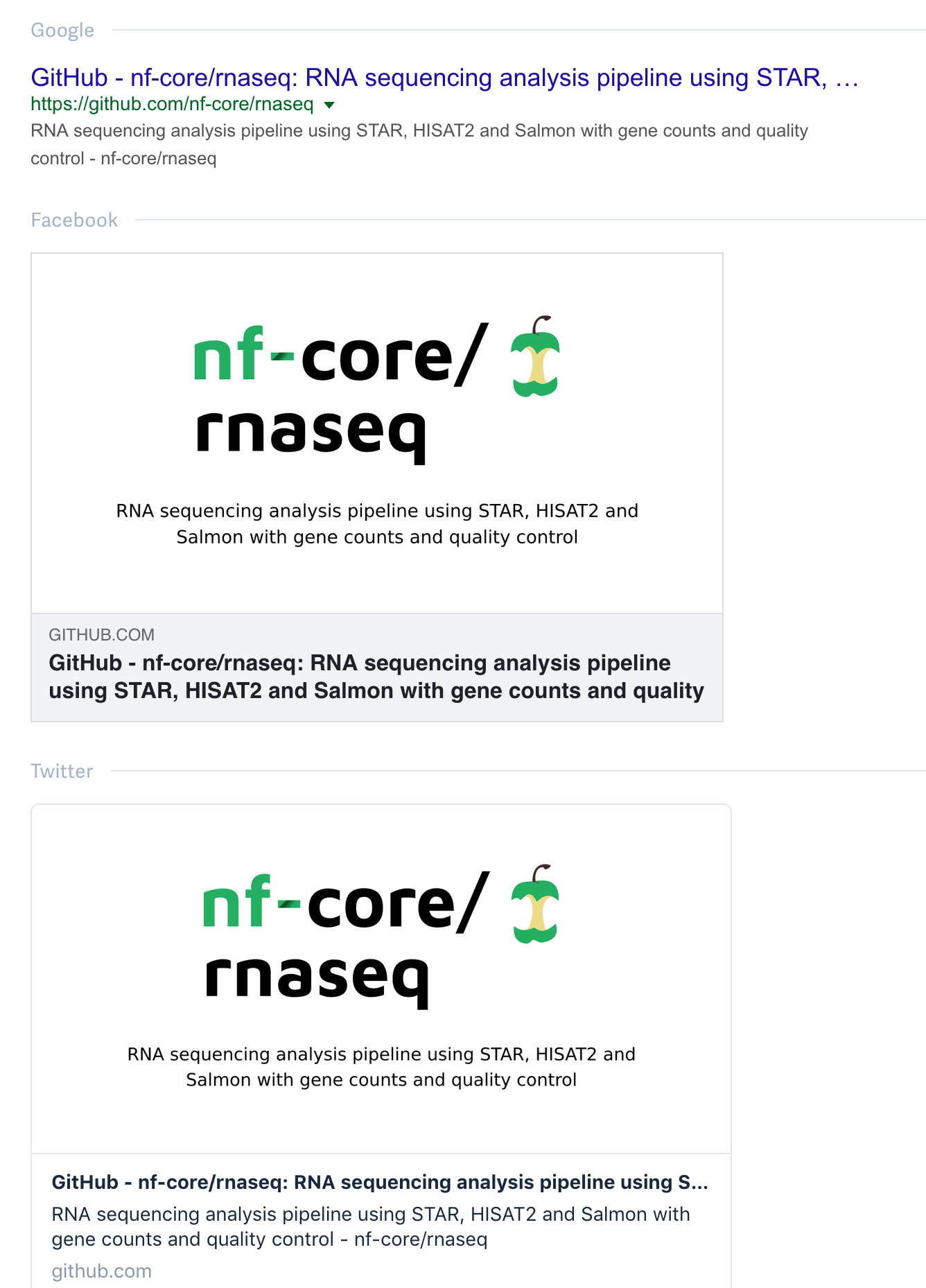
What is the motivation behind having the short description of the pipelines as part of the social preview image? Most services I could test include that text in their preview cards, which creates a bit of a redundancy:
PS: I hope this is the correct repo for this issue 🙂
 mashehu
All 19 comments
I did create all social previews myself, and I figured that it was good to have some description for the pipelines, so I took the text from the description.
I don't actually think it's a problem.
But what would you want to have instead?
 MaxUlysse
on 4 Mar 2020
MaxUlysse
on 4 Mar 2020
I would use only the logo, which seems to be the standard for social previews (if they are not articles). For example npm just uses their npm logo, so our pipeline specific versions are already a nice premium feature 🙂:
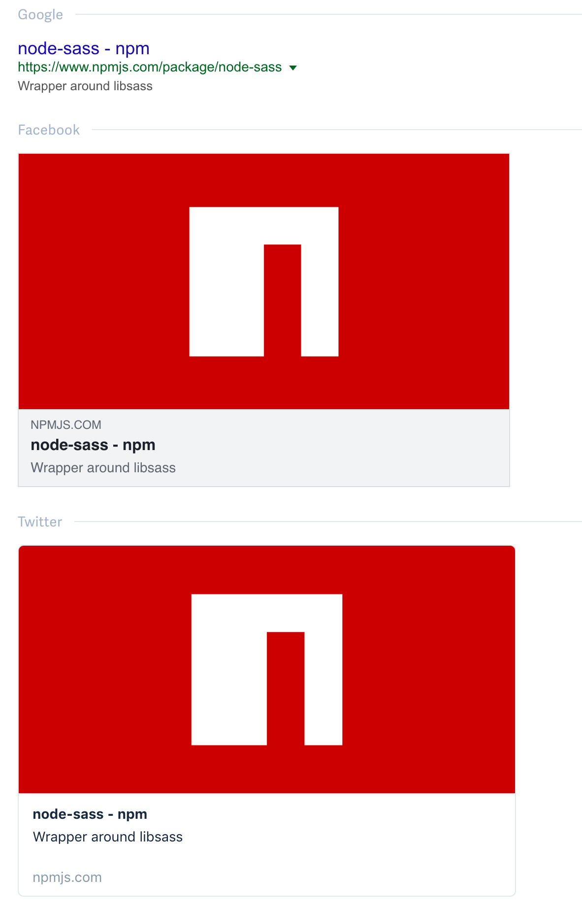
This would also allow to use the logo in other places, for example in the MultiQC reports.
mashehu
on 4 Mar 2020
I did got the inspiration of the design from the https://github.com/nf-core/tools/settings/og-template
MaxUlysse
on 4 Mar 2020
Here is an example, how github uses them (which looks to me more like for an article 🙂):

mashehu
on 4 Mar 2020
And I can see what is GitHub doing for their own stuff: https://twitter.com/gau/status/1235151595194773507
I do have more pressing issues at the moment, but if we're getting only the logo, we could actually automatize the generation of the social preview image (similar to what we're doing with https://nf-co.re/logo/automated?w=1280).
Just need to figure out the actual size of the stuff, and maybe resize the logo if it's too big.
MaxUlysse
on 4 Mar 2020
So I'm trying out without any description for the new nf-core/covid19
pipeline.
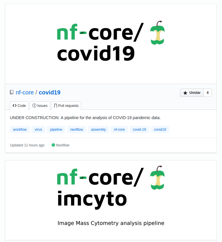
@nf-core/core any preferences?
MaxUlysse
on 17 Mar 2020
Here's how it looks like on the different platforms:


I prefer the no-text logo.
mashehu
on 17 Mar 2020
I like it without text as well.
Let's see what the rest of team like too.
MaxUlysse
on 17 Mar 2020
Yeah, with the examples @mashehu sent I would say that the description is redundant. Would also make things much easier to automate without it.
 drpatelh
on 17 Mar 2020
drpatelh
on 17 Mar 2020
I think without the text we could even make the logo bigger, but I don't know if that creates problems with long pipeline names.
mashehu
on 17 Mar 2020
It'll create issue with pipelines with longer names.
I think it make sense since we do have plenty of pipeline to keep some kind of unity.
So I propose this size, as it's quite working well for our pipelines with the longest names.
Also, the logo should be centred horizontally, but not vertically, as all logos don't have the same heights (depending on letters and such).
But as it's something that needs to be done just once, and as I already have every thing done on my side, I'll update the social media images on github, and at some point I'll make PRs for that as well...
MaxUlysse
on 17 Mar 2020
Note that not all platforms show the description text. eg. Mobile twitter client for me:
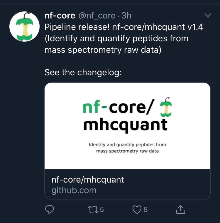
Though in this case of course we put the description text in the tweet itself (predates the social preview).
 ewels
on 24 Mar 2020
ewels
on 24 Mar 2020
So we could just remove the description from the automated Tweet then? Will still mean @MaxUlysse has to create them manually though.
drpatelh
on 24 Mar 2020
To be honest, I started posting to point out that we should keep the description text in the image as otherwise it could be lost on twitter. But once I put the screen grab in I realised that the tweet text had it 😅
Generally I like having the description text underneath as I think that it's more attention grabbing - I am more likely to read that than read the text around the embed. It is very predictable and I don't mind the duplication. However I also see the attraction of automating this which is difficult with the description text.
Overall I don't see the need to go through all pipelines changing stuff as @MaxUlysse already did, but going forward I guess we could set up a social image logo automation script based on the existing logo one to make life easier for people. If we could use the GitHub API to set this I would be 100% backing this, but as it's still a manual upload I am slightly less fussed.
I think without the text we could even make the logo bigger, but I don't know if that creates problems with long pipeline names.
I think lots of whitespace is not a bad thing, as these images often get cropped in weird ways. Having a buffer usually solves this.
I agree that the GitHub CLI one looks amazing 😍
ewels
on 24 Mar 2020
Should we make a poll and let the community decide?
MaxUlysse
on 24 Mar 2020
Hmm, weird that twitter's own card validator doesn't include the mobile option, but I read now up on the twitter docs and unfortunately the twitter:description part is not supported on mobile 😞
mashehu
on 24 Mar 2020
No need for a poll. I think we can decide this amongst ourselves 😅 . I agree with @ewels 👍 I do like the text in the image too but I was just thinking about you having to manually do this every time we get a new pipeline which wont be much in reality. If we can automate it by other means then Im happy too.
drpatelh
on 24 Mar 2020
ewels
on 24 Mar 2020
I don't really mind making it every time, we don't have that many new pipelines.
And it can usually wait a couple of days.
MaxUlysse
on 24 Mar 2020
Related issues
ewels
·
5Comments
 sven1103
·
3Comments
sven1103
·
3Comments
 ggabernet
·
5Comments
ggabernet
·
5Comments
 apeltzer
·
4Comments
apeltzer
·
4Comments
 lucacozzuto
·
5Comments
lucacozzuto
·
5Comments
Most helpful comment
And I can see what is GitHub doing for their own stuff: https://twitter.com/gau/status/1235151595194773507
I do have more pressing issues at the moment, but if we're getting only the logo, we could actually automatize the generation of the social preview image (similar to what we're doing with https://nf-co.re/logo/automated?w=1280).
Just need to figure out the actual size of the stuff, and maybe resize the logo if it's too big.