想要在卡片裡流動,目前我試不出來,也無法置中
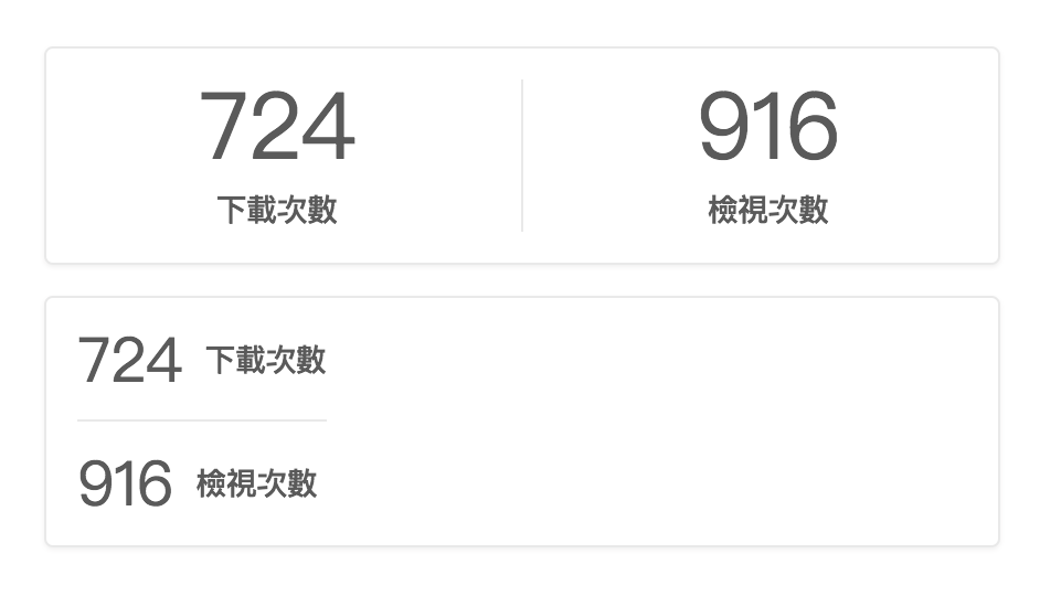
<div class="ts card">
    <div class="center aligned content">
        <div class="ts fluid divided two statistics">
            <div class="statistic">
                <div class="value">724</div>
                <div class="label">下載次數</div>
            </div>
            <div class="statistic">
                <div class="value">916</div>
                <div class="label">檢視次數</div>
            </div>
        </div>
    </div>
</div>

<div class="ts card">
    <div class="center aligned content">
        <div class="ts fluid divided horizontal two statistics">
            <div class="statistic">
                <div class="value">724</div>
                <div class="label">下載次數</div>
            </div>
            <div class="statistic">
                <div class="value">916</div>
                <div class="label">檢視次數</div>
            </div>
        </div>
    </div>
</div>
 goodjack
👍1
All 6 comments
這個 Bug 找得真的很好(Tocas 3.0 裡面反倒還改得更糟了 🤔),因為 Statistic 是 Flexbox,所以不能用普通的「文字置中」來置中裡面的「元素」(所以 Card 的 Center Aligned 自然就無法起作用)。
目前如果要讓 Horizontal Statistic 置中並流動寬度的話,將 .statistic 加入下列樣式就可以了。
width: 100%;
justify-content: center;
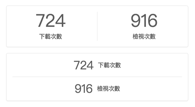
之後要置中的話⋯看是要改 Card 的 Center Aligned(讓他支援內部的 Flexbox 置中)還是讓 Horizontal Statistic 可以加上 Center Aligned 就是了。
 YamiOdymel
on 11 Apr 2018
YamiOdymel
on 11 Apr 2018
🎉1
👍1
在 guid column 裡流動呢?
還是我就是用 segment 或 card 包然後加上 borderless?
goodjack
on 11 Apr 2018
@goodjack 這裡我不太懂你的意思,你想要達成什麼樣的外觀?你不希望有框線嗎?
YamiOdymel
on 11 Apr 2018
想要有類似這樣的效果 (用 Keynote 畫的 😂
在考慮是不是要用表格來組 比較方便垂直對齊
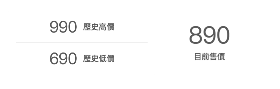
原本還想加上小的 NT$ 的
類似 MUJI 官網這樣
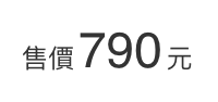
但覺得有點複雜,之後再想辦法好了
goodjack
on 11 Apr 2018
👍1
下面的答案幾乎都是 3.0 才能用,不過也先丟出一下 3.0 的解決方案好了。
3.0 之後 Grid 會支援 Middle Aligned(垂直置中對齊),基本上就可以做出第一個要求。(_簡單說就是將 Column 設為 align-items: center。_)
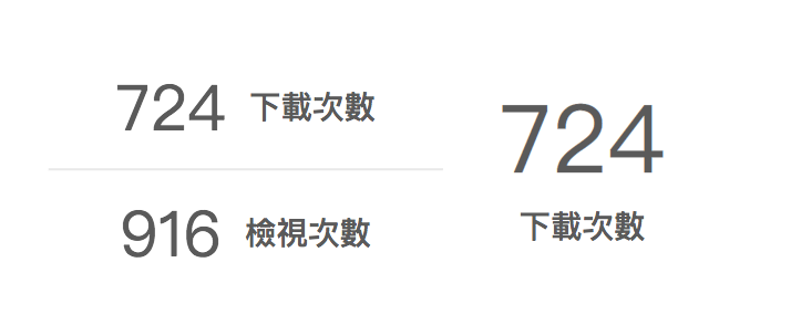
<div class="ts middle aligned two column grid" style="width: 400px">
    <div class="column">
        <div class="ts center aligned divided horizontal statistics">
            <div class="statistic">
                <div class="value">724</div>
                <div class="label">下載次數</div>
            </div>
            <div class="statistic">
                <div class="value">916</div>
                <div class="label">檢視次數</div>
            </div>
        </div>
    </div>
    <div class="column">
        <div class="ts statistic">
            <div class="value">724</div>
            <div class="label">下載次數</div>
        </div>
    </div>
</div>
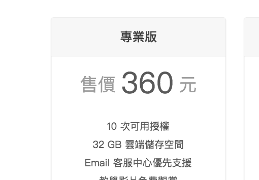
類似 MUJI 那個效果的倒是之前我也有想做類似的,所以額外新增了一個 .unit 單位標籤。(不過下面範例的「售價」有點不太適合 unit 這個名稱就是了)。
<div class="ts statistic">
    <div class="value">
        <div class="unit">售價</div>
        360
        <div class="unit">元</div>
    </div>
</div>
YamiOdymel
on 12 Apr 2018
🎉1
👍1
好期待 3.0 🎉
goodjack
on 12 Apr 2018
🎉1
Was this page helpful?
0 / 5 - 0 ratings
Related issues
 city8208
·
3Comments
city8208
·
3Comments
 MiliChang
·
6Comments
goodjack
·
5Comments
MiliChang
·
6Comments
goodjack
·
5Comments
 gnehs
·
4Comments
gnehs
·
4Comments
gnehs
·
4Comments
gnehs
·
4Comments
Most helpful comment
下面的答案幾乎都是 3.0 才能用,不過也先丟出一下 3.0 的解決方案好了。
3.0 之後 Grid 會支援 Middle Aligned(垂直置中對齊),基本上就可以做出第一個要求。(_簡單說就是將 Column 設為
align-items: center。_)類似 MUJI 那個效果的倒是之前我也有想做類似的,所以額外新增了一個
.unit單位標籤。(不過下面範例的「售價」有點不太適合unit這個名稱就是了)。