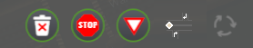
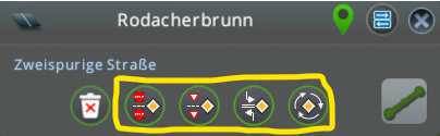
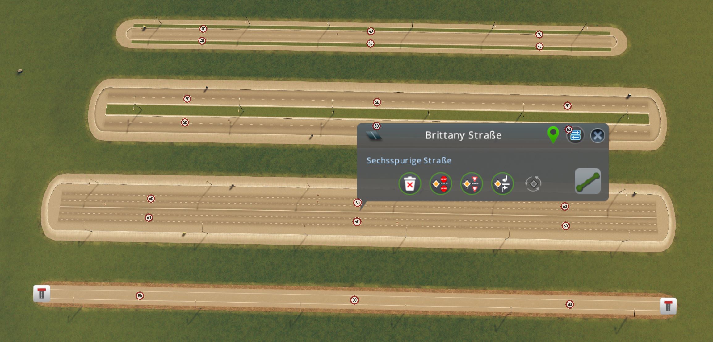
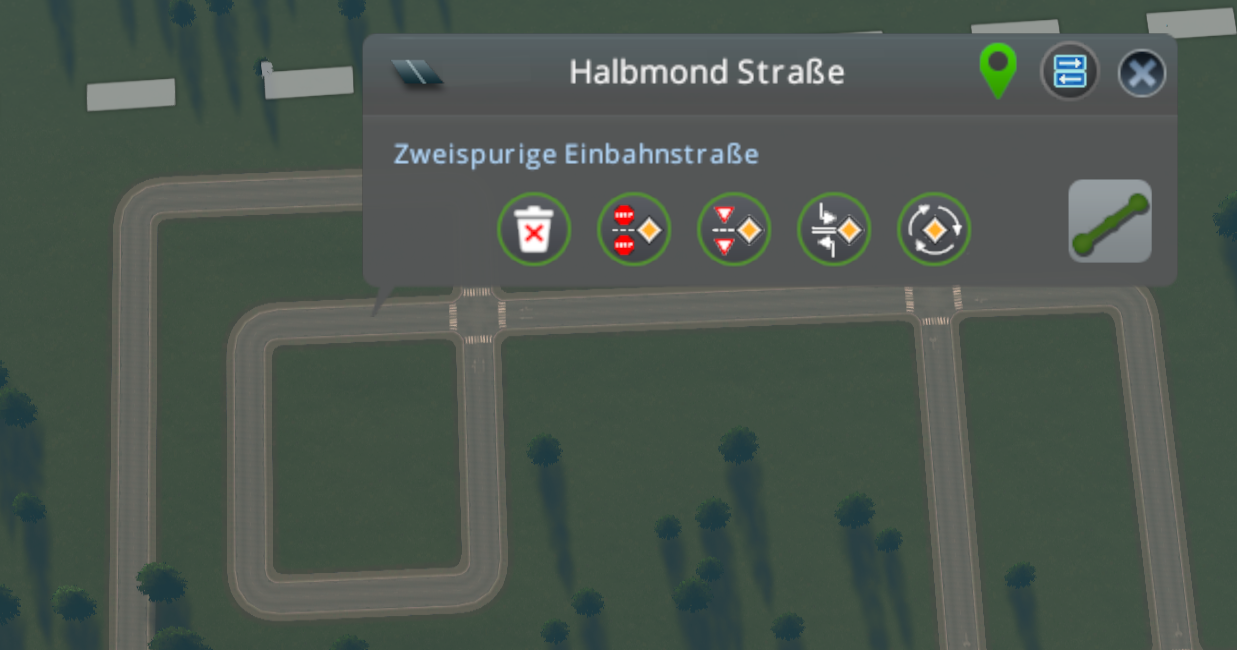
Tmpe: High prioirty road button is misleading
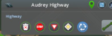
I have been trying to create good buttons for my road selection panel in #542 but I couldn't come up with something good ( https://github.com/CitiesSkylinesMods/TMPE/issues/542#issuecomment-577607193 ).
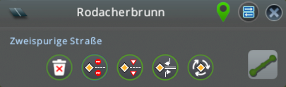
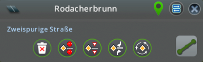
The currently used diamond icon (https://github.com/CitiesSkylinesMods/TMPE/tree/master/TLM/TLM/Resources/RoadSelectionPanel) is out of place since it not only sets the diamond symbol but also does a ton of other stuff:
- enter blocked junction
- no Ped crossing
- no left turn in the main road or on entry.
- Yield on entry.
Chamelon agreed to create a better Icon for us.
see https://github.com/CitiesSkylinesMods/TMPE/wiki/High-priority-Road
 kianzarrin
All 68 comments
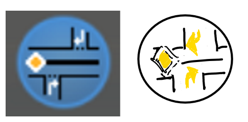
that diamond is out of place since it not only sets the diamond symbol but also does a ton of other stuff:
- enter blocked junction
- no Ped crossing
- no left turn in the main road or on entry.
- Yield on entry.
Anyone looking at that symbol would think that it only sets up priority signs. particularly considering that is exactly what the stop and yield button do.
EDIT ABOUT THE thing bellow: ...
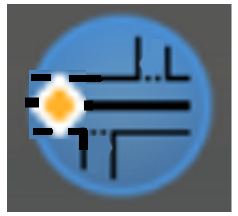
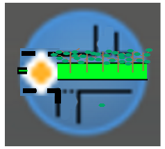
The concept of high priority button is that the central barrier is unbroken at the junction so I thought maybe we can turn this into an icon:
----------------------------------------------------
__________________________________________________
---------------------------------------------------
_______________          __________________________________
               |         |
               |         |
               |         |
               |         |
But I am not sure if it is clear to the user.
the grey background is more an issue here....
but i will solve this...
kian.zarrinToday at 16:07
its 40x40 pixels but it should also fit that circle.
ChamëleonToday at 16:07
this is why i said 30x30
kian.zarrinToday at 16:08
i think so.
ChamëleonToday at 16:08
i measured it :wink:
kian.zarrinToday at 16:09
If you have cloned TMPE repo you can replace that diamond Icon with your icon and rebuild TMPE to see how it looks.
You can rebuild while in game and the icon gets replaced instantly (make sure you have disabled all other mods)
Notice that there is a inactive version as well.
kianzarrin
on 11 May 2020
Maybe something like this would bring it more on point:

Disabled:

Normal:

 chameleon-tbn
on 11 May 2020
chameleon-tbn
on 11 May 2020
That is awesome!
kianzarrin
on 11 May 2020
tagging @kvakvs @aubergine10
kianzarrin
on 11 May 2020
@thebugfixnet The idea is awesome but the details (namely most important details - main road sign and turn arrows, they can be made bigger, even if they go over the lines.
Most important thing it conveys is done via 3 elements - the diamond sign, and 2 right turns. Maybe also reduce the road to a single center line? The minor elements like dotted lines on adjacent roads can be omitted, the button is too small for that to be seen. Or increase these elements like so
Also then it needs contrast bright outline to look good on dark background.
 kvakvs
on 11 May 2020
kvakvs
on 11 May 2020
@kvakvs Thanks for the feedback.
As the road below was the image i hat in mind, i decided to have the median in the middle to make clear there is no passing possible.
Hey you have seen the dottet lines, so they are not to o small to see 😉
I will create some Alternatives based on your feedback
chameleon-tbn
on 11 May 2020
I like the concept.
However, the lane arrows pointing right (and the priority sign on right?) will be confusing in a city that's set to left hand traffic. Is it possible to also have a LHT version of the icon, and switch which icon is shown depending on m_invertTraffic value?
 aubergine10
on 11 May 2020
aubergine10
on 11 May 2020
As i never Played LHT.... Could It simply be a flipped version or should just left arrows used?
chameleon-tbn
on 11 May 2020
@kvakvs Most important thing it conveys is done via 3 elements - the diamond sign, and 2 right turns. Maybe also reduce the road to a single center line?
I disagree. The central barrier is the most important feature. The main concept of the high priority road is that the central barrier is unbroken. all the other traffic rules can be inferred from that. So make that line extra thick @thebugfixnet (I think what is now is good).
Also note that the cars in the main road also cannot take far(far = left when traffic drives on right) turn to the alleys.
Summary: I agree with @kvakvs 's idea of emboldening the important traffic rules, but I disagree with thinning out the median which is the most important one of them all.
kianzarrin
on 12 May 2020
Another alternative would be to do away with the turning sings altogether. That way there is no need for flip textures (as if it is hide crossing mod 😄) in Left Hand Traffic (LHT). The turning arrows are implied because of the thick median.
The Main road sign is also implied but I think its a good idea if we keep that in.
If we want to make more space we can even have one T intersection instead of two. But I still think two T intersection alternative that @thebugfixnet is more beautiful.
EDIT: if we get rid of those arrows then I think its good that we keep the dotted lines. They ARE visible and they do emphasize the concept of yielding.
In any case I am not good at UI design so these are just a few suggestions based on my humble opinion but I INSIST on having a THICK median.
EDIT don't forget the trees!
Just kidding!
kianzarrin
on 12 May 2020
I agree with Kian that the median is important; it has to be obvious that it's more than a center line.
Also, maybe we could refer to the button as "Avenue rules" or something like that?
So you can set the road as:
- Stop/Yield on entry, or
- Avenue = bunch of extra stuff and no crossing the median.
Maybe the Avenue button should only be enabled if the road is 2 Way && Lanes > 2 ..?
aubergine10
on 12 May 2020
maybe we could refer to the button as "Avenue rules"
I have been switching between boulevard | avenue | high priority | when naming this feature. I have now been using High priority consistently in all of my naming.
naming conventions that I can think of:
- High propriety | medium priority | priority signs only
- Avenue | boulevard | priority signs only.
kianzarrin
on 12 May 2020
Another alternative would be to do away with the turning sings altogether. That way there is no need for flip textures (as if it is hide crossing mod 😄) in Left Hand Traffic (LHT). The turning arrows are implied because of the thick median.
@kianzarrin i believe the arrows are important to make clear that this is an unchangeable feature of the high prioritiy road if we can not make more clear what's the main rules for this road. And therefore it should be at least answered if the option @aubergine10 said (depending on m_invertTraffic value) is possible.
I absolutely agree with aubergine that the naming is not really clear.
In germany 'high priority' would just be identified as Main road with the 'diamond sign' it would not explain anything about an 'real' or 'invisible' median. In Germany we would have a double solid line if there is not used a read solid median. And the roads are not named high priority and neither boulevard.
In Germany (and as far as i know also in France) boulevards are wide ring roads with larger pedestrian paths and trees on both sides (not middle), normally between ped path and lanes . Avenues are more or less straight roads with normal ped path width and trees on both sides. Alleys are smaller roads with trees on both sides.
In Germany any kind of two way road can be with a middle median - either painted or solid. And the only namings for this specific feature are "Mittlerer Grünstreifen" ("Green Median") or "Mittelstreifen" (Center Strip). The first word is every time with some plants and a real solid barrier. The second one could be solid line, solid double line, painted Islands or solid barriers.
In general i think it would be better to name it:
- Median Strip Priority Road
- Median divided Priority Road
or something like this. This would make really clear that the media is the main feature.
Therefore i created some updated versions of the first icon design.
Changes:
- larger, outlined 'diamond sign'
- change the solid median to a painted version
- added a white dotted & solid line to show this could be changed by user
- with and w/o arrows


As the a double painted line would be async i had to adjust a little bit the size and form of the diamond sign. Therefore two versions of this.


chameleon-tbn
on 12 May 2020

This is the one I prefer the best but two problems:
- I prefer the black median with solid fill more. It is simpler (too many lines can make user dizzy and reduce his attention). Also it gives the impression that the median is raised emphasizing the fact that far turn is banned. (Not sure if they use raised platform in Germany but that shouldn't matter since this icon is supposed to be global.)
- The top branch should have dotted line rather than solid stop line.
- maybe add the arrows too? I don't care either way.

Its amazing how much detail you are able to fit in a small area!!!! In any case the stripped line has too much detail. I think simple is better.
I believe the arrows are important to make clear that this is an unchangeable feature of the high priority road if we can not make more clear what's the main rules for this road.
FYI far-side-turn ban can be turned off in the from TMPE options. Even so, I am not against the arrows because It clarifies the core concept.
kianzarrin
on 12 May 2020
In germany 'high priority' would just be identified as Main road with the 'diamond sign' it would not explain anything about an 'real' or 'invisible' median. In Germany we would have a double solid line if there is not used a read solid median. And the roads are not named high priority and neither boulevard.
I don't know man! I did some internet searching and it does not seem that there is too much difference between boulevard and avenue. Avenue is supposed to be bigger but people use the terms interchangeably. Both Boulevards and Avenues can have central barrier or simple double solid line. Both of them can have trees/grass in the center or on the side or not at all.
In Germany (and as far as i know also in France) boulevards are wide ring roads with larger pedestrian paths and trees on both sides (not middle), normally between ped path and lanes . Avenues are more or less straight roads with normal ped path width and trees on both sides. Alleys are smaller roads with trees on both sides.
Yes that was my original understanding to but doing some reading on internet and also looking at some image searches I really can't tell the difference!
kianzarrin
on 12 May 2020
Sadly pixel art is not an acceptable style for GUI, because for the user it becomes a mess of fine tiny pixels which is hard to recognize. You can fit 1-2 large key elements and if you try to fit more it becomes unreadable noise unless you look very very close. That's why i am asking to make key things bigger.
kvakvs
on 12 May 2020
This is the one I prefer the best but two problems:
- I prefer the black median with solid fill more. It is simpler (too many lines can make user dizzy and reduce his attention). Also it gives the impression that the median is raised emphasizing the fact that far turn is banned. (Not sure if they use raised platform in Germany but that shouldn't matter since this icon is supposed to be global.)
- The top branch should have dotted line rather than solid stop line.
- maybe add the arrows too? I don't care either way.
@kianzarrin these would be small changes that are easily possible.
chameleon-tbn
on 12 May 2020
Sadly pixel art is not an acceptable style for GUI, because for the user it becomes a mess of fine tiny pixels which is hard to recognize. You can fit 1-2 large key elements and if you try to fit more it becomes unreadable noise unless you look very very close. That's why i am asking to make key things bigger.
@kvakvs On general i agree. but with just 30x30 pixel net size it is not easy to bring in the needed information. But I work on something that should fir more that what you have in mind... give me a few moments :D
chameleon-tbn
on 12 May 2020
@kvakvs what do you think about something linke these?


But for this it woud be needed to have an LHT / RHT 'identifier' to use a different icon, i believe...
chameleon-tbn
on 12 May 2020
@thebugfixnet I like these very much
If the arrow heads could be bigger that'd have my vote 😀
kvakvs
on 12 May 2020

@kvakvs Wishes I fullfill fast... wonders take a little while longer... 🙃
chameleon-tbn
on 12 May 2020
If the above icon would be the choice at the end it would be also god to have the same logic for all other icons there.
Therefore i created samples for the others too... (except the trash bin)


And also on one view....
...of course there will be disabled versions also 😉
chameleon-tbn
on 12 May 2020
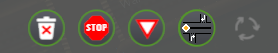
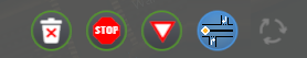
STOP signs need something done about them.
They look like ⛔ brick
kvakvs
on 12 May 2020
Still testing....

chameleon-tbn
on 12 May 2020
STOP signs need something done about them.
They look like ⛔ brick
Maybe we can remove the text in it?
kianzarrin
on 12 May 2020
At this scale octagon and circle look the same.
You can try contrast every 2nd edge.
You can try max 3 letters with very visible spacing, to show that its not a brick. Don't bother making it read as STOP.
kvakvs
on 12 May 2020
At this scale octagon and circle look the same.
You can try contrast every 2nd edge.You can try max 3 letters with very visible spacing, to show that its not a brick. Don't bother making it read as STOP.

Sadly yes...
I did, but with a grey now, as white is making it ugly...
I did... no - to have it readable it woud bee neede to have the size of the diamond sign... and that would be misleading...
chameleon-tbn
on 12 May 2020
This solution to octagons is quite acceptable in my eyes 👍
kvakvs
on 12 May 2020
IN addition to high priority road icon the roundabout icon should also be flipped. am i right?
EDIT: wait the roundabout sign is already UK way around! oh well the flipping is not the hard part.
kianzarrin
on 12 May 2020
IN addition to high priority road icon the roundabout icon should also be flipped. am i right?
EDIT: wait the roundabout sign is already UK way around! oh well the flipping is not the hard part.
Normally all should be available in RHT/LHT as the diamond sign should be in UK Version in the right Side of the Icon... If you want to bei totally conform :)
chameleon-tbn
on 12 May 2020
I'm not sure if the roundabout needs a priority sign in it (even if that is part of the customisations applied when clicking it).
The light grey pixes on stop sign look like graphics glitch to me, particulary as they contrast so much with the black border. Would alternating the border colour between black and charcoal grey give better result?
in addition to high priority road icon the roundabout icon should also be flipped. am i right?
Yup those last two signs should have LHT and RHT versions, and ideally TM:PE should only load the version that's relevant to current city (I think @kvakvs already has some texture-loading code that can handle that sort of thing).
For the stop/yield/priority signs I think the yellow diamond can stay on the left mainly due to that's how we view information (left-to-right, top-to-bottom). Although there might be some merit to having versions with the yellow diamond on the right for middle eastern / oriental languages that read from right-to-left?
aubergine10
on 12 May 2020
@aubergine10 tomorrow i will play on some color tweaking and post a few variations
chameleon-tbn
on 12 May 2020
@thebugfixnet Could you also test to see what the icons would look like with shorter center lines? For example, on the stop/yield, would they look better if the 4th dash was removed? Likewise for high priority, would it look better if the median line was shortened a little (same width as 3 dashes).
aubergine10
on 12 May 2020
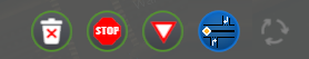
I tried out several combinations and change some smaller things.
- Shortened the center line by one element (4 pixels) on the three signs
- Enlarged the stop sign 2 pixel in the corners
- Changed the colors of the stop sign borders
- Soften the borders of the stop sign
- Optimized the Text on the stop sign
- Adapted the roundabout sign to match the finer lines of the other signs
- created LHT & RHT Versions
@aubergine10 - in my opinion this is the smoothest version and do not look to much like a graphic glitch. I tried ~30 variations at various shadings... most of them hurt in the eyes 😵
For an easier preview they have the button circle behind, the final file have transparent backround of course 😄
Stop Sign
Resizing the Stop sign brings it out a little bit away from a perfect mirroring.
The upper stop sign has 1 pixel more space to the middle line:


Version with same space from middle line and therefore 1 px more space from the top:


I believe that the second one is a good compromise.
Yield Sign


High Priority


Roundabout


And as a screen for easier comparison.

And for even easier comparison zoomed by 400% ... (Needs anybody 🔍?)


chameleon-tbn
on 13 May 2020
These look awesome
aubergine10
on 13 May 2020
So I now need to do what I do best ... flip textures!!!!!!
kianzarrin
on 13 May 2020
@thebugfixnet Can you also produce the disabled versions please? (Currently I don't think there is anyway to see disabled versions in game except for the roundabout).
kianzarrin
on 13 May 2020
Rather than having loads of extra textures for disabled states, can we not just reduce opacity?
We shoudl be looking for ways to minimise amount of textures loaded where possible; many users struggle with very little RAM.
aubergine10
on 13 May 2020
Also, for reversed/flipped textures (LHT vs. RHT) I think it would be better to include the pre-flipped versions in the mod resources, and load the relevant resource based on traffic driving side to minimise load times?
aubergine10
on 13 May 2020
@thebugfixnet Can you also produce the disabled versions please? (Currently I don't think there is anyway to see disabled versions in game except for the roundabout).
I have already but not uploaded as i will Upload the full Set as soon it is clear these are exact that what you want 😁
But See @aubergine10 comment please if disabled Just with a Filter is possible instead of a PNG.
chameleon-tbn
on 13 May 2020
Also, for reversed/flipped textures (LHT vs. RHT) I think it would be better to include the pre-flipped versions in the mod resources, and load the relevant resource based on traffic driving side to minimise load times?
I have also generated flipped Versions...
chameleon-tbn
on 13 May 2020
ignore this; bad idea
@kianzarrin I know this is really late in the process, but do we need to make some changes to the functionality...
As a user, when I see the buttons above, I am thinking the following:
- They are all applying priority stuff (they all have the yellow diamond)
- In addition, depending on clicked button:
- Toggle stop signs
- Toggle yield signs
- Toggle high priority
- Toggle roundabout rules
And now looking at the mod options that apply to priority roads (and thus, I assume as a user, all the buttons above):
It's confusing. I realise those options configure the shortcut in Priority Signs tool, but as a user how do I know if they also apply to the buttons mentioned above, especially when some of them seem to conflict with various buttons?
So my suggestion for buttons:
- Add new "Priority" button
- It will toggle priority stuff on the main road
- It will not affect side-roads
- Merge Stop/Yield buttons in to one button with three states (it will only affect side roads; no yellow diamond on button):
- No sign (default state background)
- Stop sign (selected state background)
- Yield sign (selected state background)
- The high priority button, when selected, prevents vehicles crossing traffic and also adds 'enter blocked junction' where applicable
I think this would maybe be clearer from end-user perspective. It also allows me to toggle stop/yield signs on any road, not just priority roads.
And regarding mod options, meh, I don't know. Before figuring that out, does the stuff with buttons above sound logical?
aubergine10
on 14 May 2020
Alternatively, have all buttons do priority stuff for the main road, but order them on "level of priority":
- Low priority (yield)
- Medium priority (stop)
- High priority (stop + nearside turn only + no crossings over main road)
aubergine10
on 14 May 2020
Alternatively, retain all buttons do priority stuff, but reorder them so you get like low (yield) - medium (stop) - high (stop + nearside turn only) priority?
That was my First comment to my wife when i started with the Icon edit. :) So this i agree to!
chameleon-tbn
on 14 May 2020
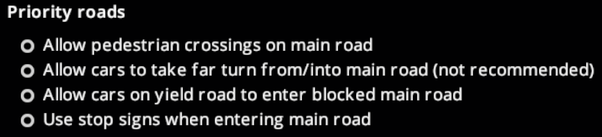
If we do low/medium/high priority approach, we could then have applicable mod settings something like:
Low Priority Roads
- [x] Allow yielding cars to enter blocked main road
Meduim Priority Roads
- [x] Allow pedestrians to cross main road
- [x] Allow side-road traffic to cross the main road (?)
High Priority Roads
- [x] Allow pedestrians to cross side roads
- [x] Allow emergency vehicles to cross the median
(If allow emergency to cross median is disabled, use lane connectors instead of lane arrows).
We could also then have a drop-down list to determine what the "quick fix" shortcuts (Ctrl+Click and Ctrl+Shift+Click) in Priority Signs tool do:
Quick fix shortcuts in Priority Signs tool sets priority to: [Low | Medium | High]
EDIT: If it's possible to put that drop-down in the Keybinds settings, we could potentially have two so user could choose different priority for Ctrl+Click and Ctrl+Shift+Click. Example: When using quick fix on a junction, I probably want high priority, but when applying quick fix along a route I probably want medium priority.
And the OSD hints when Priority Signs tool is active would reflect the setting (eg. "Ctrl+Click Set high priority junction").
aubergine10
on 14 May 2020
It would help with documentation too (rough draft):
Low priority
_Slightly improves main road traffic flow, with only minor delays for side-road traffic._
This is achieved by adding Yield signs to the side-roads, which helps reduce disruption to traffic on the main road. Traffic entering from side-roads can go left, right or straight ahead depending on junction layout. Pedestrians are allowed to cross over the main road and side roads.
In Policies Settings you can choose to allow yielding side-road traffic to enter blocked main road junctions. This will minimise delays for side-road traffic, but might impair main road traffic if the roads are busy.
Medium priority
_Noticeably improves main road traffic flow, but with longer delays for side-road traffic._
This is achieved by adding Stop signs to the side-roads, greatly reducing disruption to the traffic on the main road. Traffic entering from side-roads can go left or right.
In Policies Settings you can choose to allow pedestrians and/or side-road traffic to cross the main road. In both cases, careful consideration is required:
- If crossing is allowed, it will probably impair traffic flow on the main road.
- If you prevent crossing, the main road acts like a barrier between two halves of the city. You'll have to provide alternate ways to cross - tunnels, bridges or traffic lights?
High priority
_Significantly improves traffic flow along the main road, but can cause significant delays for side-road traffic and potentially much longer journeys for all traffic._
This is achieved by treating the road as if it has a solid, impassable median down its center line. Traffic entering from side roads must stop before entering, and upon entering can only go in the same direction as the traffic on that side of the main road. Pedestrians can still cross side-roads, but are not allowed to cross the main road.
Like medium priority roads with disabled crossings, you will need to provide alternate methods of crossing the main road. With high priority roads this is even more important because otherwise vehicles will often need to take long, slow detours to reach destinations on the other side.
Tip: Instead of making a high priority road that cuts your city in half, consider an elevated highway or, on the outskirts of your city, a bypass/ring road.
In Policies Settings you can choose to allow emergency vehicles to cross the median line (recommended if the road assets you use don't draw a solid median), and choose to allow pedestrians to cross side-roads (which helps them move around, but might reduce rate at which main road traffic can leave via side-roads).
aubergine10
on 14 May 2020
Rather than having loads of extra textures for disabled states, can we not just reduce opacity?
That would require a rework of the back-end code and is out of the scope of this review. The backend code auto generates the filenames to look for.
We shoudl be looking for ways to minimize amount of textures loaded where possible; many users struggle with very little RAM.
Oh come-on! these are so small texture even a thousand of these would occupy insignificant amount of memory in comparison to an asset. We can compress the textures though if the quality settings is low (if it automatically does not do that already). Still don't think its beneficial.
kianzarrin
on 14 May 2020
Low priority (yield)
Medium priority (stop)
High priority (stop + nearside turn only + no crossings over main road)
I am assuming you got the order wrong. Low priority should be stop and Medium priority should be yield.
Low Priority Roads
Allow yielding cars to enter blocked main road
Meduim Priority Roads
Allow pedestrians to cross main road
Allow side-road traffic to cross the main road (?)
High Priority Roads
Allow pedestrians to cross side roads
Allow emergency vehicles to cross the median
I think we are building too many layers of abstraction here. Simplicity is the key. the priority signs buttons should simply put priority signs only. Most of the users are not going to bother with this feature if it has this degree of complexity.
kianzarrin
on 14 May 2020
That would require a rework of the back-end code and is out of the scope of this review. The backend code auto generates the filenames to look for.
It's not essential to do in this review, but would be nice to do at a later date if possible.
Oh come-on! these are so small texture even a thousand of these would occupy insignificant amount of memory in comparison to an asset. We can compress the textures though if the quality settings is low (if it automatically does not do that already). Still don't think its beneficial.
It's a fairly common issue; there are lots of users out there with 8GB RAM, a bunch of DLC and sufficient assets/mods to cause lag-inducing disk swapping and sometimes even crashes. Anything that eats RAM in this game just exacerbates that issue.
I suspect we are actually doubling up on RAM consumption with the image resources; the .dll which contains them is loaded in to RAM (I think?), and then we are loading them in to texture atlas. A better approach (some task for later date) would be to include the images as just files external to the .dll and load from disk on as-needed basis.
The biggest culprit by far are the speed limit signs where we have I think 3 or 4 complete sets in the dll that also get put in to texture atlas. TM:PE mod is over 5MB, and most of that is images. Considering we're doubling that (images in dll + texture atlas) that means we're floating at around 10MB of RAM consumption. And I'm not sure if the atlases we use for our images are swapped to disk as rigidly as those used for asset textures (UI texture atlas is kept in RAM all the time I think?). With improved texture management we can potentially reduce our RAM load by about 6MB. In any case, it is something that can be investigated at a later date.
I am assuming you got the order wrong. Low priority should be stop and Medium priority should be yield.
From which perspective? Vehicles entering the main road from a side-road? The consistent theme in the buttons is the priority road. From the perspective of the priority road, yielding vehicles cause more disruption than stopping vehicles.
I think we are building too many layers of abstraction here. Simplicity is the key. the priority signs buttons should simply put priority signs only. Most of the users are not going to bother with this feature if it has this degree of complexity.
Do any of those existing mod options affect what happens when buttons shown earlier are clicked? I was under the impression that they did?
aubergine10
on 14 May 2020
Do any of those existing mod options affect what happens when buttons shown earlier are clicked? I was under the impression that they did?
No they don't #889 I think is the right issue to track this. The new layout for in game options I have suggested there would resolve the ambiguity. For now we can modify option group to high priority from Crowdin.
you are suggesting the following button layout:
Low priority | Medium Priority | High priority
But I am suggesting this bottom layout in #889 :
Simple (priority signs only) | medium flexibility/complexity | Maximum flexibility/complexity
As I have mentioned in #889 Low/Medium/High priority profiles could be under the "medium flexibility/complexity" button. I personally think we can do away with those profiles in favor of more simplicity since I don't think people are going to actually use those(save for a handful). You can always modify the high priority profile in the in game panel.
Instead I think we should have add profile button in the "Custom (Maximum flexibility/complexity )" panel.
kianzarrin
on 14 May 2020
No they don't
And same for roudabout button - not related to the roundabout mod options?
aubergine10
on 14 May 2020
The high priority road button option gets its options from the priority road (should rename it to high priority road) policy group. (EDIT look at tooltip)
The roundabout button gets its options from the roundabout policy group.
kianzarrin
on 14 May 2020
@thebugfixnet Can you please either upload the changes into your branch or give me zip file including all the images?
kianzarrin
on 14 May 2020
@thebugfixnet Can you please either upload the changes into your branch or give me zip file including all the images?
@kianzarrin I'll upload into the icon-design branch.
We had not talked about how the disabled should look like...
just black/white filter

or 50% saturation + -30% brightness

chameleon-tbn
on 14 May 2020
disable do not have a circle around them you could go for maltitol designs. The game has a complete Black texture. Kvkvs went for grey icon black and white also works
kianzarrin
on 14 May 2020
I've just pushed the in 50% saturation + -30% brightness right now but also pushed bw/versions into the folder.
https://github.com/thebugfixnet/TMPE/commit/6f228c69519c4dc09448f1c130b7d81a945abc18
So you can decide wich version is the best fit.
chameleon-tbn
on 14 May 2020
@aubergine10 @kvakvs Which approach would you go for:
1- Black
2- Black and white
3- grey ( I like this )
4- low saturation/brightness. (I am against this)
kianzarrin
on 14 May 2020
I am using 50% saturation -40% brightness on main menu, it looks okay
if the high style council decides to go for 3 or 2 they have to redo the mainmenu icons too
kvakvs
on 14 May 2020
@kvakvs I am using 50% saturation -40% brightness on main menu,
I was not aware you could disable buttons in the main menu. Is it the TMPE tool window?
EDIT: Actually considering that I fixed the code for disabled when implementing road selection panel myself I would be surprised if disabled is used anywhere else in TMPE.
kianzarrin
on 14 May 2020
That is for inactive
Disabled i do not have sprites for that state.
Just load a normal and active sprites and compare.
kvakvs
on 14 May 2020
@kvakvs so do you now agree that " 4- low saturation/brightness. (I am against this)" is a bad option as it does not distinguish between inactive and disabled?
kianzarrin
on 14 May 2020
I would recommend very dark (black) maybe.
Need to see examples.
Brightness has to go down absolutely. 0..25% bright and discolored maybe?
kvakvs
on 14 May 2020
Setting .color will colorize its texture - possible alternative to having separate disabled texture?
I'm guessing they are just normal UIButton components rather than the new stuff that @kvakvs has been working on?
aubergine10
on 14 May 2020
My components are based on UIButton just a bit better sizing and texture management
kvakvs
on 14 May 2020
OK @thebugfixnet so we all agree on Dark grey icons.
I created pull request #892 to review my code and test out your icons. pushing code to your branch will push changes to the review.
kianzarrin
on 14 May 2020
OK @thebugfixnet so we all agree on Dark grey icons.
I created pull request #892 to review my code and test out your icons. pushing code to your branch will push changes to the review.
Okay i'll create them after sleep, update the disabled ones and delete the unused
chameleon-tbn
on 15 May 2020
Test ingame
RHT
LHT
Also hover and active works
Some of the icons have white pixels at places where they are not in the files. I've checked the raw files on github also and they are OK. Where does this come from? Are they somehow touched when packing into the DLL?
![]()
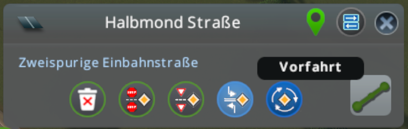
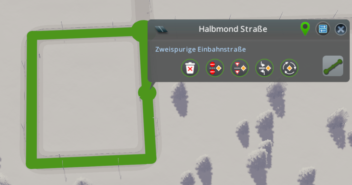
Just saw: If oneway road, roundabout is enabled - also if it is not a 'circle', 'squareabout', 'ovalabout' .... so also on any straight highway/ oneway road.
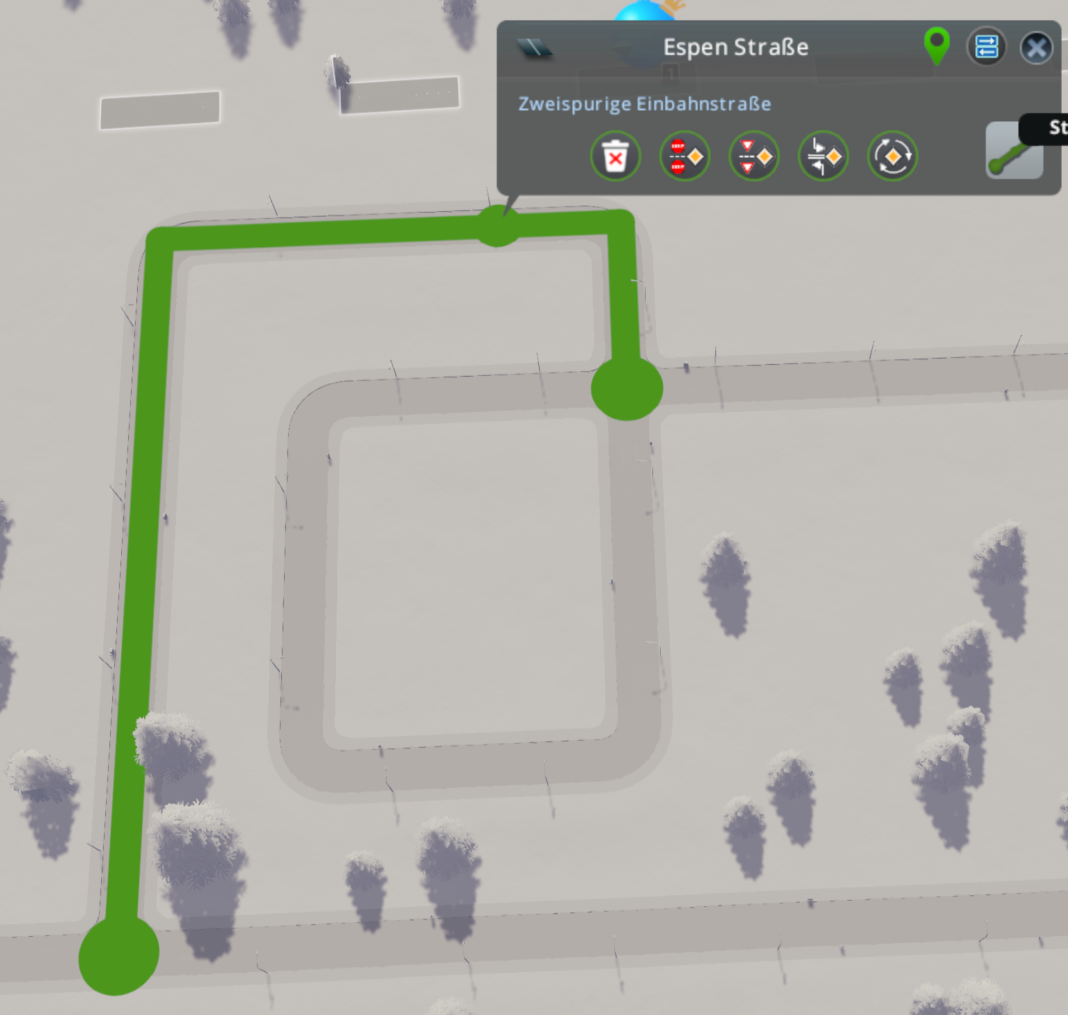
Should not checked is the road has the same starting and end point instead?
chameleon-tbn
on 15 May 2020
I had a chat with @kvakvs regarding to the white pixels. It seems that it is caused by a compression for sprite atlas, as I've tested three times rebuilding from clean and the images were different each time....
So it will not have to do with the images itself.
chameleon-tbn
on 15 May 2020
Related issues
kianzarrin
·
39Comments
 scottmcm
·
29Comments
kianzarrin
·
53Comments
scottmcm
·
29Comments
kianzarrin
·
53Comments
 FireController1847
·
28Comments
aubergine10
·
30Comments
FireController1847
·
28Comments
aubergine10
·
30Comments
Most helpful comment
@kvakvs what do you think about something linke these?
But for this it woud be needed to have an LHT / RHT 'identifier' to use a different icon, i believe...