Tmpe: Priority Signs: Interaction model is whack
I've been working on docs for priority signs feature, and realised the interaction model of that feature is not consistent with other junction-related tools.
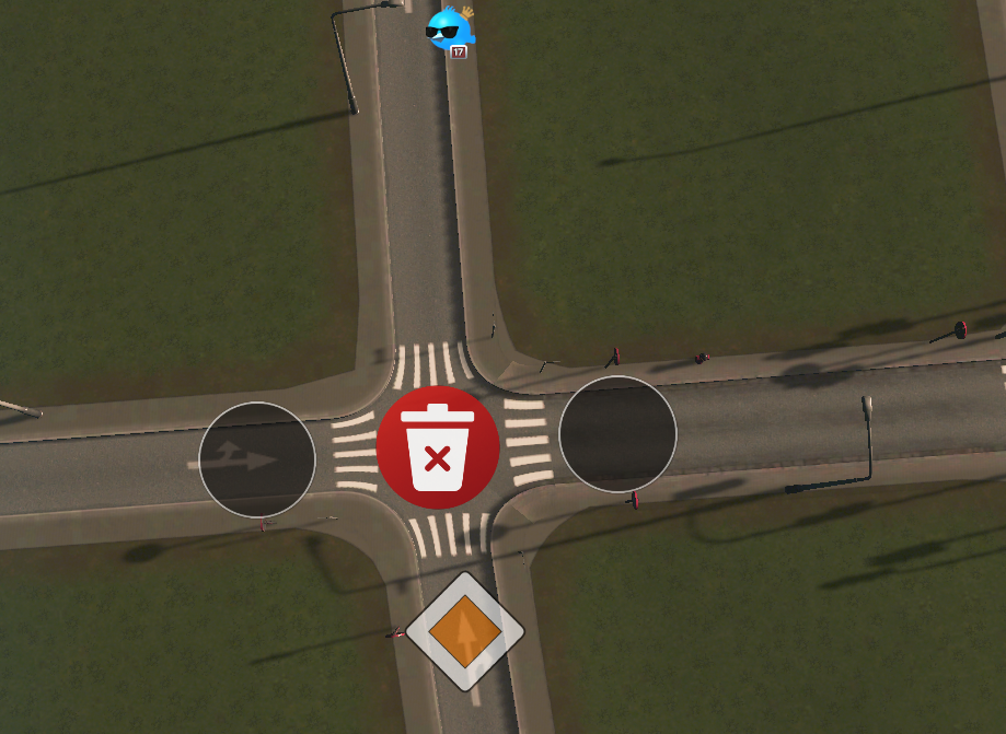
In particular, with a junction selected (that has a sign added to at least one of its roads), I should be able to right-click to deselect that junction.
When a junction is deselected, the red X button in the middle should be hidden. This will reduce risk of accidental settings deletions (useful if you have shit mouse, like I do, or a disability), especially when working with close-proximity junctions.
Also, due to the selection/deselection weirdness, the red-X button, considering where it's placed, can be mistaken for a "close" button by new users. While I love the simplicity of the holy shit, house down the road from me has installed a wind turbine! Uhm, I love the simplicity of the red X button, but maybe having a trash can icon would be better?
Suggestions:
- [x] Change icon on red button to a trash can (I'll submit a PR for review)
- Does that icon get re-used for "Clear vehicle" button on vehicle info panels?
- A trash icon would make more sense there too ;)
- [ ] Trash button should only appear for currently selected junction
- [ ] Right-click to deselect junction
- [ ] Blue circle appears in any un-selected junction when mouse hovers, allowing selection of that junction
- [ ] Shortcut: Click sign icon of any previously customised junction to cycle that sign + select that junction
Note: If Eraser tool is implemented at later date (see #38 for brief info), it's possible the trash button could be ditched to further simplify on-screen UI.
 aubergine10
All 8 comments
assigning to self to do the trash icon
aubergine10
on 13 Feb 2019
Proposal for new 'delete' icon (it was previously just a white "X") - let me know if it's OK and I'll send a PR. It's bit darker than old one to give more contrast when it scales down for use on vehicle info panels.
aubergine10
on 14 Feb 2019
Looks good 😉
 krzychu124
on 14 Feb 2019
krzychu124
on 14 Feb 2019
I've made quick test and it looks really good
krzychu124
on 14 Feb 2019
related to #541
 kianzarrin
on 4 Nov 2019
kianzarrin
on 4 Nov 2019
There have been loads of good improvements to the priority signs stuff, but the user interaction for editing is still a bit weird because there are two interaction models depending on whether a junction is already customised or not:
- If not yet customised, user has to select the node first
- If already customised, user can't select the node, they can only edit/delete
That, in a nutshell, is why it is clunky to use.
There should be only one interaction model, regardless of whether the junction is customised or not.
I think, in particular, user should always have to "select junction" to make changes. And to revert to default it should be Delete | Backspace like other tools (ie, get rid of the bin icon).
In OP I pondered user being able to click overlay icon to cycle the sign + go in to junction edit mode. However, that would be weird too (imagine tryying to make that viable for all the other tools that show only "changes from default" icons).
aubergine10
on 29 Apr 2020
I mark this as dependent on #863 because there are some fixes in #863.
we should not work on this until #863 is resolved.
kianzarrin
on 30 Apr 2020
We can plan this after UI tools are modified
For today i have:
- speed limits
- vehicle restrictions
- timed traffic lights
- and then we can revisit this, add a nice clean state transition Select → Edit → Select or Edit again
 kvakvs
on 4 May 2020
kvakvs
on 4 May 2020
Related issues
aubergine10
·
5Comments
 blackeva8
·
5Comments
aubergine10
·
6Comments
blackeva8
·
5Comments
aubergine10
·
6Comments
 Sayanel01
·
4Comments
Sayanel01
·
4Comments
 Ram419
·
6Comments
Ram419
·
6Comments