Tiptap: How hard to break out the table editor and change to flexbox?
I'm impressed with the table editor included in this component. I like the ease of which you can drag to resize columns and easily add, remove and merge rows and columns.
I've searched high and low for something like this using flexbox (or anything similar) so that we can more easily design page layouts and put components within the cells, for example. Seems like this table editor gets us most of the way there, but we would really need it to be flexbox based so that we can achieve "responsive" design. For example, resizing and pushing cells down and to the left on smaller screens. I don't think this can be achieved with a table.
How hard would this be to pull off? Or, are there any better suited component already out there to achieve this?
Thanks!
 softwareguy74
All 7 comments
Since I'm using prosemirror-tables here, I'm not able to change this. If you want something for flexbox you should take a look at the source code of prosemirror-tables and try it by yourself.
How hard would this be to pull off?
Hard! 😅
 philippkuehn
on 12 Jun 2019
philippkuehn
on 12 Jun 2019
@softwareguy74 I would also be interested in something like this.
The hardest part seems to be the resizing thingy. So maybe instead of doing floating resizes something like a grid approach would be sufficient. So that you have maybe a 12-col grid and can resize them inside that.
If I find some time I will start working on something like this, but can't give you any timeline in the moment 🤪
 Chrissi2812
on 12 Jun 2019
Chrissi2812
on 12 Jun 2019
Okay this is some basic prototype 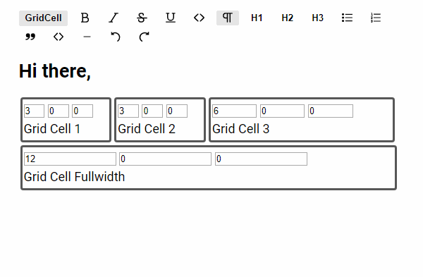
The text boxes are the column-sizes for different sizes which could be configured, like this:
GridCell({
  columns: {
    default: 5, // this is the only needed value.
    mobile: 12, // creates a second input box, which default class is column-mobile-12
   /* you could add as many as you like*/
  },
})
I'm pretty unhappy with how the drag and drop is handled in it.
Something like this would be awesome https://shopify.github.io/draggable/examples/grid-layout.html
But as it manipulates the DOM, I fear it's not useable with tiptap / prosemirror.
And also select all, will select all texts across all grid_cells
And some more bugs i didn't understand.
As said im not happy with it's current state so i won't push it for now. If someone wants this code anyway, I will publish it here.
Chrissi2812
on 12 Jun 2019
Thanks for getting a start on this! I don't need it to work with tiptap. I was trying to create a stand alone component.
The core requirement is it works with Vue and I can drop Vue components in each cell. At "design time" I need the grid lines visible and be able to drag the cell edges to resize or set a fixed size. At "run time" I need the grid lines hidden.
softwareguy74
on 12 Jun 2019
As said im not happy with it's current state so i won't push it for now. If someone wants this code anyway, I will publish it here.
@Chrissi2812 although this issue is quite old and closed, I would be interested to see the code. Any chance to take a look at it? :)
 danielstgt
on 28 Jul 2020
danielstgt
on 28 Jul 2020
@danielstgt Totally forgot about this ^^
I have pushed the code to https://github.com/Chrissi2812/tiptap/tree/feature/grid-cells.
I just added the drag handles from the other examples so that it's now working better.
Hope this is helpful for you
Chrissi2812
on 30 Jul 2020
@Chrissi2812 that helps me a lot, thanks!
danielstgt
on 31 Jul 2020
Related issues
 chrisjbrown
·
3Comments
chrisjbrown
·
3Comments
 agentq15
·
3Comments
agentq15
·
3Comments
 nekooee
·
3Comments
nekooee
·
3Comments
 unikitty37
·
3Comments
unikitty37
·
3Comments
 glavdir
·
3Comments
glavdir
·
3Comments
Most helpful comment
@danielstgt Totally forgot about this ^^
I have pushed the code to https://github.com/Chrissi2812/tiptap/tree/feature/grid-cells.
I just added the drag handles from the other examples so that it's now working better.
Hope this is helpful for you