Tiddlywiki5: Style buttons to match TW graphical appareance
Every time I use TW5 I feel that everything looks awesome except the buttons. The buttons breaks totally with the whole page style. I'm talking about basic buttons, those that are not an image. And they also change from one browser to another due to the lack of CSS rules, so every browser is applying their own.
I was thinking in something like this:

What do you think?
 danielo515
All 19 comments
Hi @danielo515 the current approach is that buttons are subject to default rendering by the browser, but classes can be added to change the appearance (eg, tc-btn-big-green). The core liberally uses buttons that don't have a class.
So I guess there could be two fixes:
- Add a
button {...}style rule to Vanilla to buttons default to a flat style - Add new core CSS classes for flat buttons, and ensure that these classes are used consistently throughout the core
 Jermolene
on 9 Apr 2015
Jermolene
on 9 Apr 2015
Hi @danielo515 the current approach is that buttons are subject to default rendering by the browser,
Why?but classes can be added to change the appearance (eg, tc-btn-big-green).
Of course, but regular buttons still ugly and inconsistent with page styles. In which webpages do you see buttons with default styles? not many, and those that does doesn't look professional.
From my point of view, a style should affect every aspect of the page aspect, so I prefer the first option.
The second one is too error prone In my opinion.
danielo515
on 9 Apr 2015
My concern with the second option is that it makes it hard to create a button that does have the OS platform default styling. In TiddlyDesktop, for example, it's appropriate to use native platform buttons.
If we went with the first option we'd need:
- Add new palette colours for the default button background and foreground colours for the normal, hover and active states for the
- Add new class
tc-btnwith the flat styling - Modify existing
<$button>instances in the core templates and ensure they have thetc-btnclass (I don't think there are actually very many of these instances; we can identify them all visually)
Jermolene
on 9 Apr 2015
At first, I was sceptical about @danielo515's request, but then I did this and now I'm thinking: yes, buttons should have a (flat) default, and should be somewhat consistent with tab buttons.
I think, unless specifically declared, the default class for a button should be tc-btn.
Some visuals (all taken on Win10, latest browser versions)...
Chrome (my default):

FF:

Opera:

Edge:

IE (a cold chill just went down my spine):

Safari (now that is particularly nasty):

 tobibeer
on 21 Sep 2015
tobibeer
on 21 Sep 2015
In most cases, I like the native browser buttons. They are generally richer in appearance and behaviour than a default CSS button. Flat buttons are easier to create but they break platform norms.
Jermolene
on 22 Sep 2015
I think that consistency is better than followin "platform norms". In fact, I don't understand what are you referring to. Why do you want native looking in some elements and a custom one in others? It is not consistent.
danielo515
on 22 Sep 2015
Perhaps Jeremy's using Chrome / Chromium mostly and there things look quite nice.
tobibeer
on 22 Sep 2015
Perhaps Jeremy's using Chrome / Chromium mostly and there things look quite nice.
Yea, but in unix systems ubuntu and co, depending on the theme and native window manager, most native buttons look really ugly if they are part of a web app. Same is true for native dropdowns.
 pmario
on 23 Sep 2015
pmario
on 23 Sep 2015
I would very much prefer a simple, consistent ui, even if flat and not "chromish" (when available).
Why browsers chose to still render abysmal default components ...I wouldn't know. A web-developer would sure know that whenever they start to style components, they will change to something entirely different.
But then there could be the convention that any element can be given some browser--default--ui class so as to preserve that as the starting point, even though that's perhaps not anything for a professional designer to rely on, tbh.
tobibeer
on 23 Sep 2015
I hate to widen the scope of the discussion, but I have recently been wondering about a more radical reboot of the UI: creating a brand new theme from scratch, and incorporating an existing UI framework, perhaps semantic ui.
Way back in the beginning of TW5 I used Bootstrap, but found it restrictive and simplistic. There were also technical problems with meeting Bootstrap's requirements for element nesting because at the time TW5 was architected differently, and produced a DOM element for every widget. It's worth revisiting now.
Jermolene
on 26 Sep 2015
imo semantic ui heavily relies on jquery.
pmario
on 26 Sep 2015
imo we need a pure CSS framework without any javascript elements
pmario
on 26 Sep 2015
@pmario you're quite right, I hadn't realised that it uses jQuery.
imo we need a pure CSS framework without any javascript elements
The attraction of using a framework with JS elements is that we can use those JS features in static pages.
Jermolene
on 27 Sep 2015
The attraction of using a framework with JS elements is that we can use those JS features in static pages.
That's right but imo then those static pages will become SPAs. So the "war" starts, which framework is the best. angular, react,
The can create simple UIs but don't know about tiddlers.
pmario
on 27 Sep 2015
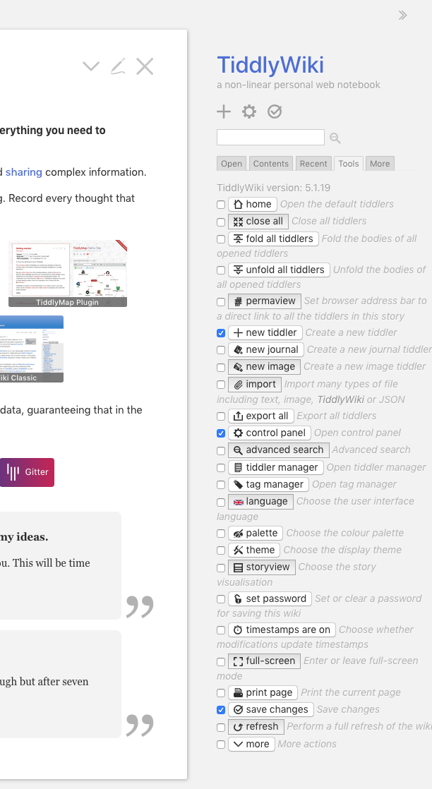
This issue seems to have languished for a few years, but I recently encountered an issue with the button styling in the latest version of TiddlyWiki, so bringing it back up again.
In Chrome on OSX, using the Snow White or Vanilla theme (just browsing https://tiddlywiki.com), looking at the list of buttons in the "Tools" menu, they're inconsistently rendered:
I agree with @tobibeer and @danielo515 in that those base themes should serve as a "normalizer"; to set something consistent, that then other themes or user CSS additions can build upon. Aside from being inconsistent within one browser, having different browsers handle the horizontal and vertical spacing of the buttons within the text line (look at @tobibeer's screenshots of how different the spacing between the button and the checkbox and the button and the text following it is across different browsers).
In my opinion, the Vanilla theme should set an explicit font color, background color, padding, and border style (including border radius) for buttons, which should normalize them across browsers, and allow theme designers to start from a known base across all browsers.
 MidnightLightning
on 19 Mar 2019
MidnightLightning
on 19 Mar 2019
Hi @MidnightLightning I have noticed that problem with the buttons in the "Tools" sidebar tab, and have investigated it at some point in the past, but I don't think I could figure out what's going on.
Jermolene
on 29 Mar 2019
I think the normalization.js doesn't normalize the border style. eg:
button {
border: 1px #ccc solid;
padding: 3px 9px;
}
or something similar. I did only test it within the sidebar. So I'm not sure, if there are other side effects. ... There are no rounded corners, which I personally don't like ... So there is room for improvement.
pmario
on 30 Mar 2019
Just to add that the problem is with this declaration of line-height: 1.2 in $:/themes/tiddlywiki/vanilla/base for button elements:
https://github.com/Jermolene/TiddlyWiki5/blob/master/themes/tiddlywiki/vanilla/base.tid#L57
Changing the line height to values from 1.0 to 1.07 causes all the page control buttons to switch to native button rendering. However, the line height is too small for us to use. Removing the line height declaration causes all the page control buttons switch to browser-based rendering. The inconsistent rendering seems to be a Chrome specific issue: the problem doesn't occur in Safari.
Jermolene
on 23 Aug 2019
@Jermolene wrote:
I have recently been wondering about a more radical reboot of the UI: creating a brand new theme from scratch, and incorporating an existing UI framework,
IMO the time is mature for this. The CSS is lagging in TW and changing it from the ground just might also affect things like the currently discussed buttons. I'd assume a lot has happened in the framework space also since Jeremy posted the above.
 twMat
on 23 Aug 2019
twMat
on 23 Aug 2019
Related issues
 phenomenal11
·
5Comments
phenomenal11
·
5Comments
 ldorigo
·
5Comments
ldorigo
·
5Comments
 diego898
·
5Comments
diego898
·
5Comments
 0xMH
·
6Comments
0xMH
·
6Comments
 TiddlyTweeter
·
3Comments
TiddlyTweeter
·
3Comments
Most helpful comment
This issue seems to have languished for a few years, but I recently encountered an issue with the button styling in the latest version of TiddlyWiki, so bringing it back up again.
In Chrome on OSX, using the Snow White or Vanilla theme (just browsing https://tiddlywiki.com), looking at the list of buttons in the "Tools" menu, they're inconsistently rendered:
I agree with @tobibeer and @danielo515 in that those base themes should serve as a "normalizer"; to set something consistent, that then other themes or user CSS additions can build upon. Aside from being inconsistent within one browser, having different browsers handle the horizontal and vertical spacing of the buttons within the text line (look at @tobibeer's screenshots of how different the spacing between the button and the checkbox and the button and the text following it is across different browsers).
In my opinion, the Vanilla theme should set an explicit font color, background color, padding, and border style (including border radius) for buttons, which should normalize them across browsers, and allow theme designers to start from a known base across all browsers.