Thelounge: [UX] Alert type favicon no longer eye catchy
- The Lounge version: v3.0.0-pre.6
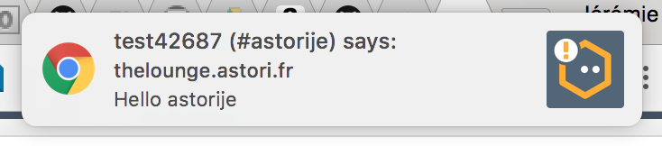
My better half complained that she often doesn't notice that I queried her ever since I upgraded her instance to pre6 because "the icon no longer changes to red".
Ironically, it took me about 50 minutes to realize she told me this for the very same reason 😂
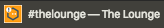
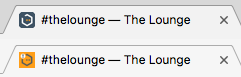
Before the introduction of the new favicons in #2009, the alert icon had a red background and was clearly distinguishable from the regular icon, but now, the difference is rather slight and as it seems not eye catchy enough. Check out these screenshots of my tab:
 vs
vs

Of course, if you see them side-by-side like this, they are clearly different. But it's not flashy enough to catch your attention when you're not directly looking at it in my opinion (and hers).
A first suggestion would be to exchange the grey and orange like so:
Or in Chrome:
This way, it would still stick to the Brand guidelines colors but still be way more eye catchy and alerting.
Bigger mockup:

vs

edit: or to increase contrast of the "eyes":

Thoughts?
 Jay2k1
All 24 comments
Thoughts?
Yes! I'm sure I would have noticed this and asked for it to be changed after upgrading my own instance, but applause to @Jay2k1's better half for complaining early.
 dgw
on 28 May 2018
dgw
on 28 May 2018
This is great!
MRW checking whether I have any unreads right now

 williamboman
on 30 May 2018
williamboman
on 30 May 2018
I, too, agree that it's not the most obvious icon and can be missed. Maybe it's worth having the existing icon when there are unread messages and another more obvious one when there are highlights. I'm not sure how I feel about the suggested icon, the orange being so obvious feels a little glaring, but maybe that's just because it's so big. Not sure.
 McInkay
on 31 May 2018
McInkay
on 31 May 2018
Here's an idea. What if the exclamation mark was the orange rather than white. How would that work? I find that Slack's red dot is pretty obvious, so that would probably work?
McInkay
on 1 Jun 2018
Agreed with the issue that the current highlight favicon does not work too well for us. However, that orange background icon is just... I don't know, I really don't like it 🤷♂️
In general, I suggest not modifying what the designers came up with without asking them first. I can understand how frustrating it would be as a designer (especially pro-bono). I'll give our designer this feedback and see what they offer. Maybe they have something in mind that we have not :)
Alternatively, what about keeping the current alerted highlight icon but swapping the "normal" one with a transparent background one, like this one (or a blue one)?
I know it's not directly what we're talking about here, but I like the notification badge, and it would be nice if we could keep the link between the favicon and the badge:
 astorije
on 4 Jun 2018
astorije
on 4 Jun 2018
Definitely up for trying that suggestion, @astorije that might work being very different but not too horrible on the eyes.
The key point with the notification icon is that it's different enough from the normal one that you notice it is different. It doesn't need to be bright orange to do that.
McInkay
on 4 Jun 2018
@astorije asking the designer is a good (and the right) idea. I didn't intend to be rude with this or something, but I don't know her and I don't think I'm in the position to ask her about this anyway. (I tried to look her up, but her website seems to be offline -- probably GDPR related).
Also, my suggestion was just that, a suggestion, to start off a discussion, not to say "let's change it to this". A basic principle of mine is not to nag about things but to instead do constructive criticism which includes not only stating problems but at the same time making suggestions on how to possibly solve or improve them.
I tried finding a compromise between making the icon as flashy as the old red one and sticking to the new design. I'm absolutely open for other ideas, especially from that designer.
Jay2k1
on 4 Jun 2018
What do you think about @astorije 's solution regarding the transparent background one being the normal one? I feel like they might be different enough to be obvious.
I don't think anyone is suggesting that you were trying to be rude or make your suggestion out to be the only solution at all, just that it can be a little frustrating to designers to have their stuff just changed. But regarding playing around with things, I'm sure that's fine, just that we wouldn't merge it in without talking to them first.
Thanks for the suggestions :-)
McInkay
on 4 Jun 2018
Yeah, I was just toying around a) to at least have a suggestion at hand and b) to see what it would look like.
Regarding the suggestion with the transparent favicon as default, I tested it with three browsers on macOS:
- On Chrome the resulting difference is significant (due to its light grey theme) but I think the alert icon still has no alerting character. It's just different.
- On dark themed browsers even the visual difference becomes very small.
Old favicons for comparison:
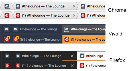
- alert type favicon clearly alerting/eye-catchy (and also clearly distinguishable from the normal icon) on both light and dark themed browsers
I think the amount of visual difference between normal and alert favicons doesn't even matter that much. What actually matters is the signalling effect of the alert favicon, because if you're like me, TL is just one browser tab in many others, and you don't constantly check the icon. It needs to catch your attention even when you don't directly look at it. That's why the old alert icon worked so well, and that's also why I made my mockup mostly orange. Bright red and orange just have an alerting, warning, signalling effect on us, hence things like warning signs, fire distinguishers, ambulances, warning vests, stop signs etc. come in these colors.
I don't like to say this, but as much as I like the new logo and design overall, looking at these images, I prefer the old favicon purely for practial/usability reasons. Sadly, because I think the new logo is plain awesome.
Jay2k1
on 4 Jun 2018
I didn't intend to be rude with this or something, but I don't know her and I don't think I'm in the position to ask her about this anyway.
I know you didn't, and I didn't take it like that, don't worry. I was just trying to be careful in case my response (or someone else's) prompted numerous new attempts, and/or in case we were drawn towards one of them.
And yeah, I'd rather be the point of contact (or anyone else from the core team, but I've happened to build contact so far) with the designer(s) if we engage with them. Not to be secretive or controlling, but just out of respect with them so we don't appear as spammers or abusers :)
A basic principle of mine is not to nag about things but to instead do constructive criticism which includes not only stating problems but at the same time making suggestions on how to possibly solve or improve them.
I highly appreciate this, thank you very much for this approach, which in my personal opinion is the best way to approach a problem and not sound demanding!
I don't like to say this, but as much as I like the new logo and design overall, looking at these images, I prefer the old favicon purely for practial/usability reasons. Sadly, because I think the new logo is plain awesome.
I wouldn't worry about this. Overall, our logo/branding is new, and comes with constraints that weren't there before. The previous red icon was actually not something coming from Shout but a "hotfix" built upon the Shout icon. We were less strict and limited with what we were doing because there was simply no graphic design behind it, it just came out of necessity. The current logo has our story and some actual design work, so we are more careful and we don't get it right at the first try, but we will :)
What do you think about giving a shot to my proposal above?
We can have a pre-release with it, see what sort of feedback we get, and revise if necessary. I'll be happy to revise, but I personally think it's worth a shot, of course unless I'm the only one thinking that :)
astorije
on 5 Jun 2018
Alrighty, with #2540 I think it's a lot better with light themes, but with dark themes it looks pretty horrible in non-highlighted mode  .
.
I think in here @astorije you suggested doing a transparent one, that'll probably work better than the white background. Do we have an existing one already?
McInkay
on 18 Jun 2018
I made this one locally while testing #2540 but when testing it I found it to look much worse: output_transparent.ico.zip
I don't really care either way though, as long as we don't do crazy stuff with our logo lol.
If you and @xPaw prefer the transparent version, I'll be fine with it. Alternatively I'll root for a blue/gray version with transparent background, but that will look even worse on dark themes (but so would GitHub's at this point, so gotta make a decision at some point 🙂)
astorije
on 19 Jun 2018
Can this be considered done? I believe the white icon solved the problem.
 xPaw
on 11 Jul 2018
xPaw
on 11 Jul 2018
No, I think it's still really bad with dark chrome themes, really offputting in a way that other favicons aren't. I want to play around with the transparent one to see how it feels.
McInkay
on 11 Jul 2018
I think it looks good as it is now. It's visible and on theme. Suggest we keep it as it is for 3.0.0, and we can look for alternatives in next release if needed. 😄
 fnutt
on 5 Sep 2018
fnutt
on 5 Sep 2018
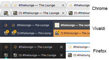
Right, so. I finally got some time to try out the transparent icon that @astorije uploaded.
Here's the 2 next to each other on a dark theme.

They both have the same highlighted icon, which is still quite a bit different from the standard one.

Here are the 2 next to each other on a white theme

And here are the 2 highlighted ones next to each other (again, the same as on master)

I personally think the transparent one (although not perfect) looks better than the white background one on both a dark and white theme, and it is different enough on both, while not changing the highlighted one so it should be just as eye-catchy for notifications.
Feel free to tell me I'm wrong. But that's definitely my opinion. I would vote for transparent for normal, and current highlight one for highlighted. The current normal one just looks so ugly on dark themes, IMO.
McInkay
on 5 Sep 2018
If we go for transparent, can we at least make the lines and dots thicker so it's easier to see what it is? Especially thinking of those with eye issues.
fnutt
on 5 Sep 2018
Making the lines and dots thicker would be a much bigger change than changing the background, and would probably require going back to the designer.
Are there any icons you feel you would confuse this with? Because generally, we get used to how something looks over time meaning that no matter what we put in you will eventually recognise it as the lounge, and one of the reasons for this whole issue being raised was that the difference between the 2 icons wasn't enough, so having the normal one as a very subtle icon will improve that anyway. If there are icons that are very similar to this then that is where we would have an issue, but I don't feel there are. You don't need to pick out every detail in an icon, it's about how it looks far away and whether it is unique enough or not.
McInkay
on 5 Sep 2018
My point was only it's hard to see the dots and the round line, because they are so slim. Most other icons have thicker lines so it's easier to see.
fnutt
on 5 Sep 2018
Yeah, I get that, but for what purpose is it important to see them clearly? If that's an issue in general, then we'd need to look at the logo as a whole at that size.
McInkay
on 5 Sep 2018
So yay, latest chrome decided to change its design. This is on Windows, both regular and alerted, with the tab inactive.
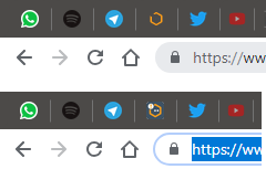
I'm not sure using transparency inside the hexagon is a good choice :/
Jay2k1
on 21 Sep 2018
Funny, I updated The Lounge last night (from pre.7 to rc.1, so I didn't have @McInkay's transparent icon before last night) and wasn't too thrilled about the light-grey background. today, my Chrome auto-updated, and when I opened The Lounge, I thought, hey, much better on the white tabs! (I use Chrome's default theme)
My point being that, by now, I am fairly confident we will never be able to please everyone, especially the 2 different light/dark contrasts.
So at this point, I say we either keep what @McInkay did, or go back to white background. I am fine either way, I think both work just fine.
When I look at other icons, I think we are not the only ones. On your screenshot, Spotify's icon looks bad on dark theme, and I suspect GitHub looks just as bad. All icons in my billion open tabs however look decent on light background. Matter of compromise I guess.
astorije
on 21 Sep 2018
My point being that, by now, I am fairly confident we will never be able to please everyone, especially the 2 different light/dark contrasts.
This. It would be very, _very_ difficult to tweak the favicon so it looks good on both light and dark backgrounds, in both normal and highlighted state. Most browsers seem to use a light tab background by default (Chrome, Firefox, Safari, the big ones). Those that default to dark (Vivaldi maybe? It's been a while) are very few. The favicon can likely please most of the people most of the time as-is.
dgw
on 21 Sep 2018
So, I think that I would agree it's still not ideal on dark theme, but as you say that's pretty par for the course.
And crucially, I think using the white background icon is infinitely worse for dark themes.
We will never make everyone happy, agreed, but it's just as good on white tabs as it used to be, and it's slightly better on dark themes, although not ideal. I say we keep it with the transparent one.
McInkay
on 21 Sep 2018
Related issues
 jlu5
·
5Comments
jlu5
·
5Comments
 JasonCarswell
·
4Comments
JasonCarswell
·
4Comments
 kevinoconnor7
·
3Comments
kevinoconnor7
·
3Comments
 Frotty
·
4Comments
McInkay
·
5Comments
Frotty
·
4Comments
McInkay
·
5Comments
Most helpful comment
No, I think it's still really bad with dark chrome themes, really offputting in a way that other favicons aren't. I want to play around with the transparent one to see how it feels.