Thegreatsuspender: Miss the suspender icon in the tab. Very hard to see what's suspended now
Chrome. Mac OSX
New version seems to have dispensed with the Suspender icon on the tab labels, and instead 'helpfully' keeps the original icon/heading of the suspended tab. Some may see this as a bonus, I would prefer to be able to EASILY see which tabs are/ are not suspended.
Could you make this a choice in settings? ie whether to keep the original tab icon or use the suspend icon with the tabs heading?
Alternatively, can the suspended tabs be grayed out? It looks like some of them are when the original tab was black, but colored icons like yahoo, google etc don't look grayed out at all.
I want an indicator of some kind. Not only does it help me know that memory issues are not due to open tabs, it helps my focus when I'm working in multiple tabs
Perhaps you coudl call it FOCUS MODE!
thanks
 jcouncil
All 16 comments
Interestingly, the fact that it used to show you the Suspender icon was a bug. It was never meant to do that. What you are seeing now has always been the intended functionality.
To help users see that a tab is suspended, the favicons are slightly faded. Perhaps this effect is too subtle for your tastes.
I'll leave this as a feature request to see if anyone else feels the same way.
Thanks for the feedback.
 deanoemcke
on 31 May 2020
deanoemcke
on 31 May 2020
perhaps adding a config setting for the user to choose "show suspender icon" (bug/feature), "show tinted icon". I could see use cases for both. sometimes the tint isn't enough to quickly discern.
 bparkin1283
on 31 May 2020
bparkin1283
on 31 May 2020
I find it very easy to tell the difference between the faded favicons and the regular ones. They are significantly duller.
 ebmorran
on 1 Jun 2020
ebmorran
on 1 Jun 2020
gamma/contrast settings make a difference.
but for accessibility purposes, TGS could
- overlay the favicons with a miniaturized (1/3 of the area?) version of its own icon (with white background, alpha value for the overlay 50%?)
- put the tab title in parentheses
discarded ideas, which seem counterproductive:
- giving the tab background a slight tint, but that would make them stand out more
- making the fade stronger, but that might impact the legibility/recognizability of the tabs
in the end, one needs to ask oneself whether the information that a tab is suspended is so important that one should accept trade-offs ... i personally don't think so.
 ossilator
on 1 Jun 2020
ossilator
on 1 Jun 2020
I find it very easy to tell the difference between the faded favicons and the regular ones. They are significantly duller.
Your use of the words "easy" and "significantly" 'is disingenuous.
@ossilator great ideas.
bparkin1283
on 1 Jun 2020
I find it very easy to tell the difference between the faded favicons and the regular ones. They are significantly duller.
Your use of the words "easy" and "significantly" 'is disingenuous.
@ossilator great ideas.
Why would you accuse someone of being disingenuous just because they have a different experience from you? I never had the bug that caused the favicons to change to the Great Suspender icon, and I've never had any difficulty differentiating between a suspended and unsuspended tab.
ebmorran
on 1 Jun 2020
Disingenuous may be a bit strong. Different personalities I suppose. I wouldn't come into a thread and simply add the fact that I personally have better contrast or visual abilities. The OPs suggestion is legitimate. I just dont understand what you're adding. You can see it. Great. He/she, I and likely many others cannot.
To be clear I'm not saying get rid of it. It's all good. Just saying allow the old 'bug' to be an option. Seems pretty simple no additional support for the existing default needed. You won't use the setting. That's what a setting is for.
bparkin1283
on 2 Jun 2020
If your experience of finding it difficult is useful information, so is
someone's experience of not finding it difficult. There is an inherent bias
to overemphasizing issues in reporting/review systems because nobody makes
a post to say "hey by the way, I just wanted to let you know I found the
favicon fading really well-done and helpful." Especially in something based
on perception like this, it's possible that only a small minority of users
have this problem. If no one provided their own feedback of it working,
they would seem like the majority.
On Mon, Jun 1, 2020, 21:38 bparkin1283 notifications@github.com wrote:
Disingenuous may be a bit strong. Different personalities I suppose. I
wouldn't come into a thread and simply add the fact that I personally have
better contrast or visual abilities. The OPs suggestion is legitimate. I
just dont understand what you're adding. You can see it. Great. He/she, I
and likely many others likely cannot—
You are receiving this because you commented.
Reply to this email directly, view it on GitHub
https://github.com/greatsuspender/thegreatsuspender/issues/1159#issuecomment-637216246,
or unsubscribe
https://github.com/notifications/unsubscribe-auth/AEOB3HLNCV7BZOSNAGQOXU3RURJZ5ANCNFSM4NO4YDDQ
.
ebmorran
on 2 Jun 2020
Thanks for the response; that’s pretty funny 😀 So yes; the fading is a bit too subtle. Please fade more, AND please bring back the bug as an option in settings!
ie;
To indicate suspended tab:☑️ Fade tab icon ☑️ Replace tab icon with suspender logo
PS having your logo in tabs has a strong branding effect; because I uses suspender so much that logo is seared into my browsing experience, and unlike other extensions I never forget your name and so can easily recommend you Often!
On Sunday, May 31, 2020, 4:27 AM, Dean Oemcke notifications@github.com wrote:
Interestingly, the fact that it used to show you the Suspender icon was a bug. It was never meant to do that. What you are seeing now has always been the intended functionality.
To help users see that a tab is suspended, the favicons are slightly faded. Perhaps this effect is too subtle for your tastes.
I'll leave this as a feature request to see if anyone else feels the same way.
Thanks for the feedback.
—
You are receiving this because you authored the thread.
Reply to this email directly, view it on GitHub, or unsubscribe.
jcouncil
on 2 Jun 2020
adding lots of micro-options is bad for both usability and maintenance. finding a single solution against which no reasonable objections can be made is preferable.
ossilator
on 2 Jun 2020
adding lots of micro-options is bad for both usability and maintenance. finding a single solution against which no reasonable objections can be made is preferable.
couldn't agree more. or at least, the single solution which has the least reasonable objections.
the main argument against using the suspender icon is that it makes it extremely difficult to differentiate the tabs once you have a lot of them and the titles can no longer fit. IMO this is a showstopper. being able to differentiate one website from another based on different favicons is more important than being able to differentiate suspended tabs from unsuspended ones.
there is clearly an accessibility issue here though. maybe we could explore why it's so bad to return to a tab and then discover it's suspended. what's wrong with discovering it's suspended once you've clicked on it? either way you will want to unsuspend it right? otherwise why would you have clicked on it?
tangentially related, there is the screencapture option which will show you what was on the screen before the tab suspended. the hope of this feature was that the tab would still be able to give you the information you need without having to unsuspend. making the difference between a suspended tab and an unsuspended one moot.
deanoemcke
on 2 Jun 2020
If your experience of finding it difficult is useful information, so is someone's experience of not finding it difficult. There is an inherent bias to overemphasizing issues in reporting/review systems because nobody makes a post to say "hey by the way, I just wanted to let you know I found the favicon fading really well-done and helpful." Especially in something based on perception like this, it's possible that only a small minority of users have this problem. If no one provided their own feedback of it working, they would seem like the majority.
…
On Mon, Jun 1, 2020, 21:38 bparkin1283 @.*> wrote: Disingenuous may be a bit strong. Different personalities I suppose. I wouldn't come into a thread and simply add the fact that I personally have better contrast or visual abilities. The OPs suggestion is legitimate. I just dont understand what you're adding. You can see it. Great. He/she, I and likely many others likely cannot — You are receiving this because you commented. Reply to this email directly, view it on GitHub <#1159 (comment)>, or unsubscribe https://github.com/notifications/unsubscribe-auth/AEOB3HLNCV7BZOSNAGQOXU3RURJZ5ANCNFSM4NO4YDDQ .
I understand the perspective I just don't agree with it. I never once assumed any enhancement to come out of the OPs request would be a replacement. The current state is the assumed ability to differentiate, that's fine, but the fact that you have someone make this post, and then have multiple responses to it and then you say "I can easily differentiate". Okay, cool?
In fact, I said specifically that I could see use cases for BOTH ways.
Some have suggested finding some compromise, which I think is great. I'm just saying your initial post made it seem like "I'm good don't change anything". I think that's what's missing here. It's open-source, it's a forum, I get it, but no one was trying to take away what your current experience is (even the OP said 'make it a setting', ie don't change the default).
bparkin1283
on 2 Jun 2020
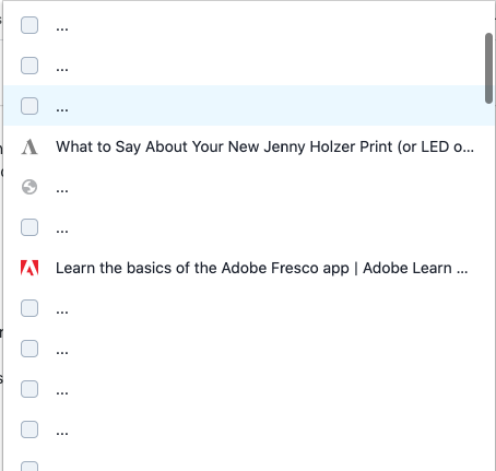
The suspended tabs ARE hard to see; here's a set, let me know which you think are suspended
(L to R, 1-13) I'll post answer tomorrow :)

jcouncil
on 2 Jun 2020
1, 3, 4, 6, 8, 10, 11, 12, 13
On Tue, Jun 2, 2020, 17:50 jcouncil notifications@github.com wrote:
The suspended tabs ARE hard to see; here's a set, let me know which you
think are suspended
(L to R, 1-13) I'll post answer tomorrow :)[image: Screen Shot 2020-06-02 at 2 47 40 PM]
https://user-images.githubusercontent.com/10947214/83573330-162e8b00-a4e0-11ea-8f4b-d33e8b09493d.png—
You are receiving this because you commented.
Reply to this email directly, view it on GitHub
https://github.com/greatsuspender/thegreatsuspender/issues/1159#issuecomment-637825176,
or unsubscribe
https://github.com/notifications/unsubscribe-auth/AEOB3HJGOVBDOVVNI4AO2DTRUVX2BANCNFSM4NO4YDDQ
.
ebmorran
on 3 Jun 2020
Have to admit it's similar for me. There's a similar extenstion on Edge called Tab Discard which adds a ✅ to the end of the tab title to let you know that the tab is suspended. Quite a good feature I thought
 eighteentee
on 25 Aug 2020
eighteentee
on 25 Aug 2020
Hey everyone - currently running:
- Extension version: v7.1.8
- Browser name & version: Version 86.0.4240.80 (Official Build) (x86_64)
- Operating system & version: MacOS Catalina Version 10.15.7
And I've got the return of the Suspended Tab Favicon right now which isn't helpful for when I'm looking for something:

Also seeing this in Quicktab navigation extension:
Which is also killing me. Love Great Suspender, if there's a way to keep the original favicons in the chrome tab but make them indicate suspension in another way ...
 julianrad
on 27 Oct 2020
julianrad
on 27 Oct 2020
Related issues
 lookfirst
·
3Comments
lookfirst
·
3Comments
 brycenesbitt
·
4Comments
brycenesbitt
·
4Comments
 togakangaroo
·
4Comments
togakangaroo
·
4Comments
 codemedic
·
3Comments
codemedic
·
3Comments
 geirman
·
4Comments
geirman
·
4Comments
Most helpful comment
gamma/contrast settings make a difference.
but for accessibility purposes, TGS could
discarded ideas, which seem counterproductive:
in the end, one needs to ask oneself whether the information that a tab is suspended is so important that one should accept trade-offs ... i personally don't think so.