Is your feature request related to a problem? Please describe.
The ToDo list is functional and great, but lacking a little bit of some beauty and aesthetics that the note-taking platforms are using to make the user experience even better.
Describe the solution you'd like
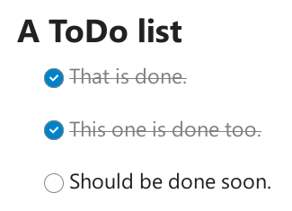
The solution is to make the checked/done line easy on the eyes to recognize.
Add the following CSS code:
.checkbox-item.checked {
color: gray;
text-decoration: line-through;
}
And change the border radius to 50%:
editor-wrapper div.ProseMirror .checkbox-item::before {
border-radius: 50%;}
That's all.
Additional context
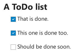
I took screenshots to show how it was and how it will be.
Before:
After:
 themedleb
All 6 comments
I don't think we should use different checkboxes than anywhere else in Nextcloud. Also round empty boxes actually indicate a radio button so i think that might give the wrong indication, since this is a very common pattern in UI elements. cc @nextcloud/designers
 juliushaertl
on 22 Jun 2020
juliushaertl
on 22 Jun 2020
Absolutely agree with @juliushaertl here: Round checks have a semantically different meaning.
 stefan-niedermann
on 22 Jun 2020
stefan-niedermann
on 22 Jun 2020
Agree on not using round checkboxes for the confusion with radio buttons – but the grey text and striked-out text proposed by @themedleb is actually very nice! It gives immediate feedback and more of a sense of "done!"
@themedleb do you want to open a pull request for that part? Please use var(--color-text-maxcontrast) instead of grey so it works in both light and dark theme. :)
 jancborchardt
on 22 Jun 2020
jancborchardt
on 22 Jun 2020
but the grey text and striked-out text proposed by @themedleb is actually very nice!
This is right and would also partially enhance the situation for https://github.com/nextcloud/text/issues/819
stefan-niedermann
on 22 Jun 2020
I don't think we should use different checkboxes than anywhere else in Nextcloud
I noticed that after I saw files listing has squared checkboxes, I was like "Oh nooo!!, that's inconsistent!!!" but then I was like "But the ToDo list looks nice!" lol So I ignored it.
Also round empty boxes actually indicate a radio button so i think that might give the wrong indication
Yes, you are right, I didn't think of when it's empty, all I thought about is the white dot indicates that the radio button is checked and check sign/icon indicates that the checkbox is checked.
do you want to open a pull request for that part?
I never opened a pull request before, as I'm not too much familiar with Github and Github like platforms ... Still learning 😅.
@juliushaertl @jancborchardt @stefan-niedermann Thank you all.
themedleb
on 22 Jun 2020
I never opened a pull request before, as I'm not too much familiar with Github and Github like platforms ... Still learning :sweat_smile:
That’s fine! :smile: Everything you need to know for how to open a pull request is in this short section of the Open Source Guide: https://opensource.guide/how-to-contribute/#opening-a-pull-request
Let me know if you have further questions, I’m happy to help you.
jancborchardt
on 23 Jun 2020
Related issues
 doobry-systemli
·
3Comments
juliushaertl
·
3Comments
jancborchardt
·
6Comments
doobry-systemli
·
3Comments
juliushaertl
·
3Comments
jancborchardt
·
6Comments
 inthreedee
·
6Comments
inthreedee
·
6Comments
 tobiasKaminsky
·
4Comments
tobiasKaminsky
·
4Comments
Most helpful comment
I don't think we should use different checkboxes than anywhere else in Nextcloud. Also round empty boxes actually indicate a radio button so i think that might give the wrong indication, since this is a very common pattern in UI elements. cc @nextcloud/designers