Teslamate: What is the purpose of new bar graphs in efficiency dashboard?
Describe the bug
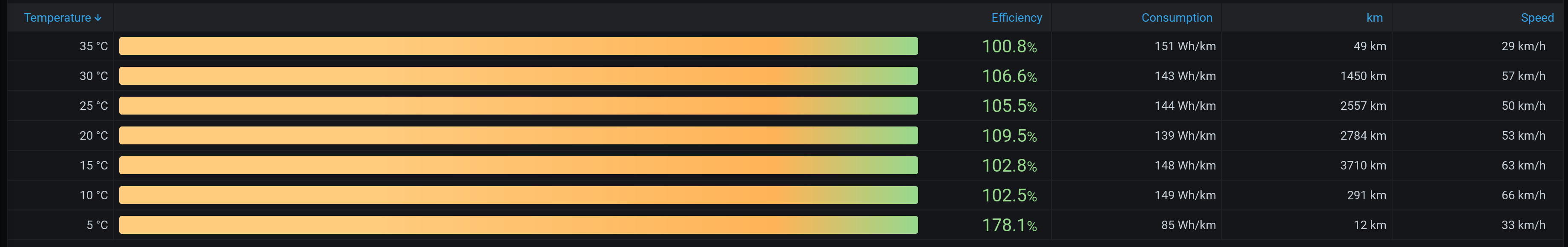
I noticed new orange/yellow/green bar graphs in the efficiency dashboard after updating TM to 1.20. They look nice, however they are all the same regardless of the corresponding efficiency percentage. Or I just might not get their real purpose...
Expected behavior
Make the bar graphs in the efficiency dashboard in a way that they really reflect the efficiency percentages (their size changes according to the percentage).
How to reproduce it (as minimally and precisely as possible):
See the attached screenshot with an example.
Relevant entries from the logs
Screenshots
Data
Environment
- TeslaMate version: 1.20.0
- Type of installation: Docker
- OS TeslaMate is installed on: Linux
- User OS & Browser: Firefox & Safari
- Others:
 petariga
All 5 comments
That is because your Efficiencies are all over 100%. Mine looks reasonable:

 DrMichael
on 10 Oct 2020
DrMichael
on 10 Oct 2020
Does that mean that nobody has counted on reaching efficiency above 100%?
petariga
on 10 Oct 2020
Probably... :-)
DrMichael
on 10 Oct 2020
@petariga you can add a min/max override property and see what works best. We should probably set a fixed max value greater than 1.
 adriankumpf
on 11 Oct 2020
adriankumpf
on 11 Oct 2020
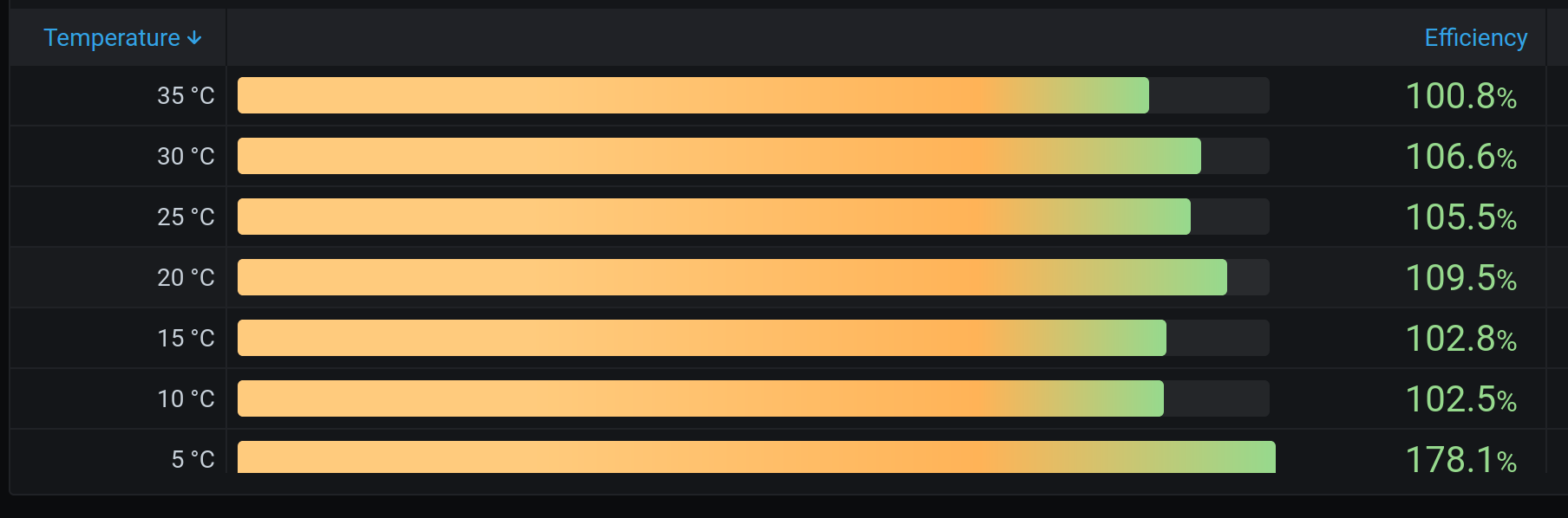
Well, probably the most accurate solution would be to get the highest percentage from the listed efficiency percentages and count the sizes of the other bars according to this value. And keep the orange bar for all values under approx. 90% and green above 90%.
Setting Max between 1.1 and 1.2 might work as a hot fix for the sizes of the bars in most cases too. However, the gradient colour of the bars does not match then. I would expect to have them orange up to let's say 90% and then green all the way to the maximal value, however with Max between 1.1 and 1.2 each bar has a different colour shift.
Max 1.15:
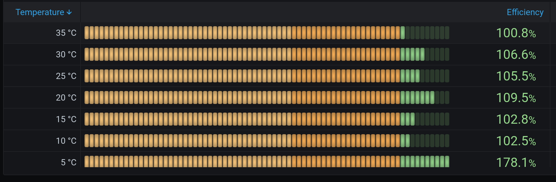
Update: if you change Gradient gauge to LCD gauge surprisingly the orange/green colours are set correctly - up to 100% orange, above 100% green:
petariga
on 11 Oct 2020
Related issues
 JakobLichterfeld
·
6Comments
JakobLichterfeld
·
6Comments
 tobiasehlert
·
4Comments
DrMichael
·
4Comments
tobiasehlert
·
4Comments
DrMichael
·
4Comments
 bahree
·
5Comments
bahree
·
5Comments
 bastrik
·
3Comments
bastrik
·
3Comments
Most helpful comment
Well, probably the most accurate solution would be to get the highest percentage from the listed efficiency percentages and count the sizes of the other bars according to this value. And keep the orange bar for all values under approx. 90% and green above 90%.
Setting Max between 1.1 and 1.2 might work as a hot fix for the sizes of the bars in most cases too. However, the gradient colour of the bars does not match then. I would expect to have them orange up to let's say 90% and then green all the way to the maximal value, however with Max between 1.1 and 1.2 each bar has a different colour shift.
Max 1.15:

Update: if you change Gradient gauge to LCD gauge surprisingly the orange/green colours are set correctly - up to 100% orange, above 100% green:
