Terra-core: [search-field] investigate alignment of search-field, input, select, buttons
Bug Report
Description
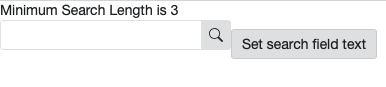
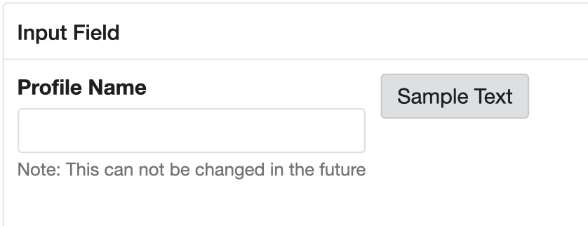
Investigate why buttons, form-inputs, selects, search-field and other similar components when put inline do not correctly align
\
\
A few examples to test, probably more:
 neilpfeiffer
All 6 comments
I was unable to re-create the issue, I added display:inline to the wrapping div. Could you tell me any specific css change to re-create this? cc @neilpfeiffer .
Edit: A slight misalignment was visible on re-investigating. I tried different variants of buttons, along with padding and margin values. But it looked same. Any inputs on the fix would be helpful.
 saket2403
on 4 Aug 2020
saket2403
on 4 Aug 2020
I was unable to re-create the issue, I added display:inline to the wrapping div. Could you tell me any specific css change to re-create this?
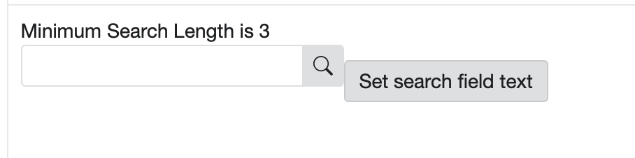
You can try the property display: inline-block but put it only on the search-field. I got a similar misalignment in date-picker.
 pranav300
on 11 Sep 2020
pranav300
on 11 Sep 2020
You can try the property
display: inline-blockbut put it only on the search-field. I got a similar misalignment in date-picker.
Adding inline-block might not work in case of terra-search-field because search-field uses flex styles to organize input and icon button for search-field. so making it inline-block will break flex styles and makes search-field to look like :
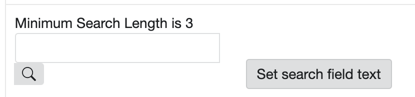
alignment looks different in chrome and safari. this makes me to think whether this could browser rendering issue 🤔.
chrome :
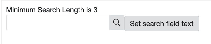
safari :
looks like issue is happening when elements that have display has inline put together. So need to investigate on inline style behavior to further find a solution.
 supreethmr
on 11 Sep 2020
supreethmr
on 11 Sep 2020
I made some changes to input-group style property here. Removing display: inline-fex or setting it to display: inline-block seem to improve the alignment.
Testing >
WDIO's did not complain and I checked against all browsers, the performance seem to be consistent.
Any thoughts on this @neilpfeiffer ?
 lokesh-0813
on 14 Sep 2020
lokesh-0813
on 14 Sep 2020
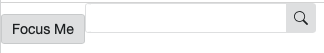
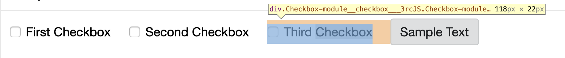
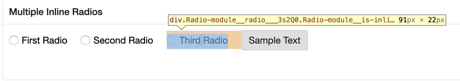
I did some investigation on other inline components like ( checkbox + button ) and (radio button + button ) and it looks like other components doesn't seems to have alignment issue as shown above.
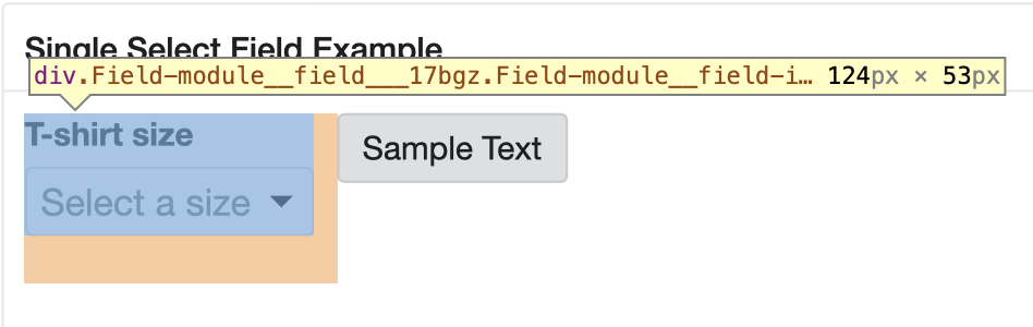
With inline field components it is different behavior and It looks like when button is placed with inline field components it vertically aligns to top of field components as shown in below screenshots.
So I am not sure whether this should be addressed along with this issue OR whether this should be taken care while implementing the inline field components with button or other inline component..?
supreethmr
on 14 Sep 2020
@supreethmr - your top tests are looking correct as expected ( checkbox + button ) and (radio button + button ), so no issues there.
Your second test, placing standalone elements (buttons, etc) next to Fields, is also looking correct - as the two elements really will never create an idea layout on their own, since their composition is too different (fields contain the labels/help/etc). The alignment to the top is correct, and you are right - if alignment with fields is needed, some other layout tool/component will be needed.
\
\
Back to the original issue for Search-Field - the fix works out to be much simpler rather than changing display styles, but has to come down to vertical-align. Browser default is baseline - which accounts for the variation Supreeth noted a few days ago. Buttons we fixed awhile back to have a vertical-align middle https://github.com/cerner/terra-core/blob/f03e926e522c5d7f9655f4f28bcee149fbbd1237/packages/terra-button/src/Button.module.scss#L56
Whereas search-field still is using the default baseline, so quick test of adding vertical-align: middle; here fixes it:
https://github.com/cerner/terra-core/blob/f03e926e522c5d7f9655f4f28bcee149fbbd1237/packages/terra-search-field/src/SearchField.module.scss#L8-L12
plus it removes the need of this, which was trying to compensate for the differences:
https://github.com/cerner/terra-core/blob/f03e926e522c5d7f9655f4f28bcee149fbbd1237/packages/terra-search-field/src/terra-dev-site/test/search-field/examplestyles.scss#L2-L4
\
\
\
After an audit, adding some sort of vertical-align will need to be added to the parent wrapper elements to small list of other "inline" type components, however, since for dates and times, we just removed placeholders and added new date and time format masks as help text below the date-input, date-picker, time-input, the approach of adding vertical-align:middle will now need to be updated, since top may be what UX will intend.
Posted a PR #3159 for a fix in search-field to resolve this issue, and will followup with future design enhancements after additional UX design is finished on other form and date components, since that will take more investigation.
neilpfeiffer
on 15 Sep 2020
Related issues
neilpfeiffer
·
5Comments
 StephenEsser
·
4Comments
StephenEsser
·
4Comments
 dv297
·
4Comments
dv297
·
4Comments
 bjankord
·
3Comments
bjankord
·
3Comments
 noahbenham
·
5Comments
noahbenham
·
5Comments
Most helpful comment
You can try the property
display: inline-blockbut put it only on the search-field. I got a similar misalignment in date-picker.