Terra-core: Uplift Button Component for OCS
Issue Description
Uplift Button component.
Issue Type
- [ ] New Feature
- [x] Enhancement
- [ ] Bug
- [ ] Other
 emilyrohrbough
All 9 comments
Button Tech Design
React Props:
Changed
variantprop [string] sets the button variant. See Question 1.
- New options: 'default', 'utility', 'emphasis', 'de-emphasis', 'action' .
- Note: 'action' and 'de-emphasis' are consumer specific.
- Previous options: 'default', 'primary', 'secondary', 'link'
- New options: 'default', 'utility', 'emphasis', 'de-emphasis', 'action' .
Removed
isCompactprop [bool]sizeprop [string] Options: 'tiny', 'small', 'medium', 'large', 'huge'
Themeable Styles
- Background color
- Border color
- Border radius
- Border style
- Box shadow
- Font weight
- Padding
- Height
Responsiveness & Accessibility
None to consider for uplift.
Questions
- Designs indicate variant types of
'default','utility','emphasis','de-emphasis'and'action'. Do we want to use these types or maintain the current types of'primary', and'secondary'in favor of'emphasis'and'de-emphasis'?
emilyrohrbough
on 29 Nov 2017
+1 on tech design, lets us the same names UX uses for the variants.
Do we need to remove the href prop. I know UX has talked about not having links look like buttons.
 bjankord
on 29 Nov 2017
bjankord
on 29 Nov 2017
I agree with @bjankord about keeping the href prop
 mjhenkes
on 29 Nov 2017
mjhenkes
on 29 Nov 2017
We should add a refCallback prop for use with popup and menu.
 jmsv6d
on 29 Nov 2017
jmsv6d
on 29 Nov 2017
Shouldn't font-color, font-family, and font-size also be themeable, or are those inherited?
+1
 yuderekyu
on 30 Nov 2017
yuderekyu
on 30 Nov 2017
@yuderekyu ^ These will be themeable but inherited
emilyrohrbough
on 30 Nov 2017
Orion JIRA created
 PaulSolDev
on 30 Nov 2017
PaulSolDev
on 30 Nov 2017
Interesting information I've discovered for anyone interested:
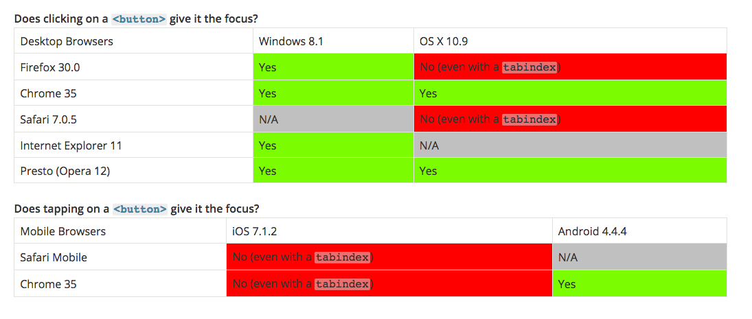
- ^ and Firefox on Windows 10 does not give focus on click.
Additionally, Firefox does not apply :active focus styling with keyboard interactions with the SPACE key.
emilyrohrbough
on 1 Dec 2017
Chrome (webkit, really) does some unexpected behavior with buttons when you click:
https://stackoverflow.com/questions/20340138/remove-blue-border-from-css-custom-styled-button-in-chrome
If we're going to be changing button, this might be a good thing to add.
 calebmeyer
on 7 Dec 2017
calebmeyer
on 7 Dec 2017
Related issues
 StephenEsser
·
5Comments
StephenEsser
·
5Comments
 noahbenham
·
4Comments
noahbenham
·
5Comments
noahbenham
·
4Comments
noahbenham
·
5Comments
 cwalten
·
6Comments
bjankord
·
3Comments
cwalten
·
6Comments
bjankord
·
3Comments
Most helpful comment
We should add a
refCallbackprop for use with popup and menu.