Bite-sized, i.e. fixes or combination of fixes that can be done in less than 15 mins each
- ~Primary buttons are mostly used. Need to vary the color used. E.g. delete button
should be red.~ Merge to #10243
- ~Task:~
- ~Scour through the website to find all the different buttons used~
- ~Decide the colour of each buttons~
- ~Implement them~
- ~Task:~
- ~Buttons should look more like buttons~ Merge to #10243
- ~V6 has a drop shadow effect that makes it look more 3D. V7 buttons kind of blends into the background~
- ~Task:~
- ~Get a suitable button style from bootstrap or self-defined ones~
~Information displayed inconsistently~ ✅ (@t-cheepeng )
~Task:~
~Button under Courses tab of instructor pages is grouped into Other Actions. But the other tabs with similar tables has actions that are not grouped~ Will not be grouping the action buttons together as there is no strong reason to do so. Also avoids an unnecessary additional click to get to the items
~Archived course table in the Courses tab is not collapsible but the Recycle Bin table is collapsible.~
- ~Misaligned labels and inputs fields in forms/details pages~ ✅ (@t-cheepeng )
~Task:~
~Adding new course on instructor page~
~Edit feedback session Course ID label and data in the top box~ ~Landing Page~ ✅ (@t-cheepeng )
- ~Task~
- ~Bottom banner not centralised in mobile view~
Medium-sized, i.e. fixes that are of considerably widespread reach, but consists of smaller sized fixes each
- ~Bottom banner not centralised in mobile view~
- ~Task~
~Error pages should show feedback form to collect user submitted error~ Merge to #9356
- ~Missing feature from V6~
- ~Task:~
- ~List down all the different error pages~
- ~Decide which pages should show a feedback form~
- ~Notes: Make use of the component
ErrorReportComponent~
- ~Opening / closing tabs feels very abrupt. V6 had animations for that~ ✅ (@ccyccyccy)
- ~Task:~
- ~List down all pages with tabs~
- ~Assign them a global class for tabs toggling~
- Animations do not play smoothly on initial component load, e.g. Expanding a panel.
- ~Task:~
- ~We use snackbar and progress bar from Angular material, however Bootstrap has support for those as well (toast and progress bar). Check if we can use Bootstrap instead and therefore eliminate the dependency to Angular material.~ ✅ (@wkurniawan07)
- ~Input Validation~ [Defer] Feature increases development effort and is not essential for V7. Can be added in after release of V7
- ~Validate input after the user finishes typing, not after clicking save.~
- ~If too hard to instantly validate, then consider scrolling up to invalid entry after clicking save? Or highlight error box in red~
- ~Task:~
- ~Investigate further if validation at the frontend really gives any improvements since backend already does so and returns error messages.~
- ~Validate input after the user finishes typing, not after clicking save.~
- ~Instructor edit question page~ ✅
- ~Would like a way to collapse the questions. They take up too much space. Hard to get an overview of all the questions~ ✅ (@ccyccyccy)
- ~Default should be expanded~
- ~Could reuse the same “Expand All” button from the results page~
- ~Would be good to implement this feature~
- ~Optional description taking up a lot of space. Make it appear smaller at first and reuse the same resizable box for the main question box, making description textbox size dynamic~ ✅ (@ccyccyccy)
- ~Course ID not aligned~ (Fixed in UAT)
- ~Clicking on feedback path that expands to show possible paths should not dismiss the tab~ ✅ (@ccyccyccy)
- ~Cancel modal should not pop out if there is no changes made~ ✅ (@ccyccyccy)
- ~Have a divider between “Choose from template questions” and the rest of the options under “Add new question”~ ✅ (@ccyccyccy)
- ~While editing question, “Discard” and “delete” button side by side feels like they do a similar function. Rename “Discard” to “Cancel”~ ✅ (@ccyccyccy)
- ~MCQ MSQ: Click / hover on ‘X” button on options should have animations~ ✅ (@ccyccyccy)
- ~Distance between questions should be slightly larger.~ ✅ (@ccyccyccy)
- Clicking on a disabled field should highlight the edit button
- Big hassle to capture click events on disabled fields. Defer for now
- ~Save and save changes buttons have the same function. Make them look the same~ ✅ (@ccyccyccy)
- ~Add cancel button below the question beside the save button~ ✅ (@ccyccyccy)
- ~Would like a way to collapse the questions. They take up too much space. Hard to get an overview of all the questions~ ✅ (@ccyccyccy)
- ~Ensure that all clickable areas are actually clickable~ ✅ (@ccyccyccy)
- ~E.g. Clicking on template questions to expand tab only works when clicked on the words rather than the box~
- ~Ensure cursor turns to pointer on clickable surfaces (where applicable)~
- ~E.g. Checkboxes don’t need pointers, but expanding tabs should need them~
- ~E.g. Student list cursor do not change to pointer on clickable surfaces~
- ~Ensure entries in tables and sortable tables are consistently displayed on load~ ✅ (@t-cheepeng)
- ~E.g. Instructor results page/all records page: comments shown are not sorted by date~
- ~E.g. Instructor courses page: Refreshing the page shows different layout every time~
- ~Convert sortable table to be used for all tables?~
- ~Use first column by default to sort (Customizable)~
 ccyccyccy
All 10 comments
Regarding input validation at point 9, we have an issue open tracking the implementation and development of this in #9419. There's only those few forms left honestly (unless I missed something), and I still stand by my opinion in https://github.com/TEAMMATES/teammates/pull/10049#issuecomment-627767630 that it would benefit the user experience in filling out the forms. Furthermore, I realise now that it might save us unnecessary backend API calls (that are going to be rejected anyway) thus reducing the overall server computational cost.
@damithc okay for us to proceed on this?
 madanalogy
on 30 Jun 2020
madanalogy
on 30 Jun 2020
Regarding input validation at point 9, we have an issue open tracking the implementation and development of this in #9419. There's only those few forms left honestly (unless I missed something), and I still stand by my opinion in #10049 (comment) that it would benefit the user experience in filling out the forms. Furthermore, I realise now that it might save us unnecessary backend API calls (that are going to be rejected anyway) thus reducing the overall server computational cost.
@damithc okay for us to proceed on this?
Indeed there are benefits of front-end validation. Right now our primary concern is optimizing development effort. I suggest we postpone it because it increases the development effort and not essential for V7. Those are incremental improvements we can do after V7 has been released.
 damithc
on 30 Jun 2020
damithc
on 30 Jun 2020
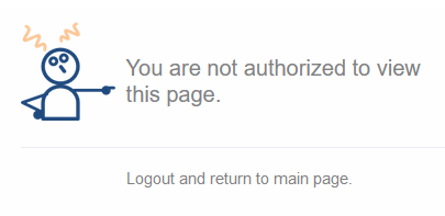
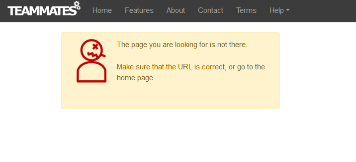
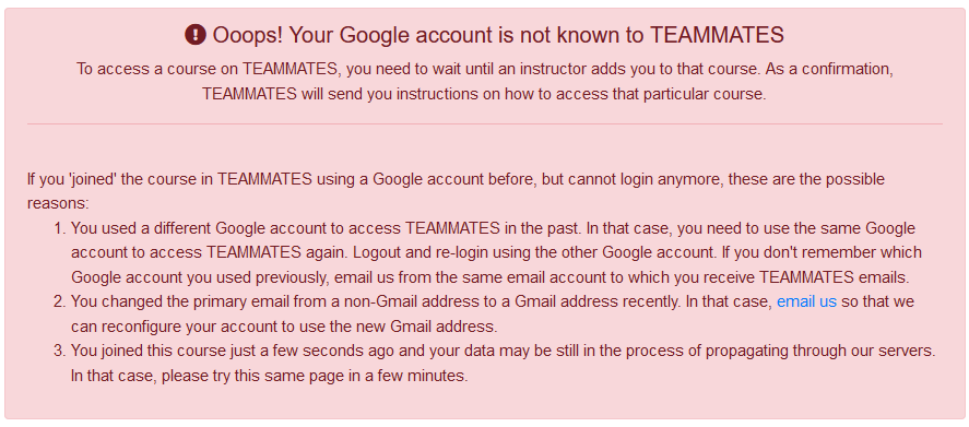
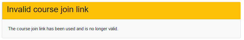
For item number 6. the different error pages that are shown in the app are:
- You are not authorized to view this page (Has error form in V6)
- The page you are looking for is not there (Has error form in V6)
- Ooops! Your google account is not known to TEAMMATES (Does not have error form in V6)
- Invalid course join link (No counterpart exists in V6)
@damithc @wkurniawan07 @xpdavid Do we follow V6 and only have the error form in 1. and 2. or have the error form for all 4 items? Also, do we want to embed the form onto the page itself or have it popup as a modal?
 t-cheepeng
on 2 Jul 2020
t-cheepeng
on 2 Jul 2020
The general rule:
If using the form, the log message saved (which is then emailed to me) should contain enough information for me to take an action. For example, I should be able to email the person back. If it is not possible to know the contact details of the person trying to access, either we have to collect that info using the form or else ask the user to email us instead of using the form.
I think we can have the form in 3 too.
For 4, users often reuse the previous link to reach the same course. It should only show an error if the link is being used by a different Google account than the one it was used before. In those cases, we can use the form.
damithc
on 2 Jul 2020
Looks like I need to give more context about how the new error page (if it can still be called a "page") works.
In V6, the architecture is 100% server-side rendering (SSR) with occasional AJAX request in many parts. That means, any request for new page will be served entirely by the back-end. If any error is encountered during such processing, the server will redirect to pre-defined error pages, such as pageNotFound.jsp, unauthorized.jsp, etc. You can find the details in the release branch which still contains the V6 code (at the time of writing), specifically here: https://github.com/TEAMMATES/teammates/tree/release/src/main/webapp.
In V7, the architecture is single-page application (SPA) with AJAX requests to REST endpoints for data. Under this architecture, there is only one initial request for page which is index.html, and everything else is just directing the user to the correct page template, as defined by the web URL. For this reason, error page being defined as a "page" does not make sense anymore, except for one single case which is "page not found".
Since V7 (or, in general, SPA+REST application) works by getting data and then transforming data into user-friendly view, any error "page" doesn't really fit what an error page really means in SSR architecture. In fact, the ones you listed above are not errors, those are expected output from business logic (e.g. if a course join link is no longer usable, then we display as such). It is true that we can be more user-friendly and perhaps add some reporting form, but as far as the actual definition of error (server returning 4XX or 5XX) is concerned, none of the examples above are errors.
Actual error handling in V7 can/should be done in few different ways:
- Pop up the error report component; this is implemented only in course join page, you can reproduce by going to a course join link but drop the
entitytypeparameter - Pop up a toast message
- Display "Data failed to load. Try again?" or alike in the table/div/... itself
- ...
This is a very delicate matter and varies largely case by case, much more so than in V6.
 wkurniawan07
on 3 Jul 2020
wkurniawan07
on 3 Jul 2020
This is a very delicate matter and varies largely case by case, much more so than in V6.
Understood. Can all these cases be divided into two categories like this?
- User contact details known (e.g., user followed a legit session link in an earlier step)
- User contact details unknown (e.g., clicked on an a link of a deleted course)
If the answer is yes, the first category can be shown the feedback form (for serious errors) and the second category can be asked to email us directly or show a feedback form but with an additional field for contact email.
damithc
on 3 Jul 2020
Can all these cases be divided into two categories like this?
No. It's not that simple. Take, for example, the instructor home page (user contact details known). These are the AJAX requests happening after the initial page load:
- Load the courses belonging to the instructor
- Load the sessions of each course
- Load the instructor privileges for each course (to know what kind of actions the instructor can do for each course)
The first one, as it happens only once and only during the initial page load, can be handled by popping up either error report component or toast message.
The second one, however, happens afterwards and happens concurrently, so if there are 10 courses for this instructor, there will be 10 parallel requests (or maybe 3 as only the first 3 courses are loaded by default; need to check again). Here it doesn't make sense to pop up any message because there can possibly be multiple parallel errors happening, so displaying "Data failed to load. Try again?" is the better option.
The third one is even more complicated, as any error coming from it will only be visible when the user finds out that s/he cannot perform any action s/he should be able to.
wkurniawan07
on 3 Jul 2020
No. It's not that simple.
Understood. For each case, also factor in if the contact details are known or not and tweak the response accordingly. If not known, and if appropriate (case by case basis), either collect that info from the user or ask the user to email us directly. I just want to avoid the case where the user thinks she reported the error and waits for a fix but I have no way to reach the user.
damithc
on 3 Jul 2020
Can I take on 10 (Instructor edit question page) part (i)?
 manzurayusup
on 4 Jul 2020
manzurayusup
on 4 Jul 2020
@manzurayusup Thank you for the interest. However, that sub-issue is already being worked on by other people.
t-cheepeng
on 6 Jul 2020
Related issues
 whipermr5
·
4Comments
whipermr5
·
4Comments
 sujeet14108
·
4Comments
sujeet14108
·
4Comments
 joanneong
·
4Comments
whipermr5
·
4Comments
wkurniawan07
·
3Comments
joanneong
·
4Comments
whipermr5
·
4Comments
wkurniawan07
·
3Comments
Most helpful comment
Indeed there are benefits of front-end validation. Right now our primary concern is optimizing development effort. I suggest we postpone it because it increases the development effort and not essential for V7. Those are incremental improvements we can do after V7 has been released.